
Typography is a core accessibility feature because people read with their eyes, their brains, and their tools. When text contrast, size, spacing, and semantics fail, the whole experience fails too. This is why typography accessibility best practices should guide both design and QA for real components, not just “font choice.” In 2026, content is viewed across devices, zoom levels, and assistive technologies. As a result, small typography decisions can compound across breakpoints, states, and dynamic content.
This guide gives actionable steps you can apply to headings, body copy, links, form labels, and UI messages. You will learn a workflow that checks reflow and meaning, not only pixel-perfect visuals. Then you will implement those checks with CSS and design-system tokens. Finally, you will avoid common mistakes that repeatedly break accessibility in production.
We focus on web typography and HTML/CSS decisions that directly support readable, operable text. We also keep the scope practical, so you can apply it to design systems and component libraries. For reference, the principles align with W3C Understanding Success Criteria from the W3C and WCAG 2.2 Overview for the core framework.
Contents
- 1 Build an accessibility-first typography workflow designers can apply
- 2 Choose font sizes, line length, and spacing that preserve readability at zoom
- 3 Ensure color contrast and text styling communicate meaning without relying on color
- 4 Preserve semantic structure so screen readers and visual users experience the same hierarchy
- 5 Typography that works across UI components, forms, and interactions
- 6 Correctly implement accessibility-friendly typography in CSS and design systems
- 7 Common mistakes and misconceptions that undermine accessible typography
- 8 Compare realistic typography approaches so you can choose the best option for your product
- 9 Address edge cases where typography accessibility breaks in the real world
- 10 Frequently Asked Questions About Typography Accessibility Best Practices for Web Design
- 10.1 What typography changes most improve accessibility for low-vision users?
- 10.2 How do I test typography accessibility when users zoom to 200%?
- 10.3 Should I use px or rem for accessible web typography?
- 10.4 How can I make links accessible when the design uses subtle styling?
- 10.5 What font size and line height are best for body text readability?
- 10.6 Does letter spacing help or hurt readability for people with dyslexia?
- 10.7 How do I ensure headings convey the right hierarchy visually and semantically?
- 10.8 What typography accessibility issues happen with forms and validation messages?
- 10.9 How can I prevent typography from breaking in localized or long translated text?
- 10.10 Can custom fonts improve accessibility, or can they make things worse?
- 11 Conclusion
Build an accessibility-first typography workflow designers can apply
Start by treating typography like a user interface system, not a decorative layer. First, identify which text users must read to navigate, understand, or complete tasks. Then, define how each type of text should behave under real-world changes like zoom and reflow. This prevents the common pattern where the design looks fine at 100% and then collapses when users zoom.
A strong workflow begins with reading tasks. Headings create structure. Body text supports comprehension. Links enable navigation. Form labels and help text reduce errors. In addition, error and validation messages guide corrections. When you map typography to these tasks, you can set requirements that match user intent.
Next, use an input-to-output rule set. Decide the typography requirements for each component: contrast expectations, minimum sizes, and spacing rules. Then map those requirements to CSS variables or design tokens. For example, define a body scale, a heading scale, and spacing tokens. This makes typography changes consistent and easier to test.
You should also test at extremes. Verify at browser zoom, such as 200%, and at narrow viewports. Check how line height and wrapping behave. Then verify reflow when content length changes, like expanding an accordion. Meanwhile, confirm that increased OS font scaling does not cause overlap.
To define “good,” set component-level targets. Body copy should feel readable across paragraphs and long sections. Headings should be scannable and clearly distinct. Links should look like links in every state. UI labels should remain legible even in dense forms. As a tradeoff, stricter targets may reduce stylistic freedom, but they prevent usability regressions.
Use a failure-mode checkpoint for zoom breakage. If designs rely on fixed heights or overflow-hidden text, reflow will cut off content. This is a common edge case for card layouts with titles and metadata. For example, if metadata is clipped at one line, it can vanish at 200% zoom. A good workflow explicitly checks these layouts under wrapping pressure.
Choose font sizes, line length, and spacing that preserve readability at zoom
Use a responsive sizing strategy so text scales with user settings. Avoid hard-coded pixel values for font size and line height when possible. Instead, use relative units like rem for text and spacing. This lets users zoom or change settings without breaking layout.
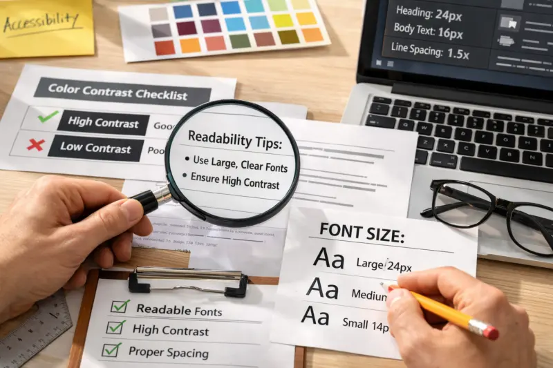
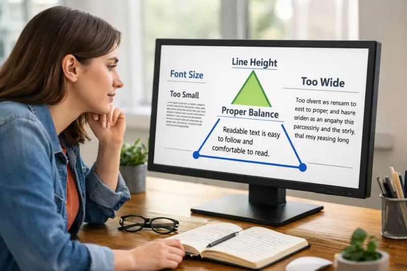
Line length has a direct impact on readability. If lines are too long, readers lose their place. If lines are too short, reading becomes choppy and tiring. A practical approach is to constrain readable text using a max-width. Then adjust max-width per breakpoint so layouts stay comfortable on tablets and wide monitors.
Spacing also matters as much as size. Line height should be generous enough for distinct lines, especially for people with low vision. Paragraph spacing should help users understand structure. However, overly tight spacing can reduce clarity. It can also make dyslexia-friendly reading harder, even if contrast is high.
Wrap behavior is where accessibility often breaks in production. Ensure headings and body text wrap naturally. Do not prevent multi-line reflow with fixed containers or truncation. If you need truncation for layout reasons, confirm it still works when users zoom and when language expands.
Mixed-size components need extra attention. Consider a product card with a title, a category label, and a price. The title might meet minimum size targets, but the metadata can drop below them visually. When line height and font scale change together, metadata can become unreadably small. Therefore, test the spacing interactions between text elements, not just each element alone.
A common misconception is that increasing font size alone fixes everything. However, line length and spacing can still harm comprehension. For example, big headings with tight line height can overlap at zoom. Meanwhile, narrow columns can create awkward wraps for short labels. Typography accessibility best practices require tuning the full reading system, not one variable.
Ensure color contrast and text styling communicate meaning without relying on color
Contrast must be strong enough that text remains readable in context. Start by evaluating contrast for normal text and UI text. Then check contrast for thin strokes and small font sizes. Thin text often looks lower-contrast than thick text, even when the same color is used.
Consider how color effects can change contrast. Shadows, gradients, and translucent overlays can reduce legibility. If a text layer sits on top of a busy image, contrast may change across the image. In that scenario, one region might look fine while another region becomes unreadable. To fix this, use a background treatment or ensure the text sits on a consistent surface.
Links need more than a color swap. Users must find links in normal, hover, and focus states. Use underlines or other non-color indicators. Also make sure visited links remain distinguishable. However, be careful with subtle styling that looks like static text. It can cause people to miss interactive elements.
Text styling should also avoid “meaning by emphasis alone.” If the only difference is a lighter weight or opacity, some users will not perceive it. This can happen when emphasis relies on color plus weight changes. Therefore, use structure and decoration, not just style differences.
Disabled and muted text create a special tradeoff. They are meant to look less prominent. Still, they must remain readable so users understand context. In forms, muted helper text should not become too faint. Error and success messages should also maintain clear contrast at small sizes.
A real-world edge case involves translucent containers. Imagine a callout card with semi-transparent background on a photo hero. As the photo content changes behind it, contrast can drift. When users zoom, reflow can shift the text onto different parts of the image. That shift can make contrast inconsistent, so test with varied content.
Preserve semantic structure so screen readers and visual users experience the same hierarchy
Semantic HTML creates an accessible reading order. Visual hierarchy should match the actual document outline. Use heading elements to represent structure, not just typography. When headings are styled without correct semantics, assistive technologies may lose the meaning.
Align heading levels with the content’s logical flow. H1 should represent the main topic. Then H2 and H3 should reflect major and sub sections. However, do not skip levels for aesthetics. Skipped levels can confuse screen reader users who rely on heading navigation.
Also treat emphasis as meaning, not as styling. Use strong or em when the emphasis changes interpretation. Rely less on italics and font weight alone. Meanwhile, decorative text should not become a “fake heading.” For example, a component title inside a card is often not a page heading.
Spacing and size must reinforce hierarchy without breaking the accessibility tree. A common mistake is to style multiple “component titles” as if they were headings. This can flood the accessibility tree with headings that do not reflect page structure. A better approach is to keep true headings only for document structure, and use non-heading elements for card labels.
Consistency helps. If your design system maps heading tokens to heading elements, it reduces drift. Also ensure that typography changes do not override semantics. For example, if an interactive control looks like a heading, users might expect different behavior.
When people navigate by headings, hierarchy becomes a cognitive shortcut. If the hierarchy is wrong, reading becomes slower and less reliable. Therefore, semantic preservation is one of the most reliable typography accessibility best practices you can apply. It improves both screen reader experiences and visual scanning.
Typography that works across UI components, forms, and interactions
Typography needs to be consistent across the whole interface, not only on the page. Users encounter headings, body text, captions, buttons, helper text, and error messages. Each text type has different requirements for size, weight, and spacing. Therefore, create a typography inventory for your component library.
Small UI text can be tricky. Tooltips, captions, and helper messages often use smaller sizes. If they are too small, low vision users struggle. If they are too tight, users with cognitive load also struggle. A practical approach is to set a minimum legibility size for UI text and then test it in context, not just in isolation.
Form validation messages need strong structure. Error and success text should be readable and clearly associated with the input. Avoid relying on color alone. Also include sufficient spacing so long messages wrap cleanly. If an error message spans multiple lines, line height and paragraph spacing should keep it scannable.

Focus indicators are part of typography accessibility. The focus ring must not be visually hidden by overlapping text layers. In addition, focus states should not shrink or blur the text so much that it becomes hard to track. When keyboard users move through links and controls, they need a stable visual anchor.
Empty states also require careful typography. When content loads dynamically, empty screens often show prompts and guidance. Those messages should still meet contrast and sizing rules. Accordions and expandable sections can add long blocks of text later. Typography must remain readable when content length changes.
A common edge case occurs when placeholder text is used as guidance. Placeholders disappear when users type. If the placeholder held key instructions, users lose context. Instead, use visible helper text and labels, then keep placeholders short and optional. This supports comprehension and reduces errors.
Correctly implement accessibility-friendly typography in CSS and design systems
Design tokens turn accessibility into something you can scale. Define typography scales with CSS variables for font size, line height, and spacing. Then apply those tokens consistently across components. This helps you avoid ad hoc overrides that create uneven experiences.
Use relative units for typography and spacing wherever you can. rem and em respond to user zoom and browser settings. They also help keep layouts stable across breakpoints. Avoid forcing everything with fixed pixel heights, especially for text containers. When text needs to reflow, fixed heights create clipping.
Also avoid brittle CSS patterns. Overflow clipping, absolute positioning, and hard max-heights often break when lines wrap differently. For example, if a button label uses absolute positioning, it may overlap an icon at 200% zoom. Prefer natural flow layout so reflow can work as intended.
Font loading must be handled carefully. Use a sensible fallback font stack so text is readable while custom fonts load. Then choose a font-display strategy that avoids long blank text. When the custom font swaps in, spacing can change due to different metrics. Therefore, verify contrast and spacing in both fallback and final font states.
Font rendering differences can also change perceived contrast. Letter shapes, hinting, and fallback fonts can alter how thin characters appear. As a result, assumptions about line height and spacing can fail. Test with real browsers and with throttled network where possible, because font timing affects layout during loading.
A nuance many teams miss is that accessibility is time-based too. When a font swap happens, line breaks may change. That can affect headings, metadata, and wrapping. Therefore, include reflow checks in your release process, not only during initial design review.
Common mistakes and misconceptions that undermine accessible typography
One big mistake is believing that large font size alone fixes accessibility. Large text improves visibility, but it does not guarantee readability. Line length, line height, contrast, and wrapping still determine comprehension. Therefore, treat the reading experience as a system.
Another misconception is to rely on placeholders for instructions. Placeholders vanish during input. That means the instruction disappears exactly when users need it. Replace placeholder-only guidance with visible labels and help text. Then keep placeholders for short examples or optional hints.
Many designs also use emphasis by color and weight only. For example, an active link might be a slightly darker shade. However, some users cannot reliably perceive that difference. Others may view the page in high contrast modes. As a result, add non-color cues like underlines and clear focus states.
Designing for one viewport is also a common failure. Responsive type must be tested across breakpoints and zoom levels. At narrow widths, line breaks change. At wide widths, line length can exceed comfort. At higher zoom, headings may wrap and push content into new contexts.
Finally, accessibility testing is rarely one-and-done. Copy changes, new localized strings arrive, and new components get added. Each change can break line length, wrapping, or contrast. Therefore, keep typography checks as part of ongoing QA, especially for content-heavy pages and component updates.
A deeper nuance is that “good” can regress silently. If someone edits a token, it can affect dozens of components. If a designer adds a fixed-height wrapper, reflow can clip content. These regressions often slip past visual QA. They are exactly why typography accessibility best practices include reflow and extreme zoom checks.
Compare realistic typography approaches so you can choose the best option for your product
Different products need different typography strategies. Some teams need speed and consistency. Others need flexibility for complex marketing layouts. Still, accessibility imposes constraints on each approach. So you should choose the approach that makes those constraints easy to maintain.
Tokenized typographic scales are a common starting point. They are simple, consistent, and system-friendly. The main risk is that teams might oversimplify edge cases, like cards with mixed metadata sizes. You can reduce that risk by adding component-specific rules and minimums for UI text.
Dynamic type scaling can respect user settings better than forced pixel sizing. If you tie typography to user preferences using relative units, reflow is more reliable. The main risk is that layouts might not anticipate larger line wraps. Therefore, test your layout with extreme zoom and with longer localized strings.
Font strategy matters too. Classic web fonts with stable metrics can be easier to predict. Variable fonts and advanced typographic features can improve flexibility. However, they can introduce unexpected metric shifts when font axes change. If you adopt advanced features, validate line breaks and contrast under fallback and loaded states.
Layout-driven typography and content-first typography both exist. Content-first approaches use max-width and natural flow. That tends to work better with reflow. Layout-first approaches constrain content to strict grids. The risk is truncation or clipping when wrapping changes. If you use grids heavily, ensure text containers can grow.
When choosing, use a rubric. If small UI text and long messages are common, accessibility constraints should win. If you are building dashboards, test dense layouts at 200% zoom. If you are building long-form reading pages, test line length and paragraph spacing. In every case, designer taste should yield to readability constraints that protect user comprehension.
Here is a simple comparison rubric.
| Approach | Accessibility upside | Main risk | Best fit |
|---|---|---|---|
| Tokenized typographic scales | Consistent sizing and spacing across components | Edge cases may get under-specified | Design systems and component libraries |
| Dynamic scaling with relative units | Better resilience to user settings | Layouts may not reflow cleanly | Apps with varied user preferences |
| Stable web fonts vs advanced features | Predictable metrics improve layout stability | Font swaps can shift line breaks | Marketing sites and reading experiences |
| Content-first max-width | Natural wrapping supports readability | Grid constraints can fight text growth | Long-form content and docs |
Address edge cases where typography accessibility breaks in the real world
Typography rules often differ between reading pages and UI tasks. Long-form content can prioritize comfortable line length and paragraph rhythm. Forms and checkout flows must prioritize compact, legible labels and clear error messages. If you apply the same typography system to both without adjustment, users will feel the mismatch.
Localization adds another layer of risk. Translated strings can be longer than the original. Headings can wrap into multiple lines. Button labels can grow and push UI elements. Therefore, you should avoid fixed heights and overflow clipping around translated text. In addition, test heading hierarchy when line breaks happen in other languages.
Some users benefit from adjustable font and spacing. Do not promise a single universal “dyslexia-friendly” font fix. Instead, ensure your typography system respects user overrides. When users adjust their browser or OS settings, your CSS should not fight those changes. That includes avoiding aggressive line-height locks and removing user styles.
Motion can also harm readability. Animated text or scrolling effects can distract attention from content. In addition, dynamic changes that alter font size on interaction can trigger reflow at the wrong time. A safer approach is to keep text stable and animate non-text properties. When you do change text size, test it for overlap and readability.
Consider a specific assistive-tech scenario. Some users override fonts or set higher spacing in their browser. If your CSS uses overly specific selectors and forces values, their preferences may not apply. That can remove the user’s readability improvements. Therefore, allow user styles to win where appropriate and test with those overrides.
Finally, remember that content length changes break typography. An accordion that starts short might later contain long terms and multiple paragraphs. A card that fits one line of metadata might later include longer product names. If your layout cannot handle growth, accessibility fails even if your initial design looked correct.
Frequently Asked Questions About Typography Accessibility Best Practices for Web Design
What typography changes most improve accessibility for low-vision users?
Contrast, font sizing strategy, spacing, and reflow behavior usually make the biggest difference. Use relative units so users can zoom and change text size without clipping. In addition, keep line height and paragraph spacing generous enough to separate content. A simple test is to zoom to 200% and confirm headings and body text still wrap and remain readable.
How do I test typography accessibility when users zoom to 200%?
Look for wrapping, truncation, and overlap in headings, body text, and forms. Check whether line breaks still make sense when containers get narrower. Also verify focus states for links and controls, because outlines can shift during reflow. Finally, confirm that long error messages still wrap without cutting off content.
Should I use px or rem for accessible web typography?
rem is usually a safer default because it scales with user settings and browser defaults. px can still work for certain fixed-layout UI parts, but it is more likely to break reflow expectations. As a rule, use rem for font sizes and line heights, then test at zoom. This helps your typography remain resilient across devices and preferences.
How can I make links accessible when the design uses subtle styling?
Do not rely on color alone. Ensure links have an underline or another non-color visual cue in normal and hover states. Then make focus styles highly visible and consistent with keyboard navigation. Also maintain strong contrast between link text and surrounding text.
What font size and line height are best for body text readability?
There are no universal values, but many teams start with a base size near 16px and then adjust with a modular scale. For line height, the key is clarity between lines at your chosen size. In practice, test readability in context, including long paragraphs and narrow layouts. If users struggle to track lines at zoom, increase line height or constrain line length.
Does letter spacing help or hurt readability for people with dyslexia?
Small letter-spacing changes can help some readers. However, too much letter spacing can harm word shape and slow scanning. Because needs vary, treat letter spacing as a controlled adjustment, not a blanket rule. Test with real content and consider offering user overrides rather than locking letter spacing in CSS.
How do I ensure headings convey the right hierarchy visually and semantically?
Use heading elements in the correct order, so the visual outline matches the document outline. Avoid skipping levels just to style something quickly. Also do not create “fake headings” by styling random text as if it were a heading. Keep card titles that are not page structure as non-heading elements to avoid confusion.
What typography accessibility issues happen with forms and validation messages?
Label readability, small UI text, and error messaging patterns are frequent issues. Make sure labels stay visible and have enough contrast. For errors, include clear text styling and spacing beyond color changes. Also ensure focus visibility so keyboard users can tell where they are after validation.
How can I prevent typography from breaking in localized or long translated text?
Allow text containers to grow and wrap naturally. Avoid fixed heights and overflow clipping around headings, buttons, and metadata areas. Use flexible max-width rules for body text so line breaks remain readable. Then test with real translated strings at multiple breakpoints and zoom levels.
Can custom fonts improve accessibility, or can they make things worse?
Custom fonts can improve accessibility when their legibility matches the content’s needs. However, they can also make things worse if font metrics change line breaks or if fallback is handled poorly. During loading, ensure text is readable with a fallback stack. Then validate contrast and spacing in both fallback and final states.
Conclusion
Typography accessibility best practices work when you treat typography as a readable system with meaning, not as decoration. Build a workflow that starts with reading tasks, then sets component requirements. Next, implement those requirements with tokens and relative units so text scales reliably.
Then validate at the extremes. Test reflow at 200% zoom, narrow widths, and content expansion. Confirm that focus states remain visible and that error messages wrap cleanly. When you catch failures early, you prevent late-stage fixes that break other components.
In 2026, accessibility stays strongest when typography is maintained, not “finished.” Re-test when copy changes, when new components ship, and when localization updates arrive. If you audit one high-impact surface first, start with forms and navigation. Then expand the same checks into body content and your design system.
Updated September 2026