
Font pairings can make a website feel polished, or instantly “off,” even when every font looks great alone. If you want a reliable way to match readability with brand style, this guide delivers exactly that—plus a curated set of ready-to-use options. You’ll find 10 Best Font Pairings for Web Design, with clear roles for headlines and body text, plus when to use each combo. It’s written for web designers, marketers, and developers building landing pages, UI, and brand systems. You’ll also learn a simple decision path, common failure modes, and practical testing steps you can run in an afternoon. By the end, you’ll know how to choose fonts that look intentional across devices.
How to choose font pairings that look intentional (not accidental)
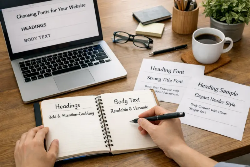
Start with roles, not aesthetics. Headings and body text need different job descriptions on most websites. If you assign the same “voice” to both, the page often loses hierarchy.
Next, decide your contrast strategy. Contrast can come from a serif versus sans split, or from weight and size differences. In addition, harmony matters. Two fonts can contrast well and still feel like they belong together.
Then confirm legibility at real sizes. Drafts often look perfect at large mockup sizes. However, the body font at 14–18px and line lengths around 55–85 characters will reveal most problems. Test it on a light and dark background too.
Because typography changes by context, treat UI differently from editorial copy. Button labels, form errors, and table headers need tighter clarity. Meanwhile, blog posts and marketing paragraphs can support more nuance, like italics or a more expressive serif headline.
Finally, avoid two common extremes. Too-similar fonts can look bland and “samey.” Too-dissimilar fonts can create a jerky reading rhythm. A good pairing keeps the scan path smooth from headline to supporting text.
One helpful mental model is a “decision path.” First pick a purpose for each font. Then pick one contrast axis. After that, check the rhythm via line height and spacing. This keeps your choices consistent when you move from hero sections to forms.
What are the pairing rules that make web typography feel balanced
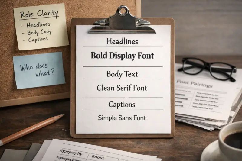
Balanced pairings usually follow a few repeatable rules. The first rule is role clarity. Decide which font owns headlines, which owns body, and which owns UI microcopy.
The second rule is contrast you can control. Serif versus sans is the most common path. Yet you can also create contrast with x-height, stroke width, and weight range. For example, a font with a tall x-height often reads cleanly in small sizes, while a different font can carry expressive display moments.
The third rule is harmony. Harmony is not sameness. Instead, it’s a shared tempo in proportions. Look for similar “feel” in character shapes, like round counters and terminal shapes. If the fonts fight visually, spacing tweaks rarely fix the root issue.
In practice, build a quick test stack. Draft body at 14–18px with line height around 1.4–1.7. Set headings around 28–40px for desktop. Keep paragraph width near 600–900px so lines don’t stretch too far.
Feeling lost in font choices for your site?
Let us help you create a stunning website with the perfect typography that captures your brand identity and drives conversions. Our expert design services will ensure your fonts are not just beautiful, but intentional and effective.
Also watch how your pairing behaves with italics. Italics often look stylish in headlines. However, body italics can drop legibility when contrast is low or screens are small. If you use italic body text, increase size or line height to compensate.
A frequent misconception is that kerning alone solves spacing issues. Kerning helps words fit, but it cannot fix overall rhythm. If line breaks look odd, adjust letter spacing, font-size scaling, and line height first.
For teams that build design systems, define these rules in components. A “Heading” token should lock in the relationship between headline and body. A “Body” token should lock line height defaults for long-form pages.
10 curated web-ready font pairings for real page layouts
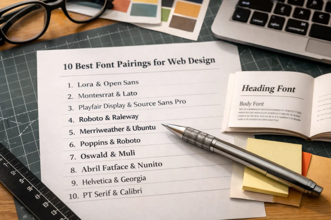
Below are 10 proven font pairings you can apply to common website layouts. They’re chosen to balance contrast, rhythm, and cross-device readability. Each option includes a clear headline role and body role so you can implement fast.
These pairings work best when you keep the hierarchy simple. Use one font for headlines, one for body, and keep UI mostly consistent. When you add a third font, it should be rare and intentional, like a dedicated display style.
To use them, start with your page type. Landing pages need strong hero hierarchy. Product UI needs stable microcopy. Marketing blogs need comfortable scanning and expressive section headers. Then pick the pairing that matches that primary job.
As you test, check the details that break on real devices. Confirm numerals in dates and pricing. Check accented characters for your languages. Validate wrapping at smaller widths, because that is where “pretty mockups” fail.
Edge case to plan for: some display fonts have tight curves or dramatic shapes. On small screens, those shapes can clip or wrap awkwardly. If you choose a dramatic display headline, increase line-height and test at 320–375px width.
Also note that many sites rely on system fonts as fallbacks. If your chosen web fonts fail to load, the fallback stack changes metrics. That can shift line breaks and ruin hierarchy. Choose fallbacks that preserve x-height and weight feel.
These pairings are designed as starting points. Use the “when to use” notes to adapt them to your brand voice without losing readability.
Pairing serif headlines with sans body for editorial warmth
Serif-plus-sans is a classic web strategy for a reason. It gives you warmth in headings and clarity in paragraphs. When you set roles cleanly, the page feels both branded and easy to read.
A strong pattern is to use a readable serif for headings and a neutral sans for body. The serif adds personality through terminals and shape contrast. Meanwhile, the sans keeps body text crisp at smaller sizes. This setup works well for marketing sites, nonprofit storytelling, and content-heavy landing pages.
For spacing, avoid “default everything” styling. Use a slightly tighter line-height in headings, but keep body line height comfortable. Also choose weights intentionally. Headline weights can go bold for impact, but body should stay around regular to medium for long reads.
For italics, keep them role-based. Use italic for headings or short callouts. If you need italic body text, increase size and confirm contrast. Many brands accidentally reduce accessibility by making body italics too light.
A real-world scenario is a SaaS landing page. Your hero headline can use a serif display style. Your body and feature descriptions can use a humanist sans for scanning. Meanwhile, navigation and button labels should use only the sans for consistency.
Tradeoff: some modern Didone-style serifs can feel too “sharp” for long body text. Use them for headings only. Pair them with a sans that has stable proportions to prevent a jittery rhythm.
Pairing sans headlines and body for consistent UI and dashboards
Sans-plus-sans can feel modern, especially for products and dashboards. It also reduces font switching issues. When both roles share a similar structure, the UI often looks cohesive.
To keep sans pairings from looking uniform, create hierarchy with weight, size steps, and spacing. For example, pick one sans for headings and another sans for body. Or use a single family with controlled weights, and reserve the second family for special accents.
However, sans pairings come with a tradeoff. If the two fonts have similar x-height and proportion, they can blend too smoothly. The page can look corporate but not branded. In that case, add contrast through a wider sans for headings or switch numeral style.
Watch variable fonts carefully. Some variable fonts shift in appearance across browser engines. Therefore, test your weight axis in the actual target browsers. Make sure your 600 and 700 weights look distinct, not muddy.
Component-level guidance matters. Table headers need enough distinction from row text. Form labels need clarity at small sizes. Button text should stay bold enough to read instantly.
One common mistake is relying on letter spacing alone for hierarchy. Small uppercase labels can look “cheap” if spacing is off. Prefer weight and size ramps first, then fine-tune tracking in microcopy.
Serif + serif pairings that work when you need extra character
Two serif fonts can work, but the conditions must be right. If you pair two serifs that share similar structure, the page can read like one blurred voice. If you pair wildly different serifs without control, the rhythm becomes jarring.
The safest approach is role separation. Use one serif with a more “text” feel for body or long-form. Use the other serif for display, like section titles or pull quotes. Then keep body sizes and line height comfortable.
In addition, avoid using serif+serif on dense UI screens. Tables and forms need clean shapes and predictable spacing. Editorial contexts allow more flexibility because users expect different reading patterns.
Edge case: some book-style serifs have lower x-height. They can feel elegant, but they may reduce clarity at 14–16px. If that happens, increase size or choose a sans body instead.
For a real-world layout, use serif+serif on a blog template. Headings can use a higher-contrast serif. Body can use a more text-friendly serif with stable spacing. UI elements like nav and buttons can remain sans for consistency.
Common misconception: “If it’s readable at desktop, it will be fine on mobile.” On mobile, line breaks change and vertical rhythm tightens. Test your font sizes and line height at small widths to protect scanning.
A repeatable workflow for selecting a pairing in under an hour
You can choose a strong pairing quickly if you test the right things. First, gather brand references. Look at your logo mood, colors, and content tone, then decide what kind of “voice” the typography should carry.
Next, select one candidate headline font. Pick a serif or sans based on your desired personality. Then select a body font that supports legibility, especially at small sizes and across long paragraphs.
Then apply the pair to a mini template set. Use a hero section, a feature grid, a long paragraph block, and a form. Also include numerals like prices, counts, or dates so you can confirm numeral rhythm.
How you evaluate matters. Check x-height and counters for clarity. Confirm stroke contrast feels consistent between fonts. Test line length and line height together, because spacing changes perceived hierarchy.
Elevate Your Typography Game
TURN VISITORS INTO CUSTOMERS.
Ensure your design stands out with professional website solutions that enhance readability and user experience. From custom font pairings to modern, mobile-friendly layouts, we help create websites that captivate and convert.
29 Years of Expertise Tailored Services Satisfaction Guaranteed
Tradeoff: chasing perfection in mockup screenshots often wastes time. Instead, validate at responsive breakpoints. Wrap behavior changes, and that can distort the perceived rhythm of your pairing.
Plan your fallback fonts too. Put thought into font stack order so hierarchy stays similar if fonts fail. Also prevent layout shift by ensuring your font loading strategy does not cause dramatic reflow in hero and headings.
For marketers, a simple A/B method works. Change only typography hierarchy first. Then compare headline size and weight, not the entire design system. This isolates the impact of the pairing on conversion-focused pages.
Common missteps that ruin otherwise good font pairings
Most font pairing failures come from a few predictable choices. First, people ignore role clarity. They use the “pretty” font for everything, which makes hierarchy collapse.
Another misstep is extreme contrast without structure. A dramatic display serif can look great in isolation. Yet without a matching sans for body and UI, reading becomes harder and the page feels unstable.
Line length and spacing also get overlooked. When paragraphs become too wide, readers lose their place. When line height becomes too tight, text feels dense and tiring.
In addition, watch italics. Italics often reduce letter clarity in small sizes. If you use italic for body text, test it on mobile and confirm contrast against background colors.
Performance can indirectly break typography. Too many font weights and styles make loading unpredictable. When the browser swaps fonts mid-load, your design can momentarily shift, and that harms perceived quality.
A deeper issue is kerning and tracking differences in small UI. Navigation labels, badges, and microcopy use different typography rules than paragraphs. If tracking is wrong on those components, the whole site can feel “off,” even if the blog looks fine.
What to do when your brand fonts do not pair naturally
Sometimes your brand fonts clash, even if you love them separately. In those cases, you have a few practical options. You can change roles, add a supportive font, or adjust spacing and weight to create harmony.
Start by keeping the brand font where it has the most impact. Use it for headlines, logos, or short hero copy. Then choose a second font for body that matches metrics and legibility. This keeps the brand feel while protecting readability.
If you must keep both fonts, adjust the relationship instead of forcing sameness. Increase line height in body text. Reduce heading weight if it competes. Also check numeral style so dates and prices do not “jump” between fonts.
Tradeoff: switching roles can change perceived tone. A serif brand font used only for headings can feel less “narrative.” However, it often works best for landing pages that need fast scanning.
One common alternative is using stylistic variants instead of swapping families. Small caps can add voice in navigation. Tabular or oldstyle numerals can align metrics across fonts. These options keep your hierarchy consistent without introducing new font files.
Real-world scenario: you have a display headline font and a brand sans that feels too thin at small sizes. Keep the display font for the hero. Use a “support sans” for body and forms with compatible proportions. Then keep button labels in the body sans to avoid microcopy inconsistency.
Font pairing edge cases for numbers, localization, and responsive layouts
Numbers and localized text can break a pairing faster than you expect. Numerals carry their own rhythm, and mismatched numeral styles can look like different fonts. Therefore, align numeral behavior across your headline and body fonts.
Check tabular versus proportional numerals. Tabular numerals line up like a grid, which helps prices and tables. Proportional numerals can look smoother in long text but may shift alignment in UI components. Choose based on where the numbers live most.
Localization is the second big risk. Accented letters, punctuation, and non-Latin scripts can expose weaknesses in one font. Some fonts that look great in English can look cramped or uneven in other languages.
Responsive behavior is the third edge case. Wrapping changes what “harmony” feels like. A pairing that reads well on desktop may feel mismatched after line breaks on mobile. Confirm line-height and spacing at your key breakpoints.
Deep nuance: font metrics differences can create vertical rhythm drift. That drift shows up in cards, buttons, and accordions. To prevent it, test your pairing inside the actual components, not just in a paragraph block.
Implementation checks matter too. Validate fallbacks and variable font axes. If a weight axis does not map cleanly, the browser might substitute a different weight, which changes hierarchy. Always review the page when the fonts are intentionally blocked to see what users get.
Frequently Asked Questions About Font Pairings for Web Design
What are the best font pairing rules for web readability?
Readable pairings keep clear hierarchy and consistent rhythm. Use contrast that supports roles, like serif headlines with a sans body, then confirm legibility at your real body font size. Also set line height for comfortable scanning and check that paragraphs have a sensible width. Finally, test in dark mode if your site uses it, because contrast issues can appear only there.
How many fonts should a website use for a clean typographic system?
Most websites can stay clean with two font families and a controlled weight range. Headings use one family and body uses the other, while UI microcopy usually stays on the body font. A third style is sometimes justified for special display moments, but only if it does not add new complexity to components. If you need more weights than necessary, your system likely has too many font files.
Can you pair two serif fonts without hurting scanning on mobile?
Yes, but you need strict role control and careful sizing. Use one serif for body or long sections only if it holds up at 14–18px with comfortable line height. Keep the second serif for headings or short editorial areas to avoid dense text blocks. Then test on small widths so wrapping does not destroy the vertical rhythm.
What font pairings work best for landing pages versus blogs?
Landing pages usually benefit from a strong headline font paired with a very legible body font. The goal is fast scanning, so prioritize hierarchy through size and weight. Blogs can use more expressive headline styles because readers stay longer and look for section structure. However, body readability still wins both cases.
How do I choose a body font when the brand font is only for headings?
Pick a body font that has a stable x-height and clear counters at small sizes. Check how it renders at 14–16px and whether it stays readable when text wraps. Then match line height and weight so paragraphs feel calm under headings. Finally, ensure numeral shapes and punctuation align well enough for a cohesive reading flow.
Should I use italics for body text, headings, or both?
Italics are often safest for headings and short callouts. For body text, italics can reduce clarity, especially when contrast is low or font size is small. If you must use italic body text, increase size and line height, and verify it on mobile. Also avoid thin italic styles for long paragraphs.
Why do font pairings look good in mockups but fail in production?
Common causes include font fallback behavior and missing weights. If the fonts load late or a weight is not available, the browser swaps to a different style and changes line breaks. Responsive wrapping can also differ from your mockup, which shifts hierarchy rhythm. Finally, some browsers render font hinting differently, so you need real device testing.
What should I test to ensure a font pairing works across browsers and devices?
Test font loading and fallbacks, because hierarchy can shift when fonts do not load. Then review key breakpoints with real content length, including long paragraphs and tables. Check numeral rendering, punctuation, and accented characters if you support multiple languages. Also confirm that variable-font weight axes render correctly on your target browsers.
UI typography needs stable clarity at small sizes. Use one body font for labels and helper text so component spacing stays consistent. Then apply hierarchy with weight and size ramps for headings, table headers, and form labels. Ensure button text stays bold enough to read instantly and verify numeral alignment for prices and metrics.
Which font pairings are most accessible for low-contrast or dark-mode designs?
Accessibility depends on contrast, size, and weight. Choose fonts with clear letterforms and avoid overly thin styles in dark mode. Keep body font sizes large enough and use enough line height to reduce visual strain. Most importantly, verify contrast for the exact foreground and background colors you use, not just by “eyeballing” the design.
Transform Your Website Today With Expert Help.
Let us guide you in pairing stunning design with optimal functionality to attract and retain visitors. Request your free consultation now and see the difference a professional website can make.
REQUEST A FREE CONSULTATIONConclusion: pick a pairing by roles, then validate with real content
If you want the fastest path to great typography, choose by roles first. Pick a headline voice, then pick a body voice that stays legible at small sizes. After that, confirm harmony through spacing, line height, and contrast you can measure visually.
Use the 10 curated font pairings above as your starting set. Then apply the “when to use” logic so the pairing matches the page job, like hero impact, long-form scanning, or UI clarity. If something feels off, do not change fonts randomly. Instead, adjust hierarchy via size and weight, then re-test the same components.
Your best next step is practical. Choose 2–3 candidate pairs. Apply them to a hero, a long paragraph section, and core UI components like forms and buttons. Then validate readability and accessibility at the breakpoints you actually ship.
After that, build a small typography test page. Compare pairings with real copy, including numbers and any localized characters you support. With that one page, you’ll stop guessing and start committing with confidence.
Choose 2–3 candidate pairs, apply them to hero + body + UI components, and validate readability/accessibility at breakpoints.
Create a small typography test page and compare pairings with real copy, including numbers and localized text.
If you still feel stuck, repeat the workflow with a tighter rule: keep UI on one font. Then let headlines carry the creative contrast. This approach preserves brand personality while protecting scanning in the places users read fastest.
Updated September 2026