

“Best” in 2026 for free web design tools means you can complete your specific website tasks without paying for software, and still export clean, usable assets. In this guide to the Best Free Web Design Tools, you’ll see how to choose options that fit your workflow for layout, prototyping, graphics, coding, and testing. Because free tools vary in output quality and portability, the best choice depends on what you need to deliver, not what the tool can demo.
In practice, you are choosing between open-source editors, free tiers with limits, and browser-based tools that prioritize speed over export freedom. You also need to plan for “handoff,” because designs that look right inside a tool can break when you move to real CSS, images, and components. This comparison is built like a buyer’s path: start with your deliverable, then pick the best tool category for each stage.
This guide is for beginners building their first site, designers validating layouts with stakeholders, freelancers moving from mockups to builds, and students learning a professional workflow.
How to compare free web design tools in 2026 so “best” matches real workflow
You should compare free tools by what you must produce, not by which one is “most feature-rich.” A tool can be excellent for visual design, yet weak for export, responsiveness, or code handoff. That mismatch is the main reason free projects get stuck late.
Start with an evaluation framework that maps to real tasks: layout and page design, prototyping and interaction, graphic assets, code and page building, and testing and QA. Then score each tool on deliverables, not vibes. For example, if you need reusable components, check whether the tool supports components, symbols, or linked styles that survive export.
Free tools usually fall into three buckets. Open-source tools cost nothing and keep ownership, but may require more setup and maintenance. Free tiers often work well early, yet limit exports, project count, storage, or advanced features. Browser-based tools feel simple, but export can be constrained, and collaboration may be smoother than portability.
One tool may look “best” for the first draft, then break during the final step. A common edge case is when the tool’s typography and spacing match perfectly in its preview, but real CSS line wrapping changes the layout. Another frequent mistake is ignoring export formats until you are ready to ship, then realizing components or effects did not translate.
To judge output fidelity, check where free tools often fail: CSS grid and flex behaviors, font substitutions, and responsive type scaling. Also test how icons and illustrations export, since SVG viewBox and styling can change. A practical nuance is to treat previews as “specs,” not “proof,” and verify in a browser at least once before you commit to a design.
Finally, remember that “free” can mean a hidden cost. The time you spend rebuilding layout rules in code is a real tradeoff. If your project depends on clean handoff, portability and export reliability matter more than convenience.
Best free tools for layout and responsive page design from wireframes to screens
The best free tools for layout help you create responsive pages with reusable structure, not just pretty screens. In 2026, “good layout” means grids, typography controls, and components that remain consistent across breakpoints. If your tool supports those elements, you can design faster and hand off cleaner.
Compare three layout approaches. Drag-and-drop page builders are friendly for quick mockups, but often lock you into their template logic. Design-first tools help you craft pixels and type, yet you must still ensure responsive behavior translates. Code-first layout editors suit dev workflows, but they can slow down non-technical users.
READY TO ELEVATE YOUR ONLINE PRESENCE?
Transform your website with our expert design and development services. From custom WordPress sites to SEO solutions, we turn visitors into loyal customers.
When you test layout strength, focus on grid systems, auto-layout or constraints, and component styling. Check whether spacing is based on repeatable rules like layout grids, consistent margins, and shared styles. Also confirm you can preview responsive states without guessing. Many tools offer device previews or breakpoint controls that let you validate collapse, wrapping, and alignment early.
A real-world scenario is designing a landing page hero, features grid, and pricing section with the same style system. If your tool can control typography scales and spacing tokens, you reduce rework later. If it only supports manual positioning, the design usually degrades when you shrink screens.
Tradeoffs matter for “pixel-perfect” expectations. A common misconception is that free tools can guarantee identical rendering in production. Your browser will use real fonts, real CSS wrapping rules, and real image dimensions. The best approach is to validate responsiveness early by resizing the canvas and checking text wrap, not only by trusting the preview.
An edge case is when a tool exports with fixed sizes, breaking fluid layouts. If that happens, you will need to rebuild layout constraints in CSS. That is why responsive preview controls and consistent component behavior matter in the selection step.
Prototyping interactions with free tools so ideas test before code
The best free prototyping tools let you test flows and states, not just show static pages. In 2026, strong prototypes capture navigation, hover and active states, and key content transitions. That clarity helps stakeholders agree before you invest in implementation.
When you compare prototypes, look for interactive mockups that support clickable flows and component-linked behavior where possible. You also want clear state handling for common UI patterns like tabs, accordions, modals, and dropdown menus. Even if the prototype cannot run your exact code, it should mirror the behavior you plan to build.
Another evaluation point is animation and micro-interactions. Free tools can often animate between frames, but they may not model the same constraints as CSS transforms and JavaScript. A practical application is to prototype a landing page form’s error states and success states. That prevents the classic mistake of designing only the happy path.
Tradeoffs show up when prototypes overpromise realism. If a prototype ignores layout constraints, it can hide problems that will appear in real CSS. An edge case is prototype navigation that depends on absolute positioning, which later breaks on mobile when content wraps differently.
To avoid demo-only prototypes, map your interaction to feasible UI components. Design your states so they can translate into design tokens like spacing and color, plus implementation logic for showing and hiding elements. Teams often miss this connection and end up rebuilding interaction rules from scratch.
Prototyping helps most when you need alignment: UX designers refining interaction logic, marketers validating a campaign flow, and teams reducing back-and-forth during early reviews.
Free graphic tools for web-ready icons, SVG, and visual assets
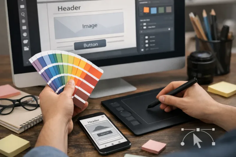
The best free graphic tools produce web-ready assets that you can style and reuse later. For web design, SVG icons and clean exports often matter more than fancy visual effects. If you keep your graphics editable and consistent, your site stays easier to maintain.
Use a practical comparison for graphics. First, check whether the tool supports SVG editing and whether exports preserve viewBox and shapes. Second, confirm you can manage raster exports like PNG for photos or backgrounds. Third, look for workflow features such as layers, naming, and batch exporting.
Deliverables should include favicon-ready icons, consistent icon sizes, and retina-friendly exports. For SVGs, watch file complexity. SVG bloat happens when you export too many layers or convert strokes into dense paths. That can slow rendering and make later changes painful.
A useful real-world scenario is building an icon set for a small business site. If you standardize stroke width, corner radius, and naming early, swapping icons later becomes easy. You also avoid the common mistake of mixing inconsistent SVG styles, which forces manual CSS overrides.
Tradeoffs exist between ease and maintainability. A beginner-friendly tool may create SVGs quickly, yet produce outputs that are harder to recolor with CSS. Another limitation is color management. Some tools embed colors directly in the SVG, so theme changes require editing files instead of updating variables.
To reduce export pitfalls, standardize early. Use a predictable viewBox, keep background fills separate when needed, and avoid embedding fonts inside SVG. When your SVG is clean, the implementation becomes simpler and more consistent across devices.
Free coding and build tools that turn designs into real HTML, CSS, and JS
The best free tools for coding help you turn designs into real pages that behave correctly in browsers. Free does not mean weak . A strong workflow combines free editors or IDEs with frameworks and static site tools that remain under your control.
Start by choosing your coding goal. If you want to learn HTML and CSS, use a free code editor plus browser devtools. If you want faster structure, use a free framework or static site generator that provides templates and component patterns. The key is keeping control of markup and styles so your design system translates cleanly.
Testing as you build belongs in the same workflow. Use linting and formatting tools, plus a local server to check assets and routes. Browser devtools are also essential because they reveal missing files, wrong paths, and CSS differences that never appear in design previews.
A handoff pattern that works well is mapping design tokens to CSS variables. For example, define your spacing scale, color palette, and typography sizes once, then reuse them across components. Also standardize asset handling by using predictable folder names and consistent file types.
An edge case is “works in preview but breaks in real browsers.” This usually comes from differences in asset paths, unsupported CSS features, or missing JavaScript polyfills for certain browsers. Another common mistake is relying on absolute positioning from the design tool, which breaks when real text wrapping occurs.
To avoid those issues, validate structure early. Load fonts intentionally, verify image dimensions, and test responsive breakpoints in devtools before you finalize layout. This is where free coding tools can outperform paid design-only workflows.
For guidance on what HTML and CSS should do across environments, the World Wide Web Consortium provides helpful baseline documentation for web platform behavior via MDN Web Docs and W3C. Even though these sources are not “web design tools,” they help you ground decisions in real standards behavior when tools disagree.
Testing and QA with free methods for accessibility, responsiveness, and basic quality
The best free web design tools support testing so you can catch problems before users do. Testing is not only about whether a page looks good. It is about checking interaction, layout on different screens, and accessibility basics.
Build a layered QA workflow. First, do responsive checks using your own browser resizing and any built-in preview modes in your toolchain. Second, do cross-browser sanity checks, at least across the browsers your audience uses. Third, verify functional UI elements like buttons, links, forms, and navigation.
Accessibility checks are where free tools can help most when you use them correctly. Automated audits can flag missing labels, low contrast, or missing headings, but they cannot confirm meaning. Use keyboard navigation tests to confirm focus order, visible focus styles, and usable tab behavior. Also check color contrast awareness by looking at text against its background.
To ground expectations, refer to WCAG for the kinds of accessibility criteria that matter. Automated checkers often map imperfectly to those criteria, so manual checks remain necessary. A key nuance is that false positives happen, especially with custom components and dynamic content.
Performance realities also matter, but you should not make “speed” the theme. Still, optimize assets you export, keep SVG icons efficient, and watch font loading behavior. A common mistake is using many heavy images or oversized SVGs, then blaming layout tools for slow pages.
For a practical QA checklist order, do it in this flow: layout, interaction, assets, accessibility basics, cross-browser pass, then final export. That sequence reduces the chance you fix one problem and accidentally introduce another. If your testing finds issues that trace back to design tokens, revise the design system before you rebuild many pages.
A practical decision path for choosing free tools first, second, and last
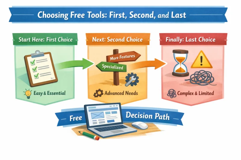
The best way to avoid getting overwhelmed by free tools is to decide based on deliverables and sequence. Build a minimum stack, then validate it with one small page before scaling up. This keeps your project from becoming a tool experiment.
Start with your first output. If you need a landing page mockup, choose a layout and page design tool that supports responsive states and reusable components. Next, add prototyping if you must test flows and interactions. After that, create or assemble graphics with a tool that exports clean SVG and properly sized raster images.
Then move to coding and building. Pick a free code editor plus a framework or static site tool that matches your comfort level. Finally, run free QA checks using browser devtools, keyboard testing, and basic automated audits. This sequence works because early tool choices affect handoff and export quality later.
Constraints will guide your selection. If you must export editable code, prioritize design tools with reliable HTML/CSS or component export options. If you need the fastest publishing for a small business site, choose tools that integrate cleanly into your build pipeline or output static pages you can host easily.
A useful guideline is to detect lock-in risks early. The biggest signals are poor export formats, inconsistent responsive behavior, or components that cannot translate. If you see those patterns in your first page test, switch categories before you build five more pages.
Collaboration adds another nuance. If you need stakeholder feedback, use export or share options that preserve visual fidelity. But still keep a version where you can access sources, so you can rebuild without losing quality.
Common pitfalls when choosing free web design tools and how to prevent rework
The biggest pitfalls with free web design tools are usually about exportability, consistency, and workflow separation. If you pick tools only for what they show, you can pay later in rebuilding CSS and reorganizing assets. Avoiding that rework is mostly about planning early.
One misconception is that free tools are limited only in features, not in outcomes. In reality, gaps in export formats and component fidelity change how much work you do after design. Another misconception is that any tool can design and build equally well. Most teams get better results by separating design and prototyping from implementation.
A common pitfall is an inconsistent design system. If spacing and typography are handled ad hoc, your CSS becomes messy and hard to maintain. Another pitfall is ignoring handoff details like asset naming, SVG viewBox settings, and state annotations. When those are unclear, you end up recreating assets or guessing states during coding.
An edge case involves free tier limits that hit near launch. Project caps, storage limits, or export restrictions can force an emergency migration. Plan around this by testing exports for all key asset types early and by keeping copies of sources in your own workflow.
Another mistake is trusting a single preview. When a tool preview matches your screen, it can hide issues with real font rendering and line wrapping. To prevent that, always run at least one browser-based pass of the layout before you finalize styles.
If you take one preventive step, make it this: build a small “handoff test” page that includes typography, a few icons, and at least one interactive component. Then validate the export and responsive behavior together. That test reveals problems faster than waiting for the whole site.
Choosing tools for portfolio sites, landing pages, blogs, and small business websites
The best free web design tools depend on the website type and how often you will update content. A portfolio site needs visual polish and reusable sections. A landing page needs conversion clarity and flexible layout. A blog needs templates and repeatable styling. A small business site needs accessibility, forms, and trust-focused structure.
For portfolio sites, prioritize layout tools with strong typography and spacing control, plus SVG-friendly assets for icons and dividers. You also want components that make it easy to reuse a project card design across many pages. If you plan to publish new work often, pick a toolchain that makes updating sections straightforward.
For landing pages, prototyping is more valuable because stakeholders care about the flow and states. Create a prototype that includes navigation, button clicks, and form error messaging. Then build with a code workflow that keeps your hero and sections responsive with consistent type and spacing tokens.
For blogs, think in templates. Free design tools can create a great theme, but you need to ensure repeated components like headings, images, and callouts match across posts. A common tradeoff is that visual-first tools create layouts that are harder to reuse when content varies in length.
For small business websites with forms and landing pages, focus on responsive layout plus QA. Forms are a common edge case because labels, keyboard focus, and error messages must work reliably. If your toolchain cannot support accessible form patterns cleanly, you may need to adjust your implementation approach.
In multilingual or variable-length text scenarios, free tools sometimes handle truncation differently than production CSS. Test wrap, line breaks, and overflow behavior early so your layout does not collapse when content grows.
Frequently asked questions about best free web design tools in 2026
What’s the difference between open-source web design tools and free online tools?
Open-source tools usually give you more control over files and exports because you can access and modify the underlying project assets. Free online tools are often faster to start, but they may limit exports, lock you into their formats, or restrict advanced features. Update cadence also differs, since open-source communities release changes while online platforms may gate capabilities behind free tier rules.
In most workflows, the best choice depends on whether you need clean portability for a production build. If you want minimal rebuild cost later, open-source and export-friendly tools often help more.
Which free tools are best for responsive layout without breaking on mobile in 2026?
The best tools for mobile reliability are the ones that provide responsive controls you can verify, not only device previews that look correct at one size. Evaluate whether you can define breakpoints, test text wrapping, and keep spacing consistent across states. Then validate using real browser rendering and devtools, since that reveals layout shifts that design previews can miss.
A practical approach is to test your most sensitive sections first, like hero text, pricing cards, and navigation. If they survive resizing and keyboard navigation, your layout is likely ready.
Can I export my design as real HTML/CSS with free web design tools?
Some tools can export HTML/CSS or generate code, but the result may not be production-ready without manual cleanup. When export is available, you should check whether components keep structure, whether typography and spacing map correctly, and whether assets export with correct paths. You should also test the exported output in multiple browsers because support differs by tool.
Common limitations include missing responsive rules, simplified animations, or styling that does not match your design tokens. Treat export as a starting point, not a guarantee.
Are there free tools for prototyping animations that still translate to code?
Free prototyping tools can show animation ideas, but perfect translation to code depends on how the animation is built. If the prototype animates between states like expand, collapse, or modal open, you can usually implement the same logic with CSS transitions and small JavaScript handlers. If the prototype uses complex timelines, the implementation may require re-creating motion rules by hand.
To improve translation, design animations as a set of clear states. Then document the end state for each interaction so coding matches the prototype.
What’s a realistic free workflow for beginners who want to build a website end to end?
A realistic beginner workflow is to pick one layout tool, one prototyping or interaction method, one graphics tool, and one code/build path. Then build a small page first, test it in your browser, and only expand once export and responsiveness look correct. Most beginners get stuck when they design only in one tool and wait to solve code and QA later.
Keep the workflow category-based. For example: design first, validate interactions with a prototype, export assets, then build and test using your free code toolchain.
How do I avoid lock-in when using free design or site-building tools?
To avoid lock-in, prioritize tools that export sources you can keep and reuse, like SVG files, image assets, and structured component definitions. Check what happens to your design system when you export, including whether styles map to reusable tokens. Also confirm you can rebuild the layout without relying on internal platform templates.
Rebuild cost is real, so test your export on your key pages early. If export is messy or incomplete, switch tool categories before you scale.
Which free tools help with website accessibility testing, and what can’t they catch?
Free automated audit tools can catch common issues like missing form labels, empty headings, and obvious contrast problems. They cannot fully verify meaning, keyboard experience, or screen reader comprehension. Manual keyboard checks and basic screen reader testing still matter because assistive tech behavior depends on semantics and focus order.
A good workflow combines automated checks with a real keyboard-only pass and a quick screen reader run. That pairing prevents you from chasing false positives.
Can free graphic tools produce SVG icons that won’t slow down my site?
Yes, but you must watch SVG complexity and export settings. Keep SVGs clean with a sensible viewBox, avoid unnecessary layers, and reuse consistent paths when you can. Also consider rasterizing only when SVG would be overly complex, such as highly detailed artwork.
After export, measure file size and inspect the SVG markup quickly. If the SVG is thousands of lines for a simple icon, it is usually worth re-exporting or simplifying.
Do I need separate tools for design, coding, and testing, or can one tool do everything?
One tool can cover parts of the workflow, but it rarely does everything well in a production context. Design tools excel at layout and visuals, while code tools control real HTML structure, CSS, and JavaScript behavior. Testing also depends on real browser rendering and accessibility checks that design tools may not fully replicate.
A practical compromise is to keep tools aligned: export clean assets and tokens from design, then test in the browser after you build.
Best free web design tools for a small business website with forms and landing pages?
For small business sites, choose layout tools that support responsive sections and accessible typography, plus graphic tools that export icons and illustrations cleanly. For forms and landing pages, plan a build workflow that lets you verify keyboard focus, labels, and error messages. Then run a QA checklist that includes responsive checks and basic accessibility audits.
The best “free” stack is the one that lets you iterate confidently. If your tools make it hard to handle form states and consistent section styling, pick alternatives earlier rather than later.
Want to bring your website to the next level?
With free web design tools, it's easy to start, but for a powerful, reliable website that converts visitors into customers, you need expert guidance. At eDesignerz, we specialize in turning visions into reality with our professional web design and development services.
Conclusion: build a minimal 2026 stack that matches your deliverables
The best way to find the Best Free Web Design Tools in 2026 is to compare by deliverables, export quality, and how well each tool fits one stage of your workflow. Start with a layout tool that supports responsive structure, then add prototyping only if you need interaction validation. Follow with graphics that export clean SVG and web-ready raster assets.
Next, choose a free coding and build path you can test in real browsers, then finish with free QA checks for responsiveness and accessibility basics. Use the “minimum stack” decision path: map your project deliverables to tool categories, test with one small prototype page, and only then commit to scaling up.
If you want less rework, validate export and mobile behavior early for your most sensitive sections. Pick 2 to 3 candidate tools per stage and run a handoff test that includes typography, icons, and one interactive component. After that, expand confidently with the same workflow so your site stays consistent as it grows.
Updated August 2026