
Professional designers in 2026 don’t pick tools by hype. They pick a workflow that reliably moves work from concept to prototype to production-ready assets, with smooth collaboration and iteration. That is why searching for Best Web Design Tools matters: you want the right mix for your deliverables, not just flashy features. This guide compares the most used free and paid options by how they perform in real designer workflows, including design, development handoff, prototyping, review, and optimization.
You’ll see how “best” changes by project type, like a marketing site, a product UI, client work, or a design system. You’ll also get a practical set of criteria you can apply to your stack. Expect tradeoffs around export quality, component structure, team review controls, and file management as your project grows.
We’ll cover categories of tools and how they connect across phases. You’ll learn how to evaluate interoperability so your design doesn’t drift from your implementation. By the end, you’ll have a decision framework to shortlist tools that match your team and deliverables.
Use a tool stack that matches how professional projects actually move
Professional designers rarely use one app from wireframes to final assets. A tool stack mirrors how work flows across phases and owners. When you match tools to deliverables, you reduce rework and handoff gaps.
The common phases look like this: discovery, visual design, component or system creation, prototyping, development collaboration, and launch iteration. Each phase needs different strengths. Visual design tools focus on layout accuracy and style consistency. Prototyping tools focus on interaction clarity. Handoff tools focus on specs, export behavior, and structure.
A simple rubric helps you compare options across categories. Look at output quality, designer usability, interoperability with your dev workflow, collaboration controls, and long-term maintainability. “Interoperability” means your design outputs translate into something developers can implement accurately, with minimal manual guesswork. It also means variables, spacing, and naming stay consistent across files and versions.
“Best” depends on constraints. If clients require strict brand governance, you need stronger component and token workflows. If you must deliver reusable components and documentation, you need tooling that keeps structure and behavior clear. If you work with mixed skills, like a designer plus a developer plus QA, you need permissions and review paths that don’t break mid-project.
One edge case is legacy assets and mixed sources. You may inherit older icons, fonts, or style rules that do not map cleanly into modern components. Another common issue is accessibility work that needs structure planning early. If you only create visuals and add semantics later, your tools may not support the needed refactors.

Compare professional UI and layout tools by component structure, not just screens
Professional UI tools earn their keep when they preserve structure you can scale. The most important difference is whether the tool supports components and responsive behavior in a maintainable way. That affects how easily you can evolve a design system.
In practice, design tools fall into three broad models. Vector-first tools prioritize precise shapes and illustrations. Component-first tools prioritize building reusable UI pieces with variants and states. Hybrid tools mix layout flexibility with component behavior. For websites, you care about how each model supports grid systems, responsive constraints, and consistent typography and spacing.
“Professional-grade” means more than pretty exports. It means symbol or component behavior stays consistent as you duplicate and modify elements. It also means responsive logic is predictable. For example, you want auto-resizing rules to behave the same way when text wraps or buttons expand across breakpoints. You also want naming and structure that map to how developers think in components.
CUSTOM WEBSITES THAT CONVERT
Let us help you build a modern, mobile-friendly website that attracts visitors and generates leads. Schedule your free consultation today to discuss your project and get a custom quote.
Handoff readiness is where many tools separate. You should be able to translate design decisions into developer-friendly artifacts like design tokens or CSS variables. You also need export fidelity for SVGs, images, and typography. If your tool exports inconsistent SVG markup or loses font details, you will redo work later in production.
Maintainability matters once you update the system. If you change a base color or button style, component updates should propagate cleanly. A common mistake is exporting lots of static images early. Later, you lose the ability to update styles without redoing pages and variants.
Prototype interactions with tools that validate user flows, not only visuals
Interaction prototypes should test decisions, not just look convincing. The best tools for professional designers let you model states, transitions, and realistic navigation. That helps stakeholders trust what they review.
Different prototypes serve different goals. Communication prototypes help align teams on layout and overall direction. Validation prototypes test user flows by showing micro-interactions, empty states, errors, and realistic state changes. When you validate flows early, you catch issues before development locks in the wrong structure.
Fidelity should match your use case. A clickable prototype can be enough to confirm overall page hierarchy. But if you need to test complex components, like form validation or multi-step onboarding, you need stronger control over interaction behavior. You should check how the tool handles responsive behavior during prototyping. If breakpoints behave differently than the final layout, stakeholders may approve a design that fails on real devices.
Prototyping also supports optimization thinking. When you capture user-test findings early, you prevent expensive redesign. The practical link is that prototypes clarify what needs iteration. Developers then implement the right component behaviors from the start, not after “corrections by screenshot.”
A common misconception is that prototypes replace testing. Tools can show interactions, but they cannot validate real usability. Another edge case is content realism. If your prototype uses placeholder text that never wraps, you may miss truncation bugs, overlap issues, and incorrect line heights.
Make design-to-dev collaboration maintainable with specs, annotations, and token discipline
Design-to-dev collaboration succeeds when teams share a source of truth. The best tools support specs, annotations, and asset exports that developers can implement without guessing. They also help teams keep token values aligned over time.
Start with documentation patterns that match how websites are built. You want design tokens for color, spacing, and typography. You also want component behaviors documented by variants and states. When the tool makes these artifacts easy to generate and update, you reduce drift between the design file and the implemented UI.
Collaboration models matter for client work. You may need async review for stakeholder calendars, plus a clear system for who can comment and who can publish changes. Synchronous co-editing can be helpful, but it often creates conflicts when teams work across time zones. Tools that track changes and review comments help you keep feedback structured and searchable.
Interoperability checks prevent subtle failures. Verify how the tool exports files developers use: naming conventions, variable mapping, and the consistency of design tokens. Also check what happens when you change a style in design. Do exported assets update cleanly, or do you get stale duplicates?
Artifact hygiene is the deeper issue. If your team stores tokens, component references, and design files in separate places, it becomes easy to lose the “current” version. A common mistake is treating exported assets as the source of truth. In reality, code or token definitions often become the real source, so your tooling should support syncing or traceability.
Choose free vs paid options by where tradeoffs impact production outcomes
Free tools can be great for exploration, but paid tools often matter for collaboration, export fidelity, and maintainability. The tradeoffs show up when projects become multi-page, multi-stakeholder, and component-driven. That is where Best Web Design Tools comparisons help you judge real risk.
Use a decision lens for free vs paid. First, check collaboration limits. Free tiers often restrict review workflows, file sharing, and team features, which can block client approvals. Second, check export quality. If exports break SVG markup, strip font details, or scramble spacing, you will pay the cost in rework. Third, check how many projects and libraries you can manage without turning your workspace into a mess.
Also evaluate advanced libraries and governance. Design systems require reusable components, consistent variants, and token discipline. If a free tool limits component libraries or makes structure hard to reuse, you may rebuild the same patterns repeatedly. A nuance that gets missed is multilingual and responsive complexity. Layouts with right-to-left behavior or long strings need predictable wrapping and constraints, and some tools struggle unless you plan early.
Licensing matters in client work. You need commercial usage terms that cover your deliverables and client access. If your client expects to own editable design sources, you must confirm how exporting or transferring files works. Paid tools often make stakeholder access smoother, but always verify terms in the tool’s documentation.
Here are two authoritative references for the kinds of documentation you should rely on when you evaluate tools. Adobe’s design system overview can clarify how component thinking supports consistency Adobe Design Systems. For accessibility basics that influence how your UI should be structured, use the WCAG guidance W3C WCAG Overview. For modern web performance priorities that connect to iterative optimization after launch, use Google’s guidance Google Core Web Vitals.
Avoid common failures when you select the Best Web Design Tools
Many tool choices fail because teams optimize for demos, not production delivery. The biggest warning signs appear in collaboration friction, brittle exports, and weak component structure. Avoid these issues early to reduce rework.
One misconception is “one app can do everything.” Tools can overlap, but professional workflows still require clear handoff boundaries. Another misconception is that export quality is automatic. In reality, export fidelity varies across tools and depends on how you build your layers, typography, and symbols.
Another failure mode is prototypes that mislead. If your prototype does not match responsive behavior, stakeholders may approve an incorrect layout. You should verify text overflow rules, breakpoint behavior, and component resizing before you share. Also watch for accessibility blind spots. If the tool encourages purely visual layouts, it may be harder later to plan focus states, semantic structure, and content-driven layouts.
Evaluation traps are easy to fall into. Demos often hide limitations like library management, comment history, or how components export. Free tiers can also block team review. A tool that works solo may fail when you add a client and a developer who need stable exports and consistent versions.
An edge case is last-minute brand changes. If your design uses hard-coded styles everywhere, one color update can cascade into massive rework. If your components and tokens are structured well, you can update the system and propagate changes with fewer page-by-page edits.
Pick tools using practical paths for different professional project needs
There is no single best setup for every designer. Instead, pick a path based on where changes happen most and what deliverables your team must ship. This approach makes free vs paid decisions feel obvious.
One path is “design-system-first.” You prioritize component libraries, token workflows, and governance. That means you choose tools that keep variant states consistent and make it easy to update a system without breaking pages. You also want collaboration controls for approvals, because system updates affect many screens at once.
Another path is “client-review-first.” , collaboration and approval flow matter most. You prioritize review comments, permissions, and stable exports for stakeholders. The tool should help you manage feedback without mixing versions or losing the context of decisions.
A third path is “prototype-to-dev.” You prioritize interaction fidelity and developer handoff. You need prototyping that shows state changes clearly and specs that developers can translate. You also need responsive checks that reduce the risk of stakeholder confidence that fails in implementation.
A fourth path is “asset-heavy marketing production.” , template workflows and batch export matter. You want repeatable layouts, consistent typography, and export behavior that keeps spacing and imagery clean. The tradeoff is that you may need stricter component discipline to avoid visual drift across many pages.
Is your web design toolkit set for success?
Transform your creative vision into a stunning reality with a professional website that wows visitors and drives conversions. Let's discuss how our tailored design services can enhance your projects today.
A deeper nuance is that tool choice should match change timing. If design changes late, you need strong component and token foundations. If development changes early, you need better interoperability and specs. If content updates frequently, you need content-driven layout realism in prototyping and typography testing.
Scale designs with tokens, component governance, and migration-safe workflows
Design systems scale when teams govern components like products, not like files. Tokens and component governance help you maintain consistency across pages and teams. They also make updates less risky.
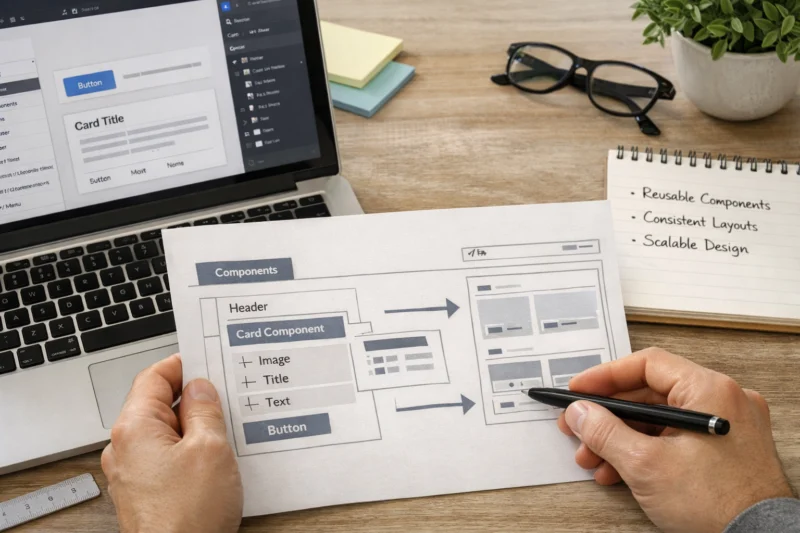
Tokens connect visual decisions to implementation. You typically manage color, typography, and spacing as named values. Then components reference those tokens so a system update can propagate. A practical example is a button component that uses tokens for padding, font styles, and background colors across variants.
Governance means you define who can change what and how updates roll out. Teams should review component changes, track variants and states, and prevent breaking updates. If your tooling supports versioning or change tracking for components, you gain safer updates. Without that, you end up with “orphan styles,” where pages start using outdated values that no longer match the system.
Migration-safe workflows prevent painful late-stage rewrites. When you change the underlying system, you need a plan to audit usages and update references. The deeper insight is that migration is often a tooling problem. If exports and references do not map cleanly, you cannot confidently update everything, and manual cleanup becomes inevitable.
A common mistake is duplicating components for client variants instead of managing variants as part of governance. Duplicates create drift and inflate maintenance costs. A better approach is to support governed variants through structured naming and token-driven styling.
Frequently asked questions about web design tools for professional designers
What are the Best Free Web Design Tools for professional designers in 2026?
The best free options usually cover design basics, simple prototyping, and exporting. In 2026, the practical limitation is often collaboration depth, like review workflows and multi-stakeholder permissions. Free tools can work well for small websites or solo prototypes, but they may not support robust component libraries for design systems.
When comparing free tools, test your real deliverables. Export a component that includes typography, states, and responsive resizing. Then confirm whether your workflow keeps naming consistent and whether developers can translate the result without guesswork.
Which paid web design tools are worth it for client web projects?
Paid tools are worth it when your project needs reliable collaboration, consistent exports, and maintainable component structure. The value often shows up during review cycles with clients and developers, especially when multiple people comment on the same design artifacts. Paid tools also tend to provide stronger support for design libraries and governance.
Pricing depends on team size, required collaboration features, and whether you need advanced component and token workflows. Most designers justify cost only after a short evaluation using the same export and review tasks as a real client project.
How much do web design tools for professional designers cost?
Costs vary widely because tiers differ by collaboration features, number of projects, and team access controls. In many cases, you might spend anywhere from a low monthly plan for individuals to higher team plans that include advanced libraries and review workflows. For design systems, the “effective cost” includes the time saved in handoff and rework.
The most accurate way to estimate is to consider what you must deliver: responsive prototypes, token-ready components, and developer-friendly exports. Then request a quote or check the vendor’s current pricing for your team size and expected usage level.
How do I choose web design tools that work well with my development workflow?
Start by verifying interoperability, especially how tokens, styles, and component structure map to what your developers implement. Test one complete handoff: a designed component with variants and responsive behavior. Then check whether exports preserve spacing, typography, and scalable vector markup.
You should also confirm naming and structure consistency. If your tool outputs confusing IDs or inconsistent variable names, it increases the chance of drift between design and code.
What tools help professional designers create responsive prototypes that don’t mislead stakeholders?
Look for prototyping tools that let you test responsive behavior with realistic content sizes. Your prototype should include states like empty, error, and loading. It should also show how components wrap or truncate when strings get longer.
Before you share a prototype, validate it on multiple viewport sizes and test with different text lengths. A good practice is to include at least one “nasty case” variant, like long button labels, to avoid approval based on ideal placeholder text.
What’s the best workflow for collaboration between designers and developers?
Use async review when stakeholders need time to comment, and keep annotations tied to specific components or sections. Developers should receive structured specs, like tokens, spacing rules, and component behaviors for states and variants. This reduces back-and-forth caused by unclear intent.
In practice, you also need version control expectations. Agree on what is the source of truth for decisions so you avoid implementing from an outdated design file.
Can I use one tool for design, prototyping, and handoff without causing rework?
Sometimes, yes, if your work is straightforward and your tool’s exports and component structures match your build process. However, teams with complex components, design system governance, or strict client review needs often require a multi-tool stack. The tradeoff is convenience versus maintainability.
Run a small test before committing. Build one component end-to-end, export it, and then check how much developer cleanup is required. If rework is frequent, a dedicated handoff workflow will usually be more reliable.
How do design systems and tokens affect which web design tools I should choose?
Design systems and tokens require structure, governance, and update-friendly workflows. Tools that handle tokens and component variants well help your team propagate changes across screens without breaking consistency. If a tool only exports visuals, it may be harder to maintain a system as it evolves.
Choose tools that support controlled updates and predictable component behavior. This matters most when you have multiple stakeholders and multiple pages built from the same system.
What are common signs that a tool choice will fail during production?
Watch for brittle exports that don’t preserve spacing, typography, or SVG behavior. Also look for weak collaboration controls, like unclear versioning and hard-to-find review comments. Responsive mismatches between prototype and implementation are another strong red flag.
Finally, check whether the tool encourages messy component libraries. If naming and structure degrade quickly, you will pay for that during maintenance and future updates.
How should I evaluate a web design tool’s export quality for production-ready assets?
Test exports with real UI artifacts, not only simple screens. Verify SVG and image output quality, font handling, and whether spacing remains consistent across sizes. Also check how exported assets name layers and whether developers can map them back to components.
Do one complete pass: design a component with variants, export it, and measure the amount of manual alignment and cleanup required. If developers struggle to translate the result, the tool choice is risky.
Are collaboration features the most important factor when comparing web design tools?
Collaboration is crucial, but it is not the only factor. If exports are brittle or component structure is weak, collaboration won’t prevent rework. Your best outcome usually comes from alignment across handoff quality, component structure, and workflow fit.
Use collaboration features to reduce decision confusion, not to mask underlying export or maintainability problems. A tool can be great for comments and still fail when developers need reliable specs.
Ready to Build an Exceptional Website?
Transform your vision into a stunning, conversion-focused website with our expert WordPress design and development services.
Request a Free ConsultationConclusion: shortlist tools by workflow deliverables, then validate with a mini build
The best approach to Best Web Design Tools is selecting by workflow phase and deliverable. Use a tool stack that supports concept, design creation, component system work, prototyping, and developer handoff with maintainable documentation. When your choices match how work moves, you avoid most production surprises.
As you compare free and paid options, tie tradeoffs to collaboration needs, export and spec reliability, and long-term maintainability. A good tool helps your team keep one consistent source of truth, so updates do not cascade into rework. That is what professional designers optimize for in 2026.
Your next step is practical. Shortlist tools by your project type, like client marketing pages, product UI, or a design system. Then run a small evaluation using real deliverables: components, responsive prototypes, and an export-to-spec handoff. Build a repeatable criteria checklist so future tool changes don’t derail ongoing work.
When you revisit your stack, keep the same decision mindset. Reuse the criteria you validated earlier: collaboration controls, interoperability checks, responsive prototype realism, and component governance readiness. That consistent process is the best way to keep your workflow stable as your projects grow.
Updated August 2026