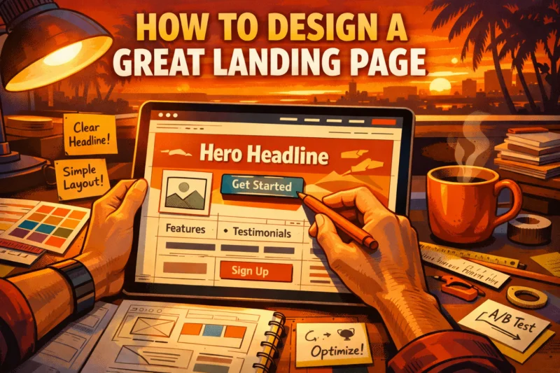
How to Design a Great Landing Page starts with one simple rule: make it obvious, believable, and easy to act on. A great landing page is not just attractive; it guides the right visitor to one clear next step, which is why design choices directly affect conversions, clarity, and trust.
If you want to know How to Design a Great Landing Page in a way that actually works, the answer is a focused framework: match the page to visitor intent, build a clear conversion path, and remove friction before it has a chance to reduce response. Most landing pages fail because they confuse visitors, ask for too much, or do not match the offer they were promised. This article gives you a step-by-step process for designing a landing page that is persuasive, conversion-ready, and grounded in real user decision-making.
Start with the landing page goal and the one action you want visitors to take
A great landing page begins with one conversion goal, not a layout or a color palette. Before you design anything, decide the single action that matters most, such as lead capture, demo request, purchase, registration, download, or booking.
That goal should reflect both the offer and the traffic source. Someone clicking a paid search ad for “book a consultation” should not land on a generic homepage-style page with five competing options. Someone arriving from an email about a webinar needs a very different flow than a visitor comparing pricing for a product trial. The page can look polished and still fail if the action is too broad or unclear.
Many teams often lose focus and prioritize personal preferences over a solid approach to boosting conversions. They tend to clutter the page with additional links, offers, and explanations, which can dilute the main objective. To create effective landing pages, the primary question should be, “What single action will lead to the success of this page?” For insights on how to drive user actions effectively, check out these essential tips for creating a site that converts boosting user engagement.
This discipline plays a significant role in enhancing the user experience by preventing visitors from struggling to understand the page or searching for the next action. When goals are clearly defined, it becomes simpler to craft effective headlines, select appropriate calls to action, and determine what content to eliminate. This clarity lays the groundwork for a structured page that not only looks appealing but also effectively drives conversions, leading to strategies for improving user experience.
Map the visitor’s intent before you design anything
The best landing pages start with visitor intent, because people arrive with different expectations depending on how they found the page. You need to know who is landing there, what they were promised, and what they expect to understand within seconds.
Intent changes across funnel stages. In awareness, visitors are still learning whether the problem matters. In consideration, they are comparing methods, vendors, or solutions. In decision, they are checking proof, pricing, and friction before committing. A single offer may work across all three stages, but the page usually needs different emphasis depending on the audience segment.
That is why message match matters so much. A visitor coming from a Google ad, an email campaign, an organic search result, or a partner referral needs the page to continue the same conversation. The headline should echo the promise, and the body should immediately confirm they are in the right place. This is where insights into user interactions can be incredibly useful, as they allow you to design experiences based on what users are looking to resolve rather than solely focusing on marketing messages.
Most guides skip this nuance, but it matters in real campaigns. The same software demo offer may need a risk-reduction page for skeptical B2B buyers, while the same offer for a returning audience can be shorter and more direct. If you understand intent, you also know which seo-friendly design choices help the page align with the search query and which content blocks are unnecessary noise.
Build the page structure around a clear conversion path
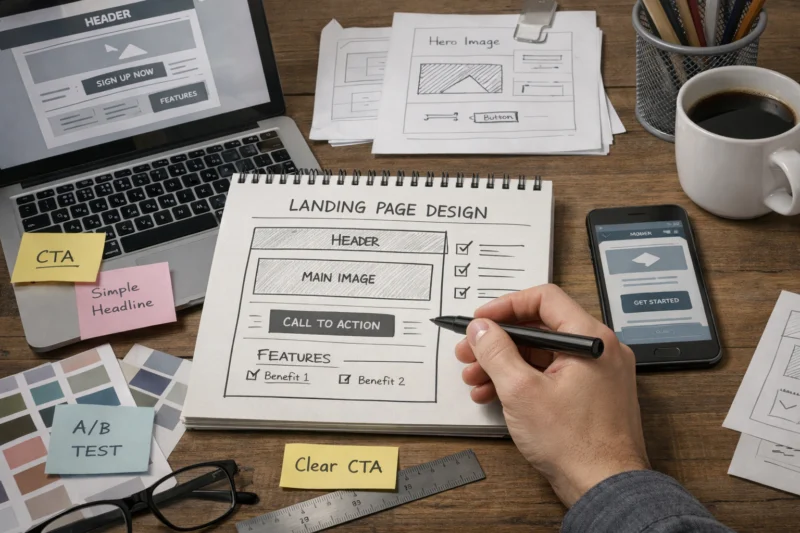
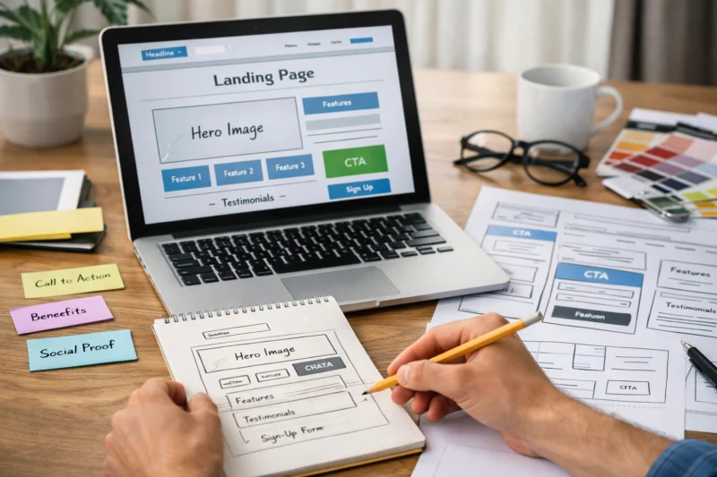
Strong landing pages follow a conversion path that feels natural: headline, value proposition, proof, benefits, CTA, and supporting details. That sequence helps visitors move from recognition to confidence to action.
The structure matters because people rarely convert the moment they see an offer. They scan for relevance, then reassurance, then a reason to believe. If your page starts with too much detail, the visitor has not yet earned it. If it starts with too little, they may not understand why they should continue. Good structure balances persuasion and clarity without overwhelming the reader.
Removing distractions is part of the job, but removing too much can backfire. A blank or overly minimal page can feel suspicious if the offer is expensive or unfamiliar. For high-stakes decisions, users often need supporting details, proof, and a clear explanation of what happens next. This is where trust signals in design work alongside hierarchy to support confidence rather than interrupt it.
The tradeoff is real: too much structure can feel rigid, while too little structure creates friction and confusion. A practical approach is to design for one primary path with optional reinforcement, not multiple equal paths. This method can lead to a significant improvement in visitor retention, as it helps create a clear understanding of what actions to take next, ultimately contributing to strategies that effectively enhance your website's bounce rate. For teams refining a broader website conversion strategy, structure is often the most overlooked lever.
Design the above-the-fold section for instant understanding
Above the fold should answer three questions immediately: what is this, who is it for, and why does it matter? If visitors cannot answer those questions in the first screen, many will leave before they ever see your supporting content.
The headline is the most important element in this section because it sets the core promise. The subheadline should clarify the outcome, reduce ambiguity, or name the audience. The primary CTA should be obvious and action-oriented, and the visual hierarchy should guide the eye toward the most important information first. A strong hero section is not crowded; it is intentional.
Visuals help only when they clarify the offer or reduce hesitation. For some products, a screenshot, a product mockup, or a short explainer image is enough. For others, a generic stock photo adds nothing and can even weaken trust. The main point is that “above the fold” is not about squeezing everything into the first screen. It is about prioritizing the right information first so the visitor understands the value fast.
What most guides get wrong is treating the fold like a fixed line instead of a perception threshold. On mobile, especially, the first view may only contain one or two key items. That makes hierarchy, spacing, and readability more important than visual density. If your hero section is doing its job, the visitor knows whether to continue without feeling forced to decode the page.
Choose the right landing page layout: what to look for in common page formats
The right layout depends on the offer, traffic source, and level of trust required. A long-form sales page is not automatically better than a short lead-gen page, and a short page is not always better than a detailed one.
Use a long-form sales page when the offer is complex, expensive, or unfamiliar, and when visitors need more explanation before they are ready to act. Use a short lead-gen page when the action is simple and the value is immediately clear. Product-focused pages work well when the visitor already understands the category and just needs product details, proof, and a direct path to purchase. Event and signup pages perform best when the decision is lightweight but time-sensitive.
The deeper point is that layout choice should follow user anxiety and purchase complexity, not aesthetics alone. If the audience is skeptical, the page needs room for proof, clarification, and objections. If the decision is low-friction, extra content can slow people down. This is why the best high-converting landing pages are often different from one another even within the same brand.
| Layout type | Best for | Strength | Tradeoff |
|---|---|---|---|
| Long-form sales page | High-ticket, complex, or skeptical audiences | More persuasion depth and objection handling | Can feel heavy if the offer is simple |
| Short lead-gen page | Downloads, consultations, simple lead capture | Fast comprehension and low friction | Less room for trust-building |
| Product-focused page | Direct purchase or product detail requests | Clear product value and conversion path | Needs strong product clarity and proof |
| Event/signup page | Webinars, registrations, launches, bookings | Time-sensitive urgency and quick action | Can underperform if the value is vague |
If you are comparing a stronger call to action with a simpler page format, the right layout often makes the CTA easier to understand rather than louder. Layout is not just how the page looks; it is how the visitor experiences the decision. For deeper guidance on page composition, a related topic is conversion-first landing page planning.
Make the copy and visual design work together
Copy and design should reinforce each other, not compete for attention. The words explain the value, while the visuals guide the eye, support comprehension, and reduce effort.

Typography, spacing, contrast, and visual rhythm all affect whether the page feels easy to scan. Large blocks of dense text create friction. Weak contrast makes important messages harder to read. Inconsistent spacing can make a page feel unfinished even when the content is strong. Good design creates a reading path that feels calm and intentional, which is especially important for people arriving from paid traffic or comparison searches.
Images, icons, and illustrations work best when they clarify what the offer is or what happens next. Product screenshots can reduce uncertainty. Icons can help segment benefits. Illustrations can soften the tone of a technical page and make abstract ideas easier to process. But a “clean” design is not the same as a high-performing design if it becomes generic or vague. A page can look elegant and still fail to communicate why the offer matters.
This is also where many teams should think about broader seo-friendly design choices. The page should be readable, structured, and aligned with the query intent, but it should still feel persuasive and specific. In practice, the most effective pages are often those that combine visual restraint with substantive detail. That balance creates a better user experience and supports a conversion-focused content design approach.
Add trust signals that reduce hesitation
Trust signals reduce hesitation by showing visitors that other people, credible institutions, or the product itself have already validated the offer. The most useful proof types include testimonials, reviews, logos, stats, case studies, guarantees, and security cues.
Where you place trust signals matters as much as which ones you choose. Some should appear near the hero section to reduce immediate doubt, while others work better after the main value proposition or beside the CTA. For a new or expensive offer, proof should appear early and repeatedly. For a familiar low-risk offer, a lighter touch may be enough.
Choose proof that matches both the offer and the audience’s skepticism level. A B2B buyer may want named clients, measurable outcomes, or a case study with context. A consumer buyer may respond more quickly to reviews, ratings, or guarantees. The key is specificity. Decorative proof does not help if it feels generic or overused. This is why trust signals in design should be treated as part of the message, not as decoration.
If you are building a page as part of a broader website conversion strategy, proof is one of the highest-leverage elements to refine. It often works best when paired with a stronger call to action that reduces uncertainty about the next step. For deeper reading, this connects closely to social proof and conversion behavior on product and service pages.
Common mistakes that hurt landing page performance
The most common landing page mistakes are clutter, weak hierarchy, unclear CTA language, too many links, and messaging that does not match the source traffic. Any one of these can reduce conversions; together, they can make a page feel hard to trust.
Overdesigning is another common failure. Animations, oversized visuals, multiple promotional blocks, and competing calls to action can distract from the conversion path. A visitor should not have to interpret the page before understanding what to do. If the page feels like a homepage with a campaign banner attached, it probably needs simplification.
Generic stock visuals and empty buzzwords are especially damaging because they create distance instead of confidence. Phrases like “innovative solutions” or “next-level growth” do not help a visitor make a decision. The page needs concrete value, not branding fog. This is one reason many pages underperform: they are built around internal preferences rather than actual user decision-making.
What most teams get wrong is assuming visual polish equals clarity. A page can be beautifully designed and still fail because the action is vague or the proof is thin. If you want to reduce friction and lower bounce rate, focus first on clarity, relevance, and the removal of unnecessary choices. Better design decisions often come from visitor behavior insights rather than subjective taste.
Advanced landing page considerations most guides get wrong
Advanced optimization is usually about reducing uncertainty, not adding more elements. Once the basics are right, the biggest gains often come from mobile behavior, page speed, accessibility, and handling complex offers more intelligently.
Mobile-first behavior changes everything. On smaller screens, section order matters more, CTAs need to be easy to tap, and content density must be lower. A page that feels comfortable on desktop may feel exhausting on mobile if it requires too much scrolling or reading. Page speed also matters because slow load times interrupt trust and increase abandonment, especially when the visitor came from an ad or search result.
Accessibility should be part of landing page design from the start. Sufficient contrast, readable type sizes, clear button labels, and keyboard-friendly interactions make the page easier for everyone to use. These are not just compliance details; they improve comprehension and reduce friction. If a page is difficult to read or interact with, it is less likely to convert, even if the offer is strong.
Edge cases deserve special treatment. High-ticket offers need more proof and explanation. Skeptical audiences need lower-friction next steps. Multi-step forms may work better when the first action feels small. Pages serving multiple audience segments may need a tighter segmentation strategy before the design itself is finalized. The deeper truth is that advanced optimization is often about reducing uncertainty, not adding more elements to impress the user.
This is also where many teams benefit from a design review informed by user testing and real conversion data. If you are improving a page for a better user experience, the most useful changes often come from simplifying decisions, not visual embellishment.
Improve the page with testing, measurement, and iteration
You know a landing page is improving when the data shows clearer engagement and stronger completion, not just when it looks better. The key metrics to monitor are conversion rate, scroll depth, CTA clicks, form completion, and bounce rate.
Testing should isolate one variable at a time so the result is interpretable. If you change the headline, hero image, CTA, and form length all at once, you will not know what caused the improvement or decline. Start with the highest-impact elements: headline, CTA, hero visual, proof placement, and form length. These typically influence the visitor’s first decision points and can produce meaningful changes without redesigning the entire page.
One of the most useful habits is to compare performance by traffic source and audience type. A page that converts well from email may underperform from paid search because the intent is different. That is not necessarily a failure; it is a clue. The page may need different messaging, proof, or layout for each channel. This is where a more mature website conversion strategy becomes essential.
Do not assume a better-looking page is a better-performing page unless the data confirms it. Sometimes a cleaner layout lowers clarity, or a shorter form reduces trust. Testing helps you avoid guessing. If you are working from visitor behavior insights, even small changes can reveal whether the page is aligned with real decision patterns. For teams focused on a lower bounce rate, the first test is often not design polish but message match and CTA clarity.
For additional context on page performance and design quality, it can help to review authoritative guidance from Google Search Central — helpful content principles, U.S. Web Design System — accessibility and UI consistency, and Nielsen Norman Group — landing page usability research.
Frequently Asked Questions About Designing a Great Landing Page
What makes a landing page effective?
An effective landing page combines clarity, relevance, trust, and one primary conversion action. Visitors should quickly understand the offer, see that it matches their intent, and feel confident taking the next step.
How long should a landing page be?
Page length depends on offer complexity, audience awareness, and trust requirements. A simple download page can be short, while a high-ticket or skeptical audience usually needs more explanation, proof, and objection handling.
What should be above the fold on a landing page?
Above the fold should include a clear headline, supporting message, primary CTA, and any critical trust cue that reduces hesitation. The goal is instant understanding, not trying to fit every detail into the first screen.
How do I know if my landing page is too cluttered?
If the page has too many choices, competing headlines, inconsistent spacing, or too much visual noise, it is probably cluttered. A visitor should not have to work to find the main action.
What is the best CTA for a landing page?
The best CTA reflects the visitor’s readiness and the value of the next step. “Get started” may work for a simple action, while “Book a demo” or “Download the guide” is better when the next step is more specific.
Do landing pages need images or videos?
They do if the visuals help people understand the offer faster or feel more confident about it. A useful screenshot, product demo, or explainer video can help, but decorative visuals that do not support the decision can distract from conversion.
How do I design a landing page for mobile users?
Use a vertical flow, fast-loading assets, readable type, and buttons that are easy to tap. Mobile visitors are less tolerant of clutter, so the page should make the next step obvious without forcing extra scanning.
What are the biggest landing page design mistakes?
The biggest mistakes are unclear goals, weak messaging, poor proof, and distraction. Many pages also fail because they prioritize aesthetics or internal preferences instead of user decision-making.
How do I design a landing page for a high-ticket offer?
High-ticket pages need stronger proof, more explanation, and a lower-friction next step. Visitors usually want to reduce risk before committing, so case studies, specific outcomes, and trust cues become more important.
How can I tell if my landing page is working?
Look at conversion rate, CTA clicks, form completion, scroll depth, and bounce rate together. If visitors are landing but not acting, the problem is usually relevance, clarity, or friction rather than traffic volume alone.
Conclusion
A great landing page is built on one clear goal, a strong match with visitor intent, and a conversion path that reduces friction at every step. The best pages are not just attractive; they are easy to understand, easy to trust, and easy to act on.
If you want to improve a page today, start with the biggest source of friction first: unclear messaging, weak proof, cluttered layout, or an underperforming CTA. Then test one change at a time and use the data to guide the next iteration. That is how landing page design becomes a repeatable growth process instead of a guess.
The most effective teams treat design as a decision system. When you combine clarity, proof, structure, and testing, you create landing pages that support real conversions and a better user experience. Apply the framework now, and you will have a practical path to stronger performance in 2026 and beyond.
Updated April 2026