

Micro-interactions reduce drop-offs and confusion by making every hover, click, and wait feel instantly understood. When UX micro-interactions work well, users never wonder whether the system heard them. That same clarity is what many teams mean when they search for UX micro-interactions after noticing “jumpy” interfaces, unclear loading, or repeated submits.
This article is hands-on. You will learn how to diagnose which UI moments break trust, then design state rules that prevent jumpiness. You will also see how to implement these interactions in front-end code, and how to measure their impact with interaction-level metrics.
We will use a workflow you can run on real screens: inventory moments, define state and motion rules, implement accessible feedback loops, test, and iterate. You will leave with concrete do’s and don’ts, plus patterns you can ship safely.
Inventory the moments where users feel uncertainty and friction
Start by mapping micro-interactions to the exact moments users hesitate. This matters because most “jumpy UI” problems come from missing or inconsistent state changes, not from visual polish alone. When users cannot predict what happens next, they click again, leave early, or request help.
A practical approach is a “moment inventory.” Go through the user journey step-by-step, then list each UI component and state. Include hover, focus, pressed, loading, success, empty, and error. For each row, note what the user expects and what the UI currently shows.
Then connect moments to observed issues. For example, if analytics show drop-off after submit, check whether the button immediately confirms the click. If users double-click, the pressed state may not appear, or it may revert too fast. If the interface feels jumpy, check whether content reflows when spinners or skeletons mount.
It also helps to separate “feedback” from “communication.” Feedback confirms the user action. Communication explains system status, like “saving,” “retrying,” or “no results.” Fixing the wrong layer is a common mistake. Teams often add a spinner (communication) while the button never acknowledges the click (feedback), which still triggers repeated submits.
In real products, this inventory often reveals quick wins. People may say the form “feels broken,” but the root cause is a single control that lacks a stable loading pattern. After teams fix those moments, they often see fewer support tickets and higher completion rates because trust rises.
Define state clarity, continuity, and predictability for every interaction
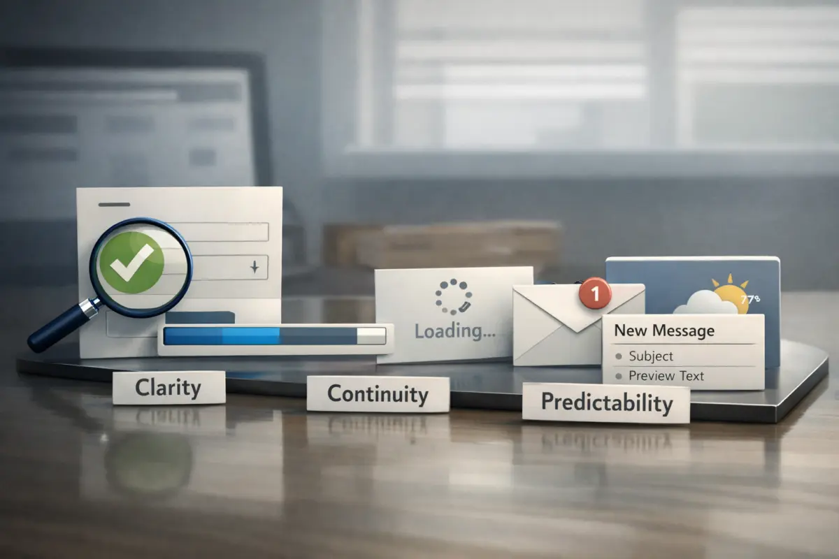
Good micro-interactions follow simple rules: clarity, continuity, and predictability. These rules stop jumpiness because the UI does not surprise the user between states. They also reduce cognitive load when users move quickly.
Clarity means users can tell what changed. When a button is pressed, it should look pressed. When loading starts, the label should indicate progress. Continuity means key layout stays stable. If a spinner appears next to text, reserve space so the content does not shift. Predictability means the next state matches expectations, like loading after submit and success after completion.
To apply this, write state criteria per component. Use a small matrix: idle → hover → pressed → loading → success → error. For each transition, specify what changes and what must remain stable. Include focus behavior too. A keyboard user needs clear focus rings and no unexpected focus jumps.
Motion then supports those rules. Keep durations consistent, and avoid “wild” easings that change meaning. Also respect reduced motion settings. The Web Content Accessibility Guidelines recommend supporting user preferences for reduced motion through CSS and feature detection in your design system. See W3C Web Content Accessibility Guidelines (WCAG) 2.2 for the underlying accessibility guidance.
An important edge case is “input latency illusion.” This happens when the UI waits for the async call before updating the pressed state. Users perceive delay, so they click again. The fix is to acknowledge interaction immediately, then show loading separately once the request really begins.

Use motion and transition rules that prevent layout reflow and visual “jumps”
Micro-interactions should feel smooth, but they must also feel stable. “Jumpy” UI often comes from layout reflow when state elements mount late or vary in size. Stabilizing layout is one of the highest-impact UX micro-interactions improvements.
Start with layout stability. Reserve space for progress indicators. Use skeletons that match the final content structure. Avoid late font swaps that shift text width. Also avoid inserting new blocks above existing content during loading, because that pushes everything down.
For motion, use small, purposeful transitions. Button hover and pressed feedback can be near-instant and subtle. Modal open and close can include fade and transform, but keep the content readable at all times. Meanwhile, do not animate critical affordances only for delight. If animation hides state changes, users may miss confirmation.
Implementation-wise, prefer CSS transitions for low-cost effects and keep JS minimal. However, ensure your animation does not block input. If a user clicks again while a transition runs, the state machine must remain deterministic.
One deeper failure mode is mixed timing. If the skeleton appears after a noticeable delay, users see nothing happening, then sudden content. If the skeleton disappears before data fully renders, users see flicker. Therefore, align indicator timing with your rendering pipeline and test on slow connections.
Another nuance is high-frequency updates. For things like live search or typing indicators, avoid heavy animation on every keystroke. Use a consistent, low-motion indicator, or show inline status only when meaningfully updated.
Build accessible feedback loops for hover, focus, click, and async loading
Accessibility is not optional in micro-interactions because feedback must be available to every input method. Users should get the same state understanding whether they use a mouse, keyboard, or screen reader. Otherwise, UX micro-interactions can reduce friction for some people while increasing it for others.
For hover and click, ensure keyboard focus has visible styling. When a control becomes “pressed” via keyboard activation, apply the same pressed state. Do not rely on color alone. Use text, icons, or ARIA attributes when appropriate, but keep them consistent with the visual state.
Create Seamless UX with Expert Micro-Interactions
Enhance User Trust with Smooth, Predictable Interfaces
Improve your website's user experience by integrating expert UX micro-interactions designed to reduce confusion and increase conversions. At eDesignerz, we build clear, accessible, and fast WordPress sites that keep users engaged and ready to convert.
Get Your Free Website Consultation29+ Years of Expertise • Customized WordPress Design • Satisfaction Guaranteed
For async loading, disable the action that is in progress. Also prevent duplicate submissions by ignoring new submits while loading. Screen readers need context. Use polite announcements for status changes where it matters, and avoid announcement storms during rapid updates.
Error states require careful micro-interactions. Inline validation should guide users early, but not overwhelm them. Focus should move to the first field with an error after submit, or announce that errors exist if focus movement would disrupt flow. Keep messaging non-duplicative. If you show inline errors, avoid also spamming toasts for the same failure.
A deeper insight is focus restoration after UI transitions. If you open a drawer or modal, trap focus inside it. When you close it, restore focus to the trigger element. This prevents disorientation and reduces “where did my focus go?” confusion.
For implementation reliability, reference WAI-ARIA Authoring Practices when building interactive patterns like dialogs and tabs. It helps you align micro-interaction behavior with accessible roles and states.
Choose the right micro-interaction pattern for each state and risk level
Not every micro-interaction should be a spinner or a toast. The right pattern depends on uncertainty risk, action frequency, and how reversible the action is. Therefore, choose patterns that communicate intent without adding noise.
Immediate feedback fits high-frequency actions. Use hover, focus, and pressed states for buttons and links. When a user triggers something that takes time, show async indicators. Skeletons work when layout will change and users benefit from visual structure. Spinners can work for short waits, but they often feel like “nothing is happening” on longer tasks.
Confirmation messaging should match the action outcome. Button label changes can confirm success without interrupting flow. Toasts can work for brief, non-blocking updates. Inline success is often best for form submissions because it keeps context close to the input.
Transitions help with context changes. For route navigation, you can show a subtle progress indicator. For modals and drawers, use consistent enter and exit motion. Empty states should guide. Offer a next action, like “try a different filter” or “reset search,” so users know what to do now.
Be careful with “double confirmation.” A common mistake is to return the button label to idle too early while the request still runs. That creates conflicting signals: the UI says it is done, but the final result fails or updates later. The fix is to keep the loading state until the latest outcome is confirmed.
A useful nuance is consistency across similar components. If one submit button disables and shows loading, but another submit button allows rapid double submits, users will not build a reliable mental model. Standardize state semantics at the design system level.
Implement UX micro-interactions with deterministic state machines, not ad-hoc flags
In code, micro-interactions stay reliable when you use deterministic state models. Ad-hoc booleans create contradictions like “loading false but request still running.” Those contradictions then cause jumpiness, flicker, and confusing focus behavior.
A strong pattern is a component-level state machine with explicit states: idle, hover, pressed, loading, success, and error. You then define transitions triggered by events like pointer down, keyboard activation, request start, and request resolve. This approach keeps UI consistent across rerenders.
Event handling also matters. Make pointer and keyboard parity a first-class requirement. Prevent double firing by avoiding both “click” and “submit” handlers that trigger the same logic. If you add throttling or debouncing, apply it to input changes, not to primary action confirmation.
Transitions in implementation should not block input. Prefer CSS transitions for visuals, while the state machine controls when the UI changes. Meanwhile, ensure that buttons remain operable through focus and disabled states.
A deeper issue is out-of-order async responses. Users can trigger multiple requests quickly, like changing filters during loading. If the older response arrives last, your UI can revert to stale data. Use request IDs or abort controllers so the UI only reflects the latest outcome.
For measurement readiness, add instrumentation hooks tied to state transitions. Emit events for “interaction acknowledged,” “loading started,” “loading completed,” “error shown,” and “success confirmed.” This helps you later answer whether UX micro-interactions actually reduce confusion.
Measure impact with interaction-level metrics tied to trust and recovery
Micro-interactions should be measured like product outcomes, not just visual polish. Interaction-level metrics show whether users received timely feedback and recovered smoothly from errors. Page speed alone cannot reveal whether the interface felt responsive.
Track repeat attempts and double-click behavior. Double-click rate, repeated submit events, and rapid retry counts show uncertainty. Also track time-to-feedback: the delay between pressing a control and seeing a pressed or loading state. This directly tests the input latency illusion problem.

Next, measure error recovery. Record error rate and how quickly users correct and resubmit after an error. For form flows, track step-level funnel drop-offs and the number of times users navigate away after a failure.
Because jumpiness often comes from layout shifts, include layout stability proxies. Track interaction interruption rates, like how often scrolling resets after loading, and include signals similar to CLS-style indicators in your monitoring stack. Teams often find that “small” layout shifts correlate with higher abandonment.
Set baselines before redesign and define thresholds. For example, aim to reduce repeated submit attempts by a specific percentage after you ship loading-state changes. Then run A/B tests where possible, but isolate variables. Test one interaction pattern at a time so you can attribute gains.
Enhance UX With Smart Micro-Interactions
Create Seamless User Experiences That Convert
Improve your website with UX micro-interactions that cut confusion and increase engagement. Our WordPress design and development services deliver fast, clear, and user-friendly sites that convert visitors into customers.
29+ Years Experience • Custom Web Design • SEO Included
A common misconception is that faster acknowledgment always improves UX. Faster UI can still be harmful if it miscommunicates status. Therefore, pair quantitative metrics with qualitative checks like session replays and accessibility audits.
Tooling, many teams pair event-based analytics with monitoring for layout stability signals. Ensure your event names align with the state machine. That alignment makes it easier to interpret results and avoids “metric gaming.”
Avoid common mistakes that make micro-interactions feel worse
Micro-interactions can reduce friction or increase it, depending on how precisely states behave. Most problems come from timing mismatches, inconsistent semantics, and focus mistakes. Fixing these issues usually yields faster wins than adding new animations.
One frequent mistake is delayed loading indicators. If the spinner appears after a noticeable gap, users interpret it as unresponsive. Another issue is removing indicators too early. If the UI returns to idle before data is actually ready, users face flicker and distrust.
Over-animated transitions also hurt usability. Motion can distract and slow comprehension, especially for error and success states. If animation does not communicate meaning, it becomes noise. Meanwhile, inconsistent feedback across similar components forces users to relearn controls.
Focus jumping is another major cause of “jumpy” experiences. It can happen when rerenders replace DOM nodes, causing the active element to move. It can also occur when modals reopen without restoring focus. The result is disorientation, especially for keyboard and screen reader users.
An edge case is reduced motion. If you ignore user preferences, animations may feel uncomfortable. Also remember offline-like behavior. When retries occur, the UI should show a stable “retrying” state and not spam toasts.
inconsistent micro-interactions increase cognitive load. Users cannot build a reliable mental model. That uncertainty then drives repeated clicks and support requests. A fix checklist should verify state determinism, accessibility parity, indicator timing, and layout stability for every affected component.
If you want a design system reference for accessible behavior, follow W3C ARIA Authoring Practices and align interactive roles with your UI states. It reduces guesswork and prevents pattern drift.
Select simpler alternatives when animations or indicators are limited
Sometimes you cannot rely on heavy animations or complex loaders. That does not mean you must accept confusion. You can still improve UX micro-interactions using minimalist cues and stronger state semantics.
When motion budgets are tight, use minimalist feedback like label changes and inline status text. For example, change a button label from “Save” to “Saving…” immediately. Also disable the button during the request. This provides clear feedback without elaborate effects.
Progressive disclosure can reduce disruption. If the action is rare or risky, disable controls and show a succinct status near the control. Avoid full-screen overlays that hide context unless the flow truly requires it.
For reversible actions, offer undo. Micro-interactions should reduce anxiety, not increase it. If undo is feasible, the user can recover without hunting for a fix.
Offline-tolerant patterns help when requests fail. Provide inline retry controls near the failed input. Avoid generic popups that require extra reading and interruption. This approach keeps the user close to the problem.
A key nuance is consistent state semantics even when patterns differ. Even if you use a minimalist indicator instead of skeletons, the meaning must stay the same: acknowledgment first, then progress, then confirmation or error. That consistency is what builds trust across the product.
In enterprise or component-library constrained environments, you may not control every animation. However, you can usually standardize state cues, timing, and accessibility behavior by extending the component’s state API.
Handle latency, errors, and design-system constraints without breaking trust
Real systems face unpredictable latency and partial failures. Your micro-interactions must protect trust during those moments. If the UI handles concurrency and errors well, users feel in control even when the backend struggles.
If you cannot guarantee fast responses, acknowledge the interaction immediately. Then show an “in progress” state tied to the actual request lifecycle. Do not pretend success. Instead, keep the button disabled and reflect real outcomes in the success or error state.
Design-system constraints are common. If your components already exist, extend them carefully. Add state hooks for loading, success, and error. Ensure all variations share the same semantics so users learn one pattern across the app.
Error nuance matters. Differentiate validation errors from system errors. Validation errors should appear near the field and guide correction. System errors should offer retry and keep the form state when possible, so users do not lose their work.

Power users also need predictable behavior. They may submit quickly, navigate with keyboard shortcuts, and change filters rapidly. Micro-interactions must not block navigation unexpectedly. For concurrency, show the right state per control, not a global “loading everything” overlay.
A deeper edge case is announcement timing. If you announce loading on every keystroke, screen readers may experience an announcement storm. Use careful thresholds and update live regions only when meaningful changes occur. This keeps the interface calm and usable.
What makes UX micro-interactions feel “instant” without misleading users
Users perceive “instant” UX when the interface acknowledges their action immediately. That perception does not require lying about completion. Instead, you split acknowledgment from progress and keep each state truthful.
For example, when a user submits a form, change the button state right away to “Saving…” or a pressed loading style. Then, once the request actually starts, show additional loading details if needed. If the backend is slow, the UI should stay in that in-progress state until it receives the correct result.
To avoid misleading users, prevent conflicting signals. The button should not revert to idle until success or error is rendered. If you add optimistic UI, ensure you can roll back safely and show clear reconciliation when the server disagrees.
Timing is also about perceived continuity. Even if data arrives late, the UI should keep context stable. Reserve space for results so the page does not jump. Use skeletons that match final layout, so users see structure, not randomness.
Another nuance is handling retries after errors. If you switch from error to loading and back, ensure the same interaction still maps to the same user intent. Therefore, keep focus and form data intact while showing a consistent retry state.
This is where UX micro-interactions become a system-wide layer. The goal is not “faster” in a technical sense. The goal is understandable progress, consistent feedback, and reliable outcomes.
What are the most effective UX micro-interactions audit steps to run today
An audit should be fast, repeatable, and tied to measurable outcomes. If you audit without a moment inventory and state criteria, you will likely chase cosmetic issues. Instead, audit the micro-interactions that connect directly to drop-offs and confusion.
First, pick the top 3 drop-off moments. Use analytics to locate where users stop after an interaction. Then inspect those screens and compare what the user does with what the UI shows at each state transition.
Next, verify state determinism. Check whether the UI can enter contradictory states, like loading off while data is still pending. Also verify out-of-order handling when users change filters or submit multiple times.
Then review accessibility. Confirm keyboard parity, focus restoration, and non-duplicative error messages. Finally, check layout stability. Make sure loading placeholders reserve space and do not cause reflow.
After fixes, instrument and measure. Track time-to-feedback, repeated submits, error recovery speed, and layout stability proxies. Compare before and after with a test window that captures enough interaction events.
A common mistake is to ship many small changes at once. If you change five interaction patterns together, you cannot tell what helped. Instead, run one pilot change per cycle, then expand once you see improvements in clarity and trust.
Frequently Asked Questions About Improving User Experience with UX Micro-Interactions
What are UX micro-interactions, and how do they differ from larger UI elements?
UX micro-interactions are small feedback moments tied to user actions. They include pressed states, hover feedback, loading placeholders, and success or error responses. Larger UI elements are bigger layouts like pages, sections, and navigation patterns.
For example, a modal dialog is a larger UI element. A button label changing to “Saving…” and a spinner appearing in a reserved area are micro-interactions. Both work together, but micro-interactions are the “state language” that builds trust.
How can I tell whether my drop-off is caused by unclear loading or by the backend itself?
Look at timing between the click and the first visual acknowledgment. If users do not see a pressed or loading state quickly, the problem may be unclear feedback. If they see immediate acknowledgment but still abandon, the backend may be slow or failing.
Check repeated submit attempts and error rates. Also correlate those with the time windows when loading states appear. These signals help you separate “waiting feels wrong” from “the request truly fails.”
What’s the best way to design micro-interactions for async form submissions?
A strong pattern is immediate button acknowledgment, then a stable loading state, then clear success or error confirmation. Disable the submit button to prevent duplicate submissions during the request. Keep the UI in loading until the final outcome is known.
For errors, show inline messages near the relevant fields and move focus to the first error after submit. Avoid showing both inline errors and toasts for the same issue. This reduces confusion and error recovery time.
How do I ensure keyboard and screen-reader users get the same interaction feedback?
Ensure keyboard focus shows a visible indicator on interactive controls. When a user activates a button with Enter, the pressed and loading states should match the pointer behavior. Also restore focus after closing dialogs or drawers.
Boost user trust with smooth, clear micro-interactions.
Expert web design and WordPress solutions that eliminate jumpy UI.
Transform Your Website with Better UX Micro-Interactions
Get Your Free Website ConsultationFor loading and status changes, use accessible announcements only when they add meaning. Avoid repetitive live-region updates during rapid interactions. Align your behavior with established dialog and widget patterns in accessible documentation.
How do I prevent “jumpy” interfaces caused by skeletons and late-rendered content?
Reserve space for skeletons and spinners so elements do not shift when they mount. Use skeleton layouts that match the final content structure and typography. Also avoid replacing large blocks above the fold during loading.
Test on slow connections and with realistic data sizes. Watch for flicker where loaders disappear before content fully renders. These issues often create the “jumpy” feeling even when the loading logic is correct.
Should loading indicators appear immediately after click, or only after the request starts?
Users need immediate acknowledgment, so show a pressed or in-progress button state right after activation. Then show any deeper loading UI when the request truly begins. This separation prevents the input latency illusion.
If you only show loading after the request starts, users may think the click did nothing. However, if you only change the label and never show progress for longer tasks, users may still feel uncertain. Therefore, map each UI state to a real lifecycle point.
What micro-interaction metrics should I track beyond page speed and time on page?
Track time-to-feedback, double-click or repeated submit rates, and error recovery speed. Also measure task completion and step-level funnel drop-offs after key interactions. For layout stability, monitor layout shift proxies tied to user interactions.
Include interruption rates like how often users scroll away or navigate away during loading. These metrics reveal whether micro-interactions reduce uncertainty. They also help you confirm that the UI communicates meaning, not just motion.
Can micro-interactions make accessibility worse if I add more animations?
Yes, animations can hurt if they are distracting or ignore user preferences. People who set reduced motion may find certain transitions uncomfortable. Also, heavy motion can hide state changes and make focus feel inconsistent.
Accessibility can also suffer from announcement duplication. If you announce the same state change repeatedly, screen reader users may feel overwhelmed. Use motion with meaning and keep updates calm.
How do I handle race conditions when users trigger multiple interactions quickly?
Use deterministic UI state and track each request with an ID or abort mechanism. Then ensure only the latest response can update the UI state. This prevents older responses from overwriting newer results.
Also keep per-control state scoped. If multiple components load simultaneously, each should show the correct state. A global loader can create confusion when one section finishes before another.
What if we can’t change the design system—how do we improve UX micro-interactions anyway?
You can still improve by extending component behavior through well-defined state hooks. Standardize state semantics like loading timing, pressed confirmation, and error placement. Also audit focus management and layout stability in the existing components.
Start with the top drop-off controls and fix their state transitions first. Then roll improvements across similar components once the patterns prove themselves. Consistency often matters more than the exact visual style.
Conclusion
Improving UX micro-interactions is a workflow, not a one-time redesign. First, inventory the moments where users feel uncertainty. Next, define state clarity, continuity, and predictability so interfaces stop jumping between states.
Then implement accessible feedback loops with deterministic state behavior. Measure what matters with interaction-level metrics like time-to-feedback, repeated submits, and error recovery speed. Finally, iterate one pattern at a time so you can attribute improvements to the right changes.
As a practical next step, audit the top 3 conversion drop-off moments and pilot one micro-interaction improvement with clear success criteria. If you do that, you will likely uncover quick wins where users currently click twice or abandon because the UI never confirms what happened. Collaborate with accessibility and analytics owners to validate both usability and measurement.
When you document the state rules and timing decisions, improvements scale across the product. That makes micro-interaction quality easier to maintain through future releases. And it keeps trust high even as screens and components evolve across.
Updated November 2026
Enhance UX with Professional Micro-Interaction Design
Create Seamless User Experiences That Convert Visitors
Boost your website user experience with smooth, clear micro-interactions. eDesignerz creates custom WordPress and WooCommerce sites designed for accessibility and engagement, turning visitors into loyal customers. Get your free consultation and improve your UX today.
29+ Years of Expertise Custom WordPress & WooCommerce Satisfaction Guaranteed