
If you want higher engagement, start by designing for user success, not aesthetics. The best website design usability tips help people find answers fast, take the next step with confidence, and make fewer mistakes. For designers, that means better craft decisions. For business owners, it means more conversions, fewer support tickets, and steadier retention.
In 2026, usability expectations are higher than ever. People browse on mobile-first screens, use assistive technologies more often, and expect interfaces to explain themselves. At the same time, AI-assisted experiences raise the bar for clarity and personalization without confusion.
This guide gives practical heuristics you can apply today. You will also learn how to validate changes with testing, so you do not “redesign by vibes.” Along the way, you will see common failure modes and how to prevent them.
Contents
- 1 Build a usability plan that ties each page to a clear user goal and metric
- 2 Reduce cognitive load with navigation patterns, layout structure, and content hierarchy
- 3 Design calls-to-action and forms that feel obvious, safe, and low-effort
- 4 Test usability with task-based methods and interpret results without bias
- 5 Use accessibility and inclusive design to improve usability and reduce risk
- 6 Choose between incremental fixes and full redesign using clear criteria and risk controls
- 7 Common usability mistakes that silently reduce trust and engagement
- 8 Improve perceived performance and interaction design so usability stays smooth on every device
- 9 Frequently Asked Questions About Essential Website Design Usability Tips for Success
- 9.1 What are the most important website design usability tips for small business websites?
- 9.2 How do designers balance visual style with usability on modern landing pages?
- 9.3 Which usability testing methods work best for busy business owners with limited time?
- 9.4 How can I tell if a usability problem is content, layout, or navigation?
- 9.5 What should I include in a usability audit checklist for a website redesign?
- 9.6 Are accessibility improvements always beneficial for conversions and engagement?
- 9.7 How many website pages need usability testing before launch?
- 9.8 What’s the best way to reduce form friction without increasing abandonment?
- 9.9 How can we improve usability for users who are not familiar with our industry terminology?
- 9.10 What should we do when users keep clicking the wrong buttons or links?
- 10 Conclude with a practical usability success loop for 2026
Build a usability plan that ties each page to a clear user goal and metric
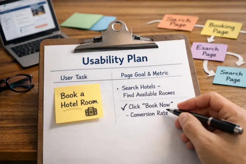
Usability improves results when every page supports a specific user task. First, name the task a real person tries to complete. Then match the page design to the information that task requires.
A helpful decision chain looks like this. You start with the user’s goal, such as “book a visit” or “compare plans.” Next, you map the user’s information need, such as pricing clarity or availability. Then you design the interaction, such as choosing a date or reviewing included features. Finally, you choose a success metric that proves the page worked.
For example, a home page often supports broad tasks, like “understand what you do” and “find the right service.” A pricing page supports a narrower task: “decide if this plan fits my budget and needs.” Those pages need different layouts, even if they share a brand style system.
To set success metrics, use task-based indicators, not just traffic. Task completion rate shows whether users can finish. Time-on-task can help when tasks are comparable, but it can mislead when users feel lost. Error rate, misclicks, and form abandonment point to friction.
One nuance matters. Usability priorities shift across the funnel. In awareness, you optimize for comprehension and next-step clarity. In consideration, you optimize for comparison. In decision, you optimize for confidence and risk reduction.
Stakeholders also need a clear usability plan. Designers should propose patterns and label strategies early. Business owners should approve what tradeoffs they accept. Analytics should define what “truth” looks like before you ship changes.
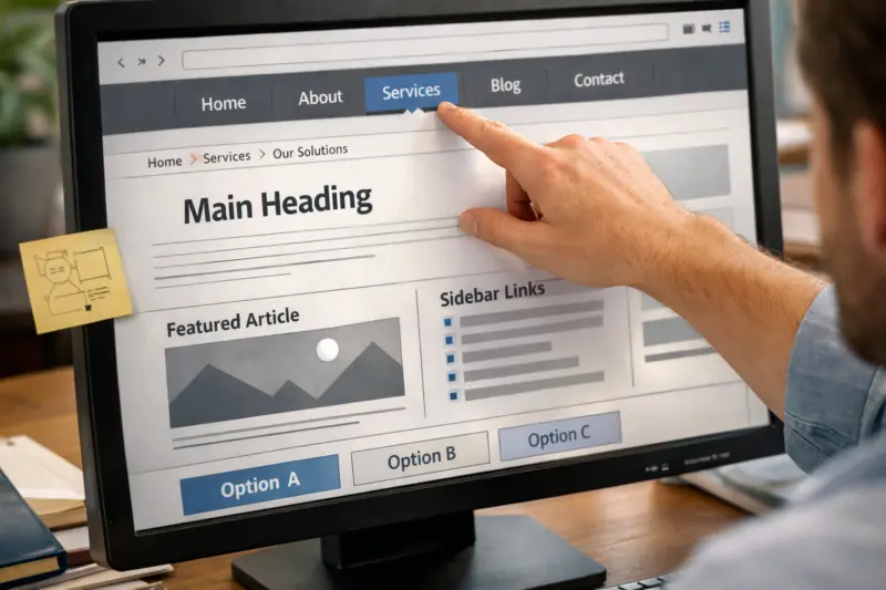
Users stay engaged when they can predict where information will appear. Clear navigation and content hierarchy reduce mental work. That helps visitors focus on decisions instead of figuring out the interface.
Start with information architecture. Use navigation patterns people recognize, like logical categories and consistent placement. Then keep the number of primary choices limited. When users face too many options, they hesitate and bounce.

Next, design the page layout for scanning. Use clear sectioning with meaningful headings. Keep paragraphs short and direct. Add visual rhythm with whitespace and consistent spacing. Also ensure labels match the user’s language, not internal terms.
Content hierarchy should reflect intent. A product or service page might lead with what it does, then who it helps, then pricing or packaging, then proof, and finally a clear call to action. If you mix these in the wrong order, the user reads more to figure out what matters.
Progressive disclosure can help when details are complex. Show the essentials first, then reveal additional info only when needed. However, avoid hiding key costs or requirements behind too many layers. That creates “hidden work” users did not expect.
There are edge cases. Multilingual sites often fail when headings and navigation do not translate consistently. Dense B2B catalogs can fail when filters and comparison tools do not guide user decisions. Multiple conversion paths can fail when CTAs compete instead of coordinate.
One common mistake is “UX cleanup” without measurement planning. If you change analytics events, redirect rules, or navigation labels, you can break your ability to track impact. Plan the measurement update before the redesign.
For guidance on practical usability and interaction principles, review the Nielsen Norman Group library, especially articles on navigation, information architecture, and user testing. For accessibility foundations, the W3C Web Content Accessibility Guidelines (WCAG) explain the technical targets behind readable and operable experiences.
Design calls-to-action and forms that feel obvious, safe, and low-effort
Conversion improves when CTAs and forms reduce uncertainty. People do not abandon because they hate forms. They abandon because they cannot predict outcomes or understand requirements.
Start with CTA clarity. The button label should describe what happens next. Avoid vague text like “Submit” when a better option exists, like “Get a quote” or “Book an appointment.” Also make the CTA visually distinct without being noisy.
Then use expectation-setting microcopy. Tell users what they will provide and what the next step looks like. If you have policies, surface the most relevant ones near the action. For example, show cancellation terms near booking actions, not in an unrelated footer page.
Form usability should prevent errors instead of punishing them. Use field types that match the data, such as email and phone formats. Offer smart defaults where appropriate. Add inline validation that explains the mistake in plain language. Keep required fields truly required.
Privacy reassurance matters for engagement. If you collect data, explain how it will be used. When users understand why the form asks for each field, they feel less risk.
Be careful with friction tradeoffs. Adding persuasion language can backfire when it conflicts with user intent. A user trying to book quickly might hate extra steps like “Why do you want this?” unless it is essential.
Also avoid disabling navigation during checkout-like flows unless you have a strong reason. Users often want to review details. If you block navigation, make the progress and next actions extremely clear.
When your forms power multiple goals, ensure each path has its own design logic. A contact form for general questions should not look like a final checkout. Otherwise, users feel they are in the wrong flow and abandon.
Test usability with task-based methods and interpret results without bias
Usability testing is how you turn opinions into evidence. The key is to test tasks that reflect real user goals. Then measure success by behavior, not by whether people “like” the design.
Start small with a quick heuristic review. List the top issues you expect, such as unclear navigation or confusing labels. Then validate with user sessions that assign specific tasks. A moderated session can help you ask follow-up questions. An unmoderated test can scale faster, but it may miss context.
Use task-based analytics to complement tests. Track task completion, form errors, misclicks, and rage clicks. If your site supports it, measure field-level drop-offs and validation failures. These signals help you pinpoint what breaks trust.
Be thoughtful with metrics. Time-on-task can be useful when you control task complexity. However, it can also reflect confusion and can vary by device proficiency. Instead, focus on completion rates and error patterns first.
Design test tasks that match page types. For a home page, ask users to find the right service and locate pricing or next steps. For a category page, ask users to filter and select a relevant option. For onboarding, ask users to complete the first meaningful setup step.
One deeper nuance is participant realism. Avoid only testing “happy path” users. Include people who have limited time, low familiarity with the domain, and accessibility needs. If you never test those users, your design may work only for a small group.
Finally, synthesize findings using severity and journey stage. Group issues by impact on the user’s goal. Then decide what ships now versus what goes into backlog. This prevents the redesign from becoming a grab bag.
For a practical framework, see Usability.gov, which outlines common testing methods and what to measure. Pair it with accessibility walkthrough guidance from the W3C WCAG approach so usability and inclusion reinforce each other.
Use accessibility and inclusive design to improve usability and reduce risk
Accessibility improves usability because it removes barriers to understanding and action. When a site works with keyboard navigation and screen readers, it often works better for everyone. It also reduces the risk of exclusion and avoidable conflicts.
Begin with the overlap between accessibility and core usability. Check readable contrast for text on backgrounds. Ensure focus states are visible for keyboard users. Use proper labels for form fields so assistive technology can announce them correctly.
Then confirm that interactive elements behave predictably. Buttons should be reachable and clearly identified. Links should have discernible text, not only “click .” Error messages should explain how to fix the problem, not just say that something failed.
Inclusive typography and layout also support comprehension. Use scalable text and avoid layouts that break when users zoom. Also respect motion preferences by reducing unnecessary animations and providing a way to stop or avoid complex motion.
A useful deeper insight is that accessibility findings can reveal structural UX problems. For example, incorrect heading order can create a confusing reading sequence. Missing landmarks can cause screen reader users to lose context. When you fix accessibility, you often fix clarity too.
Edge cases often hide in plain sight. If your site uses heavy tables for data, ensure screen reader reading order and cell associations make sense. If you have complex filters, ensure keyboard focus stays visible and users can understand filter results.
A common misconception is that accessibility is only a legal checklist. In reality, it is a usability baseline. When your site is accessible, fewer users get stuck, and more users reach your intended next steps.
To validate, run a screen reader walkthrough and test with keyboard-only navigation. Use a contrast audit for key templates. Then retest after changes so you do not break focus order with layout updates.
Choose between incremental fixes and full redesign using clear criteria and risk controls
You should change strategy based on the source of usability problems. Sometimes small fixes solve the issue. Other times, only a redesign of information architecture will help.
First, audit the site and identify where the failures come from. If labels and CTAs are unclear, an incremental content and UI refresh may be enough. If users cannot find categories or complete journeys due to confusing structure, you need broader information architecture work. If components behave inconsistently across templates, a component system redesign can reduce recurring issues.
Next, evaluate constraints. Consider tech limitations, design system maturity, and the availability of content. If your analytics measurement is weak, a full redesign can be risky because you will struggle to attribute results.
Tradeoffs are real. A full redesign can break search performance if URLs and internal linking structures change without careful redirects. Meanwhile, incremental changes may not solve systemic problems in navigation and layout logic. That is why you should classify issues before you pick a path.
A practical risk control is to validate before committing. Test prototypes on critical journeys, then set baselines for current performance. Make sure you can compare results before and after, using task metrics and behavioral analytics.
Here is an example comparison table you can adapt to your situation. It helps teams align on scope and risk.
| Approach | Best when usability issues are… | Primary risks | How to de-risk |
|---|---|---|---|
| Incremental improvements | Surface-level friction in copy, layout, or form fields | Not fixing underlying navigation logic | Prioritize top journey tasks and retest after each batch |
| Page-by-page UX refresh | Specific templates underperform on key pages | Inconsistent patterns across templates | Create reusable components and keep labeling rules consistent |
| Full site redesign | Structural issues in information architecture and interaction patterns | SEO and tracking regressions | Prototype critical journeys, plan redirects, and preserve analytics events |
| Component or system redesign | UI inconsistency and repeated UX bugs across templates | Longer rollout and adoption effort | Start with the highest-traffic components and validate on key pages |
Finally, decide based on whether the gaps are structural or surface-level. That simple classification often prevents teams from overbuilding. It also ensures you spend effort where usability will actually change user outcomes.
Common usability mistakes that silently reduce trust and engagement
Usability failures often look small, but they erode trust quickly. When users feel uncertain, they hesitate. When they hesitate, they leave.
One common mistake is unclear CTAs. If users cannot tell what the action does, the button becomes a question. Another mistake is confusing labels. When names do not match user expectations, users waste time trying to interpret them.
Hidden navigation also hurts. If menu items shift location or disappear based on viewport changes, users get disoriented. Cluttered screens create the same effect. Too many competing elements force users to guess what matters.
Micro-decisions matter more than many teams expect. Vague pricing can create anxiety. Missing confirmation states can make users fear they did not complete the process. If the site loads with no progress indicator during multi-step flows, users may refresh or abandon.
Measurement misconceptions can worsen these problems. Traffic growth does not automatically mean usability improved. Bounce rate also needs context. A high bounce can mean users found what they needed quickly. A low bounce can mean users stuck around but could not complete goals.
A deeper nuance is that consistency is not the same as familiarity for every audience. Standard patterns can fail for specialized users. For example, expert users may look for advanced shortcuts. If you hide those behind generic navigation, they feel the site is “slow,” even if it is visually fast.
To prevent repeat issues, use a usability acceptance checklist before launch. Include CTA clarity, form field logic, navigation discoverability, heading structure, keyboard operability, and confirmation messaging. That checklist becomes your last line of defense.
Improve perceived performance and interaction design so usability stays smooth on every device
Usability depends on what users experience during interactions. If the interface feels unpredictable, users interpret that as risk. That risk reduces engagement even when load times are acceptable.
Design feedback for every meaningful action. When users submit a form, show a clear loading state and then a confirmation outcome. For multi-step processes, include progress indicators. Also ensure that error states explain what happened and what to do next.
Responsiveness is also part of usability. Use touch-friendly targets so taps do not miss. Ensure responsive typography maintains readability across breakpoints. Avoid layout shifts that move content while a user is reading or trying to tap.
There is also a tradeoff with “UI polish.” Overused animations, modals, and popups can disrupt attention. They can also interfere with screen reader workflows if focus management is weak. Use motion with restraint and test it on real devices.
Some usability issues masquerade as performance problems. If a page’s hierarchy is unclear, users keep searching and scrolling. They feel like the site is “slow,” even if the network response is fine. Fix structure and clarity first on key journeys.
To evaluate, test critical journeys on representative devices and network conditions. Then prioritize fixes by user impact. If a layout choice causes abandonment in the first step, fix that before adjusting minor visuals.
If you want a simple sanity check, revisit each interaction state. Ask: What does the user see before the action? What changes right after? What confirms completion? This review often finds usability gaps that performance tools alone cannot detect.
Frequently Asked Questions About Essential Website Design Usability Tips for Success
What are the most important website design usability tips for small business websites?
Start with clarity: make the main value and next step obvious on the home page. Next, fix the highest-friction flows, usually contact forms and booking or quote requests. Measure success by form completion rate and task completion on key pages, not just by visitor counts.
How do designers balance visual style with usability on modern landing pages?
Keep the non-negotiables first: readable headings, predictable navigation, and CTAs that state what happens next. Then use visual style to support scanning, like consistent spacing and typographic hierarchy. Validate with quick usability tests on the landing page, then adjust based on what users attempt to do.
Which usability testing methods work best for busy business owners with limited time?
Use a lightweight heuristic review plus one round of task-based user testing. Focus on 3 to 5 tasks tied to your top pages, such as choosing a service and completing a contact form. If you cannot run live sessions, unmoderated tests and session recordings can still show where people get stuck.
Look at where users pause, what they click, and what they read. If users ignore a CTA even when they see it, the issue may be content clarity or expectation mismatch. If users cannot find the relevant section at all, the issue is more likely navigation or layout hierarchy.
What should I include in a usability audit checklist for a website redesign?
Include categories for information architecture, UI patterns, forms and CTAs, accessibility, and analytics or measurement. Score severity by user impact and frequency, then link each issue to a journey stage. This makes it easier to decide what to ship first.
Are accessibility improvements always beneficial for conversions and engagement?
They are often beneficial because they remove barriers that block key actions. For example, better form labels can reduce input errors and increase completion. However, you still need to verify with data because changes can affect layout and may require re-checking your CTA visibility and focus order.
How many website pages need usability testing before launch?
Test the pages that carry the highest user effort or decision impact, typically home or landing, the main conversion page, and the first onboarding or support entry point. You do not need full coverage if you sample tasks that represent each journey stage. Prioritize journeys where abandonment or confusion is most expensive.
What’s the best way to reduce form friction without increasing abandonment?
Reduce friction by cutting unnecessary fields, using the right input types, and clarifying what happens next. Add inline help for tricky fields and show errors where users can fix them. Then measure field-level drop-off so you can confirm the change reduced mistakes rather than merely shifting them.
How can we improve usability for users who are not familiar with our industry terminology?
Use plain language labels and explain jargon the first time it appears. Apply progressive disclosure so advanced details appear only when users ask for them or reach deeper sections. Also match navigation labels to what users expect, so they can self-select the right path early.
Check labeling, placement, and whether CTAs compete in the same visual area. Review screenshots and session recordings to see what users expected to happen. Then run small iterative updates and re-test the affected journey until users consistently choose the intended action.
Conclude with a practical usability success loop for 2026
Usability success follows a simple pattern: connect design decisions to user goals, structure information for quick understanding, reduce friction in the most important interactions, and validate with task-based testing. When you do those four steps, engagement improves because users can act with confidence.
Your next step should be operational, not theoretical. Choose your top three user journeys, such as landing to conversion, onboarding to first value, and support or self-help entry. Then run a targeted usability audit and test the critical tasks within each journey.
In 2026, build an evidence loop. Set baselines for task completion and form success before changes. Test in small batches, then track outcomes that match the journey, such as error rates and abandonment reasons. This approach helps you avoid vanity metrics that look good but do not reflect usability.
Finally, decide whether you need incremental improvements or a broader redesign. Use your audit to classify usability gaps as structural or surface-level. If they are structural, consider component or information architecture changes. If they are surface-level, start with CTAs, forms, and hierarchy updates. Either way, document risk controls for SEO and tracking so you can compare results with confidence.
Updated September 2026