
Choosing the best fonts for web design means balancing readable type, brand fit, accessibility needs, and reliable web delivery. If you’ve searched “Best Fonts For Web Design,” you likely want options that look professional on desktop and stay clear on mobile, in dark mode, and at different zoom levels. In this guide, “best” means fonts that work well in real layouts, not just in a design tool. You’ll also learn how to pick web font delivery (hosted, self-hosted, or custom) and how to tune pairing, sizes, and line spacing so your typography feels intentional.
Modern web typography also depends on variable fonts, smarter loading strategies, and font-display settings that prevent ugly flashes. Therefore, the right choice is not only about style. It is also about character coverage, fallback behavior, licensing clarity, and how your type system holds up when fonts load late.
Contents
- 1 Choose fonts that stay readable everywhere
- 2 A practical shortlist of font styles that win most web projects
- 3 Build your type system with pairing rules that won’t fall apart
- 4 Size, line-height, and spacing guidelines that make fonts feel professional
- 5 Web font delivery choices: hosted libraries, self-hosting, and custom files
- 6 Avoid common font mistakes that quietly break readability and branding
- 7 Type decisions for accessibility and multilingual content beyond contrast
- 8 Font selection for modern UI patterns and design systems
- 9 Best fonts for web design are built on readability, coverage, and reliable delivery
- 10 Are Google Fonts always better than self-hosted fonts
- 11 How do I choose a font pairing that looks intentional
- 12 What font size and line-height should I use for body text
- 13 Which is more accessible for websites: serif or sans-serif
- 14 Can I use a custom font safely without breaking performance
- 15 How do I prevent layout shifts when fonts load
- 16 What should I do if my chosen font doesn’t include certain characters
- 17 What are best practices for picking fonts for a multilingual website
- 18 Is there a “best” number of fonts and weights for a design system
- 19 A repeatable process for finding the best fonts for web design
Choose fonts that stay readable everywhere
Readable web fonts behave consistently across devices, sizes, and rendering engines. That is why “best fonts” start with legibility. If users cannot read body text comfortably, the font choice fails its main job.
Readability depends on more than “looks nice.” First, letterforms must remain distinct at small sizes. Next, line length and spacing must support scanning. Finally, the font must have enough glyph coverage for your languages and punctuation.
How fonts work on screens also matters. Different browsers and operating systems render type with different anti-aliasing and hinting approaches. As a result, a font that looks crisp in a screenshot can soften in production. In addition, missing italics or bold weights can force substitutions, which shifts metrics and makes lines break differently.
For accessibility, aim for predictable text layout and comfortable sizing. Users may increase browser default font sizes. When that happens, the font should still keep a stable rhythm through headings and body copy. Some font styles also feel harsher for readers with dyslexia, especially with overly geometric shapes or tight apertures. However, no font guarantees universal comfort, so test with real copy and real controls.
One deeper insight is that readability includes fallback fonts. If your primary font fails to load, a fallback replaces it. That fallback often has different x-height and widths. Therefore, your page can reflow when fonts switch, which changes reading speed and breaks carefully tuned line lengths.
Here are practical fit tests you can run. Compare your chosen font at 14–16px on mobile widths. Then test a long-form paragraph with real sentence structure. Next, check numeral styles for dates and prices. Finally, confirm multilingual characters using your actual translated strings.
A practical shortlist of font styles that win most web projects
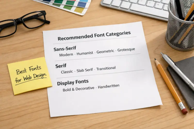
The safest “best font” decision is often a style category, not a single name. Most successful web designs rely on well-supported sans-serifs for UI and readable serif families for editorial hierarchy. Monospace fonts work best for code, datasets, and technical callouts.
Sans-serifs usually win for user interfaces. They stay clear in buttons, form labels, and dense navigation. In addition, sans-serif letterforms tend to keep consistent spacing across weights. This makes it easier to design a typographic system for dashboards, landing pages, and e-commerce product pages.
Serif fonts can add warmth and authority. They often improve hierarchy in marketing content and blog-style templates. However, serifs require more careful line-height. If you set line-height too tight, characters collide visually. Therefore, many teams pair a serif for headings and long reads with a sans-serif for UI labels.
Monospace fonts help when users need precision. Code blocks, command snippets, and table-heavy documentation often benefit from monospace alignment. Still, monospace style choices matter. Some monospace fonts are too dense, so your code lines wrap awkwardly on small screens.
A common mistake is treating “a font family” as “one font.” If you need italic, bold, and medium weights, check that those files exist in your plan. Otherwise, the browser may synthesize styles. That can look off and can also change spacing. Another nuance is variable fonts. When variable fonts are available with strong browser support, they reduce the number of files you load and help keep weight transitions smooth.
When mixed content appears, build around one system. Use one primary family for body and UI. Then add one complementary family for headings, pull quotes, or special sections. This approach keeps branding consistent without multiplying layout risks.
Build your type system with pairing rules that won’t fall apart
Intentional font pairing follows rules you can repeat across the site. The most reliable method uses one primary family for body and UI, plus one complementary family for headings or emphasis. This reduces surprise while keeping your design expressive.
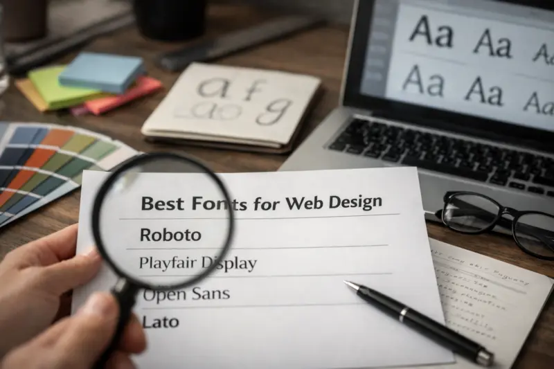
Pairing works best when the fonts contrast in function, not just in taste. For example, use serif headings with a sans-serif body. Or use a humanist sans with a geometric sans for structured sections. Meanwhile, keep your contrast consistent across the whole site so headings feel like part of the same system.
To make pairing practical, limit families and define typographic tokens. Tokens are the reusable values your design uses for each role. For example, set a base font-size, a heading scale, and a standard line-height for body copy. Next, define spacing between heading levels. Therefore, your typography stays coherent even when you add new pages or templates.
There is also a “deeper” pairing risk: metric mismatch. Two fonts can look similar, but their x-height and ascender behavior differ. When fonts load, the browser applies metrics and adjusts wrapping. If your pairing uses mismatched metrics, you can see layout shifts during loading. That shift can move headings and change the height of hero sections.
For implementation, verify loading behavior and fallbacks. Choose a type setup that includes the weights and styles you need. Then ensure your fallback stack uses broadly similar metrics. Otherwise, your site can look fine in your editor but feel jarring when real visitors load pages.
Practical “when to use” scenarios help. Startups often need a strong default system and fast iteration. Organizations standardizing documentation need consistency across templates. Designers with strict layout systems benefit from limiting families and using predictable tokens.
Size, line-height, and spacing guidelines that make fonts feel professional
Professional typography is mostly spacing, not decoration. Correct font size and line-height create a calm reading experience. When those values are right, the page looks polished even with simple styles.
Start with a base font-size that matches your layout density. Many web designs begin around 16px for body text. However, smaller or denser interfaces may use 14px. Then set line-height to a comfortable range. A common target is about 1.4 to 1.6 times the font-size for body copy.
Next, tune heading spacing. Headings often need less vertical gap than body text, because their line-height can stay tighter. Still, you should avoid excessive spacing that makes pages feel broken. Therefore, set consistent margins between H2, H3, and body sections to keep scanning smooth.
Responsive design changes typography in real ways. Narrow columns cause more wrapping. When wrapping increases, line-height and letterforms affect perceived density. As a result, a setting that feels perfect on desktop can feel cramped on mobile. Adjust at breakpoints using the smallest readable line length as your anchor.
A deeper nuance is that spacing affects stability during font loading. If you load fonts late, fallback metrics can change line breaks. That can shift the height of blocks and push content down. Therefore, stable line-height choices plus solid fallback planning reduce layout shifts and keep reading predictable.
Measure with real content. Compare line length at 90–100% zoom, then check mobile breakpoints. Use long sentences, not only short headlines. Finally, review tables and captions. Captions often need slightly tighter spacing, but they must still stay legible.
Web font delivery choices: hosted libraries, self-hosting, and custom files
Font delivery affects reliability, accessibility, and visual stability. When you pick “best fonts,” you also need a best way to load them. The delivery method changes caching, subsetting options, and how you handle fallback during loading.
Hosted libraries like Google Fonts can simplify selection and deployment. They also offer easy access to many families and weights. However, hosted delivery still depends on your site configuration and loading strategy. Therefore, you must verify that your font-display settings prevent invisible text issues.
Self-hosting gives more control. You can subset fonts to include only the characters you need and limit weights to what your design system uses. That can reduce total download size. In addition, you can control caching headers and CDN distribution. Therefore, self-hosting can be a better fit when you need tight performance and consistent behavior across many pages.
Custom fonts are an option when brand uniqueness is crucial. They can also solve legibility issues if a brand needs specific letterforms. Yet custom work costs more and adds longer timelines. Moreover, custom fonts require careful licensing for future edits and additional glyphs, especially when you expand into new languages.
A deeper insight is that “fast” is not only file size. Fallback metrics and font-display choice decide whether users see a stable layout. If your fallback looks radically different, you may get a visible jump when the web font arrives. Also, subsetting too aggressively can remove needed characters, so your translated content breaks into missing glyphs.
For planning, review font licensing and usage rules first. Then set a font-display strategy so users see text immediately. The W3C discusses user and accessibility aspects of readability and typography, which supports why stable text presentation matters: W3C Web Accessibility Initiative and MDN Web Docs on font-display. If you use variable fonts, the official CSS Fonts guide helps you understand how browsers handle font behavior: MDN Web Docs on Variable Fonts.
When choosing between hosted and self-hosted, ask one question. Do you need precise control over subsetting, caching, and cross-page consistency? If yes, self-hosting often wins. If no, hosted fonts can still be an excellent choice for many projects.
Avoid common font mistakes that quietly break readability and branding
Many font problems do not show up in mockups. They appear after real data, real devices, and real loading conditions. Therefore, avoiding common mistakes is part of choosing the best fonts for web design.
One classic misconception is that Photoshop typography equals web typography. Screens render fonts differently, especially at small sizes. In addition, web fallbacks change text metrics. As a result, lines may wrap sooner, and your carefully balanced headings can jump lines.
Another pitfall is using too many families and weights. If you have five fonts and ten weights, you will struggle to keep hierarchy consistent. You also increase the chance of missing files for italics or bold styles. When that happens, the browser synthesizes them, and the result looks inconsistent across pages.
Watch for decorative fonts in body text. Decorative faces can work for hero headlines. However, body copy requires clarity and stable spacing. Also, inconsistent numeral styles can confuse users, especially in pricing and dates. If some numbers look old-style and others look tabular, alignment will shift across UI components.
A deeper production failure mode is glyph coverage loss. Subsetting can accidentally exclude characters like curly quotes, em dashes, or diacritics. Then users see fallback glyphs that look mismatched. This can also happen during localization when you add new languages later.
Finally, consider the accessibility angle. Low contrast combined with tight line-height makes reading harder. Also, tiny sizes that pass on desktop can fail on mobile due to smaller effective line lengths. Therefore, test on real devices and browser zoom levels.
Type decisions for accessibility and multilingual content beyond contrast
Accessibility includes sizing, spacing, and predictable rendering. Contrast is important, but it is not the only factor that makes text usable. The best fonts support comfortable reading under user controls.
First, respect user font scaling. Many users increase browser default text size. Your layout should adapt without text overlapping or truncating too early. Therefore, choose fonts with stable metrics and test line wrapping at larger sizes. Also, keep line-height generous for longer paragraphs.
Next, plan for multilingual coverage. A “best” family for English may lack punctuation, diacritics, or common characters used in other languages. Before launch, validate your exact translated strings. Then check that numerals, currency symbols, and quotation marks appear correctly.
Scripts change layout behavior. For right-to-left languages, baseline and glyph shaping can differ between fonts. Some fonts also handle mixed scripts with different spacing rules. Therefore, design your fallback chain so the browser can pick a similar-looking font for missing glyphs without breaking your rhythm.
A deeper insight is that accessibility testing should include zoom and increased default fonts. Some fonts look fine at normal size but become cramped when users scale up. Meanwhile, others keep readability but cause overflow if your containers are fixed height. Test both in desktop and mobile, because wrapping changes the reading experience.

Common mistake: assuming a font’s character coverage is “good enough.” It is better to audit early with your actual content. In addition, if you plan to localize, revisit your subsetting strategy. Subset files can change when you add new languages.
For accessibility principles and practical guidance, the Web Content Accessibility Guidelines are a core reference point: W3C WCAG. For multilingual and directionality concerns, the Unicode Consortium is a strong baseline for how scripts and characters behave: Unicode.
Font selection for modern UI patterns and design systems
Design systems need fonts that behave well inside components. Buttons, inputs, tables, and charts often require tighter tuning than editorial text. Therefore, treat UI typography as its own layer within your broader type system.
Buttons and form fields need clear letter shapes at small sizes. They also need consistent height across states. When a font lacks a bold weight, the browser may simulate it. That can change button label widths and affect alignment. Next, tables require predictable numerals so columns line up across rows.
Variable fonts can simplify weight control in design systems. With variable fonts, you often get smooth weight interpolation instead of separate files for each weight. That can help maintain consistent brand expression across heading levels and UI emphasis. However, compatibility and setup still matter. Some browsers support variable fonts differently, and misconfigured CSS can break expected weight behavior.
Dark mode adds another requirement. Your chosen font weight must stay readable against darker backgrounds. Sometimes the same weight that works in light mode feels too thin in dark mode. Therefore, tune weights for theme contexts, not only for default styles. Also, ensure focus states remain visible with your typographic choices.
A deeper insight is that icon fonts and pseudo-text can interfere with accessibility. If you use a font icon mapped to a character, screen readers might read it oddly. Also, if glyphs shift due to font loading, icons can misalign. Prefer real text for meaningful content, and use proper labeling for decorative icons.
Finally, define font-related design tokens. Create tokens for family, size, weight, and line-height per role. Then apply those tokens across components so typography stays consistent as your product grows.
Best fonts for web design are built on readability, coverage, and reliable delivery
The best fonts for web design are the ones that stay readable at small sizes, include the glyphs you need, and load in a stable way. That is true whether you prefer a classic serif look, a modern sans-serif UI style, or a monospace tech feel. Trends matter less than how your typography behaves with real content.
Look for fonts with strong weight support, including bold and italic if your design needs them. Also confirm coverage for punctuation and the scripts you plan to use. Then choose a delivery method that prevents invisible text and reduces layout shift.
Finally, test in your actual layout. Use long paragraphs, narrow cards, and real tables. If it stays readable and consistent, it earns the “best” label for your project. The goal is less about style hype and more about dependable user reading.
Are Google Fonts always better than self-hosted fonts
No, Google Fonts are not automatically better than self-hosted fonts. They are convenient and often well supported, which is why many teams start there. However, self-hosting can offer more control over caching, subsetting, and font-display behavior.
With self-hosting, you can limit the number of weights and styles you load. You can also subset to only required characters. This can improve consistency on pages that share the same font setup.
Still, hosted fonts can be the right choice when you want fast setup and broad library options. Either way, check how fonts load in production and how fallbacks behave. Your “best fonts” decision depends on the delivery UX, not only the font name.
How do I choose a font pairing that looks intentional
Choose pairing rules that match the job of each text role. For example, use one font family for body and UI, then add a complementary family for headings. This keeps hierarchy clear and prevents the site from looking like it uses random typography.
Use contrast strategically, such as serif headings with sans-serif body, or two sans families with different personalities. Then define an explicit heading scale and spacing rules. When fonts load late, metric differences can cause reflow, so confirm your fallback stack supports your chosen rhythm.
Finally, test pairing with your real content. Check that headings do not wrap awkwardly and that line lengths feel natural. Intentional pairing is mostly repeatable system design.
What font size and line-height should I use for body text
For body text, a common starting point is around 16px with line-height between about 1.4 and 1.6. If your interface is dense, you may start closer to 14px. However, smaller text needs more careful spacing and strong contrast.
In narrow layouts, wrapping increases and the same line-height can feel cramped. Therefore, review typography at your mobile breakpoints. Also test at 90–100% zoom and at increased zoom to see whether lines and blocks keep their intended hierarchy.
Use real paragraphs, not placeholder text. The “professional” feel comes from consistent rhythm across headings and body blocks.
Which is more accessible for websites: serif or sans-serif
Neither serif nor sans-serif is universally more accessible. Accessibility depends on size, line-height, contrast, and how the font renders on different devices. In many cases, sans-serif fonts read comfortably in UI at small sizes.
That said, serif fonts can be highly readable for long-form content when line-height and spacing are tuned well. The bigger accessibility win is ensuring your typography remains stable when users scale text. Also ensure your site does not swap to a dramatically different fallback font mid-read.
Test both styles with the same content and settings. If one option keeps reading smooth across zoom levels and devices, it earns the better accessibility outcome for your site.
Can I use a custom font safely without breaking performance
Yes, you can use a custom font safely if you subset correctly and control loading. Limit the font files to the weights and styles you actually need. Then use a font-display strategy so users see text immediately while fonts load.
Also plan your fallbacks. Your fallback font should match metrics closely enough to reduce layout shift. Finally, measure layout stability and readability on mobile networks, because font loading behavior changes with bandwidth and cache.
Custom fonts often shine when branding needs uniqueness. Still, performance discipline matters more than the font origin.
How do I prevent layout shifts when fonts load
To prevent layout shifts, start with good fallback planning. Use font-display approaches that avoid invisible text, but also ensure the fallback has similar metrics. Layout shifts often happen when the browser swaps to a new font with different widths and x-height.
Next, subset fonts so the right glyphs and weights load reliably. If you load many weights you do not use, you increase the chance of late swaps. Finally, test on slow connections and with a cold cache to see the real user experience.
When layout shifts stay small, the page feels stable and easier to read. That stability is a core part of font “quality” on the web.
What should I do if my chosen font doesn’t include certain characters
If a font lacks certain characters, the browser will fall back to another font. That fallback can change spacing and style, which can break your typographic rhythm. The first step is to run a glyph coverage check using your real content and translated strings.
Then update your font strategy. You may need a font family with broader coverage, or you may need a fallback stack that matches metrics. If you used aggressive subsetting, confirm your subset includes the missing characters.
After changes, test again in production. Localization often reveals gaps that you cannot catch with a quick alphabet sample.
What are best practices for picking fonts for a multilingual website
For multilingual websites, prioritize script coverage and predictable fallback behavior. Choose a primary family that supports your main languages, then verify punctuation, diacritics, and numerals. Test with real translated strings, because short sample text can miss edge glyphs.
Also consider directionality for right-to-left scripts. Verify how your chosen fonts handle baseline and spacing for those scripts. If your page mixes scripts, check that fallback fonts align visually without creating abrupt reflow.
Finally, revisit subsetting after every language expansion. A subset that works for one locale can fail for another, especially with quotation marks and currency symbols.
Is there a “best” number of fonts and weights for a design system
There is no single universal number, but fewer is usually better. Most design systems work well with one primary family, one complementary family, and a small set of weights per role. The tradeoff is flexibility versus consistency and performance.
Each additional family adds complexity to pairing, spacing, and fallback planning. Each additional weight adds more font files, which can increase load time and styling mismatches. Therefore, define a limited set of weights that cover your headings, body, and emphasis needs.
In practice, a sensible cap keeps your typography coherent and easy to maintain. Your “best” choice is the smallest system that still supports your design hierarchy and content needs.
A repeatable process for finding the best fonts for web design
Use a simple path to choose the best fonts for web design without getting lost in style options. Start by listing your readability and accessibility requirements. Then pick a system family for body and UI, because consistency is where professional typography comes from.
Next, pair intentionally. Choose one complementary family for headings or emphasis, then define a heading scale and spacing rules. After that, tune font size and line-height using real content at your mobile breakpoints. This step is where typography becomes calm and confident.
Finally, validate delivery. Confirm licensing, font coverage, and font-display behavior. Test fallback and layout stability so users do not see jarring jumps when fonts load late. If you do these steps, your font choices will feel “best” in the way that matters for real visitors.
As a next step, build a small set of type tokens for sizes, weights, and line-heights. Then apply them across templates, tables, and content blocks. When your type system is repeatable, your design stays strong even as your site grows.
Updated September 2026