

Business Website Design is how a company turns its offering into a clear, credible, conversion-focused website that creates and improves online presence. Choosing the right Business Website Design approach means planning structure, UX, content, and calls to action so visitors know what you do and what to do next. You will also avoid common mistakes that make even a “beautiful” site fail to generate leads. This guide gives practical, business-ready insights for planning and building a site that works in 2026, with mobile-first behavior and AI-assisted workflows that support smarter updates. It is for service businesses, B2B providers, local companies, and growing brands that want professional results without guesswork.
Contents
- 1 Build your business website design around real customer journeys
- 2 Choose a structure that builds trust fast and reduces friction
- 3 Design for usability and accessibility across every screen and audience
- 4 Keep brand consistency while staying conversion-focused
- 5 Plan what to include with a page strategy and conversion assets
- 6 Compare website design approaches and pick the safest implementation path
- 7 Avoid common business website design pitfalls that quietly kill leads
- 8 Handle complex offerings, multiple locations, and high-consideration sales cycles
- 9 Frequently asked questions about business website design and creating your online presence
- 9.1 How much does business website design cost?
- 9.2 How long does it take to design and launch a business website?
- 9.3 How do I know what pages my business website should include first?
- 9.4 What does “conversion-focused design” mean for service businesses?
- 9.5 Should I redesign my website or create a new one from scratch?
- 9.6 How much content do I need before launching a business website?
- 9.7 What are the most common business website design mistakes that reduce leads?
- 9.8 Can a template-based site still look custom and feel on-brand?
- 9.9 How should we collect leads if our sales cycle is high-consideration?
- 9.10 What should our website show to build trust for first-time visitors?
- 9.11 Business website design for multiple locations: what’s the right approach?
- 10 Conclusion: design a business website that earns trust and drives action
Build your business website design around real customer journeys
Online presence is not just traffic. It is the full path from first impression to trust, then to inquiry or purchase. A strong Business Website Design approach maps what people want at each step, so your site answers their questions in order.
Start by defining the stages your customers actually move through. Most businesses follow a pattern like awareness, trust building, and then action. For example, a first-time visitor needs clarity fast. Someone who compares options needs proof and details. A ready-to-contact visitor needs a friction-light way to start. An existing customer often needs support and next steps.
Next, translate those journeys into a practical page blueprint. Build a homepage that explains value and directs visitors to the right entry path. Create service or product pages that match what people search for. Add industry or use-case pages when they support faster understanding. Then include an About page that earns credibility, not just history. Finally, design a contact flow that matches intent, such as a call button, a form, or a quote request.
Measure success per journey stage, not only by overall traffic. Track CTA click-through, form completion rates, call tracking, and email capture. If you offer complex work, also track assisted conversions like brochure downloads that lead to sales calls. A deeper nuance is that different visitors can come from different sources, and those sources should land them on different pages. Ads might justify an immediate offer. Organic searches might require a more detailed landing page. Referrals might need social proof and a clear “what happens next” message.
Tradeoffs are real . If you force one homepage to serve every visitor, you often create confusion. Meanwhile, if you create too many specialized pages, you may dilute content quality and make updates harder. A practical scenario is a business with both local clients and national partners. You can use shared core templates while designing separate entry pages that fit each audience’s expectations.
Choose a structure that builds trust fast and reduces friction
Trust and conversion rise when your layout makes decisions easy. Business website design should prioritize credibility signals and clear pathways to contact, so visitors never wonder what you do or how to start.
Begin with a credibility-first layout. Place your value proposition where visitors can see it immediately. Then support it with social proof near key claims. Industry relevance also matters. If you specialize, say so early and use language your audience recognizes. Clear navigation helps as well. It should show major choices without making visitors dig.
Next, organize information by how decisions get made. Above the fold, summarize the offer in plain terms. Use headings that match user questions. Then break down services into “what you get” and “who it is for.” This prevents decision fatigue, especially for high-consideration offerings. CTA strategy should also be disciplined. Choose one primary CTA per key section, then align secondary actions around it.

Design forms and contact options to remove friction. Field minimization matters, but it must not reduce helpful context. For example, an intent-specific form can ask what you need and how soon you want help. That improves routing, which improves response quality. Progressive disclosure works for complex services. You can start with a short form, then offer a longer intake later if the visitor chooses it.
Trust components should vary by business type. B2B buyers often look for process clarity, proof, and decision-maker-friendly details. Local service customers often value reviews, location relevance, and fast contact. Subscription businesses typically need clear onboarding expectations and transparency about service scope. A common mistake is burying “what happens next” after the visitor submits a request. People need reassurance that their message will be handled and what they should expect.
One edge case is when customers want a quick call rather than a form. If your site hides phone availability, those visitors may bounce even if your offer is strong. Another common misconception is that “more CTAs” always increases conversions. In reality, too many options often increase uncertainty. Design the page so the visitor’s next step feels obvious.
Design for usability and accessibility across every screen and audience
Usability and accessibility are conversion tools, not just technical checkboxes. A Business Website Design that works on phones, supports keyboards, and reads clearly reduces drop-offs during key steps like form completion.
Use a mobile-first UX approach. This means navigation should be thumb-friendly and content should scan quickly. Keep font sizes readable and avoid tiny buttons. Make sections collapsible when needed, but do not hide essential information behind endless menus. Also plan for tap behavior. Links and buttons should be spaced enough that users can select correctly on smaller screens.
Accessibility basics protect more than compliance. They improve clarity for everyone. Use sufficient contrast so text remains readable. Apply semantic heading structure so assistive technologies can understand your page. Provide clear alt text for meaningful images. Ensure keyboard navigation works through key areas like menus and forms. Also make error messages specific. If a field fails validation, explain what to fix and how to correct it.
Performance affects user experience too, even when speed is not the main theme. Media choices and layout stability help people read without irritation. Use appropriately sized images. Avoid heavy video autoplay. Plan for stable layouts so content does not jump while loading. When users feel in control, they are more likely to complete contact actions.
For international audiences, clarity matters. Support language preferences where needed and avoid idioms that confuse non-expert visitors. If time zones affect scheduling, show them clearly on booking or inquiry steps. A deeper nuance is that accessibility and conversion friction often overlap. Clear labels and helpful validation can reduce abandonment even for visitors using mobile devices in loud or busy environments.
A common mistake is treating accessibility as a one-time audit near launch. Instead, bake it into your content workflow and design system. As the site grows, new sections should follow the same readable structure and interaction patterns.
Keep brand consistency while staying conversion-focused
Brand design should make your offer easier to trust, not harder to understand. Business website design needs consistent visuals and tone, while still directing visitors toward the next action.
Use brand elements to reinforce meaning. Color can highlight key calls to action. Typography choices can improve readability and hierarchy. Imagery should match your claims. For example, if you promise expertise, use case study visuals and real examples rather than generic stock. Your tone matters too. It should communicate confidence and clarity, not only style.
Visual storytelling is most effective when it supports proof. Case studies often work as structured modules. Show the challenge, the approach, and the results. Then connect those outcomes to the visitor’s likely concerns. If you sell services, make deliverables and timelines easy to scan. If you sell products, show use cases and benefits that match how buyers evaluate options.
Align content with page reading patterns. Most visitors scan first, then read what seems relevant. Use short paragraphs, clear headings, and benefit-focused bullets where appropriate. Visual elements should confirm key messages, not distract from them. Also keep your CTA placement consistent. If the button style changes every time, visitors lose momentum.
Governance helps when teams update the site. A simple design system can define spacing, font rules, button styles, and reusable content blocks. That makes future pages consistent and reduces design drift. The tradeoff is that strict systems can limit creativity. Still, you can keep flexibility inside set component rules.
An edge case is when a brand refresh changes identity but the offer stays the same. In that situation, you may be tempted to redesign everything. Instead, keep core conversion pathways stable, then modernize visual components gradually. Also beware of “brand-only” pages that look premium but hide the service scope, pricing approach, or next steps.
Plan what to include with a page strategy and conversion assets
A business website needs both the right pages and the right supporting assets. Business website design becomes more effective when you treat pages as job roles and assets as conversion accelerators.

Start with a minimum page set that matches customer journeys. Typically this includes a homepage, service or product pages, industry or use-case pages (when relevant), an About page, and a contact page. Then add conversion assets that help visitors take action before they are ready to talk. Lead magnets can work for certain service businesses, such as checklists, estimates, templates, or resource guides. For B2B, case studies and sample reports can do the same job.
Use content blocks that scale across industries. A strong service page often includes a problem/solution section, features mapped to benefits, a process overview, FAQs, and proof. Also add outcomes. Outcomes should be specific and tied to deliverables. Testimonials help, but they work best when they connect to the visitor’s context, such as industry type or project goals.
Structure service pages with clear scope. Explain who it is for, what you deliver, and what the timeline looks like. Include expectations about communication and decision points. If you have multiple engagement levels, show them as tiers with distinct outcomes, not vague labels. For local businesses, a quote-request or appointment flow can replace long browsing. For lighter eCommerce needs, make product pages clear and keep checkout steps focused.
A practical nuance is content velocity. Your site must adapt to new offers, seasonal campaigns, and updated testimonials. Design should support iteration without breaking layout. Reusable templates help, as long as you still tailor page content to the specific intent behind each page.
A common limitation is overbuilding before launch. Too many pages can lead to thin content. Thin pages create weak signals and also make users unsure. Instead, ship a focused version that covers the core journeys, then expand based on real engagement data.
Compare website design approaches and pick the safest implementation path
You can achieve great results with different build approaches, but each has different risks. Business website design should match your business complexity, integration needs, and ability to maintain the site after launch.
Consider four broad implementation categories. First, DIY builders can work for simple sites with limited customization. Second, template-based theme builds can offer faster launches while still allowing design system consistency. Third, an agency design and build path often helps when you need strategy, UX, and copy guidance. Fourth, a hybrid approach can fit teams that want internal control but need specialists for design, UX testing, or development.
Choose based on criteria that affect outcomes. Complexity of offerings matters. If you need appointment scheduling, lead routing, or multiple forms, your requirements rise. Brand differentiation goals also matter. If your site must reflect a mature service model, custom UX may be worth it. Timeline constraints and budget shape feasibility too.
Tradeoffs should be explicit. More customization can improve differentiation but can also increase maintenance effort. DIY can reduce cost but may shift workload onto your team. Quality UX research can improve conversion, but it may add planning time. “Best guess” layouts sometimes look fine but miss key user questions.
Demand a clear handoff package from any provider. You should receive wireframes, content guidance, analytics setup plans, and QA checks. Confirm who owns the design system, templates, and analytics configuration. A common “handoff risk” is when your team cannot edit pages without breaking style or CTA behavior.
For business owners, a useful decision marker is how often you expect to update. If you plan frequent campaigns, you need a maintainable structure. If your offerings rarely change, a simpler system can be enough.
Avoid common business website design pitfalls that quietly kill leads
Many websites fail because of friction and unclear messaging, not because of poor visuals. Business website design mistakes often reduce leads by confusing visitors or making action feel risky.
Start with the biggest killers. An unclear value proposition makes the site forgettable in seconds. Generic homepage layouts often say “what” but not “why you.” Too many CTAs can also increase uncertainty. Finally, navigation that hides the offer forces visitors to hunt, which leads to bounce.
Next, check for “looks professional but performs poorly” issues. Sliders, heavy animations, and autoplay media can distract from key decisions. Unreadable typography and poor contrast hurt comprehension. Weak mobile layout can make forms frustrating to complete. Broken or confusing form UX is a major conversion leak, because users do not want to fight the interface.
Design decisions can also harm SEO-support goals. If service pages are thin, they will struggle to address intent. If imagery is irrelevant, it can weaken trust and clarity. If you ignore service-specific content sections, visitors may feel the site is not tailored to their situation.
Trust gaps reduce leads too. Missing testimonials or case studies makes it hard to justify contacting you. Unclear pricing or engagement model can also stall progress. People need transparency about how engagement works and what they receive. Also, your site should answer “what happens next” after the visitor reaches out.
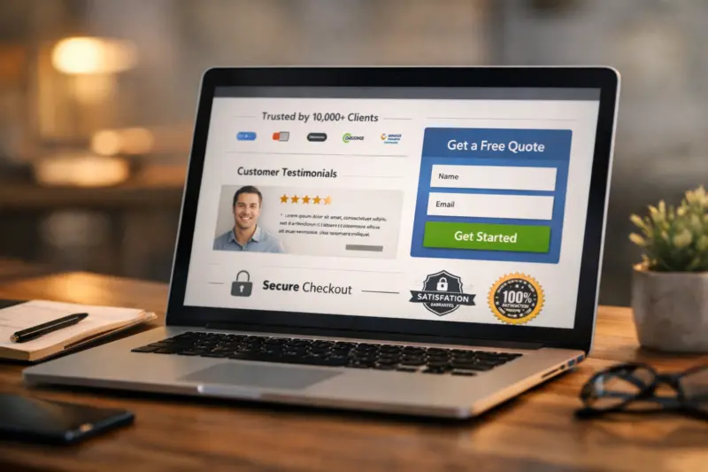
A deeper nuance is the conversion mismatch problem. Your landing page must match the visitor source. An ad-driven visitor expects a direct path. An organic visitor often expects detailed answers for a specific problem. If the page makes them re-learn the offer from scratch, you lose momentum.
A common mistake is assuming a redesign fixes everything. Sometimes the structure and messaging are still misaligned. Start with analytics and user behavior, then adjust the pages that matter most to lead generation.
Handle complex offerings, multiple locations, and high-consideration sales cycles
Complex businesses need design that supports choice without overwhelming visitors. Business website design for multi-location or high-consideration sales should guide people through staged actions and clear proof.
For complex offerings, present tiers and scoped deliverables clearly. Use structured sections that separate outcomes, included work, and expectations. Avoid walls of text. Instead, show how an engagement begins, what steps follow, and what decisions the buyer makes along the way. If you offer add-ons, explain them as optional modules tied to specific needs.
For multiple locations, use a consistent template strategy while adding location-specific credibility. Create location landing pages when each area has distinct audiences or service coverage. Add local proof like testimonials that reference local experience, and show service areas clearly. Meanwhile, keep internal linking logical so visitors can move between relevant services and locations without losing context.
High-consideration sales cycles require staged CTAs. Early on, visitors may prefer downloading a guide, requesting an informational call, or submitting basic requirements. Later, they may book a consultation or request a formal proposal. Design should reflect maturity levels so the CTA matches the visitor’s confidence. Lead capture should also support nurturing, such as email follow-up with relevant resources.
Be careful with compliance-related claims. If you make performance or outcome statements, explain your method and boundaries clearly. Use cautious language when certainty varies by project. This helps avoid misunderstandings and improves trust, which is the real commercial goal of careful disclosure.
An edge case is when users behave differently than your “average” persona. Some people want to call immediately. Others want to browse before reaching out. Still others want to download a document first. To support all intent levels, provide multiple CTA types while keeping a consistent journey and a clear “next step” message. Users should never feel lost on the way to contacting you.
Frequently asked questions about business website design and creating your online presence
How much does business website design cost?
Business website design cost varies based on your site size, the complexity of your pages, and the level of customization you need. It also depends on how much copy and content you already have, and whether you need integrations like scheduling, forms, or lead routing. In many cases, you can expect a broad range, and exact pricing is best confirmed after a short discovery call and page scope review.
How long does it take to design and launch a business website?
The timeline depends on how many pages you need, how fast you can provide content, and whether your design requires custom UX work. A typical project may take several weeks for planning and wireframes, then additional time for design, development, content polish, and QA. If you choose a simpler template-based build and your content is ready, launch can be faster.
How do I know what pages my business website should include first?
Start with pages that match your main customer journeys. Most businesses begin with a homepage, one key service or product page, an About page for credibility, and a contact page that supports inquiry. Then add industry or use-case pages and additional services based on what drives the most interest from search and referrals.
Use a minimum viable site structure so you do not overbuild. Prioritize the pages that answer the highest questions before contact. Then expand after launch using analytics and inquiry patterns.
What does “conversion-focused design” mean for service businesses?
Conversion-focused design means your pages guide visitors to take the next step with clarity and minimal friction. It includes strong CTAs, proof where it matters, and forms that match visitor intent. For service businesses, it also means service pages explain scope, process, and what happens after contact.
Should I redesign my website or create a new one from scratch?
Redesign is often enough when your information architecture is solid and your content can be updated. A full rebuild may make sense if your site is difficult to edit, your pages are outdated, or your conversion paths no longer match how customers search and contact you. The right move depends on migration risk, design drift, and content gaps.
How much content do I need before launching a business website?
Launch with enough content to answer the core questions on your main pages. Typically, that means clear service or product descriptions, proof, and a contact path with clear expectations. You can improve depth later, but your initial pages should not be empty or vague.
Plan for post-launch additions, such as more case studies, FAQs, and updated testimonials. A practical approach is to publish a core set now, then iterate based on inquiries and page engagement.
What are the most common business website design mistakes that reduce leads?
The most common mistakes include unclear messaging, too many CTAs, and forms that add friction. Many sites also miss key trust proof like testimonials or process clarity, which makes visitors hesitate. Finally, mobile layout issues and mismatched landing pages can cause early bounce even when the visuals look good.
Can a template-based site still look custom and feel on-brand?
Yes, a template-based site can feel custom when you tailor typography, color, layout rules, and content blocks. Use a design system approach so reusable components stay consistent. The key is customizing the offer presentation, not only the skin of the site.
How should we collect leads if our sales cycle is high-consideration?
Use staged CTAs that match visitor readiness. Early actions can be email capture, downloads, or request-for-information forms. Later actions can be consultation booking or proposal requests. Pair each CTA with proof and clear “what happens next” steps so visitors do not feel trapped.
What should our website show to build trust for first-time visitors?
First-time visitors need proof, clarity, and process. Include testimonials or case studies, show what your work looks like, and explain how engagement begins and ends. Make your next step obvious, like booking a consult or sending a structured inquiry.
Business website design for multiple locations: what’s the right approach?
Use shared design principles across locations so the brand feels consistent. Then add location-specific content that reflects how people seek services in each area. Include local proof and clear service coverage details, while keeping internal navigation simple so visitors can move between relevant pages.
Conclusion: design a business website that earns trust and drives action
Business website design succeeds when it supports real customer journeys, not just aesthetics. Plan your pages around how people move from awareness to trust, then to inquiry. Build credibility and reduce friction with disciplined CTA placement, clear forms, and helpful “what happens next” messaging. Keep usability and accessibility strong across devices so visitors can read, navigate, and convert without stress. Finally, choose an implementation path that you can maintain, since long-term updates determine whether your online presence keeps improving.
If you are deciding what to do next, start with an audit. Review your pages, your CTAs, your mobile experience, and your trust components. Then map improvements to measurable goals like form completion, call tracking outcomes, and assisted conversions. When you tie design changes to real signals, you avoid redesigning based on taste alone.
For a practical next step, request a design consultation or run a structured website planning workshop to finalize your page blueprint and success metrics before building or redesigning. If you already have a site, this same workshop can help you prioritize fixes that improve leads while protecting what already works. After the plan is clear, you can choose DIY, a hybrid model, templates, or agency support with confidence.
Updated September 2026