

A well-designed navigation menu increases user engagement by reducing decision effort and helping people reach their goal with fewer wrong turns. The best Navigation Menu Design Best Practices balance clarity, hierarchy, and accessibility across desktop and mobile. If you have ever watched users bounce after clicking a menu item, the issue is often the navigation logic, not the destination page.
Navigation shapes behavior in a predictable way. When the menu mirrors how people think and browse, users click with confidence, explore more pages, and complete tasks faster. When it does not, users pogo-stick, backtrack, or abandon the site.
This guide covers practical criteria and a repeatable workflow for designing navigation menus that keep attention and support discovery. It also reflects 2026 realities like responsive layouts, modern front-end routing, and accessibility expectations that affect whether users can reliably operate your menus.
Contents
- 1 Map user goals to navigation structure so clicks turn into engagement
- 2 Choose navigation patterns that fit your content density and screen constraints
- 3 Label navigation clearly, then support users with hierarchy and affordances
- 4 Design accessibility into navigation so more users can reach goals
- 5 Use a validation workflow that links menu changes to real outcomes
- 6 Audit navigation mistakes that quietly drive users away
- 7 Compare realistic navigation approaches and decide which one you should standardize
- 8 Scale navigation as your site grows without losing trust
- 9 Frequently Asked Questions About Navigation Menu Design Best Practices for User Engagement
- 9.1 How many top-level items should a navigation menu include for the best user engagement?
- 9.2 What’s the best way to structure submenu categories without overwhelming users?
- 9.3 Should navigation use descriptive labels or short brand terms to improve engagement?
- 9.4 How do I validate navigation menu design changes without relying only on click-through rates?
- 9.5 What are the most common accessibility failures in navigation menus on modern websites?
- 9.6 How can I design a mobile navigation experience that doesn’t reduce discoverability?
- 9.7 When should we switch from a traditional dropdown menu to a mega menu?
- 9.8 How do we keep navigation accurate when content changes frequently in 2026 CMS workflows?
- 9.9 Why do users sometimes click navigation items but still don’t engage with the destination content?
- 9.10 What’s the ideal approach to handle logged-in vs. logged-out navigation options?
- 10 Navigation Menu Design Best Practices end with measurable, maintainable engagement
User engagement from navigation starts with matching menu choices to real user goals. Define engagement as more than clicks. It is click-through that leads to task success, lower pogo-sticking, and deeper discovery once people arrive.
To build the structure, translate common user journeys into navigation groupings. Many sites have the same patterns: primary tasks people need right now, secondary paths for research, and utility links like account and search. Primary tasks deserve clear placement and fewer steps to reach. Secondary exploration can live in menus with more context and gentle grouping.
Then design information hierarchy with deliberate limits. Use top-level categories for broad themes, and cap submenu depth so users do not feel trapped. A good rule is to keep navigation depth predictable, even when content is large. If your site needs deeper browsing, consider adding internal search, stronger filters, or a dedicated index page.
Engagement also drops when overlapping intents force guesswork. Users may see “Pricing,” “Plans,” and “Cost” and wonder which one is correct. Solve this by aligning labels with intent and destinations, or by grouping related items under a single parent with clear distinctions. You can also reduce overlap by using consistent naming across templates and content types.
Teams should align the information architecture with your page templates and content model. If your CMS stores pages in ways that do not match how users search mentally, the navigation will drift over time. Real-world example: an e-learning site may have multiple course listing pages, but the menu only points to one. Users who want “beginner tracks” will struggle unless the navigation reflects that pathway consistently.
A common misconception is that “more menu items” equals “more engagement.” Often, extra options increase cognitive load and slow decisions. Instead, prioritize one primary route per intent and use supporting items only when they clearly reduce confusion.
For teams that want to extend this work, the same approach applies to on-page SEO best practices. Navigation and page signals should agree so users and systems interpret site structure consistently.
You should select a navigation pattern based on how many meaningful choices users must compare. A single-level menu works when choices are few and obvious. A mega menu helps when users need to scan many related items quickly.

Common patterns each support engagement differently. Horizontal header menus keep task-starting actions visible and fast. Side navigation can work well when users repeatedly visit sections, like in tools or dashboards. Mega menus increase discoverability by presenting multiple categories with scannable summaries. Footer navigation helps with late-stage exploration but should not replace primary pathways.
Mobile changes the tradeoffs. Space shrinks, so menus often become drawers or stacked lists. Your goal stays the same: reduce the number of decisions needed to reach a destination. Use responsive rules that preserve orientation and expected behavior. For example, keep ordering consistent between desktop and mobile whenever possible so users do not relearn the site.
Responsive menus also need careful focus and interaction handling. Overlays and drawers require focus management so keyboard and assistive tech users do not lose their place. If focus jumps unexpectedly, engagement collapses because users cannot confidently navigate. Make active states clear and keep submenu expansion behavior consistent across devices.
A deeper nuance is “menu catalog” versus “menu list.” When your navigation turns into a catalog, users need columns, grouping, and short summaries. When your navigation is just a list of links, keep it light and avoid turning every submenu into a mini sitemap. Real-world scenario: a large catalog site often benefits from grouped mega menus on desktop, plus a simplified drawer on mobile that still leads users to the right category quickly.
A common mistake is using a mega menu everywhere because it feels feature-rich. Mega menus can overwhelm users when content is sparse, and they can reduce clarity for people who prefer minimal choice. Use the pattern that matches user scanning needs and keep content summaries tight.
For accessibility and semantics, the foundational guidance from WAI-ARIA Authoring Practices helps you design expandable menus and dialogs with correct keyboard behavior and state communication.
Good menu labels reduce decision friction, which directly improves engagement. Users should understand what they will get before they click. If labels rely on internal jargon, people hesitate and bounce.
Start with label strategy. Use consistent terminology across the site, and favor labels that match how users describe the task. Verb-first labels can work in some product experiences, but most content sites do better with plain nouns or task-oriented phrasing. Avoid “cute” names when the user needs certainty, not brand voice.
Next, apply ordering and visual hierarchy. Put most-used items first, but also consider seasonal or context-specific relevance. Use typography, spacing, and active indicators to show what is selected. A user should never need to guess whether they are on the current section because that ambiguity increases backtracking.
Affordances matter for engagement because they confirm interaction. Hover and focus states should be distinct and predictable. If a submenu opens on hover only, touch users and keyboard users can get stuck. Use click-to-expand behavior for touch and maintain consistent open and close rules.
Some labels require nuance because short is not always clear. “Docs,” “API,” and “Guides” can sound similar to new visitors, causing misclicks. To fix this, test micro-labels with real users and watch what they actually choose. You can also add brief helper text under a label when it clarifies intent, but only when it does not clutter the menu.
Another tradeoff is icons. Icons can help when they map to common user mental models, like a magnifying glass for search. But icons can hurt when they add meaning that screen readers cannot describe without careful accessible naming. If you use icons, pair them with text and ensure assistive tech reads the label clearly.
A common misconception is that “more context equals better UX.” Too much helper text can create a slow-scanning menu that users avoid. Keep descriptions short and make them specific, like “Export reports” rather than “Reports for all needs.”
Accessibility is not a separate checklist; it is part of navigation quality and user engagement. If users cannot operate the menu, they cannot complete tasks, regardless of how good the content is.
Start with keyboard behavior. Ensure a logical tab order, visible focus indicators, and consistent submenu interaction. For expandable menus, announce expanded or collapsed state so assistive tech users understand what changed. Keep landmarks and heading structure predictable so screen reader users can orient themselves quickly.
Color and motion also affect usability. Use contrast that makes focus rings and selection states easy to . If you animate menu transitions, respect reduced motion preferences and avoid transitions that hide content or delay focus placement. Otherwise, some users will interpret the menu as broken and abandon it.
Nested navigation creates special issues. Submenus can trigger repeated announcements or confusing nesting without clear roles and state updates. Prevent repeated announcements by managing what gets focus when a submenu opens. Also avoid building deep, sprawling trees that force screen reader users to explore one item at a time.
Engagement ties directly to feedback quality. When a submenu opens, users should see a clear state change and know how to close it. If users lose track of where they are, they often back out quickly. Real-world scenario: an e-commerce site with a drawer menu that traps focus can cause frustration for keyboard users, increasing abandonment even when the product page is relevant.
A common mistake is assuming assistive tech will “figure it out.” It will not if state management and focus are inconsistent. Follow established practices from WAI-ARIA Authoring Practices and test with real keyboard and screen reader flows.
If your menu includes search, also follow guidance from the Web Content Accessibility Guidelines (WCAG) to ensure states and visibility are accessible. Navigation quality improves when accessibility is treated as part of UX design, not only compliance.
Navigation Menu Design Best Practices become effective only when you validate them against outcomes. Define success as navigation choices that lead to task completion and continued exploration, not just higher click-through.
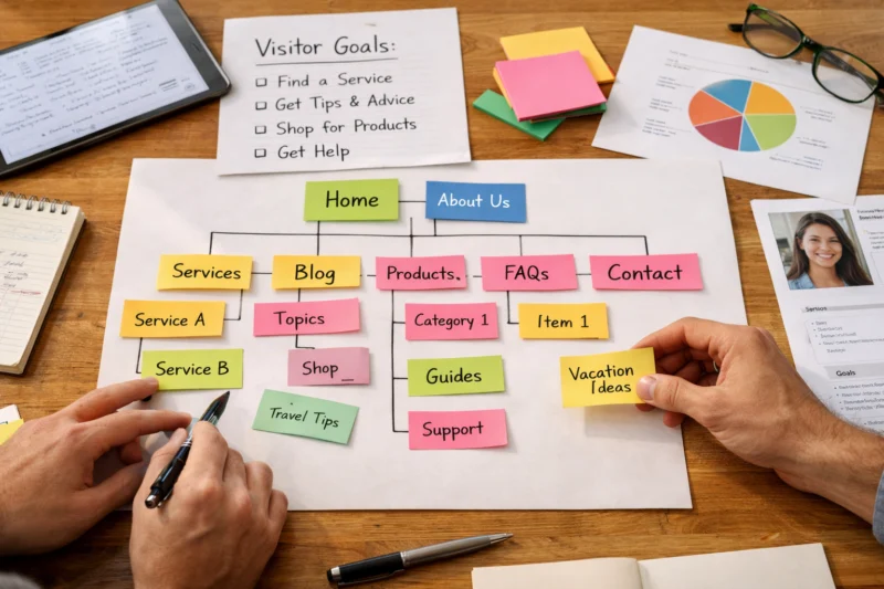
Build a workflow that matches how teams actually ship. First audit current navigation using both qualitative and quantitative signals. Look for confusion patterns like backtracking after a click, low engagement on key sections, and “dead end” items that lead nowhere useful. Then create hypotheses, such as “Users cannot find guides because the label is unclear” or “Submenus are too deep for first-time visitors.”
Next prototype and test before broad rollout. Usability sessions are valuable because navigation problems show up fast. Tree testing can also reveal whether your information architecture makes sense without UI polish. For keyboard and screen reader support, run targeted accessibility checks in real browsers instead of assuming.
Measure with instrumentation that reflects intent. Track navigation CTR by menu item, but pair it with outcomes like scroll depth after the click, time to first meaningful action on the destination, and abandonment points. If CTR increases while engagement drops, you likely improved discoverability but weakened destination expectation. That mismatch often comes from labels that sound similar but lead to different content.
A deeper nuance is setting thresholds for changes without causing constant menu churn. For example, decide in advance when you will simplify top-level categories versus when you will add a new grouped entry. If you allow every request to change the menu, users lose orientation each release.
Real-world scenario: a SaaS site changes “Integrations” to “Connectors.” Clicks might rise because the new label feels broader, but users may land on a page that does not match their expectations. Track back clicks and time-to-success to catch this fast.
For additional context on measuring user interactions and improving experience design, resources from Nielsen Norman Group usability heuristics can help teams frame navigation decisions as usability tradeoffs.
Many navigation problems do not look broken. They look “mostly fine,” but they still reduce engagement through confusion, inconsistency, or mismatched expectations.
Start with the classic structural issues. Too many top-level items dilute priority and force users to scan rather than choose. Unclear labels create ambiguity, especially for first-time visitors. Dead-end items waste attention if they point to irrelevant pages, outdated content, or temporary landing screens.
Then inspect interaction behavior. Hover-only menus fail on touch and can trap keyboard users. Submenu timing matters too: menus that close too quickly frustrate people who move carefully. Inconsistent open and close behavior also breaks trust, because users cannot predict what will happen when they try again.
Check alignment between navigation and page hierarchy. If your menu category implies a topic but the destination focuses on something else, users feel misled. Outdated links often come from CMS changes and editorial updates, which can create orphaned categories that no longer map to content.
A deeper insight is organizational mismatch. When navigation reflects internal org charts instead of user goals, it creates social proof failure. Users think, “This site is built for employees, not for me,” and exit even if the content exists. Fix it by using goal-based labels and grouping that mirrors how users search within your domain.
Edge cases can be the real engagement killers. Localization can change label length and push items into awkward wrapping layouts. Account states can hide or reorder important links, which confuses returning users if changes are unpredictable. Multi-brand sites can also create navigation drift if shared templates do not align naming across brands.
A common misconception is that small label changes do not matter. They matter because users scan quickly and decide in moments. If “Support” becomes “Help Center” without the same content promise, the click can increase but engagement can fall.
When you audit, record each issue with an expected user impact. That makes it easier to justify fixes beyond subjective opinions and helps prioritize the highest engagement gains.
You do not need one “best” navigation approach. You need a standard that fits your content volume and user tasks, then a consistent set of rules for scaling.
A simple single-level menu plus internal search works when users do not need to browse deeply from the header. Categorized dropdown menus help when you have a limited number of sections that benefit from quick scanning. Mega menus fit dense catalogs where users compare categories and need summaries to choose efficiently.
Persistent side navigation often suits product-like experiences where users repeatedly switch between sections. It reduces repeated menu discovery and can support sustained engagement. The tradeoff is that side navigation can dominate screen space and feel heavy on smaller devices.
Hybrid strategies often win in 2026. For example, use a mega menu on desktop for scanning, but simplify to grouped drawer sections on mobile to preserve readability. The key is parity: users should reach equivalent content paths, even if the presentation changes. If desktop shows “Guides” but mobile hides it behind “Resources,” you teach different mental models.
Implementation complexity matters for governance. A mega menu with multiple content summaries requires stronger CMS discipline and template rules. Side navigation requires stable page routing so links do not break when new routes appear.
You can use the following comparison to decide what to standardize. Assign each pattern a “best use” and “avoid use” rule so new requests stay consistent.
| Pattern | Best when | Engagement strengths | Main limitation |
|---|---|---|---|
| Single-level header | Few top destinations | Fast choices, low clutter | Weak for deep catalogs |
| Categorized dropdown | Moderate section count | Clear grouping and quick access | Can grow into clutter |
| Mega menu | High content density | Scan-friendly discovery | Requires careful labeling and testing |
| Persistent side navigation | Frequent section switching | Stable orientation and repeat access | Space cost on mobile |
A common mistake is to decide based only on aesthetics or stakeholder preference. Decide using content volume, user familiarity, and task complexity. If you standardize without measuring, you may lock in a pattern that boosts clicks but hurts task success.
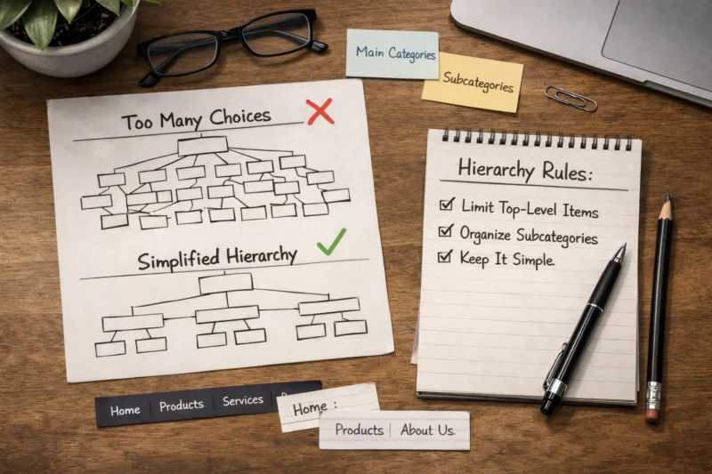
Navigation fails over time when it cannot keep up with content change. Scaling means governance, link continuity, and predictable behavior when content and routes evolve.
Start with ownership. Assign clear responsibility for the menu, including who approves new items and who cleans up outdated ones. Without governance, requests stack up and the menu becomes a list of internal priorities rather than user goals. Create a review cadence, such as a quarterly trim, and require justification based on user needs.
Next, handle naming and sunset policies. When content changes, keep navigation labels stable if the user intent stays the same. If you must rename, map the old label to the new destination and ensure search behavior aligns. Use redirects so users do not hit broken paths, and keep internal destination links consistent to avoid disorientation.
Dynamic navigation is another scaling concern. Account-based menus should change predictably between logged-in and logged-out states. If the menu structure shifts dramatically based on user status, users can feel lost. A safe approach is to keep the same top-level items while swapping only the utility link destinations.
A deeper insight is multi-path redundancy. Sometimes multiple menu routes lead to the same destination, like “Docs” and “Guides” both pointing to documentation overview content. This can reduce confusion, but it can also create ambiguity if destinations differ subtly. Also consider search engines and analytics consistency by keeping canonical navigation cues and tracking events consistently.
In 2026, many teams use modern front-end routing and CMS-driven navigation, so regressions can happen after refactors. Add accessibility regression testing in your CI workflow and verify keyboard flows still behave correctly. Also confirm analytics events still map to the correct menu interactions after structural changes.
Edge case scenario: a multilingual site expands content and translations lengthen menu labels. If your responsive rules are brittle, the menu may wrap unpredictably and hide submenu triggers. Build flexible layouts and test in real translations so engagement does not drop after localization updates.
There is no single perfect number, but many sites perform well with a small set of top-level choices that cover primary tasks. Use analytics to identify which items get meaningful engagement and which ones users rarely select. If you have many sections, group them into fewer top-level categories or move secondary paths into submenus or search.
A practical approach is to measure task success after menu clicks. If users click an item but abandon quickly, reducing top-level items alone may not fix the underlying label-to-destination mismatch. Start with simplification where label clarity and hierarchy are weakest, then validate changes with user testing.
Structure submenus around clear user intents and keep depth shallow when possible. A good pattern is one level for broad subtopics and a second level only for truly distinct choices. If users need to compare many items, consider a mega menu or a category index page instead of deep nested trees.
Label categories so users know what they will find, not how your internal team organizes content. Then test the menu with keyboard navigation to confirm users can expand, understand, and collapse submenus without getting trapped.
Use descriptive labels when clarity matters most for first-time visitors. Short brand terms can work only if users already recognize them or if they are paired with clear context on hover or via accessible helper text. When brand terms replace intent-based labels, misclicks increase and engagement can drop even if CTR looks healthy.
Test both versions by running first-click tests and checking backtracking rates. If users repeatedly choose the wrong item and return, the label likely fails to set expectations for the destination content.
Use a mix of metrics that reflect outcomes, not just attention. Track task success signals like time to first meaningful action, scroll depth after the click, and whether users reach a key page within a few steps. Also watch for pogo-sticking by measuring back clicks soon after selecting a menu item.
Pair quantitative instrumentation with usability sessions. Users often explain confusion that analytics cannot reveal, such as unclear labels or surprising destination behavior. This helps you avoid false positives where clicks rise but engagement declines.
Common failures include missing visible focus states, hover-only submenu triggers, and inconsistent focus management in drawers or overlays. Another issue is state communication, where expanded and collapsed controls are not announced to screen readers. These problems can make navigation feel unreliable and cause immediate abandonment.
Test with keyboard-only navigation and at least one screen reader workflow. Then verify that nested navigation does not repeatedly announce the same parent state on every focus move.
Keep the item ordering consistent with desktop where possible, and ensure the mobile menu presents equivalent destinations. Use clear section groupings inside the drawer so users can scan quickly and find primary tasks without excessive tapping. Also provide strong active states so users can tell where they are.
Focus management is essential on mobile. When the drawer opens, move focus into the menu, and return focus to the trigger when it closes. This prevents users from getting lost and supports continued engagement.
Switch to a mega menu when you have enough related content that users need to scan and compare categories quickly. A mega menu is also helpful when users frequently choose between multiple subtopics from the header. If your dropdown contains many items, users spend too long deciding and may abandon.
Use a content-density threshold that reflects actual needs. If submenu items exceed what most users can reasonably scan in seconds, a mega menu with structured columns and short summaries can improve discovery.
Use governance and a review process tied to content releases. Require approvals for menu changes and define a naming policy so labels stay consistent even when the underlying pages update. Also use redirects and link continuity checks when routes change to prevent dead ends.
In 2026 workflows, automation can help but should not replace QA. Add regression checks that verify navigation items still resolve to the correct destinations after CMS updates and front-end routing changes.
This often happens when labels create expectation gaps. For example, “Guides” might lead to marketing pages, while users expected documentation, reducing engagement even though the click was successful. It can also happen when the destination is difficult to scan or lacks an immediate next step once users arrive.
Fix the mismatch by aligning navigation intent with page outcomes and by ensuring the destination clearly confirms it matches the selected label within the first screen. Then validate using engagement-after-click metrics.
Keep the navigation structure familiar and change only the utility items that depend on login state, such as account and saved items. Users should not experience major shifts in top-level categories just because they sign in. Predictability reduces disorientation and supports engagement.
Define boundaries for personalization so the menu never hides essential entry points. If logged-in users see extra tools, place them as secondary items and ensure the main pathways remain consistent for task-starting behavior.
Strong navigation boosts user engagement by aligning menu choices with how people think, browse, and complete tasks. When you map user goals to structure, select the right pattern for your content and screens, and reduce decision friction with clear labels and hierarchy, clicks turn into meaningful outcomes.
Design for accessibility so keyboard and screen reader users can navigate confidently. Then validate changes with metrics that reflect task success, backtracking, and engagement after the click. In 2026, the navigation system must also stay reliable through responsive layouts, modern routing, and CMS-driven updates.
Your next step is practical: audit your current menu with real users and assistive tech, then prototype one improvement with instrumentation before expanding changes broadly. Treat navigation as a living UX system, not a one-time artifact. If you do that, your Navigation Menu Design Best Practices will keep working as your site grows.
Updated September 2026