

Readers want a clear, predictable way to move through a site or app and reach the right place fast. That is the aim of user-friendly navigation design, and you can achieve it through concrete choices about labels, structure, and feedback. When navigation works, users waste less effort guessing and backtracking. They also feel confident because each click has a clear meaning. In 2026-era experiences, this must work on mobile-first layouts, with accessibility needs built in, and across complex information.
Contents
- 1 Define user-friendly navigation design outcomes you can measure
- 2 Map navigation to how people think: structure, labels, and hierarchy
- 3 Use a decision path to audit, prototype, test, and validate navigation
- 4 Prevent frustration by avoiding common navigation mistakes that hide clarity
- 5 Choose navigation patterns that fit intent: global menus, local navigation, search, and hybrids
- 6 Design for complex content and edge cases without losing clarity
- 7 Keep navigation consistent as your site grows: governance, measurement, and navigation debt
- 8 Frequently asked questions about user-friendly navigation design
- 8.1 What makes a navigation menu feel intuitive to first-time visitors?
- 8.2 How do I choose between breadcrumbs and a side navigation pattern?
- 8.3 What should I do when users can’t find the exact page they need?
- 8.4 How many top-level menu items are too many for user-friendly navigation design?
- 8.5 What are the most effective ways to test navigation before launch?
- 8.6 How can I improve navigation accessibility for keyboard and screen reader users?
- 8.7 Should I prioritize a simple menu or a feature-complete menu for complex websites?
- 8.8 How do I prevent navigation from confusing users across mobile and desktop layouts?
- 8.9 What if my site uses categories, tags, and filters—how do I avoid navigation redundancy?
- 8.10 How do I redesign navigation without breaking SEO and user workflows?
- 9 Wrap up by creating a navigation system you can improve continuously
User-friendly navigation design is not a “nice menu” goal. It is a set of outcomes that reduce confusion and effort while improving findability. The practical outcome is that people can locate what they need, understand where each link goes, and complete their task with fewer steps.
Start by thinking in three measurable outcomes: findability, comprehension, and efficiency. Findability means users can locate relevant sections from global entry points like headers and sidebars. Comprehension means users can predict what they will get after clicking each item. Efficiency means users reach the right page or feature with minimal wrong turns.
Navigation is also a system, not a single component. Information architecture, labeling, interaction patterns, hierarchy, and feedback all work together. If one part fails, users compensate by scanning more, trying more clicks, or using back and browser history. You can also track navigation error rate indirectly through repeated backtracking and “rage taps” on mobile.
One nuance is that “easy” can conflict with “discoverable.” Too much structure hides options and slows exploration. Too little structure forces users to search for meaning, which increases decision load. The goal is balanced mental effort: users should not need to learn your navigation before it works.
In real-world scenarios, a first-time visitor expects broad guidance. A returning visitor often wants fast paths to specific pages. Both groups benefit from consistent labels and predictable placement, but they experience navigation differently. Consider adding lightweight directions like breadcrumbs on deeper pages, so users do not feel lost inside nested content.
Common success metrics include task completion rate, navigation error rate, and time-to-content as a directional signal. Time-to-content alone can mislead, though. A long reading page can inflate time without reflecting navigation failure. Use it with behavioral clues like exit points from navigation-heavy screens.
If you have an accessibility audience, outcomes must include non-visual navigation too. Keyboard reachability and clear focus states are part of “efficiency,” because blocked navigation forces extra effort. You can ground these practices in established guidance like the W3C’s accessibility approach for keyboard and focus behavior in interactive components, as described by W3C Web Accessibility Initiative (WAI) and W3C ARIA Authoring Practices.
People do not browse menus as pure lists. They scan for cues that match their mental model and then commit to a direction. You improve user-friendly navigation design by aligning structure and labels with how users categorize information in their own language.
Hierarchy choices strongly shape that alignment. Global navigation works best for stable, top-level paths that represent major intent areas. Local navigation supports deeper decisions inside a section, like switching between related pages or sub-features. Depth affects memory and scanning: deeper systems can feel powerful, but they increase the need for users to track where they are.
Labeling is where comprehension is won or lost. Use plain language and consistent terminology. Avoid internal jargon, department names, or clever metaphors that require decoding. Aim for labels that describe outcomes, not internal systems. For example, “Billing history” communicates intent better than “AR portal exports.”
Navigation patterns should match content type. Use categories for broad topic entry, filters for faceted exploration, and breadcrumbs for nested orientation. Tags and filters work differently: tags help browsing by attributes, while filters help refine. If you mix them without explanation, users may click expecting refinement and instead jump to a new list.
Where content belongs matters for duplicates and ownership boundaries. Cross-category items often create “same thing, different URL” confusion. Decide whether one destination is canonical, then route other paths through it. If you must keep multiple views, make the differences obvious through sublabels or short supporting text.
Label ambiguity is a frequent edge case. A label might represent both a feature and a learning resource, like “Templates” for documents and templates for onboarding. Mitigate with grouping, sublabels, or separate destinations that clearly state the difference. You can also reduce ambiguity by placing the more common intent first in a menu group.
A common misconception is that users only need accurate destinations. They also need accurate expectations. The best labels reduce “information scent” so users can predict what happens after clicking. If your category pages look similar, add contextual cues like counts, “most popular” indicators, or a clear summary sentence.

Great navigation does not appear from guesswork. A decision path helps you connect user needs to layout changes and evidence. Follow a simple flow: audit what you have, map tasks to structure, prototype states, test with users, and iterate with data.
Begin with a navigation audit. Review top entry points and exit points across header, sidebar, menus, and in-content links. Look for “broken expectations,” such as labels that lead to unexpected content types. Also check interaction consistency: does the same concept appear with different names in different templates?
Next, identify user tasks. Choose a small set of real goals like “compare plans,” “view order status,” or “find a help article by topic.” Then map information architecture to tasks using the labels and hierarchy. If tasks do not fit cleanly, your labels and structure will likely fail comprehension tests.
Prototype more than the menu shape. You need to test hover, focus, and expanded states. Prototype mobile behavior too, including collapsed menus, large tap targets, and scroll behavior under sticky headers. Also include empty and error states, since “nothing to show” is a common real-world outcome after filters or permissions change.
Validation methods should include both understanding and behavior. Quick card sorting can validate broad categories and label grouping. Usability tests confirm comprehension and highlight where users hesitate or misclick. Analytics help after launch by showing where users stall, bounce, or repeat navigation attempts.
Accessibility should be tested early, not at the end. Check keyboard navigation paths, focus order, and visible focus states for active items. For assistive technology, verify that expanded and collapsed states are announced correctly. Guidance on interactive controls and ARIA patterns can be found in W3C ARIA Authoring Practices.
A deeper insight is to “test against failure.” Users do not always land in ideal flows. Evaluate confused paths such as missing permissions, expired sessions, blocked actions, or no-results states. For example, when a user lacks access, replace dead ends with clear next steps like “request access” or “browse public resources.”
One practical tradeoff is time versus coverage. You can run faster tests by focusing on your top navigation routes. But do not skip accessibility checks for keyboard and screen readers, since these issues can block entire user groups from completing tasks.
Navigation mistakes often look small, but they create big frustration. When users cannot predict outcomes, they waste effort clicking, backtracking, and switching strategies. Fixing these issues is one of the fastest ways to improve user-friendly navigation design without redesigning everything.
Vague labels are a top failure point. If “Resources” could mean guides, documentation, webinars, or downloads, users hesitate. Inconsistent naming across pages also breaks comprehension. For instance, a concept named “Support” in the header but “Help” in article pages forces extra scanning and undermines trust.
Overcrowded menus reduce scan ability. Mega menus can work, but only when items are grouped, prioritized, and scannable. If you list too many options without visual structure, users cannot find anything quickly. A good rule is to design for the first decision, then reveal depth only when needed.
Interaction issues create hidden traps. Missing clear active states makes it hard to tell where the user currently is. Hover-only controls fail on touch devices and can break for keyboard users. Also avoid confusing back behavior, like content that changes without updating the breadcrumb or current menu state.
Information scent problems matter on category pages. If category pages look identical except for a name, users cannot infer what they will get. Add summary text that describes the content type, range, or key differences. Also ensure that sorting and filtering UI uses consistent labels across pages.
Accessibility oversights can be severe. Focus traps that trap users in an open menu block keyboard flow. Non-semantic markup can cause screen readers to announce controls incorrectly. Dynamically updated menus can also confuse screen readers if state changes are not announced properly.
A nuance many teams miss is the “power user versus novice” mismatch. A dense mega menu may work for returning users who already know what they want. New visitors still need simpler entry points and clear orientation. Use progressive disclosure so novices can find basics without wading through everything.
Common misconception: “If it works in Chrome with a mouse, it is done.” True navigation quality includes keyboard parity, screen reader announcements, and touch behavior. Use standards-oriented checks so your navigation behavior matches what assistive technologies expect, supported by W3C Web Accessibility Initiative (WAI).
You can make navigation intuitive by matching the pattern to user intent and content depth. Global menus support broad decisions, while local navigation helps within a section. Search supports discovery when users cannot guess where something belongs.
Start with global navigation. Use top-level items for primary tasks and stable sections. If you have side navigation, it often works well on desktop for deep tools, because it keeps context visible while users switch between related pages. Hamburger and collapsible patterns can save space on mobile, but they must preserve discoverability and provide clear active states.
Breadcrumbs help users maintain orientation, especially on nested pages. Tabbed navigation can work for a clear set of views that are mutually exclusive, like “Overview” versus “Details.” In-page anchors help for long pages when users need to jump within a single document.
Search should not replace navigation when content can be categorized. Use search when your dataset is large, frequently updated, or hard to categorize. For example, help centers with many articles benefit from search because topics overlap and users often remember exact phrases. Integrate search without removing browsing by letting users switch between “Browse” and “Search results” with consistent filters and labels.
Hybrids are usually best when you carefully scope each system. A common hybrid strategy is simple global navigation plus breadcrumbs and local navigation for depth. You can also combine category entry points with filters once users land in a list.
One nuance is the “two systems” risk. If menu categories, search filters, and sorting use different label vocabularies, users feel like they are in two different products. Keep labels consistent across systems, and ensure results language stays aligned. For instance, use the same term for “Articles” across menu items, search result tabs, and filter chips.
Here is a practical comparison table you can use to decide quickly:
| Pattern | Best-fit scenarios | Tradeoffs | Accessibility considerations |
|---|---|---|---|
| Global menu | Stable top-level tasks; mobile and desktop entry | Limited space; can hide depth | Ensure focus order and clear active states |
| Side navigation | Desktop tools and multi-page workflows | Harder on small screens | Support keyboard navigation and visible focus |
| Hamburger/collapsible | Mobile-first layouts | Reduced scan ability without good labeling | Use semantic controls and announce expanded state |
| Breadcrumbs | Nested pages; orientation in deep hierarchies | Not enough for broad discovery | Make each crumb a clear, focusable element |
| Search | Large or hard-to-categorize content | Users may ignore browsing | Provide accessible results updates and focus |
| Local navigation (section tabs/links) | Within a topic; mutually related pages | Can multiply choices if overused | Use correct roles and keyboard interaction |
Design for complex content and edge cases without losing clarity
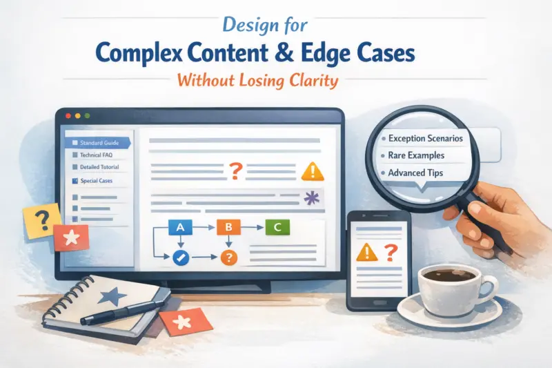
Complex sites fail when navigation breaks under real constraints. You need to handle multi-level hierarchies, multi-product layouts, and permissioned content without creating dead ends. User-friendly navigation design must still guide people when content changes or options disappear.
For multi-level hierarchies, keep global navigation shallow and rely on local navigation and breadcrumbs for depth. When you use deep trees, ensure users can always return to a safe parent state. Use clear progression cues like section headings and consistent grouping, so orientation survives page transitions.
Multi-brand or multi-product sites face duplication risks. The same concept may appear under different brands, and users can interpret this as different offerings. Make ownership boundaries clear by using consistent labels and adding small sublabels that explain the relationship, like “Brand A plans” versus “Brand B plans.” When possible, route to canonical pages and avoid duplicate navigation paths.
Multilingual navigation introduces another edge case: labels must not be translated into unfamiliar terms. Also watch for layout differences that change how many items fit on screen. Validate that keyboard and screen reader flows remain correct across languages, since longer strings can change focus order if components are not designed responsively.
Role-based visibility can cause dead ends. If users cannot access a destination, remove the link or replace it with a clear explanation. Provide alternative pathways like a public summary page or a request workflow, so users never end in a broken state. Communicate the “why” in simple language, and keep next steps visible.
Mega menus can handle complexity, but they must stay scannable. Limit the number of top-level groups, prioritize the most common tasks, and avoid “everything everywhere” sprawl. Ensure keyboard and screen reader users can reach the same options in the same order.
Mobile edge cases deserve special attention. Thumb reach affects tap targets and spacing, especially in collapsed headers. Sticky headers can preserve orientation, but they can also reduce content space and hide the context of deeper navigation. Test both scroll and orientation behaviors so users do not feel trapped behind the menu.
Empty results and personalization can also break navigation clarity. If a user applies filters and gets no results, show next steps like suggested filters, a “clear filters” action, or related categories. For recently viewed items, ensure they do not become a confusing maze. Keep personalization optional and always provide a fallback browse path.
Navigation consistency is a long-term discipline, not a one-time launch task. As teams add pages and features, labels drift and hierarchy gets messy. Governance helps you prevent that drift and preserve user-friendly navigation design over time.
Set navigation guidelines that cover label standards, ordering rules, and placement for primary actions. Include a review workflow when new pages launch. For example, if a new feature becomes a top task, you may need to adjust global navigation and update local navigation patterns across templates.
Consistency across templates matters because users move between layouts. If the same concept is labeled differently on one template, users notice quickly. Predictable placement of key destinations reduces the cognitive cost of switching contexts. This is especially important for responsive layouts where the same navigation idea may render as a sidebar on desktop and a collapsed menu on mobile.
Taxonomy drift is a common growth problem. Over time, multiple categories can represent the same intent, or tags multiply without clear usage rules. Periodically audit content relationships and merge redundant categories where it makes sense. When URLs change, preserve redirect integrity for key pathways so users and search indexing continue to work.
Measurement should guide iteration safely. Track events that signal hesitation, like repeated menu openings or navigation error patterns. Use baselines before and after changes, then validate that improvements do not harm other tasks. This is particularly important when you adjust IA, labels, or breadcrumb logic.
A deeper insight is “navigation debt.” Small inconsistencies compound because users rely on patterns to build expectations. Prioritize fixes by severity, frequency, and impact on core tasks. A broken path for a top task can outweigh many minor inconsistencies elsewhere.
In practice, many teams run quarterly navigation reviews with a short checklist. Include label consistency, template parity, accessibility checks, and IA health like orphan pages or duplicate categories. If you maintain that cadence, navigation stays aligned with user mental models even as your site evolves.
Intuitive menus use plain labels that match what users already call things. They also show a clear hierarchy so users can predict what each level means. Include context like category summaries and keep destination types consistent. Then confirm comprehension with short usability tests that ask users what they expect to find after each click.
Breadcrumbs work best for orientation inside nested pages. Side navigation works best when users need to compare or switch between several related screens while staying on the same broader topic. If your content depth is high and users need a stable context, side navigation often reduces backtracking. If your depth is moderate and users need to know “where am I,” breadcrumbs usually fit better.
What should I do when users can’t find the exact page they need?
First, improve information scent by aligning labels with user wording and content type. Then add pathways that close gaps, like a related pages section, category entry points, or a clearer local navigation view. If the site is large or hard to categorize, add search and make filters consistent with browsing. Also design empty or error states that offer next steps instead of dead ends.
There is no single magic number, but you should validate based on scanning ability and device constraints. If items wrap, reduce tap target size, or force heavy cognitive scanning on mobile, the menu is likely too crowded. Use task counts and test with first-time visitors to see whether users find primary destinations quickly. When needed, group items logically and move less critical choices into local navigation.
Use a combination of card sorting, prototype usability tests, and accessibility checks. Card sorting helps validate category structure and label grouping. Prototype tests reveal whether users understand destinations and can complete key tasks with few wrong clicks. For accessibility, test keyboard navigation, focus order, and screen reader announcements for expanded or collapsed controls.
Use semantic landmarks and ensure menus and expandable sections expose state changes correctly. Make focus order logical and keep focus visible on every interactive element. Avoid hover-only interaction and make expanded menus reachable without a mouse. For screen readers, verify that expanded or collapsed regions are announced and that results updates do not hide content silently.
Prioritize a simple first decision for novices, then reveal depth through local navigation and contextual links. A feature-complete menu can overwhelm new users and increase misclicks. Use progressive disclosure so advanced options appear when users signal that intent. For complex sites, keep global navigation focused on top tasks and move the rest into section-based navigation.
Keep labels consistent and avoid changing the meaning of menu items between breakpoints. Ensure interaction parity by supporting keyboard and touch access to the same controls. Maintain orientation with stable elements like breadcrumbs or clear active states. Then test the same tasks on both form factors to confirm that users do not need new navigation “rules” on mobile.
Clarify the role of each system so users know what each one does. Categories usually represent broad ownership, tags represent descriptive attributes, and filters refine lists based on selected criteria. Align terminology across all navigation methods and keep results language consistent. If duplicates exist, consolidate pathways and ensure users can understand how to switch from browsing to filtering.
Preserve key URLs with redirects when you change destinations. Keep the primary pathways stable when possible, especially for top tasks that users and search results rely on. Validate the new navigation with analytics after launch to ensure task completion and exit behavior do not degrade. Also monitor for broken access patterns, like links that now point to different content types.
User-friendly navigation design succeeds when users can find what they need, predict what links do, and complete tasks with minimal wrong turns. You get there by defining outcomes, aligning structure and labels with user mental models, and designing feedback that reduces uncertainty. You also avoid clarity-killers like vague naming, inconsistent hierarchy, hover-only controls, and dead ends.
Good navigation is a series of choices matched to context. Use global navigation for top tasks, local navigation and breadcrumbs for depth, and search for discovery when categorization is hard. Then handle complexity and edge cases like no-results states, permissioned content, and mobile orientation so navigation stays trustworthy.
The most reliable approach is iterative: audit → prototype → test → measure → improve. Include accessibility checks and “test against failure” from the start, since real confusion rarely happens in perfect flows. Run a targeted navigation audit now, then compare two design options using task completion, error patterns, and comprehension signals, before you roll changes out.
Updated September 2026