The Ultimate Guide to Web Design: Creating a Site that Engages and Converts
Contents
- 1 The Ultimate Guide to Web Design: Creating a Site that Engages and Converts
In today’s digital age, having a visually appealing and well-functioning website is crucial for establishing an online presence. Whether you’re a small business, an entrepreneur, or a creative professional, your website serves as the face of your brand and can significantly impact how your audience perceives you. But what goes into designing an effective website, and how do you ensure it converts visitors into loyal customers? This guide will delve into the essential aspects of web design, from aesthetics and usability to optimizing for search engines, responsive design, and incorporating the latest trends like dark mode web design.
What is Web Design?
At its core, web design is the process of creating and arranging visual elements to craft a cohesive and engaging website. It encompasses various disciplines, including user experience design (UX), user interface design (UI), graphic design, and web development. While the visual design is critical, effective web design also considers how a site functions, responds, and communicates information.
Key Principles of Web Design
To design a successful website, you must balance both form and function. This balance involves understanding the fundamental principles that shape user perception and behavior. Let’s explore the core principles:
- Visual Hierarchy: Arrange elements like headers, images, and text blocks to guide users’ attention and create a logical flow.
- Consistency: Maintain consistent colors, fonts, and layout throughout the site to reinforce branding and familiarity.
- White Space: Use empty space around content and visual elements to enhance readability and focus.
- Mobile-First Design: Optimize your site’s design and layout for mobile devices first, ensuring a smooth experience across all screen sizes.
User Experience Design (UX)
User experience design (UX) is the practice of creating websites that offer a positive and intuitive experience. A good UX design makes it easy for users to find information, complete tasks, and navigate through the website seamlessly.
An essential aspect of UX design is navigation design. Users should easily locate important sections like products, services, and contact pages. Implementing hamburger menus or drop-down menus can streamline navigation, especially for mobile visitors.
- User Journey Mapping: Outline the steps users will take on your site. Each page should have a specific goal, whether it’s making a purchase, signing up for a newsletter, or reading a blog post.
- Call to Action (CTA) Buttons: Effective CTAs should stand out visually and use action-oriented language like “Get Started” or “Sign Up Today.”
Wireframing and Prototyping
Before diving into full-fledged development, start with wireframing and prototyping. Wireframes are simple sketches that outline the structure and layout of a website. Prototypes are interactive models that simulate user interactions, providing a clearer picture of the final product.
User Interface Design (UI)
User interface design (UI) focuses on the visual aspects, such as colors, fonts, images, and buttons. The UI should complement the overall aesthetic of your brand while making navigation intuitive and pleasant.
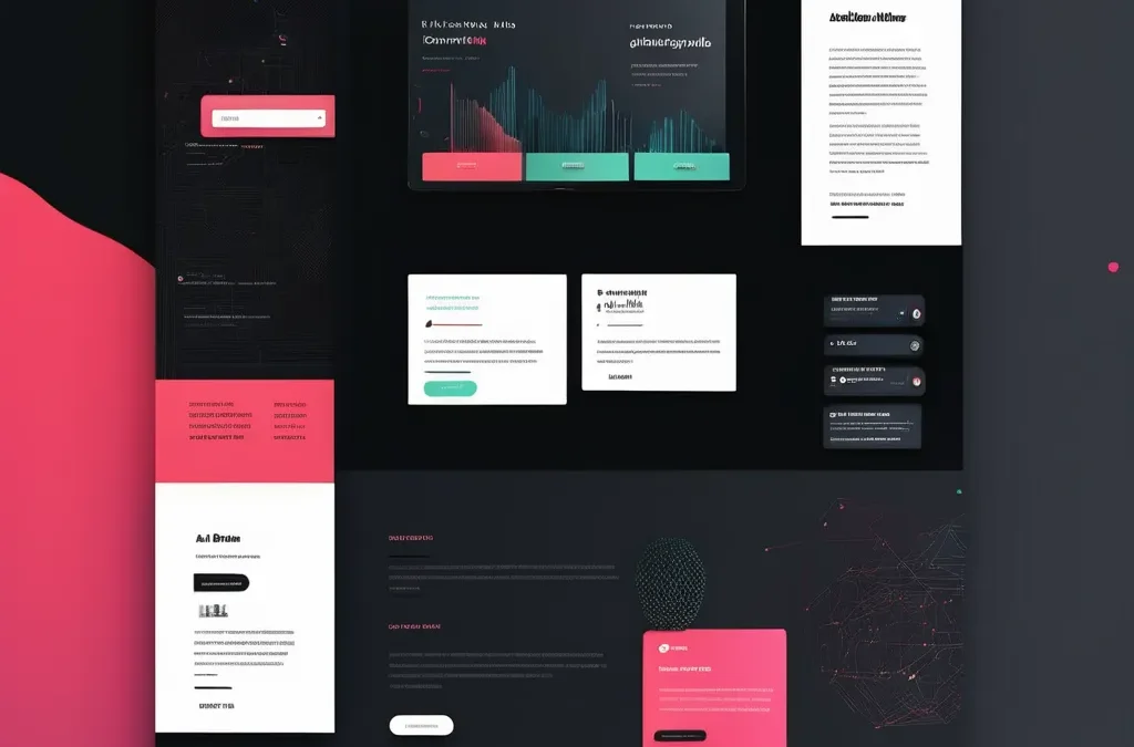
Incorporating Dark Theme Web Design
One of the biggest trends in UI design is the adoption of dark theme web design. A night mode website or dark mode CSS style uses a dark background with lighter text and other design elements, creating a visually striking contrast. Dark mode user experience is not only stylish but also reduces eye strain, making it an increasingly popular option among users.
Benefits of Using Dark Mode:
- Improved Accessibility in Dark Mode: For visually impaired users, a high contrast dark mode can make text and elements more readable.
- Energy Efficiency: Dark mode designs can save battery life on OLED screens, making your site more user-friendly for mobile users.
Dark Mode Best Practices
When incorporating a dark mode color palette, choose colors that maintain readability and avoid using overly bright shades that can create discomfort. Here are a few dark mode design tips to ensure your website looks professional and functions well:
- Use high contrast text to maintain readability.
- Keep backgrounds muted and avoid pure black, as it can cause visual discomfort.
- Implement a toggle dark mode feature, allowing users to switch between light and dark themes easily.
Choosing the Right Color Palette and Fonts
Colors and typography can impact a user’s perception and behavior. For instance, using warm colors like red or orange can create a sense of urgency, which is great for conversion rate optimization (CRO), while cool colors like blue and green convey trustworthiness and calmness.
- Color Theory in Web Design: Understand how contrasting colors can be used to highlight important elements like CTA buttons.
- Typography in Web Design: Use fonts that are legible and consistent across all devices. Avoid using more than three different fonts to prevent clutter.
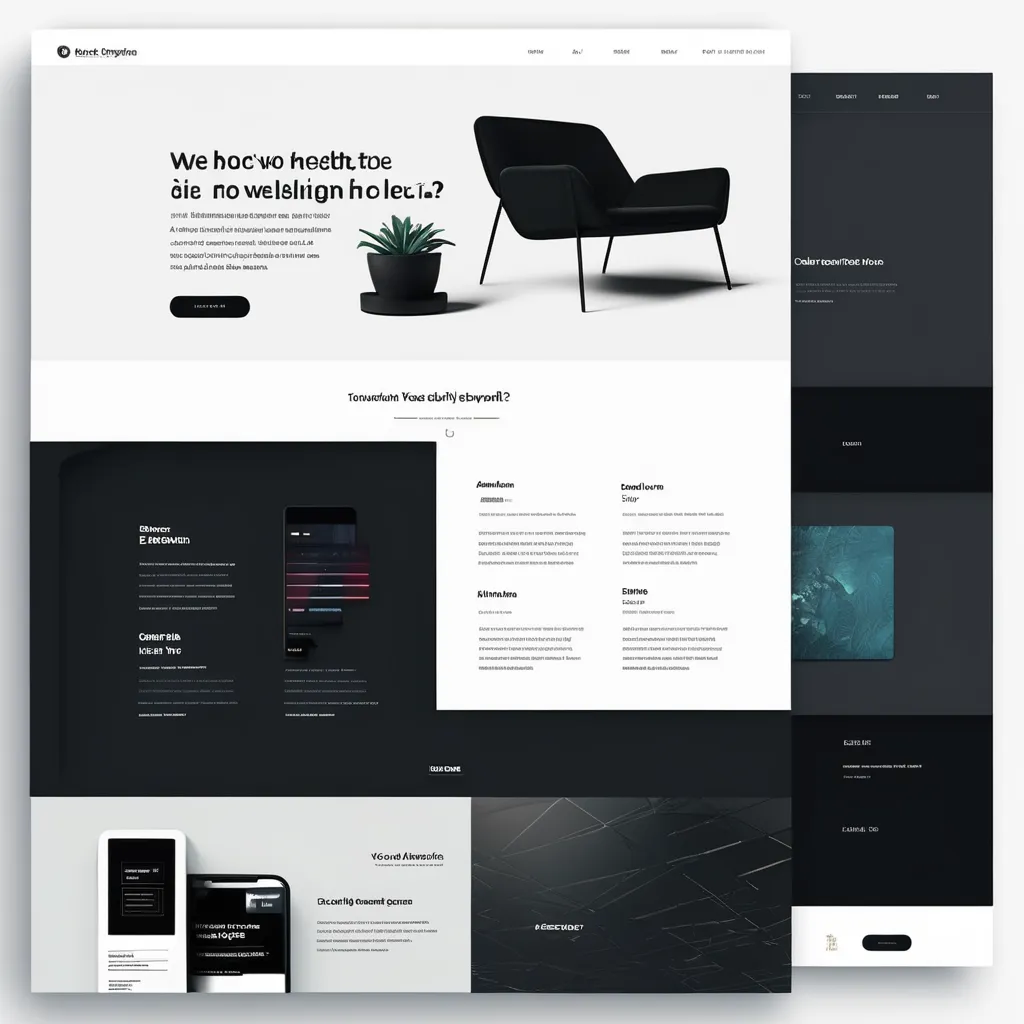
Responsive Web Design
With over half of all web traffic coming from mobile devices, having a responsive web design is a necessity. Responsive design ensures your site looks and functions well on every device, whether it’s a smartphone, tablet, or desktop.
Responsive Dark Mode Integration
Incorporating responsive dark mode into your design strategy ensures that your dark mode looks great on all devices. This involves using media queries to set different styles for light and dark modes and ensuring your dark mode CSS is optimized for various screen sizes.
The Importance of Mobile-First Design
A mobile-first design approach prioritizes the mobile version of a website before scaling up for larger screens. This strategy involves using flexible grids, media queries, and responsive images to adapt to different devices.
- Cross-browser Compatibility: Ensure your design performs consistently across various browsers, such as Chrome, Firefox, and Safari.
- Scalability in Web Design: Your site should accommodate future growth, whether it’s adding new features or handling increased traffic.
SEO Web Design: Optimizing for Search Engines
A well-designed website is more than just visually appealing; it should also be optimized for search engines. SEO web design involves implementing strategies that help your site rank higher in search engine results.
On-Page SEO Elements
- Schema Markup: Add structured data to your site to enhance its visibility in search engines and display rich results.
- Image Optimization for SEO: Compress images to reduce load times and use descriptive alt text for accessibility.
- Title Tags and Meta Descriptions: Craft compelling title tags and meta descriptions that include primary and LSI keywords.
Creating SEO-Friendly Content
Content is king when it comes to SEO. Use NLP keywords naturally throughout your content to improve your site’s relevance and context. Break up long paragraphs with subheadings, bullet points, and lists to enhance readability.
- Long-Form Content: Articles that exceed 1500 words are more likely to rank higher, as they provide comprehensive information on a topic.
- Internal Linking: Link to other pages on your site to establish a strong internal link structure, guiding users to related content.
Dark Mode Web Design
Conversion Rate Optimization (CRO)
Once visitors land on your site, your goal is to convert them into leads or customers. This process is known as conversion rate optimization (CRO), and it involves strategically placing CTAs, building trust, and reducing friction.
Key Elements of CRO:
- Landing Page Optimization: Design landing pages that focus on a single goal, such as signing up for a newsletter or purchasing a product.
- A/B Testing: Use split testing to compare different versions of a page to see which performs better.
- Visual Design Principles: Leverage visual elements like arrows or color contrast to direct attention to key CTAs.
Web Design Trends to Watch
The world of web design is always evolving. Staying up-to-date with the latest web design trends can keep your site looking fresh and modern:
- Dark Mode Design: Popular for its sleek appearance and reduced eye strain.
- Asymmetric Layouts: Break away from traditional grid patterns for a more dynamic look.
- Full-width Hero Images: Use large, immersive images at the top of your homepage to grab attention.
- Interactive Storytelling: Engage users with narratives that unfold as they scroll through the page.
Conclusion: Crafting a Site that Delivers
Web design is a multifaceted discipline that requires a balance of creativity, technical skill, and strategic planning. By incorporating trends like dark theme web design and focusing on responsive dark mode and SEO web design, you can create a website that not only looks great but also serves your business objectives.
Use this guide as a foundation, experiment with different web design tools, and always keep the user at the center of your design decisions.