
Creating visual hierarchy in web design is a crucial aspect of crafting user-friendly and effective websites. Visual hierarchy refers to the arrangement and presentation of design elements in a way that guides the viewer’s eye and emphasizes the most important content. As websites become increasingly complex, understanding and implementing visual hierarchy is essential for ensuring that users can navigate and comprehend web pages easily. This not only enhances the user experience but also supports the overall goals of web design, such as engagement and conversion.
Last updated: April 2026
Contents
- 1 Understanding Visual Hierarchy in Web Design
- 2 Key Elements of Visual Hierarchy
- 3 How to Create Effective Visual Hierarchy in Web Design
- 4 Common Mistakes in Creating Visual Hierarchy
- 5 Comparing Approaches to Visual Hierarchy
- 6 Advanced Considerations in Visual Hierarchy (Beyond Basics)
- 7 Frequently Asked Questions About Creating Visual Hierarchy in Web Design
Understanding Visual Hierarchy in Web Design
Visual hierarchy in web design is the strategic organization of elements to prioritize information and guide user focus. It plays a pivotal role in how users interact with a website, determining what they see first and how they process information. This concept is deeply rooted in psychological principles, such as the Gestalt principles, which suggest that humans naturally perceive patterns and structures in a unified whole rather than in isolated parts.
By leveraging these principles, web designers can direct user attention to key areas of a webpage, enhancing the overall user experience. Visual hierarchy helps users navigate a website intuitively, reducing cognitive load and making it easier for them to find the information they need. This is particularly important in today’s fast-paced digital landscape, where users often scan content quickly and expect immediate results.

For practical application, designers must balance aesthetics with functionality. This involves making deliberate choices about the size, placement, and style of elements to ensure that the most important information stands out. However, it’s important to avoid overcomplicating the design, as excessive complexity can lead to confusion and diminished user engagement. Common mistakes include overusing bold colors or making every element equally prominent, which can overwhelm users and defeat the purpose of creating a visual hierarchy.
Key Elements of Visual Hierarchy
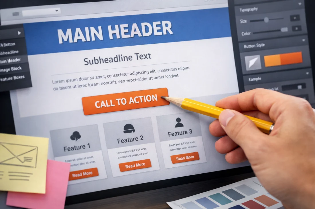
The key elements that contribute to visual hierarchy in web design include size, color, contrast, alignment, and typography. Each of these elements plays a unique role in structuring the visual flow of a webpage. Size is a powerful tool; larger elements naturally draw more attention and can be used to highlight key messages or calls to action. Color, on the other hand, can evoke emotions and create associations, making it a crucial factor in the overall design aesthetic.
Contrast helps differentiate between elements, making it easier for users to distinguish between important and less critical information. For instance, using a bold color against a muted background can make a call-to-action button stand out, guiding users towards desired actions. Alignment and spacing are equally important, as they provide a sense of order and organization, helping users process information more efficiently.
Typography significantly influences visual hierarchy. The choice of fonts can convey tone, style, and readability, impacting how users perceive and engage with content. Effective typography involves selecting fonts that complement the design and enhance readability, a topic thoroughly explored in our Font pairing guide. Additionally, imagery and icons can enhance visual hierarchy by providing visual cues and breaking up text, making content more engaging and easier to digest.

How to Create Effective Visual Hierarchy in Web Design
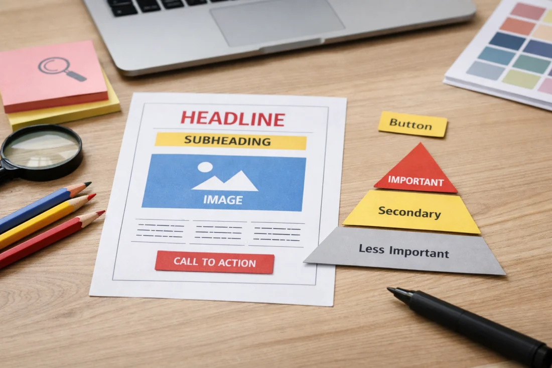
Creating effective visual hierarchy in web design starts with careful planning and a clear understanding of the website’s goals. Designers should begin by identifying the most important elements that need to be highlighted, such as brand messages, key content, or calls to action. Once these priorities are established, designers can use the elements of size, color, contrast, and typography strategically to guide user attention.
Evaluating the effectiveness of visual hierarchy involves testing and user feedback. Tools like heatmaps and A/B testing can provide insights into how users interact with a webpage, allowing designers to make data-driven adjustments. An effective hierarchy ensures that users can navigate the site seamlessly, find information quickly, and complete desired actions without confusion.
To aid designers in creating visual hierarchy, a decision path or checklist can be invaluable. This might include questions like: Are the most important elements immediately visible? Is there enough contrast to distinguish between primary and secondary content? Are the fonts and colors consistent with the brand identity? By addressing these questions, designers can ensure that their visual hierarchy supports user engagement and achieves the website’s objectives.
Common Mistakes in Creating Visual Hierarchy
One of the common mistakes in creating visual hierarchy is overusing design elements such as contrast or focal points. While these elements are crucial for directing user attention, excessive use can lead to a cluttered and confusing interface. Designers should aim for a balance that highlights important elements without overwhelming the user.
Another frequent error is assuming that more elements equal better hierarchy. This misconception can lead to overly complex designs where users struggle to identify what is important. Simplicity often leads to more effective designs, as it allows users to focus on essential information without distraction.
Misconceptions about visual hierarchy can also stem from a lack of understanding of the audience. Designers must consider the needs and preferences of the target audience, ensuring that the hierarchy aligns with their expectations and enhances their experience. By avoiding these pitfalls, designers can create websites that are not only visually appealing but also highly functional.
Comparing Approaches to Visual Hierarchy
There are various approaches to creating visual hierarchy, each with its pros and cons. Grid systems, for example, offer a structured framework that can lend a sense of order and predictability to a design. They are especially useful for responsive designs, ensuring consistency across different devices. However, they can sometimes limit creativity and result in designs that feel too rigid.
Freeform designs, on the other hand, allow for more creativity and uniqueness but can be challenging to implement effectively without losing coherence. Designers must carefully balance creativity with usability to ensure that the hierarchy remains intuitive and effective.

Templates versus custom designs is another consideration. Templates can speed up the design process and provide a solid foundation, but they may lack the flexibility needed to create a truly unique visual hierarchy. Custom designs offer more control and adaptability, allowing designers to tailor the hierarchy to specific needs and branding goals. Ultimately, the choice between these approaches depends on the project requirements and the desired website outcome.
Optional comparison table:
| Approach | Pros | Cons |
|---|---|---|
| Grid Systems | Consistency, predictability | Limited creativity |
| Freeform Designs | Creativity, uniqueness | Can be challenging to maintain coherence |
| Templates | Speed, solid foundation | Limited flexibility |
| Custom Designs | Control, adaptability | Time-consuming, requires expertise |
Advanced Considerations in Visual Hierarchy (Beyond Basics)
As web design continues to evolve, advanced techniques for refining visual hierarchy have emerged. Micro-interactions and animations are powerful tools for enhancing user engagement and guiding attention. These elements can subtly highlight important information or guide users through a process, adding dynamism to the design.
However, traditional methods may not always apply, especially in minimalist designs where simplicity is paramount. In such cases, designers must rely on subtle cues and whitespace to create a natural flow and focus. It’s a common misconception that minimalist designs lack hierarchy, but when executed correctly, they can effectively direct user attention through thoughtful composition and spacing.
Many guides on visual hierarchy overlook the importance of context and user intent. To avoid this pitfall, designers should always consider the specific needs and behaviors of the target audience. By tailoring the visual hierarchy to match user expectations and the website’s objectives, designers can create more effective and engaging experiences.
Frequently Asked Questions About Creating Visual Hierarchy in Web Design
What is the role of color in visual hierarchy?
Color plays a significant role in visual hierarchy by drawing attention and creating visual interest. Strategic use of color can highlight important elements, evoke emotions, and establish brand identity. However, it’s crucial to use color thoughtfully to avoid overwhelming users.
How does visual hierarchy affect website accessibility?
Visual hierarchy impacts website accessibility by guiding users through content in a logical and intuitive manner. Proper hierarchy helps users with disabilities navigate and understand content more easily, enhancing the overall accessibility of the site.
Why is visual hierarchy important for SEO?
Visual hierarchy indirectly benefits SEO by improving user engagement and reducing bounce rates. A well-structured design encourages users to spend more time on a site, which can positively influence search engine rankings. Additionally, effective hierarchy can enhance “Website navigation SEO” by making it easier for search engines to understand the site’s structure.
How can I test the effectiveness of my visual hierarchy?
Testing the effectiveness of visual hierarchy can be done through user feedback, A/B testing, and tools like heatmaps, which track user interactions. These methods provide insights into user behavior, allowing designers to make data-driven improvements.
What are some examples of effective visual hierarchy in web design?
A strong visual hierarchy is essential for websites that effectively lead users toward key content and actions. Success hinges on the clear prioritization of information, user-friendly navigation, and a harmonious blend of aesthetics and functionality. These sites often exemplify best practices in visual design’s role in improving engagement and usability.
In conclusion, visual hierarchy is a fundamental aspect of web design that significantly influences user experience and design effectiveness. By understanding the psychological principles and design elements involved, designers can create intuitive and engaging websites. Whether you’re starting a new project or refining an existing design, the principles of visual hierarchy are essential for achieving your web design goals. For further exploration, consider consulting design experts or exploring resources on web design best practices.