
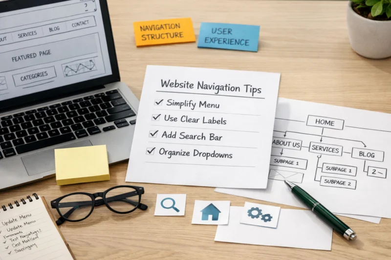
To optimize website navigation, make your site easier to scan, easier to understand, and easier to move through by organizing pages around user intent, clear labels, and a predictable hierarchy. How to Optimize Website Navigation starts with simplifying the menu structure, improving internal linking, and making sure users and search engines can find the most important pages fast.
Good navigation affects more than convenience. It shapes user experience, crawlability, conversions, and how quickly someone reaches a service page, product category, or key article. In practice, site navigation optimization is about reducing friction: fewer dead ends, fewer confusing labels, and fewer extra clicks between arrival and action. This article covers the full process, from auditing your current structure to testing mobile behavior, using breadcrumbs, improving labels, and avoiding the mistakes that make even a clean-looking menu fail.
Contents
- 1 Start with a navigation audit: what to review before changing anything
- 2 How to improve website navigation step by step
- 3 Navigation structure choices: what to use and when
- 4 Best practices for labels, menu order, and hierarchy
- 5 Mobile navigation optimization: how to keep it usable on small screens
- 6 Internal links, breadcrumbs, and footer navigation roles
- 7 Common website navigation mistakes that hurt usability
- 8 Advanced considerations: navigation issues most guides overlook
- 9 How to measure whether navigation changes worked
- 10 Frequently Asked Questions About optimizing website navigation
- 10.1 What is the best way to optimize website navigation?
- 10.2 How many items should be in a website navigation menu?
- 10.3 How do I improve website navigation for mobile users?
- 10.4 Does better navigation help SEO?
- 10.5 What are the most common website navigation mistakes?
- 10.6 How do I know if my navigation is confusing users?
A navigation audit should begin with a map of your current information architecture, including top-level categories, subcategories, footer links, and repeated pathways. Before you redesign anything, identify the pages that matter most for business and discoverability, such as money pages, cornerstone guides, and high-intent informational pages. That gives you a benchmark for what navigation should protect and promote, rather than treating every page as equally important.
The next step is to compare structure with actual user expectations. A common mistake is organizing menus around internal departments, content teams, or product lines instead of how visitors think. If users search for “pricing,” “services,” or “case studies,” but your menu uses internal labels like “solutions” or “offerings” without context, the navigation works against them. This is where reviewing website user behavior becomes valuable, because analytics, heatmaps, and search queries often reveal what people expect to find first.
Look for friction signals: too many menu items, duplicated links, buried pages, and category names that force people to guess. Large sites, multilingual websites, catalogs with many variants, and businesses serving multiple audiences may need different navigation logic for each segment. This kind of audit also supports navigation for SEO because search engines benefit when important pages sit closer to the top of a clear site hierarchy. If you are also working on improving website UX, this audit gives you the structure to align usability with discoverability.
To enhance website navigation effectively, start by identifying the primary paths users take, then create a menu that aligns with the tasks they aim to accomplish. This involves considering what a new visitor, a returning customer, or a researcher is likely to look for and ensuring these routes are clearly accessible from the header and homepage. By designing a user-friendly journey, you can streamline the navigation process, minimizing unnecessary options and guiding users smoothly towards their goals.
After that, group related pages into a cleaner hierarchy so the site has a clear parent-child structure. A good hierarchy lets visitors start broad and drill down without feeling lost, while also helping crawlers understand relationships between categories, subcategories, and detail pages. The challenge is restraint: stakeholders often want to add “just one more link” to the top navigation, but every extra item creates another decision point. The better approach is to protect the main menu and use contextual internal links, landing page modules, or footer utilities for secondary paths.
Rewrite labels so they are specific, familiar, and scannable. “Services” may be fine for one company, but “Tax Preparation,” “Bookkeeping,” or “Enterprise Security” is often better because it tells the visitor what happens next. This is also where website conversion tactics intersect with navigation decisions, since the fastest path to action usually improves the odds that a user contacts sales, requests a quote, or reads a comparison page. For content teams, web design SEO and navigation should work together so the structure supports both clarity and indexing.
If you need to support deeper paths, use internal links inside body content to extend the menu without cluttering it. That is especially useful for educational sections, product education, and support content. On a mobile friendly website, those pathways must stay short and obvious, or users will abandon the journey before reaching the right page.
The right navigation structure depends on site size, content depth, and user intent. A simple top navigation works well for smaller sites because it keeps the main paths visible and lowers cognitive load. Mega menus are better for large sites with many categories, while sidebar navigation suits documentation, knowledge bases, and resource hubs where users need repeated scanning within a topic family.
Hybrid layouts are common because no single pattern solves every problem. An ecommerce site may use a top menu for departments, a mega menu for categories, breadcrumbs for product depth, and filters for browsing. A service business often benefits from a simple top bar, a few secondary links in the header, and a stronger footer for support and policy pages. The tradeoff is always discoverability versus simplicity: too little structure makes content hard to find, but too much structure makes people hesitate.
Secondary navigation should live where it matches the task. Header secondary links are useful for high-priority support or account actions, sidebars are helpful for deep content browsing, and footer links work best for utility pages and low-friction discovery. The wrong choice is duplicating a full main menu in every location, which makes the page feel busy without adding clarity. If your site has many educational resources, pairing a lightweight header with a stronger sidebar can improve performance without overwhelming the top of the page.
| Navigation type | Best for | Main advantage | Main tradeoff |
|---|---|---|---|
| Simple top navigation | Blogs, service sites, small business sites | Fast scanning and low complexity | Limited room for deep content |
| Mega menu | Ecommerce, large publishers, multi-category sites | High discoverability across many categories | Can feel heavy if poorly grouped |
| Sidebar navigation | Documentation, help centers, resource hubs | Strong orientation within a topic family | Less effective on small screens |
| Hybrid layout | Complex sites with mixed intent | Balances browsing and task completion | Needs disciplined governance |
Navigation labels should be clear before they are clever. People should know what they will get before clicking, which means using terms that match common language rather than internal jargon or branded phrases. A label like “Case Studies” is instantly understandable; a label like “Success Stories” may work for some brands but can be too vague if users want proof, metrics, or industry examples.
Menu order should reflect user priority, not organizational charts or alphabetical convenience. Put the most important paths where people expect them, usually left to right in the header or first in a mobile accordion. If one page consistently drives leads, support, or onboarding, it may deserve a more prominent place even if it is not the most elegant structural fit. That is a practical decision, not a design failure. The goal is to support behavior, not force people to admire taxonomy.
Hierarchy should be broad enough to scale but narrow enough to stay understandable. If categories are too broad, users cannot predict what is inside them. If they are too narrow, the menu becomes fragmented and hard to maintain. Consistency matters too: use the same terminology in navigation, page titles, and headings so users do not have to re-translate your language at every step. This is one reason WordPress SEO optimization often includes navigation cleanup, because site structure, categories, and templates must all support the same logic.
A good rule is to promote pages that help users act, even if the structural fit is imperfect. For example, a high-performing pricing page or popular comparison page may need top-level visibility because it shortens the decision path. Most guides stop at aesthetics, but the real question is whether the menu helps people reach the next step with less effort. That is where navigation and conversion discipline overlap with site architecture.
Mobile navigation needs a different interaction model than desktop because the screen is smaller, the touch targets are less precise, and the user context is often more distracted. A collapsed desktop menu is not enough if it becomes slow, hard to open, or difficult to understand once expanded. On mobile, the goal is to help someone complete a task in fewer taps with less visual noise.

Tap targets should be large enough to use comfortably, and spacing should prevent accidental taps. Collapsible sections can work well, but too many nested levels create friction quickly, especially when the user is one-handed or on a slower connection. If your menu hides key pages behind multiple layers, it may technically be organized but still be poor UX. This is one of the clearest cases where improving website UX requires more than rearranging desktop elements; it requires rethinking interaction entirely.
Sticky headers can help if they preserve fast access to key actions without taking over too much vertical space. Bottom navigation may also be effective for task-focused mobile experiences, such as apps, member portals, or ecommerce sites with predictable actions. The risk is overusing hidden content or stuffing every option into one drawer, which makes the menu feel heavy and tiresome to open repeatedly. Accessibility also matters here: touch users, keyboard users, and screen reader users all experience mobile navigation differently, so it should be tested under realistic conditions, not just visually reviewed on a designer’s phone. For businesses reviewing website maintenance best practices, mobile menu checks should be part of regular QA, not an occasional redesign task.
Internal links extend navigation beyond the main menu by connecting related pages in context. That means a blog post can link to a service page, a comparison guide, a glossary entry, or a related category page when it genuinely helps the reader move forward. This is where navigation for SEO becomes especially useful, because contextual links can support crawl paths while also helping users continue a relevant journey.
Breadcrumbs are most helpful on deep sites where users move through layers of categories or content. They show location, reduce backtracking, and provide a fast path upward without forcing users to use the browser back button. On ecommerce sites, documentation hubs, and large knowledge bases, breadcrumbs often reduce frustration because people can step back one level at a time. On very shallow sites, though, breadcrumbs may add little value and can feel redundant.
Footer navigation should not be treated as a duplicate main menu. Its job is to hold utility links, support pages, legal pages, secondary pathways, and sometimes important but non-primary content. That makes it a natural place for contact details, careers, help, policies, and niche category discovery. The deeper point is that not every page should become a navigation hub; if every page contains dozens of linked modules, users can feel pulled in too many directions. Good internal linking supports a seamless user journey, but overload turns the page into clutter. When links are placed well, they also support website conversion tactics by keeping the next step visible without forcing the main menu to do all the work.
One of the biggest mistakes is using too many menu items or too many levels, which increases scanning time and decision fatigue. Another is choosing vague labels like “Solutions,” “Resources,” or “More” without enough context, which makes users guess instead of act. These issues can exist even on sites that look visually clean, because a polished menu is not the same thing as a clear one.
Another common failure is hiding important pages behind inconsistent menus or dropdowns that change from page to page. Users notice when navigation behaves differently across the site, and that inconsistency can make the experience feel unreliable. Mega menus can also become a problem when their grouping is weak or when important links are buried under decorative categories. A menu with visual hierarchy but poor information hierarchy still creates confusion.
Testing only on desktop is another frequent blind spot. Touch interfaces, keyboard navigation, and screen readers all reveal issues that static reviews miss. A site can also fail when the navigation is technically efficient but mismatched with user intent. For example, a category structure may satisfy internal stakeholders yet fail to match how customers search, compare, or learn. This is where strong web design SEO supports usability: structure should reflect how people actually browse, not just how the brand wants to present itself. In many cases, the fix is not adding more links but removing the wrong ones.
Large sites need navigation systems that scale without collapsing into taxonomy chaos. As content expands, category drift becomes a real problem: new pages get added in the wrong place, similar terms get used interchangeably, and users lose their sense of where they are. The answer is usually governance as much as design, meaning navigation rules, naming standards, and ownership should be documented and maintained over time.
Faceted navigation and filters can improve browsing, especially for ecommerce and directory-style sites, but they can also create confusion if too many combinations are exposed. If every filter state behaves like a new page, users may get lost and search engines may waste crawl resources on near-duplicate URLs. The best systems make browsing easy while controlling indexation and ensuring the core category pages remain strong. This is one area where technical SEO, content strategy, and user interface design must stay aligned.

Accessibility details are often overlooked until users complain. Keyboard focus states should be visible, link text should be meaningful out of context, and screen readers should be able to understand nested menus without ambiguity. The tension between SEO-friendly internal discovery and minimal visual clutter is real, but the solution is not to hide everything. It is to place the right links in the right layers and make each layer serve a purpose. Navigation changes can also alter crawl paths and the signals that search engines infer about page importance, so changes should be made intentionally, not casually. For teams that care about long-term performance, this should sit alongside website maintenance best practices rather than being treated as a one-time redesign issue.
For related strategy, it also helps to think about “navigation for SEO,” “website user behavior,” “seamless user journey,” and “website conversion tactics” as connected systems rather than separate tasks. When the structure is clear, pages are easier to discover, easier to trust, and easier to act on.
You can measure navigation improvements by looking at whether more users reach key pages faster, complete more tasks, and engage with the intended pathways. Useful metrics include click-through rates to priority pages, task completion rates, time to first meaningful page, and reductions in bounce where that signal is relevant to the page type. The important point is to measure navigation outcomes, not just homepage traffic or vanity engagement.
Separate behavioral metrics from technical signals so the results are interpreted correctly. If more people reach a service page but rankings remain flat, that may still be a successful navigation change because users are finding what they need. Likewise, improved crawl depth or better internal discovery can help long-term visibility even if the immediate user metric is modest. This distinction matters because navigation affects both humans and search systems, but not always on the same timeline.
Heatmaps, session recordings, tree testing, and card sorting can validate whether the structure matches user expectations. These methods show where people hesitate, misclick, or backtrack, which is often more useful than general analytics alone. Give changes enough time to collect meaningful data, especially if traffic is split across device types or audience segments. A navigation update might help mobile users immediately while desktop users show little change, or vice versa. That unevenness is normal and worth measuring by segment instead of averaging away.
The best way is to audit the current structure, simplify the main menu, rewrite labels for clarity, and then test the updated paths with real users. Start with the most important journeys first so you improve the pages that matter most for users and business goals.
There is no single perfect number, but fewer high-value options usually work better than long menus with many similar choices. The right count depends on site size, audience complexity, and whether a mega menu or sidebar is needed to support deeper browsing.
Use large tap targets, clear spacing, and a compact hierarchy that keeps the most important actions close at hand. Avoid forcing users through too many nested layers, and test the menu with one-handed use, slower connections, and keyboard or screen reader access when possible.
Yes, indirectly and sometimes directly, because clearer navigation improves crawl paths, internal linking, and the discoverability of important pages. It can also strengthen page importance signals by making your key content easier to reach from the homepage and category hubs.
The biggest mistakes are vague labels, too many menu items, buried pages, and inconsistent behavior across pages or devices. Another common issue is making the menu look polished while failing to match user intent, which leaves visitors unsure where to click.
Look for signs like repeated backtracking, low click-through to important pages, high exit rates on menu-heavy pages, or frequent use of search for pages that should be easy to find. Session recordings, heatmaps, and user testing can reveal where people pause or choose the wrong path.
Strong navigation starts with user intent, not menu aesthetics. When you focus on clarity, hierarchy, and restraint across desktop and mobile, the site becomes easier to use and easier to grow. Internal links, breadcrumbs, and footer links should support the main menu, not compensate for a confusing structure, and the most effective changes usually come from testing and iteration rather than a one-time redesign. A practical next step is to audit the current menu, identify the top user journeys, and make one high-impact improvement first.
Updated April 2026