

To improve an ecommerce site so customers find products, trust your brand, and finish checkout, focus on measurable UX and UI changes that reduce confusion at every step. This is what Ecommerce Web Design Best Practices means : a practical set of patterns for usability, discovery, trust, conversion, and mobile shopping. In 2026, shoppers also expect accessible interfaces, clear accessibility-friendly forms, and checkout flows that feel predictable. You will use the checklist approach below to audit each page type, choose the right layout decisions, and avoid common failure modes that quietly lower conversions.
Great ecommerce layout means customers can predict where things are and what to do next. When your header, categories, search, product cards, and checkout steps follow consistent patterns, shoppers spend less effort figuring out your site. That directly supports conversion because fewer people get stuck before they ever reach product pages.
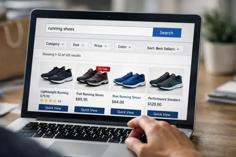
Start with a simple hierarchy that matches the shopping journey: category → product → offer → checkout. Your templates should keep the same order across pages, so a returning visitor does not relearn your UI. For example, category pages should reliably show filters, product cards, and clear “view details” actions, while product pages should keep price, variant selection, and the main CTA in stable positions.
Then design for scanning rather than reading. Use whitespace to separate intent blocks, keep typography consistent, and sequence information in a predictable order. A strong default order is images first, proof next, then price and CTA. If you hide price behind scroll depth or split the CTA across multiple regions, shoppers hesitate and abandon.
Merchandising also needs decision rules, not generic banners. Use intent match logic: browse visitors may need category-like recommendations, searchers may need results plus quick filters, and returning customers may need saved preferences or replenishment prompts. Edge cases matter , too. Long catalog pages should paginate or use “load more” in a way that does not reset filters, and out-of-stock variants should stay visible without breaking variant selection.
A common mistake is designing multiple layouts that look different across promotions. That creates cognitive friction because users must re-locate the same job to be done. Build a component library and limit template variations, so promotions change content, not structure. If you also support no-result states, show a path forward such as suggested queries, popular categories, or “clear filters” rather than a dead-end message.
Create product discovery that feels fast, specific, and never dead-ends
Product discovery improves conversions when your search and filters help shoppers find the right item quickly. Users judge your site on whether it understands them, not on how many features it has. If they cannot recover from mistakes or no-results states, your best layout cannot save the funnel.
Build search UX that is forgiving and helpful. Typeahead can reduce typing, but it should also be category-aware so suggestions reflect what buyers expect. Spelling tolerance and sensible synonyms help when customers use informal names, while a clear “no results” recovery path keeps momentum. For example, a no-results page should suggest nearby categories, offer a “clear filters” action, and include a short explanation of what changed.
Filters should reduce effort, not increase it. Keep the number of filter groups focused, use meaningful groupings like size, color, and compatibility, and show an active filter summary so shoppers know why results look the way they do. Prevent dead-end combinations by disabling impossible combinations in real time or by surfacing “near matches” when the user selects a rare spec set.

Recommendations should support intent, not clutter the core path. Use “related products” when the user views an item, “frequently bought together” for bundles, and “just for you” carefully when you truly have enough signals. A deeper nuance is avoiding misleading personalization. For new users, throttle recommendation variety and ensure you never hide main deals or the exact product the shopper asked for behind aggressive modules.
Also communicate inventory and delivery promises during discovery, not only after checkout. If a product card shows shipping dates or availability inconsistently, the user loses trust before they even reach the product page. Real-world scenario: a shopper filters by “ships today,” finds products, then lands on items that cannot meet the promise. That mismatch leads to quick backtracking and cart abandonment.
BOOST CONVERSIONS NOW. WITH EXPERT DESIGN.
Elevate your online store with our specialized ecommerce web design services. We create user-friendly, conversion-focused websites that simplify shopping and drive sales.
REQUEST A FREE CONSULTATIONDesign product pages that reduce uncertainty and help shoppers self-qualify
A high-performing product page turns “maybe” into “yes” by answering the questions that stop buyers. Most hesitation comes from uncertainty about variants, fit, quality, and returns. Ecommerce design should make those answers easy to find without forcing shoppers to hunt through tabs.
Start with essential elements that stay consistent across products. Use high-quality imagery with a zoom or gallery that works well on touch. Make variant selection obvious and keep it tightly connected to displayed price and availability. Your primary CTA should stay prominent after the shopper selects options, and the page should reflect the exact configuration that will be purchased.
Next, embed trust signals where they matter most. Display ratings and review content with enough context to evaluate quality, not just a star badge. Include user-generated photos when available, show guarantee and returns clearly, and make customer support access visible without forcing a new page. Practical application: if reviews mention a common issue, surface that context in the related section rather than hiding it deeper in a long tab.
Build an information architecture that matches how people compare products. Group specs by decision value, keep materials or compatibility sections scannable, and provide FAQs that address shipping, sizing, installation, and care when relevant. Media patterns also matter. Place video so it clarifies use, fit, or setup, and ensure image claims match copy claims to avoid “bait and switch” perceptions.
Complex products need extra alignment between selection logic and cart rules. Bundles, subscriptions, and variant-heavy items should prevent impossible combinations before checkout. A common mistake is letting shoppers select options on the product page that later fail when the cart recalculates, creating surprise errors. If you support subscriptions, clearly show frequency, cancellation terms, and price changes so buyers do not feel misled at the end.
Present trust signals as buyer certainty, not decoration
Trust design should reduce perceived risk at each stage, from browsing to payment. Shoppers do not just ask, “Is this brand real?” They ask, “Will I get what I expect, and can I fix mistakes?” When those answers appear at the right moment, people move forward.
Map where trust must show up. In headers and footers, include recognizable cues like customer support access and clear policy links. On category pages, strengthen credibility with proof such as aggregated reviews or quality claims that match product types. On product pages, show returns, shipping details, and evidence about fit or performance. In cart and checkout, highlight security and payment assurance in plain language.
Delivery and returns must be realistic and transparent. Provide cost information and use timeline ranges only when you can explain what drives them. Avoid “magic delivery” promises that only work for a narrow subset of zip codes, because that creates confusion when the cart updates. Payment security cues should be consistent with what you actually collect and process.
A deeper insight is that too many badges can backfire. When users see badge overload, they may interpret it as “covering something up.” Also, mismatched policy links can harm mobile usability. If a shopper taps a policy on desktop but the mobile experience is broken or the link leads to an outdated page, trust falls just when the buyer is most vulnerable.
Consider a real-world scenario: a customer reads a return promise on the product page, then later sees different terms in checkout. Even if the terms are still “technically correct,” the inconsistency feels like deception. Your best practice is to keep policy content centralized and ensure it renders the same message across device breakpoints and promotions.
For accessibility and security communication, align UX patterns with widely adopted guidance from Web Content Accessibility Guidelines (WCAG) and consider checkout and form clarity principles similar to those described in Google’s page experience documentation — the common theme is usability under real conditions.
Build checkout flows that prevent errors and remove last-step doubt
Checkout conversion improves when shoppers can complete purchase with minimal surprises. Most abandonment comes from friction, uncertainty, or form errors near the end. Ecommerce web design should make the process feel controlled and safe.
Use a clean sequence: cart review, shipping and taxes, payment, then confirmation. Minimize required fields and keep labels clear. Inline validation helps because users see problems immediately instead of after submission. A progress indicator reduces anxiety, especially on mobile, by showing how many steps remain.
Make shipping and taxes transparent early. Show estimates when possible and avoid surprise charges late in the flow. If users need to edit address details, allow changes without forcing a reset back to the top of checkout. Where applicable, support guest checkout to avoid sign-in barriers, and keep promo code entry simple and understandable.

Payment UX also needs clarity. Offer widely recognized payment methods and reflect what happens next after payment authorization. For recovery, handle payment declines with actionable guidance rather than a blank error state. Edge case examples include address validation failures, delivery date selection for time-sensitive orders, gift orders with separate recipient details, and orders that need special handling.
A common mistake is relying on dense forms with small hit areas or unclear error messages. On mobile, that becomes a double problem: users cannot accurately correct inputs, and the flow feels punishing. Instead, format phone and postal inputs with appropriate masks when it reduces errors, ensure focus moves to the first invalid field, and keep the CTA visible as users scroll.
Optimize for mobile shopping without shrinking usability or trust
Mobile ecommerce design should keep discovery and checkout simple, not compressed. Users on phones often have less patience and less screen space, so every tap and scroll matters. If your mobile experience hides key information, conversion drops even if desktop performance looks strong.
Use mobile-first layout rules. Keep the main CTA visible or easy to reach, and ensure variant selection is thumb-friendly. Navigation should support quick access without forcing endless menus. Responsive media behavior matters, too: galleries should support touch, and images should not jump around due to layout shifts.
For mobile cart and checkout ergonomics, reduce the number of taps to complete common actions. Use sensible defaults like country and shipping options when possible, and present forms in a readable vertical layout with good spacing. Trust cues must also remain accessible without leaving the checkout context. Reviews should be legible, and policy access should work from mobile at the moment the user needs it.
In 2026, performance budgets still matter, but do not treat optimization as “image-only.” If you compromise too much on product media, you may harm shoppers’ ability to choose the right variant. Tradeoffs are real: overly aggressive lazy loading can delay variant-relevant imagery, and overly small media files can reduce clarity for key details like texture, labeling, or fit.
A nuanced scenario is complex product selection on mobile, like shoes with multiple sizes and colors. If your variant logic depends on desktop hover states, mobile users can struggle. Ensure selection changes update the page without confusing flicker, and keep error states understandable so users know what to fix.
Choose a build approach that keeps design consistent as you scale
The best ecommerce web design is easier to maintain than it is to launch. As your catalog grows and promotions change, you need a system that prevents design drift across templates and regions. That is a major factor in sustainable conversion improvements.
Consider three practical build categories: hosted ecommerce platforms, headless or front-end with commerce APIs, and custom monolithic builds. Hosted platforms can speed launch and reduce operational overhead, which often helps teams keep standard templates consistent. Headless setups can offer stronger UX flexibility, but you take on more integration and ongoing maintenance. Fully custom builds can tailor everything, yet they require strong engineering governance.
Custom web design & development solutions that transform your online store's performance.
Implement best practices in ecommerce design with our tailored website solutions to boost user experience, drive conversions, and build customer trust.
Request Your Free ConsultationBest practice patterns exist in each approach. Use template consistency, component reuse, and controlled experimentation. Even if your stack differs, you should keep a stable checkout UI and stable product page structure so users do not face new flows during promotions. Controlled experiments matter because you need to measure what changes improve discovery and conversion.
Integrations often define success. Search, recommendations, reviews, analytics, and shipping or tax providers must work together without producing conflicting UI states. Tradeoffs show up when one integration returns data slowly or fails silently. Real-world scenario: recommendations load late on mobile and then shift layout, pulling attention away from CTA buttons.
A deeper insight is change management. Without a design system, promotions create duplicate layouts and inconsistent component behavior. That can break variant selection, misalign policy links, or create checkout differences for certain regions. Your governance should define what can change and what must remain stable across all experiences.
For accessibility and content structure, you can also align build practices with guidance from Web Content Accessibility Guidelines (WCAG) so your component library supports forms, navigation, and focus management across every page template.
Eliminate ecommerce design pitfalls that quietly reduce conversion
Many conversion losses come from small design flaws that feel minor but break trust or usability. When shoppers cannot find actions, cannot understand options, or cannot recover from mistakes, they abandon. Ecommerce Web Design Best Practices reduce these failures by tightening information flow and error handling.
Clutter is a top pitfall. Overloaded navigation, noisy sidebars, and too many competing CTAs pull attention away from the job to be done. Another common failure is inconsistent product card information, like missing variant cues or unclear availability. If a card says “in stock” but the product page shows limited inventory or different availability rules, the site loses credibility.
Usability failures show up in variant logic and filters. Broken selection states, confusing filter labels, and long forms that feel endless all create avoidable drop-off. Error handling should be clear and specific, not generic. A “something went wrong” message during address entry is one of the fastest ways to lose mobile shoppers.
Trust mistakes are equally damaging. Generic testimonials without context can feel fake. Policy pages buried too deep or out of date create uncertainty right before purchase. Badge overload can signal low credibility, while vague refund terms create anxiety when buyers want certainty. Mobile-specific pitfalls include tiny tap targets, key content in non-scrolling modals, and checkout flows that require desktop-like precision.
One deeper nuance is measurement pitfalls. If event tracking is missing or inconsistent, you cannot learn which design change improves conversion. That leads to repeated changes that do not move the needle. For example, if “add to cart” clicks are tracked but cart progression is not, you may optimize the wrong step and miss the real friction.
Test, measure, and validate accessibility so improvements stick
Conversion improvements should come from evidence, not opinions. Testing and measurement let you tie design changes to shopper behavior across discovery, product pages, and checkout. In 2026, this also includes validating accessibility so the experience works for more customers, not just most customers.
Start with baselines and clear hypotheses. Tie each hypothesis to a user goal, such as “help shoppers filter to the right option faster” or “reduce checkout form errors.” Then define success metrics that match the stage, like add-to-cart rate for product pages or step drop-off for checkout. Avoid using only top-level traffic metrics because they hide funnel issues.
Use testing methods that match the problem. A/B tests work well for isolated UI changes like CTA placement or error message copy. Usability testing helps for structural issues like confusing navigation patterns or unclear product page information. Accessibility checks are not only about compliance; they also prevent hidden usability barriers for keyboard users and screen reader users.
Track signals that reflect intent and friction. Monitor product detail engagement, variant selection changes, add-to-cart rates, search usage and refinement, filter changes, and checkout step drop-off. For forms, measure field-level errors and retry rates so you can fix the inputs that actually cause failure.
A deeper insight is avoiding false positives. Seasonality and promo-driven behavior can change how people shop, so treat promotions as a major context variable. Also, low-traffic SKUs may not produce reliable test results, so broaden tests to templates and components when possible. If you test copy changes but the underlying selection logic still fails, your experiment will look inconsistent and you will lose time.
- Combine analytics with session recordings or task-based usability sessions for complex funnels.
Finally, keep accessibility as a quality lever. Ensure keyboard navigation works through checkout, verify contrast and focus states, and make form labels programmatically tied to inputs. When accessibility is built into the design system, you reduce regressions and keep mobile checkout reliable.
Frequently asked questions about ecommerce web design best practices
What are the most important ecommerce web design best practices for increasing conversions?
Prioritize product discovery, product pages, trust signals, and a low-friction checkout. Make category navigation predictable, ensure search and filters recover from mistakes, and keep product CTAs consistent across variants. Then present clear delivery and returns before checkout so shoppers feel safe buying. Finally, validate checkout forms with inline errors and mobile-friendly input layouts to reduce abandonment.
How many product page images should an ecommerce site show for best UX?
A practical range is typically 4–8 images for simple products, plus zoomable detail shots when buyers need to inspect materials. For variant-heavy items, keep the main gallery focused on the default variant and show variant-specific imagery only when it changes meaningfully. Too many images can slow perception and add scrolling effort, especially on mobile.
It depends on catalog size and how customers shop. If buyers usually browse, strengthen category navigation with clear merchandising and strong filter support. If customers often know what they want, make onsite search prominent and fast with helpful suggestions. You can support both by keeping categories for discovery and search for exact intent, without duplicating the same filtering controls.
What should I change first on a low-converting ecommerce checkout?
Start by fixing the biggest friction points: unclear shipping and tax estimates, confusing form labels, and error handling that fails late. Next, ensure guest checkout is available and that the progress indicator makes steps feel predictable. Finally, improve payment recovery messages so users can correct declines without restarting the flow. This order reduces abandonment quickly because it targets problems near the moment of commitment.
How do I design ecommerce filters that don’t trap users in no-result states?
Limit filter complexity and use meaningful groupings, so users build valid selections. Disable impossible combinations or show “near match” options when a selection set yields nothing. In the no-results state, provide a clear path forward like clearing filters, suggesting alternative categories, or offering a few popular options to keep intent alive.
What ecommerce design elements most directly build trust during mobile shopping?
Mobile trust cues include prominent returns access, clear delivery promises near product actions, readable review summaries, and visible customer support access. Keep policy links functional on small screens so users can verify information without leaving checkout. Also ensure payment method clarity and security reassurance appear consistently at the cart and checkout steps.
How can I improve product discovery when my catalog is large and complex?
Use information architecture that mirrors how shoppers compare items, then support it with category-aware search suggestions. Build filters that reflect key decision specs and prevent dead-end combinations. For merchandising, match recommendations to intent, and show inventory or delivery details close to product cards so shoppers know what they can actually buy.
What’s the difference between hosted ecommerce design and headless ecommerce design for UX control?
Hosted ecommerce platforms often come with ready-made templates and standardized checkout patterns, which can speed consistent UX implementation. Headless ecommerce decouples the front end from the commerce back end, which gives more control over UI and interactions, but it also increases integration and maintenance work. In practice, headless can deliver more custom discovery and product page experiences, while hosted can be easier to keep consistent as you scale.
What ecommerce web design improvements give the fastest measurable lift?
Fast wins usually come from clarity and error reduction: stronger CTAs, more consistent product page layout, clearer policy and returns visibility, and checkout form improvements. Improve shipping and taxes transparency early in checkout and add recovery paths for search and filters. Confirm lift with A/B tests tied to funnel metrics like add-to-cart rate and checkout step drop-off.
How do I ensure my ecommerce site is accessible while still looking modern?
Use accessible form labeling, high-contrast color choices, and reliable keyboard navigation for menus and checkout. Maintain focus states that are clearly visible, and make tap targets large enough for touch. Modern styling still works when your components are built on accessible patterns, so users can navigate confidently without losing your design system’s look.
Elevate Your Ecommerce Experience
Is Your Online Store Ready for a Refresh?
Optimize your ecommerce website with our expert design and development services. eDesignerz specializes in creating user-friendly, conversion-focused platforms that boost sales and reduce cart abandonment rates.
Schedule a Free Consultation29+ Years of Experience Customized Designs Satisfaction Guaranteed
Conclusion: use a repeatable audit framework to improve discovery, trust, and checkout
Ecommerce Web Design Best Practices succeed when your site reduces effort at every step: predictable navigation and layouts, frictionless product discovery, clear product pages, and trust signals that appear when buyers need them. Then checkout should remove doubt through a simple flow, inline validation, and transparent shipping and payment expectations. On mobile, keep the core actions easy to reach and ensure media and forms stay reliable and readable.
To make improvements stick in 2026, measure funnel drop-offs and validate changes with testing and accessibility checks. Use the structure above as an audit framework by page type, so you always know what to change next and why it should improve conversion. When you run a UX review and conversion audit, prioritize the steps where users most often get stuck, then iterate based on observed behavior.
If you want a practical next step, run a short UX review + conversion audit plan based on these templates and checklists, then benchmark your current category navigation, product discovery, trust delivery, and checkout clarity against the patterns described . That approach keeps your roadmap grounded in shopper outcomes rather than design opinions.
Updated August 2026