
The top 10 web design trends for 2026 are the ones that improve clarity, trust, speed, accessibility, and conversion—not just the ones that look new. In this guide, you will learn which design directions matter most now, how they affect usability and credibility, and when they are worth adopting on real websites.
This matters because user expectations are changing quickly, especially on mobile devices and content-heavy pages. A site that feels dated, cluttered, or slow can make people question the brand before they ever read a word. If you are evaluating Top 10 Web Design Trends for a portfolio, service business, ecommerce store, SaaS product, or editorial site, the goal is not to chase every style shift. It is to choose the trends that solve real user problems and support your business goals.
That is why this is an informational guide, not a hype list. Some trends are genuinely improving user experience, while others are mostly visual reactions to what was overused before. The best decisions come from combining user-centered design basics with business fit, technical feasibility, and long-term maintainability.
Contents
- 1 What’s shaping web design in 2026
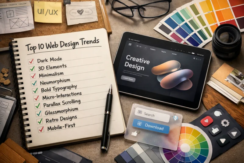
- 2 The top 10 web design trends for modern websites
- 3 Trend 1: Minimalist layouts with stronger visual hierarchy
- 4 Trend 2: Bold typography as a primary design element
- 5 Trend 3: Immersive scrolling and motion-led storytelling
- 6 Trend 4: AI-assisted personalization and adaptive content experiences
- 7 Trend 5: Accessibility-first design patterns
- 8 Trend 6: Dark mode and theme-aware interfaces
- 9 Trend 7: Microinteractions that make interfaces feel polished
- 10 Trend 8: Authentic visuals and less “stock” presentation
- 11 Trend 9: Modular, component-based page systems
- 12 Trend 10: Performance-led design and faster front-end experiences
- 13 How to choose which web design trends to use on your site
- 14 Comparing the best trend options: which approaches fit different website types?
- 15 Common mistakes people make with web design trends
- 16 Advanced considerations most guides get wrong
- 17 Frequently Asked Questions About the top web design trends for 2026
- 17.1 What are the most important web design trends right now?
- 17.2 Which web design trends improve SEO the most?
- 17.3 Are trendy website designs good for conversions?
- 17.4 How do I know if a web design trend fits my brand?
- 17.5 What web design trend is best for small businesses?
- 17.6 Do web design trends affect website speed?
- 17.7 What is the difference between a trend and a best practice?
- 17.8 How often should a website design be updated?
- 17.9 Which web design trends are most accessible?
- 17.10 What web design trends should I avoid in 2026?
- 18 Conclusion
What’s shaping web design in 2026
Web design in 2026 is being shaped by higher user expectations, mobile-first behavior, stronger accessibility standards, faster-loading interfaces, and more content-heavy browsing. Users now expect pages to load quickly, explain themselves immediately, and feel intuitive without needing instruction. If a site makes people work too hard to scan, compare, or complete a task, they leave faster than they used to.
That shift means a trend is only valuable if it improves the experience in a measurable way. A design style that looks impressive in a showcase can still fail on a service site if it hides the call to action, or on an ecommerce site if it slows product discovery. This is where responsive layout strategies and improving website usability become more than technical concerns; they shape whether people can actually use the site on phones, tablets, and large desktop displays.
It also helps to remember that some trends are reactions to previous overuse. Minimalism grew partly as a response to clutter, motion-led storytelling rose as a response to flat sameness, and authentic visuals gained traction because polished stock imagery started feeling generic. The risk is overcorrection. A website can become too sparse, too animated, too personalized, or too stripped down if it copies a trend without checking audience needs, content density, or brand context.
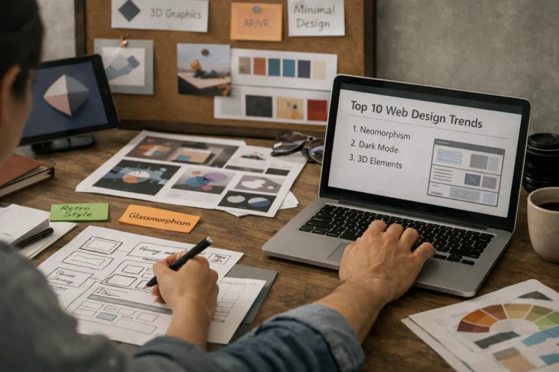
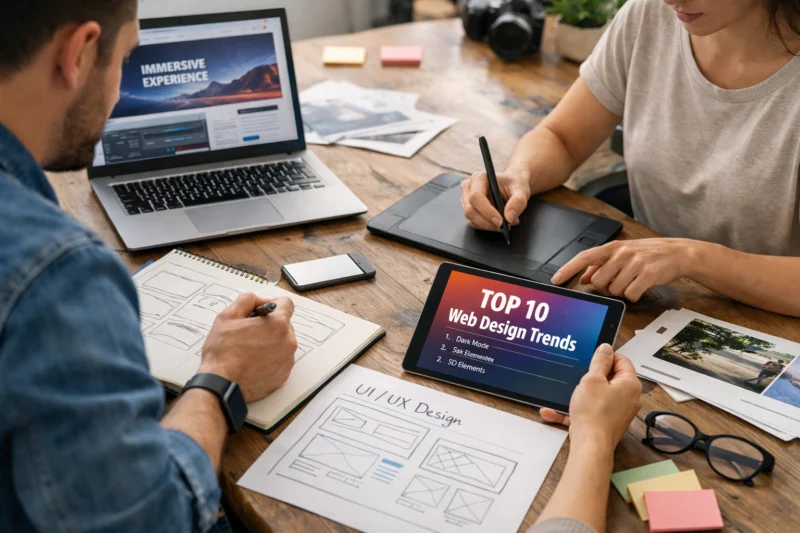
The top 10 web design trends for modern websites
The most useful way to think about modern web design trends is as design directions, not a popularity contest. The right choice depends on what the site needs to do: build trust, explain a service, sell products, support content discovery, or create a memorable brand impression. A homepage for a consulting firm has different requirements than a product catalog or a news publication.
Some trends are primarily aesthetic, while others directly improve usability. That distinction matters. A strong visual system can help users navigate faster, but a trend that prioritizes style over clarity can reduce comprehension, accessibility, or conversions. For example, a motion-heavy editorial homepage may work well for a creative brand, while a performance-first ecommerce store may benefit more from simpler layouts and lighter media.
Use the trends below as practical options. Each one comes with a tradeoff: visual impact versus speed, novelty versus clarity, or creativity versus accessibility. The best websites in 2026 are not the most trendy ones; they are the ones that match form to function.
Trend 1: Minimalist layouts with stronger visual hierarchy
Minimalist layouts are still popular in 2026, but the most effective versions are not empty or generic. They use stronger visual hierarchy, better spacing, and more disciplined typography so users can scan content faster and understand what matters first. That is a major advantage on homepages, service pages, and landing pages where attention is limited.
Clean layouts reduce cognitive load by removing competing elements and clarifying the path through the page. Instead of crowding every section with icons, badges, and overlapping messages, strong minimal design uses scale, contrast, and spacing to guide the eye. This is where user-centered design basics matter: the goal is not just to make a site look modern, but to help people find the next action without friction. For brands with detailed offers or multiple service tiers, a structured minimal layout can also improve conversions because it makes the decision process feel simpler.
The tradeoff is that minimalism can fail when it becomes too sparse, too uniform, or too polished to feel real. Some sites lose perceived value because they remove too much context or make the brand feel interchangeable with every other sleek homepage. A minimal interface still needs intentional structure, especially around key actions, proof points, and homepage messaging. Minimal does not mean empty; it means deliberate.
When used well, this trend works especially well for consultants, agencies, SaaS products, and premium service brands that need clarity and confidence. It is less effective if the business depends on heavy content discovery or a high volume of visual comparison, where more explicit cues may be necessary.
Trend 2: Bold typography as a primary design element
Bold typography is increasingly replacing heavy imagery as the main source of brand presence. Large, expressive type can create instant recognition, especially in homepage hero sections and campaign landing pages where the message needs to land in seconds. This is why typography has become more strategic, not just decorative.
In practice, bold type helps sites communicate tone quickly. A financial brand can feel authoritative, a creative studio can feel editorial, and a startup can feel sharp and confident without relying on large background visuals. Strong type systems also support successful font combinations because the display face, body face, and supporting accents all need to work together across breakpoints. When typography carries the design, weak hierarchy becomes obvious fast.
Accessibility still matters. Oversized type can become hard to read if line length is too wide, spacing is too tight, or contrast is too low on smaller screens. That is why a bold typographic approach should be tested on mobile, not just on a desktop mockup. The best use of this trend strengthens the message and speeds comprehension; the worst use overwhelms users, pushes key content below the fold, or makes the page feel like a poster instead of a usable interface.
This trend works especially well for personal brands, creative portfolios, editorial sites, and premium service companies. It is less useful when the page must present many dense product details at once, such as complex ecommerce product pages or multi-feature SaaS comparisons.
Trend 3: Immersive scrolling and motion-led storytelling
Immersive scrolling is one of the most noticeable web design trends for 2026 because it turns pages into guided narratives. Scroll-triggered transitions, layered sections, and subtle reveal effects can improve engagement by pacing information and keeping users oriented as they move through content. When done well, the page feels like a story rather than a static brochure.
The key is to separate helpful motion from decorative motion. Subtle motion can reinforce comprehension by showing progression, emphasizing cause and effect, or drawing attention to a new section without forcing the user to stop. That is the difference between motion that supports the content and motion that competes with it. The strongest modern animation techniques are the ones that make a page easier to follow, not merely more dramatic.
There are real tradeoffs. Motion can affect performance, especially on slower devices, and it can create accessibility issues for users sensitive to animation. Designers need to respect reduced-motion preferences and ensure the site still works without visual effects. In most cases, motion should reinforce content structure, not become the structure itself. If the page only makes sense because of the animation, it is too fragile for real-world use.
This trend works well for launches, product stories, creative brand sites, and editorial experiences where sequential storytelling matters. It is usually less suitable for conversion-critical pages that need speed, simplicity, and direct action.
Trend 4: AI-assisted personalization and adaptive content experiences
AI-assisted personalization is becoming more visible through adaptive layouts, tailored content modules, and recommendations based on behavior or context. A returning visitor may see different featured content than a first-time visitor, and a user in a specific region may see more relevant services, products, or offers. This can improve relevance when it is done transparently.
Common use cases include location-aware content, product suggestions, content recommendations, and service matching. For instance, an online retailer might display products that are similar to those previously viewed, while a service provider could direct visitors to the most suitable package based on their needs. This approach is particularly beneficial when integrated with key strategies for effective online store design, which can help alleviate decision fatigue for users navigating their options.
The challenge is trust. Personalization should feel helpful, not invasive or confusing. Over-personalization can create inconsistent journeys, privacy concerns, or a sense that the website is guessing too aggressively. The most effective implementations are clear about why something is being shown and allow users to override or ignore it. A good rule is that personalization should make navigation easier, not replace navigation.
This trend is especially valuable for ecommerce, media brands, SaaS platforms, and larger service websites with many possible pathways. Smaller sites can still benefit from light personalization, but should avoid complex systems that add maintenance burden without enough user value.
Trend 5: Accessibility-first design patterns
Accessibility-first design is moving from compliance-only thinking to a core design advantage. Instead of treating accessibility as a last-step checklist, more teams are designing with readability, keyboard navigation, semantic structure, and color contrast in mind from the beginning. That shift improves the experience for everyone, not just users with disabilities.
Practical examples include visible focus states, clear button labels, sufficient contrast between text and backgrounds, logical heading order, and forms that provide specific error feedback. These details make pages easier to use on mobile, in bright light, with assistive technology, or under time pressure. In other words, accessibility is not only about legal risk; it is part of improving website usability in ways that help real visitors complete real tasks.
The misconception is that accessibility limits creativity. In practice, it often improves clarity and consistency because it forces teams to make intentional choices. A site can still feel branded and distinctive while remaining accessible. In fact, many of the best-looking interfaces are successful because their structure is disciplined enough to be understood quickly. If you are planning a redesign, accessibility should be treated as a design constraint that sharpens the work, not a box that dulls it.
This trend matters for every website type, but especially for public-facing brands, government-adjacent services, education, healthcare, and ecommerce, where clarity and trust strongly affect outcomes.
Trend 6: Dark mode and theme-aware interfaces
Dark mode remains popular because it can reduce glare, feel visually modern, and create a stronger mood for some brands. It is especially appealing in products used at night, in creative portfolios, and in apps where users spend long periods inside the interface. Theme-aware systems also let users switch between modes based on preference, lighting, or accessibility needs.
But dark mode works only when it is designed as a complete system. It is not enough to invert colors and call it done. Backgrounds, shadows, borders, illustrations, screenshots, and even logos often need different treatment in dark interfaces. This is where thoughtful website trust signals matter too: a poorly executed dark theme can make a site feel less polished, not more premium.
Not every brand benefits equally from dark mode. Brands that rely on clarity, product detail, or lots of dense reading may do better with a light-first interface that can optionally support a dark theme. The main tradeoff is comfort and atmosphere versus readability and consistency. If the brand or content is heavily information-driven, theme-aware design should not compromise contrast or make small text harder to scan.
The best implementations treat dark mode as a parallel design system, not a color filter. That distinction is what separates a polished interface from one that looks trendy but incomplete.
Trend 7: Microinteractions that make interfaces feel polished
Microinteractions are the small feedback cues that tell users what just happened. A button changes state, a form confirms submission, a hover reveals more context, or a loader indicates that something is processing. These details make interfaces feel responsive and reduce uncertainty.
In practice, microinteractions improve confidence in clicks, form submissions, menu interactions, and loading moments. They tell the user that the site is listening. A subtle confirmation after a saved setting or a gentle transition between states can make a product feel more trustworthy and easier to operate. This is especially useful for interfaces with transactions, filters, account actions, or repeated tasks.
The mistake is to treat microinteractions as decoration. If they do not reduce uncertainty or clarify state changes, they are just visual noise. Over-animated controls can distract from the task and make a page feel slower than it is. Good microinteractions are usually quiet, fast, and functional. They fit naturally with modern animation techniques, but they should still be measured against speed, accessibility, and clarity.
This trend is valuable for SaaS products, ecommerce interfaces, sign-up flows, and service sites where users need reassurance. It is less important on static editorial pages unless the motion is helping people navigate long-form content more comfortably.
Trend 8: Authentic visuals and less “stock” presentation
Websites are moving away from generic stock imagery and toward original photography, realistic product visuals, and more human-centered presentation. Authentic visuals tend to build trust because they show what a business actually looks like, not an idealized version that could belong to anyone. For service businesses especially, this can make the brand feel more credible and approachable.
This is one of the clearest examples of a trend that improves trust rather than just appearance. Real team photos, candid workspace imagery, custom illustrations, and product shots in context give visitors more confidence about who they are dealing with. That matters for websites where reputation and human connection influence the decision, such as consultancies, health services, hospitality, and local businesses. It also supports website trust signals by making the brand feel more grounded and specific.
The tradeoff is consistency. Authentic does not mean random. Strong art direction still matters, because a site full of mismatched imagery can feel messy even if each image is real. The goal is to keep the visuals coherent while staying honest. In some cases, highly polished stock images actually reduce credibility because visitors can sense that the brand is hiding behind generic presentation.
This trend works best when the visuals reflect the real product, the real people, or the real environment. It is especially effective in local service branding, editorial storytelling, and product pages where context helps users decide faster.
Trend 9: Modular, component-based page systems
Modular page systems use reusable blocks to build pages consistently without reinventing every layout from scratch. That approach makes it easier to scale content across a site while maintaining a recognizable visual language. It is one reason many teams are rethinking design systems and template-driven pages in 2026.
The user experience benefit is predictability. When a visitor sees a familiar block pattern for testimonials, pricing, FAQ content, or feature comparisons, they can process the page faster. That is especially useful on larger websites where visitors move across many templates. Modular design also supports faster production, simpler maintenance, and easier collaboration between marketing, content, and development teams. It aligns well with responsive layout strategies because each block can be adapted cleanly across screen sizes.
The danger is repetition. If every page is assembled from the same blocks without enough thought, the site can feel machine-made rather than intentionally designed. The best systems allow flexibility in composition, spacing, emphasis, and content density. In other words, modular does not mean monotonous. A component library should help the brand scale, not flatten its personality.
This trend is especially useful for SaaS platforms, enterprise websites, content-heavy organizations, and any business that publishes many landing pages or service pages. It is also a practical fit for teams that need long-term governance and design consistency.
Trend 10: Performance-led design and faster front-end experiences
Performance-led design is now a design trend, not just a technical concern, because users feel speed as part of the experience. Faster pages create less friction, reduce abandonment, and make interfaces feel more trustworthy. Google’s own guidance on web performance shows how loading and rendering behavior affects user experience, while the W3C Web Accessibility Initiative emphasizes that accessible design and efficient interaction often go hand in hand.
In practical terms, performance-led design encourages lighter pages, optimized media, fewer unnecessary scripts, and simpler layouts where appropriate. It also influences visual decisions: whether an animation is worth the cost, whether a background video should load by default, or whether an image can be compressed without losing useful detail. This is where sustainable design performance becomes a real advantage. Lighter experiences are often easier to maintain, easier to use on mobile, and less wasteful across millions of visits.
The tradeoff is obvious: rich visual features can be expensive. A site may look beautiful in a high-end demo but struggle on a mid-range phone or slower connection. That is why performance should be part of the design brief from the start, not an optimization pass at the end. If the experience is visually rich but slow to respond, the cost is often paid in lower engagement and weaker conversion behavior.
This trend matters for almost every site type, especially ecommerce, lead generation, mobile-heavy audiences, and editorial brands that depend on fast content access.
How to choose which web design trends to use on your site
The best way to choose a trend is to start with the problem you are solving. If people are not finding the next step, you may need stronger hierarchy. If they do not trust the brand, you may need authentic visuals or clearer proof. If the site is slow, performance-led design should outrank cosmetic features. Trend selection should begin with audience need, not inspiration boards.
A practical evaluation framework is simple: check user need, brand fit, implementation cost, and long-term maintainability. User need asks whether the trend removes friction or adds it. Brand fit asks whether the trend matches your tone and positioning. Implementation cost covers design, development, content creation, and upkeep. Long-term maintainability asks whether the trend will still be useful after the novelty wears off. This is especially important on sites that rely on content operations or regular page updates.
Do not assume the best trend for a category is the best trend for a specific page. A SaaS homepage may benefit from bold typography and minimalism, while a product comparison page may need clarity, structure, and accessibility over visual drama. The smartest teams use selective adoption: one or two trends that solve real issues, supported by user-centered design basics, strong content hierarchy, and reliable responsive behavior.
| Website need | Better-fit trend direction | Main benefit | Main tradeoff |
|---|---|---|---|
| Trust-building service site | Minimalist, authentic, accessibility-first | Clear credibility and fast scanning | Can feel plain without strong branding |
| Ecommerce store | Performance-led, modular, microinteraction-rich | Faster product discovery and smoother shopping | Requires disciplined component management |
| Creative portfolio | Bold typography, motion-led storytelling, dark mode | Memorable brand expression | Risk of slowing pages or hiding content |
| Editorial brand | Hierarchy-driven, modular, performance-first | Readable content and scalable publishing | Less room for experimental visual flourishes |
Comparing the best trend options: which approaches fit different website types?
Different website types need different design priorities, so there is no single best approach. A minimal and typographic direction usually works well when clarity, trust, and message control are the priority. A motion-led approach is better when the goal is to tell a story or build emotional impact. Accessibility-first and performance-first approaches are the most reliable foundations because they improve usability across nearly every category.
For ecommerce, the strongest combination is usually performance-first with modular systems and subtle microinteractions. That keeps product browsing fast while preserving consistency across category, product, and checkout pages. For service businesses, minimal layouts plus strong visual hierarchy and authentic visuals tend to build confidence without overload. For SaaS, a blend of modular design, bold typography, and accessible interactions can make the product feel modern while staying usable. For editorial sites, readability and performance almost always matter more than novelty.
The main thing to look for is not which approach feels fashionable, but which one reduces friction for the audience you actually serve. Some trends combine well, such as minimalism with bold typography or accessibility-first design with authentic visuals. Others compete for attention, such as heavy motion layered on top of dense content. The best choice is the one that balances clarity, brand expression, and implementation effort in a way your team can sustain.
Common mistakes people make with web design trends
The most common mistake is copying a trend without adapting it to the brand or audience. A design pattern that works for a fashion label may not work for a law firm, and a motion-heavy storytelling layout may not be right for an ecommerce checkout path. Trend adoption should always be filtered through audience expectations and business goals.
Another frequent problem is stacking trends without restraint. A site might use oversized typography, dark mode, heavy motion, and ultra-minimal spacing all at once, which can create confusion instead of sophistication. Other failure modes include cluttered minimalism, where the page looks sparse but still feels noisy, and accessibility blind spots such as low contrast, tiny tap targets, or motion that cannot be reduced. Ignoring speed can also undo the value of otherwise attractive work.
People also overestimate the conversion effect of trends. A fashionable design style does not automatically improve performance; it only helps when it supports user goals. If a trend makes it harder to compare options, understand the offer, or complete a form, it may hurt conversion rates instead of helping them. Good design is not about looking current at any cost. It is about making the experience easier, clearer, and more persuasive for the right audience.
Advanced considerations most guides get wrong
Most trend roundups stop at visual style, but implementation is where the real outcome is decided. Device diversity alone can change the success of a trend. A layout that feels elegant on a large display may become awkward on a small phone, and an animation that feels polished on a fast laptop may feel sluggish on a mid-range mobile device. That is why testing in context matters more than assuming a trend will work because it looked good in a showcase.
Content complexity also matters. A site with simple messaging can support stronger minimalism, while a site with lots of categories, filters, or long-form explanation may need more structure. Governance is another issue that is often missed. A trend that is easy to launch but hard to maintain can create inconsistency across templates, especially when multiple teams publish new pages over time. That is where modular systems, design rules, and editorial discipline become essential.
Older browsers, lower-end devices, and accessibility requirements can also shift what is practical. A sophisticated motion treatment or adaptive interface may need fallback behavior to remain reliable. The smartest teams treat trends as hypotheses to test, not assumptions to copy. This is especially true for websites that depend on durable performance, long content lifecycles, or strict brand consistency across many pages.
The conversation around Top 10 Web Design Trends for keeps coming back to what users expect first: speed, clarity, and a smooth experience on any device. A mobile-first design approach helps set that foundation, making sure layouts, content, and interactions work well where most visitors begin their journey.
As you move into the FAQ section, think of these trends as practical choices rather than passing styles. The questions below can help clarify how Top 10 Web Design Trends for fit into real projects, and why a mobile-first design approach often sits at the center of modern website planning.
Frequently Asked Questions About the top web design trends for 2026
What are the most important web design trends right now?
The most important trends are minimalist hierarchy, bold typography, accessibility-first design, performance-led experiences, and modular page systems. These matter because they improve how quickly people understand and use a site, not just how it looks.
Which web design trends improve SEO the most?
Trends that support SEO indirectly are usually the most valuable: fast performance, clear structure, mobile usability, and accessible content hierarchy. Search engines do not reward “trendiness,” but they do benefit from pages that are easier to crawl and better for users.
Are trendy website designs good for conversions?
They can be, but only if the trend supports the decision process. A trend helps conversions when it improves clarity, trust, or momentum; it hurts conversions when it distracts from the offer or makes the page harder to use.
How do I know if a web design trend fits my brand?
Check whether it matches your audience expectations, brand tone, and content needs. If the trend makes your message clearer and feels natural for your category, it is probably a fit; if it creates tension or confusion, it is not.
What web design trend is best for small businesses?
Small businesses usually benefit most from minimal layouts, authentic visuals, accessibility-first choices, and strong performance. Those options are realistic to maintain and tend to build trust without requiring a large production budget.
Do web design trends affect website speed?
Yes. Motion, large media files, custom fonts, and complex layouts can all slow a site down if they are not managed carefully. Performance-led design helps you keep the visual benefits without sacrificing mobile usability.
What is the difference between a trend and a best practice?
A trend is a current preference that is gaining popularity, while a best practice is a more durable principle that usually holds up over time. Best practices focus on usability, clarity, and accessibility, even when visual styles change.
How often should a website design be updated?
Most sites should be reviewed continuously and refreshed when the design no longer supports business goals, usability, or brand fit. You do not need a full redesign every year, but you should adjust templates and components as user expectations change.
Which web design trends are most accessible?
Accessibility-first design is the strongest foundation, and minimalist layouts, strong hierarchy, and clear microinteractions can support accessibility when implemented well. The key is contrast, keyboard support, readable type, and predictable interaction patterns.
What web design trends should I avoid in 2026?
Avoid trends that reduce clarity, slow the site, or make accessibility worse, especially excessive motion, cluttered minimalism, and over-personalization. The safest rule is simple: if the trend makes the user work harder, it is probably the wrong one for that page.
Conclusion
The best web design trends for 2026 are the ones that improve clarity, trust, speed, and user experience. Minimalism, bold typography, accessibility-first design, authentic visuals, modular systems, and performance-led choices are especially valuable because they solve real problems instead of just adding style.
The key is selective adoption. Do not apply every trend to every page. Audit your current site, compare it against the trends that matter for your audience, and choose only the changes that solve actual user problems. If you are planning a redesign, review the site with a designer, strategist, or usability checklist so the final direction supports both brand and performance.
Updated April 2026