
Choosing the right font pairings is crucial for creating visually appealing and readable web designs. In the world of web design, font pairings not only enhance the overall aesthetics but also improve the readability and user experience of a website. By carefully selecting complementary fonts, designers can establish a clear visual hierarchy and strengthen brand identity. In this article, we will explore the 10 best font pairings for web design in 2026, offering insights into how these combinations can elevate your digital presence.
Last updated: April 2026
Contents
- 1 Understanding Font Pairings in Web Design
- 2 How to Choose the Best Font Pairings for Your Website
- 3 Common Mistakes in Font Pairings for Web Design
- 4 Top 10 Font Pairings for Web Design in 2026
- 5 Alternatives and Options: Exploring Different Font Pairing Styles
- 6 Advanced Considerations for Font Pairings (Beyond Basics)
- 7 Frequently Asked Questions About: Font Pairings for Web Design
- 7.1 What are some examples of good font pairings?
- 7.2 How do font pairings affect user experience?
- 7.3 Can I use more than two fonts in web design?
- 7.4 What tools can help me choose font pairings?
- 7.5 How often should I update my website’s fonts?
- 7.6 What are some font pairing trends for 2026?
- 7.7 How do I ensure font pairings are accessible?
- 7.8 What are the best font pairings for mobile design?
- 7.9 How do I test font pairings before implementing them?
Understanding Font Pairings in Web Design
Font pairings play a pivotal role in enhancing user experience and ensuring design cohesion on websites. When done correctly, these pairings can significantly impact brand perception and website accessibility. The right font combination helps create a strong visual hierarchy, guiding users through content and making information easier to digest. Elements such as contrast, hierarchy, and balance are essential when choosing font pairings, as they influence how users interact with your site.
Why does this matter? A well-thought-out font pairing ensures that your website communicates its message effectively, influencing how visitors perceive your brand. It’s not just about aesthetics; it’s about functionality. A mismatch in fonts can lead to confusion, making it difficult for users to navigate through content. Practical application involves selecting fonts that complement each other in style and weight, ensuring that headings, body text, and other elements are distinct yet harmonious.
One frequent oversight is neglecting the significance of contrast. When there's insufficient contrast between text and background, readability decreases, leading users to overlook vital information. It's crucial to take these elements into account to improve your site's design and ensure a more enjoyable browsing experience. For effective techniques on enhancing your site's user experience, check out this guide on optimizing your website design.
How to Choose the Best Font Pairings for Your Website
Selecting effective font pairings involves a step-by-step process that takes into account various criteria. First, consider readability; your fonts should be legible across different devices and screen sizes. Compatibility is also crucial, as fonts should complement each other without clashing. Additionally, consider the emotional impact of your chosen fonts, as different styles evoke different feelings.
Tools and resources can be incredibly helpful in this process. Platforms like Google Fonts and Adobe Fonts offer a wide range of options and allow you to preview pairings in real-time. These tools can save time and provide inspiration, making it easier to find the perfect match for your design needs.

Pay attention to the emotional tone you want to express through your website's design. For example, combining a sleek sans-serif font with a traditional serif can produce a harmonious and professional appearance. Nonetheless, it’s crucial to recognize the need to steer clear of common web design errors that could misalign your fonts with your brand's identity and the message you intend to convey, as this can lead to confusion for your audience.
Common Mistakes in Font Pairings for Web Design
Overusing decorative fonts and poor contrast are frequent mistakes in font pairings for web design. These errors can detract from the user experience and hinder the effectiveness of your website. Decorative fonts can be appealing but should be used sparingly to avoid overwhelming users.
Another mistake is failing to establish a clear visual hierarchy. Without a distinct hierarchy, users may struggle to differentiate between headings, subheadings, and body text, leading to a confusing navigational experience. To avoid these pitfalls, stick to simple, clean fonts for body text and more expressive fonts for headings.
Solutions to these common issues include employing methods for establishing visual prioritization while ensuring a balance between aesthetics and readability. By adhering to best practices and considering user needs, you can create a more engaging and effective web design that enhances overall user experience.

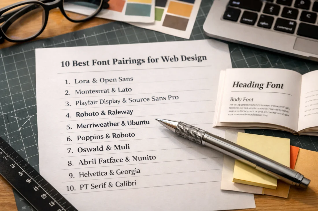
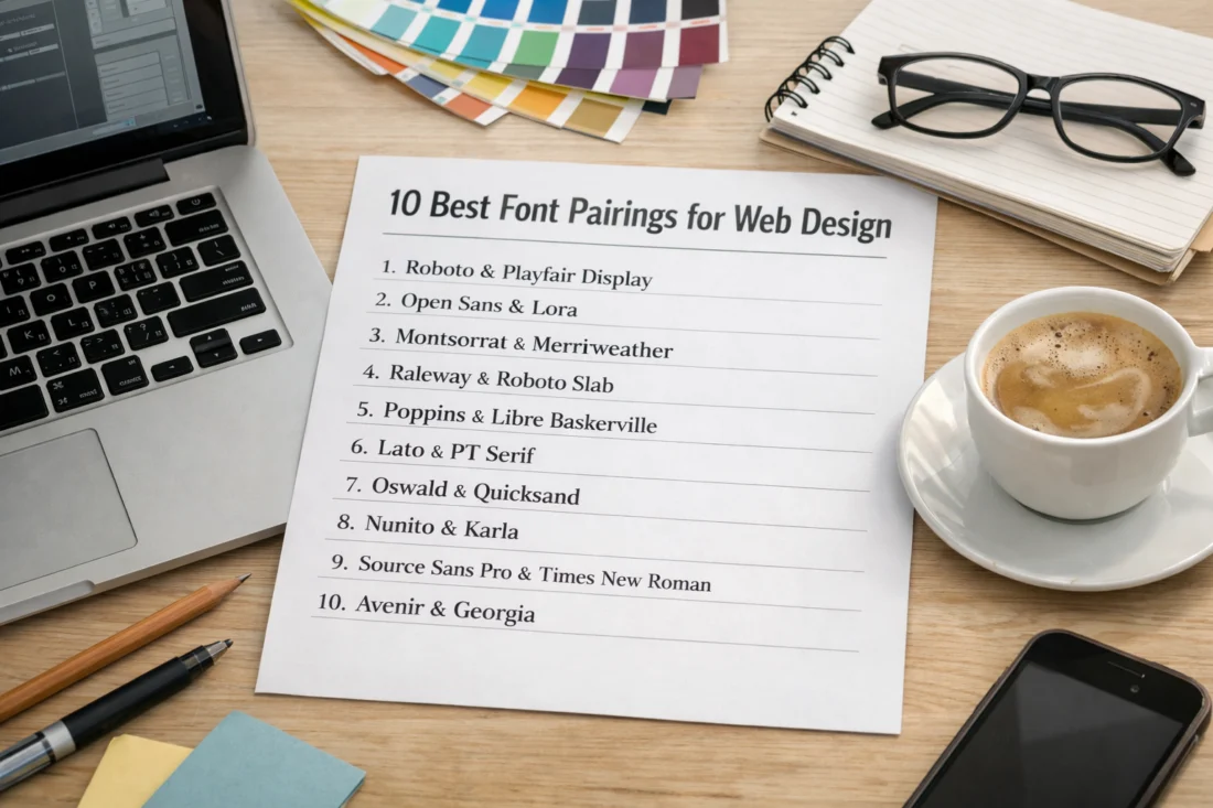
Top 10 Font Pairings for Web Design in 2026
Here are the 10 best font pairings for web design in 2026, each offering unique benefits for various design contexts:
- Roboto and Merriweather: A versatile combination perfect for balancing modern and classic tones.
- Lato and Playfair Display: Ideal for creating a professional yet approachable look.
- Montserrat and Georgia: Offers a clean, sophisticated style suitable for corporate websites.
- Open Sans and Lora: A friendly pairing that enhances readability on digital platforms.
- Poppins and Times New Roman: Combines contemporary flair with traditional elegance.
- Raleway and Garamond: Perfect for editorial websites, providing a polished and refined appearance.
- Oswald and Source Sans Pro: A strong choice for tech-focused websites, offering a modern edge.
- Nunito and Baskerville: Balances warmth and professionalism, ideal for creative portfolios.
- Ubuntu and PT Serif: Suited for educational websites, offering clarity and authority.
- Fira Sans and Arial: A simple, clean pairing that is effective for minimalist designs.
These combinations leverage emerging trends in 2026, such as the use of variable fonts and responsive typography, ensuring that your website remains contemporary and engaging.
Alternatives and Options: Exploring Different Font Pairing Styles
When exploring font pairing styles, it’s important to understand the different characteristics that each style brings to a design. Serif fonts, for instance, are often seen as traditional and trustworthy, making them suitable for formal websites. In contrast, sans-serif fonts offer a modern and clean look, ideal for tech and lifestyle brands.
Modern fonts tend to have minimalistic and geometric designs, while classic fonts are rooted in historical typefaces with ornate details. The choice between these styles depends on the brand’s identity and the message being conveyed. Each style has its pros and cons; modern fonts can appear cold if overused, while classic fonts may seem outdated when used excessively.
To achieve a balanced and engaging visual design, consider combining serif and sans-serif fonts. This approach can help enhance credibility through design by offering a professional and cohesive look that reassures visitors of the site's reliability.
Advanced Considerations for Font Pairings (Beyond Basics)
Beyond the basics, advanced considerations such as variable fonts and responsive typography are becoming increasingly important in font pairings. Variable fonts allow for a wide range of styles within a single font file, providing flexibility and reducing load times. This adaptability is crucial for optimizing websites for different devices and screen sizes.
Responsive typography ensures that fonts adjust smoothly across various platforms, maintaining readability and design integrity. This is particularly important for multilingual sites and those aiming to meet “accessible design practices“.
Edge cases, such as creating font pairings for languages with different character sets, require careful planning to ensure consistency and readability. Designers must consider these advanced topics to create inclusive and effective web designs.
Frequently Asked Questions About: Font Pairings for Web Design
What are some examples of good font pairings?
Examples of effective font pairings include Roboto and Merriweather for a balanced look, and Lato with Playfair Display for a professional yet approachable style.
How do font pairings affect user experience?
Font pairings impact user experience by enhancing readability and guiding users through the content. Well-chosen fonts can improve engagement and comprehension on your website.
Can I use more than two fonts in web design?
While it’s possible to use more than two fonts in web design, it’s best to limit the number to maintain cohesion and avoid clutter. Use additional fonts sparingly for specific elements.
What tools can help me choose font pairings?
Tools such as Google Fonts and Adobe Fonts offer a wide range of options and allow you to test and preview font pairings, helping you make informed decisions.
How often should I update my website’s fonts?
Updating your website’s fonts every 2-3 years can help keep your design fresh and relevant. Consider emerging trends and technological advancements when making updates.
What are some font pairing trends for 2026?
In 2026, trends include the use of variable fonts and responsive typography, which enhance flexibility and adaptability across different devices and screen sizes.
How do I ensure font pairings are accessible?
To ensure accessibility, choose fonts with good contrast and legibility, and follow guidelines for “accessible design practices”. Consider the needs of users with visual impairments.
What are the best font pairings for mobile design?
For mobile design, consider pairings like Open Sans and Lora, which offer clarity and readability on smaller screens. Use “mobile-friendly design tips” to enhance user experience.
How do I test font pairings before implementing them?
Test font pairings by previewing them on different devices and screen sizes, and gather feedback from users and stakeholders. Use tools like Figma or Sketch for prototyping.
In conclusion, thoughtful font pairings are essential in web design, influencing both user experience and brand identity. By experimenting with combinations and consulting resources, designers can create websites that are visually appealing and engaging. For more design insights, consider exploring “typography in web design” or consulting with a web design expert.