
The Role of Visual Design in SEO is to make content easier to understand, trust, and act on, which can improve search performance indirectly even though design itself is not a direct ranking factor. In practice, better visuals help users scan faster, stay longer, find answers sooner, and move through a page with less friction.
That matters more in 2026 because both users and search systems reward pages that communicate clearly. If a page is hard to read, poorly structured, or visually confusing, people often leave before they ever reach the useful part. This article explains how visual design affects user behavior, accessibility, page experience, content clarity, and the common mistakes that quietly weaken SEO. It also shows how to evaluate design choices without confusing aesthetics with effectiveness.
Contents
- 1 Why Visual Design Affects Search Performance Beyond “Looking Good”
- 2 How to Apply Visual Design Principles That Support SEO Goals
- 3 Visual Hierarchy, Layout, and Content Structure That Help Searchers
- 4 Design Elements That Can Strengthen or Weaken SEO Outcomes
- 5 Visual Design Choices Compared: Which Approach Fits Which SEO Goal?
- 6 Common Mistakes and Misconceptions About Visual Design in SEO
- 7 Advanced Considerations Most Guides Get Wrong
- 8 Measuring Whether Visual Design Is Helping SEO
- 9 Frequently Asked Questions About the Role of Visual Design in SEO
- 9.1 Does visual design directly affect SEO rankings?
- 9.2 Why does visual hierarchy matter for SEO?
- 9.3 Can a website look great and still perform poorly in search?
- 9.4 What visual elements help SEO the most?
- 9.5 Does image-heavy design hurt SEO?
- 9.6 How do I know if my design is too cluttered for SEO?
- 9.7 What is the relationship between visual design and page experience?
- 9.8 Should I redesign pages just for SEO?
- 9.9 How can I improve SEO with design without changing all my content?
- 9.10 What are the best visual design practices for informational pages?
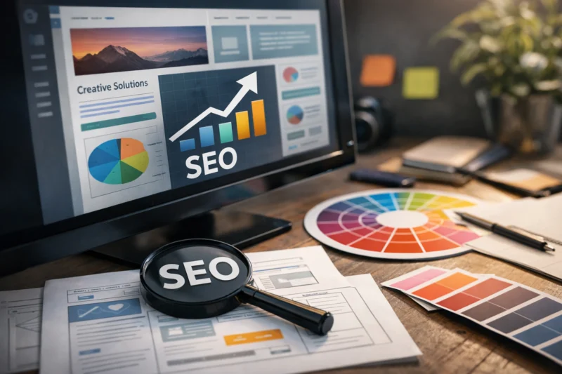
Why Visual Design Affects Search Performance Beyond “Looking Good”
Visual design affects search performance because it changes how quickly people can understand a page, not because Google “likes” pretty layouts. A strong visual hierarchy helps visitors locate the answer, reduce effort, and decide whether the page is worth reading further. That improved experience often leads to better engagement signals, stronger internal navigation, and more confidence in your content.
The important nuance is that correlation is not causation. A polished page may perform better because it is easier to use, but the design did not replace relevance, authority, or content quality. In other words, design supports SEO outcomes by lowering friction, not by acting as a shortcut around on-page SEO fundamentals or content quality rankings.
Many pages underperform because the structure buries the core answer under oversized banners, weak heading logic, or distracting modules. A visually polished page can still frustrate searchers if the user has to hunt for the main point. That is especially common on informational pages where the visitor arrives with a question and wants immediate clarity, not a brand story or an animated intro.
Good visual design tends to influence dwell-related behavior, internal navigation, conversion confidence, and content accessibility. It can make a guide feel easier to trust, a service page easier to compare, or a product page easier to evaluate. When content is readable and well organized, people are more likely to consume it, click deeper, and complete the task they came for.
One common mistake is treating design as separate from content strategy. If you want a clean website structure, the layout has to support the page’s intent, not just look modern. That is why design and editorial choices should be planned together, especially for pages competing in search results where first-impression clarity matters.
How to Apply Visual Design Principles That Support SEO Goals
Start with the user task: what should the page help someone understand, decide, or do in the fewest possible steps? If the page exists to explain a topic, the design should lead with the answer and then support it with proof, examples, and next steps. If the page exists to convert, the layout should still preserve clarity while giving the action obvious prominence.
Good visual design for SEO is usually the result of prioritization. The main content should appear quickly, supporting proof should reinforce trust without overwhelming the page, and the next action should be clear but not aggressive. This is where design boosts conversions in a way that also supports search: the page feels easier to use, so users are less likely to abandon it before understanding its value.
When evaluating a page, assess hierarchy, spacing, contrast, readability, and calls to action. Ask whether the eye naturally moves from headline to answer, then to supporting details, then to the next step. If the answer is unclear, if the page looks crowded, or if the CTA competes with the content, the design is probably working against the SEO goal rather than helping it.
More visual is not always better. Heavy decoration, oversized motion, or dense UI elements can dilute message focus and slow comprehension. This is especially true for informational pages where the reader wants efficient learning. A refinement process works best: audit the layout, simplify distractions, test the result, and then refine based on how users actually behave.
This is also where aspects like user-friendly content formatting and strategies for capturing featured snippets come into play. When a page is structured for easy scanning, it allows users to quickly find answers and helps search engines better understand the content. While design alone cannot substitute for quality writing, it can significantly enhance the readability and effectiveness of the text. For more on this topic, explore strategies for optimizing for featured snippets.
Visual Hierarchy, Layout, and Content Structure That Help Searchers
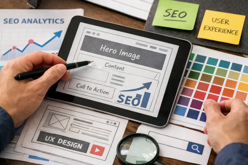
Visual hierarchy tells readers what matters first, second, and third. Headings, subheadings, whitespace, and section order all help users and crawlers infer topical relevance because they create a logical reading path. When the content structure mirrors the search intent, the page feels easier to navigate and more complete.
For informational queries, placing the answer early is usually the best move. Searchers often want a concise explanation before deeper detail, so an introductory answer followed by context performs better than a delayed reveal. That does not mean shallow content; it means respecting attention and allowing the reader to get oriented immediately.
Mobile skimmability poses a significant challenge, especially since many users first experience content on smaller screens. A webpage that appears well-structured on desktop may come off as cluttered or overwhelming on mobile devices due to inadequate headings and lengthy paragraphs. This is where the intersection of mobile optimization and visual design becomes vital: ensuring the page is easy to navigate, interact with, and comprehend within a limited viewing area. For insights on enhancing your site’s mobile performance, check out why mobile optimization matters for search rankings.
Long-form pages also need visual landmarks so readers do not lose their place. Repeated subheads, consistent spacing, and occasional section cues help people move through dense content without feeling trapped in a wall of text. The goal is to support comprehension without making the page feel fragmented.
On projects where the content is unusually deep, a clear structure can prevent fatigue and improve recall. A well-designed layout also supports internal linking opportunities because the sections become more specific and easier to reference in future content. Below is a simple comparison of how structure choices affect SEO usability.
| Design choice | What it helps | Common failure mode |
|---|---|---|
| Answer-first layout | Quick understanding and satisfaction | Putting the key point below the fold |
| Strong subheading logic | Scanability and topical clarity | Generic headings that say little |
| Whitespace and spacing | Reading comfort and focus | Crowded sections that feel difficult |
| Section landmarks | Orientation on long pages | Readers losing their place |
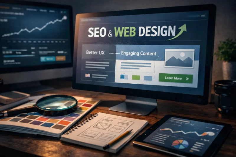
Design Elements That Can Strengthen or Weaken SEO Outcomes
Typography has a direct impact on legibility. Font size, line length, and line spacing determine how much effort a reader needs to process the page. If text is too small, too wide, or too tightly packed, people may not stay long enough to absorb the content, especially on mobile devices.
Color and contrast also matter because they affect accessibility and emphasis. Low-contrast text can look elegant in a mockup but fail in real use, especially for readers with vision limitations or users in bright environments. Strong contrast helps users separate headings, body text, and calls to action without confusion.
Images, icons, and illustrations are useful when they clarify concepts, show a process, or provide proof. They become a liability when they are decorative noise that interrupts the reading flow or pushes the core explanation down the page. Large visuals can also increase load pressure, which is why responsive image techniques are essential when design relies on media.
Sliders, heavy banners, and animated modules often create more harm than value on informational pages. They can delay access to content, crowd the viewport, and distract from the first task a visitor wants to complete. If a user must scroll past several layers of visual framing before seeing the answer, engagement often drops.
Responsive design is more than just a technical issue; it's crucial for effective user experience. Websites must maintain consistency and functionality across devices—desktop, tablet, and mobile—ensuring that the core message is effectively communicated on every platform. If the mobile version compromises the layout, obscures essential text, or reduces important context to small controls, the overall SEO potential is diminished, even if the desktop version is visually appealing. For teams aiming to create scalable systems, utilizing efficient web design frameworks can make a significant difference, provided they are set up to keep content accessible and easy to read.
It also helps to connect visual work with editorial strategy. Strong design pairs naturally with content quality rankings, because useful content still needs a presentation layer that does not obscure its value. For some pages, the best result comes from engaging content formatting that improves readability without adding unnecessary visual complexity.
Visual Design Choices Compared: Which Approach Fits Which SEO Goal?
Minimalist layouts work best when clarity, speed, and trust are the priority. They help the reader focus on the message and reduce the chance that visuals compete with the content. Content-rich layouts are better when depth, proof, or explanation is the goal, especially for complex topics that benefit from examples, diagrams, or layered context.
Static visuals usually support understanding more efficiently than interactive components, because they do not ask the user to click before learning. Interactive modules can be valuable when they simplify comparison or personalization, but they can also introduce friction if they hide information behind tabs, accordions, or hover states. The right choice depends on whether the user needs orientation or exploration.
Template-led design and custom page design each have tradeoffs. Templates scale efficiently, support brand consistency, and often align well with editorial workflows. Custom designs can communicate nuance and brand position more effectively, but they can also become overworked if the design system is not disciplined.
For informational pages, a conversion-first design and an education-first design solve different problems. A conversion-first page emphasizes action, which is useful when the goal is a demo request, lead capture, or purchase. An education-first page emphasizes comprehension and confidence, which is better when the user is still learning. Choosing the wrong emphasis can make the page feel misaligned with search intent, even if it looks polished.
The best approach is the one that matches readability, page speed impact, editorial control, and user intent. If a design choice makes the page harder to load, harder to edit, or harder to understand, it is probably hurting search value more than helping it. This is why teams often benefit from pairing design decisions with on-page SEO fundamentals rather than treating them as separate workstreams.
When you are planning page systems, support topics like clean website structure and design boosts conversions should be considered together, not in isolation. A page that looks impressive but confuses the reader will rarely earn durable organic performance.
Common Mistakes and Misconceptions About Visual Design in SEO
One of the biggest misconceptions is that aesthetic polish equals search effectiveness. A beautiful interface can still be difficult to use, especially if the layout hides the answer, weakens contrast, or forces users through unnecessary steps. Search performance depends on the usefulness of the experience, not just visual appeal.
Another common issue is burying the answer under large hero sections, oversized banners, or overly clever modules. This is a frequent problem on pages trying to impress first and inform second. When the useful content is too far down the page, the visitor must work before getting value, and many simply leave.
Accessibility is often treated as a separate checklist item, but it is central to visual SEO. Poor contrast, missing focus states, and image-only explanations exclude users and reduce the page’s practical reach. If a chart or illustration is essential, it still needs supporting text so the content remains understandable and crawlable.
Some teams also assume SEO is only about text and keywords. That view misses how design shapes the way content is experienced and consumed. The better framing is that content, layout, and interaction all influence whether the answer feels easy to trust. That is especially relevant for pages built around authority topics, where trust signals and clarity are inseparable.
Overdesigning is another subtle problem. When too many effects, colors, modules, or CTAs compete for attention, the message becomes less persuasive instead of more. In practice, many pages improve when the layout is simplified and the page has stronger visual breathing room, clearer reading flow, and fewer competing decisions.
This is also where teams should connect design decisions to supporting resources such as responsive image techniques and on-page SEO fundamentals. Those topics are not side issues; they are part of how visual choices affect usability, speed, and content comprehension in real browsing conditions.
Advanced Considerations Most Guides Get Wrong
Page experience and visual design interact, but they are not the same thing. A page can score well on a technical checklist and still feel clumsy if the visual layout does not support the visitor’s goal. Likewise, a page with an attractive presentation can still underperform if the structure frustrates scanning or buries key information.
Heavily visual industries such as fashion, travel, architecture, and e-commerce face a special challenge. Imagery is essential because it helps users evaluate style, context, or quality, but the supporting text still has to be clear, searchable, and crawlable. In these cases, the design should frame the visuals rather than replace the explanation.
Design refreshes can improve engagement, but they can also create regressions when teams change too much at once. A visual update that removes contextual detail, compresses text too aggressively, or introduces hidden navigation can improve aesthetics while reducing usability. That is why a redesign should not be judged only by brand feedback; it should be tested against actual user behavior and search performance.
One thing many guides get wrong is assuming conversion improvements always align with informational SEO. Sometimes a more aggressive landing-page style increases clicks on a CTA but reduces the page’s ability to answer the question thoroughly. For informational content, the best design often prioritizes trust and clarity before persuasion. This is especially important when the page is meant to support featured snippet optimization or other answer-style search results.
Testing matters because assumptions about “better design” are often wrong. A layout that looks more modern may feel less usable to the audience, especially if it adds friction to reading. Teams should validate changes with scroll behavior, click patterns, and post-launch review rather than relying on subjective preference alone.
In advanced audits, the strongest pages often combine editorial precision with simple structure and enough visual discipline to make the content feel effortless. That is why many organizations revisit both content quality rankings and design systems together when they want sustainable gains rather than cosmetic improvement.
Measuring Whether Visual Design Is Helping SEO
The best way to measure design impact is to look for changes in how people consume the page. Organic engagement patterns, scroll depth, click behavior, bounce-related context, and internal navigation can all reveal whether the visual experience is helping users move through the content more effectively.
Quantitative data matters, but it should not be interpreted in isolation. A higher time on page may mean better reading, or it may mean confusion. A lower bounce rate may indicate stronger interest, or it may reflect a change in layout that encourages extra clicks without improving understanding. The real question is whether the visitor finds the answer faster and with less friction.
When reviewing a page before and after a redesign, compare not just traffic but behavior around key page elements. Did more people reach the core explanation? Did the CTA become more visible without hiding the content? Did internal navigation improve because the structure became clearer? Those signals are often more meaningful than a single headline metric.
One useful method is to evaluate the page against the user’s information journey. If the redesign helps them recognize the topic, locate the answer, verify the claim, and take the next step, it is probably helping SEO indirectly. If it only makes the page look more refined, the improvement may be cosmetic rather than functional.
Measurement pitfalls are common. Teams often mistake more time on page for success when visitors are simply struggling with the layout. They also overvalue small lifts in click-through behavior while ignoring whether the content became harder to read. A better framework is to combine analytics, qualitative review, and intent matching so the design is judged by usefulness, not appearance alone.
This is where future internal links can support broader analysis pages such as user engagement metrics, website redesign strategy, and search intent optimization. Those topic clusters help explain why design changes should be measured as part of a full experience, not as isolated visual updates.
Frequently Asked Questions About the Role of Visual Design in SEO
Does visual design directly affect SEO rankings?
Visual design does not directly rank a page in the same way that relevance or content quality can influence search performance. It affects SEO indirectly by improving usability, clarity, and engagement, which can help people stay longer and consume more of the content.
If a design makes a page easier to scan and trust, it often supports better outcomes across the whole search journey. But the design still works best when paired with strong content and clear search intent alignment.
Why does visual hierarchy matter for SEO?
Visual hierarchy matters because it helps people find the answer quickly and understand what the page is about. That reduces friction and makes the content feel more useful, which is especially important for informational searches.
Clear hierarchy also helps long pages feel navigable on mobile, where the lack of structure can make even strong content seem hard to use. It is one of the simplest ways to improve readability without rewriting the page.
Can a website look great and still perform poorly in search?
Yes. A website can be visually impressive and still underperform if the answer is buried, the text is hard to read, or the content is difficult to access on mobile.
This usually happens when design choices prioritize style over clarity. The page may win praise in a review but lose search traffic because visitors do not get value quickly enough.
What visual elements help SEO the most?
The most useful elements are typography, spacing, contrast, mobile layout, and clear content grouping. These choices make the page easier to read and help users move through the information with less effort.
Supportive visuals such as diagrams or product imagery can help too, but only when they improve understanding instead of distracting from it.
Does image-heavy design hurt SEO?
It can, especially if the images slow the page down or push the useful content below the fold. Image-heavy pages are not automatically bad for SEO, but they need careful structure and strong supporting text.
For some industries, visuals are essential for comprehension. In those cases, the best solution is not removing images but making sure they are responsive, compressed, and paired with clear written context.
How do I know if my design is too cluttered for SEO?
Signs of clutter include competing calls to action, weak hierarchy, dense sections, and content buried under decorative elements. If the page feels noisy or hard to scan, users are likely experiencing friction too.
A cluttered page often looks busy rather than helpful. The fastest test is to ask whether someone can understand the page’s purpose within a few seconds.
What is the relationship between visual design and page experience?
Visual design shapes how comfortable and usable the page feels, which is a major part of page experience. Good design makes reading, tapping, and navigating easier across devices.
When the experience is smooth, visitors can focus on the content instead of fighting the interface. That supports stronger engagement and better satisfaction with the page.
Should I redesign pages just for SEO?
Usually no. A redesign should be driven first by user needs, content clarity, and business goals, then evaluated for SEO benefits as part of the outcome.
If a page has serious usability problems, a redesign may absolutely be worth it. But if the current page already works well, small design improvements are often safer than a full rebuild.
How can I improve SEO with design without changing all my content?
You can improve hierarchy, spacing, typography, contrast, and mobile presentation without rewriting the entire page. Those changes often make existing content easier to understand and trust.
Improving the frame around the content is often enough to lift performance when the writing is already strong. This is a practical path when you want better results without a full editorial overhaul.
What are the best visual design practices for informational pages?
Informational pages work best when they are readable, well structured, and supported by clear visual cues. The answer should appear early, the sections should be easy to scan, and the visuals should support understanding rather than distract from it.
Mobile presentation matters especially because many readers will see the page first on a phone. Strong informational pages usually combine clean hierarchy, accessible contrast, and thoughtful content grouping.
The role of visual design in SEO is not to replace relevance, but to make relevant content easier to find, understand, and trust. When design supports clarity, usability, accessibility, and page experience, it improves the way searchers consume the page and the way search engines interpret that behavior.
The most effective improvements are usually simple: better hierarchy, stronger typography, higher contrast, cleaner structure, and fewer distractions. That approach serves search intent better than design that is flashy but confusing, and it creates a stronger foundation for long-term organic performance.
If you want a practical next step, audit one important page, identify one friction point, and test one design improvement before scaling it across your site. That is often the fastest way to see how visual design can support SEO without overhauling everything at once.
Updated April 2026