
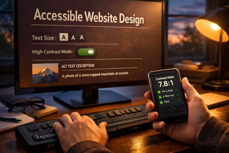
If keyboard-only users can reach your content, but can’t complete tasks, your design is not finished. Keyboard Navigation Best Practices mean you plan focus flow, operable controls, and state changes as part of UX—not as a last-minute fix. In this guide, I’ll help you apply a practical checklist/process that web designers can run during design and QA. The goal is simple: make keyboard interaction predictable, clear, and safe.
Great keyboard access matters because real people do it. Some use a keyboard due to motor limitations. Others rely on it to move faster than a mouse. And for many teams, accessibility issues also create compliance risk. When focus behavior breaks, users feel lost, even if the page “works” for others.
This article stays focused on design and interaction patterns. You’ll learn how to shape focus, tab flow, focus styling, and keyboard activation. You’ll also see how to handle dynamic UI states without disorienting keyboard users. Finally, you’ll get realistic testing pass criteria you can use in 2026.
Contents
- 1 Design tab order as a deliberate UX system, not a side effect of the layout
- 2 Use focus indicators that are visible, consistent, and never misleading
- 3 Make every interactive component fully keyboard-operable with expected activation behavior
- 4 Manage dynamic updates and state changes without losing focus or confusing users
- 5 Test keyboard navigation with real user journeys and clear pass/fail criteria
- 6 Avoid mistakes that break keyboard usability even when “tab works”
- 7 Choose an implementation approach that matches your component complexity and team maturity
- 8 Build resilient navigation patterns for grids, long forms, and interactive layouts
- 9 Keyboard navigation best practices for web designers
- 9.1 What keyboard navigation issues most commonly affect web form usability?
- 9.2 How can I confirm my tab order matches the visual layout reliably?
- 9.3 Should I add tabindex to interactive elements to fix focus order?
- 9.4 How do I prevent keyboard users from getting trapped in modals or menus?
- 9.5 What focus styling works best when designing for both mouse and keyboard users?
- 9.6 How can I make custom dropdowns and accordions fully keyboard operable?
- 9.7 How should focus behave when a page loads new content after filtering or searching?
- 9.8 Why does my site pass basic tab testing but still fail real-world keyboard use?
- 9.9 What are the best ways to test keyboard navigation across different browsers in 2026?
- 9.10 Can I rely on automated accessibility tools for keyboard navigation compliance?
Design tab order as a deliberate UX system, not a side effect of the layout
Tab order should match how users think, not only how elements appear on screen. When focus moves in a confusing sequence, keyboard users lose time and trust. Treat tab flow like navigation design, because it is.
How it works is straightforward. Browsers follow document order in the HTML, then move through focusable elements. But your visual layout can diverge from document order. For example, you might visually place a “Contact” card above a “Pricing” card, while the DOM order is reversed. As a result, tabbing feels random even when your spacing looks tidy.
Start by mapping primary tasks. Then plan a top-to-bottom flow that mirrors those tasks. Use left-to-right only when it reflects reading order for your layout. If you reorder content visually with flexbox or grid, confirm that DOM order still supports the task flow.
There is a temptation to “fix” focus with tabindex-like hacks. However, those tricks can break predictability across pages and components. They also increase maintenance work, especially after re-renders. A better approach is to align DOM structure with the user journey.
Modals and menus are where tab order often collapses. A focus trap can occur when tabbing forward cycles inside a layer that never exits cleanly. Prevent this by controlling focus entry and exit points. Also ensure that shift+tab moves backward to a logical previous control, not to an unrelated element.
A common mistake is hiding elements with CSS while still leaving them focusable. Another is making off-canvas panels receive focus before they are visible. Also watch for focus jumping after state changes, like a filter update that re-renders the list. Keyboard users feel those jumps as “teleporting.”
Use focus indicators that are visible, consistent, and never misleading
Keyboard users need a clear “where am I?” signal at all times. If your focus style is faint, removed, or clipped, the interface becomes guesswork. Visible, predictable focus indicators are a core Keyboard Navigation Best Practices element.
Focus styling works through CSS applied to interactive states. Browsers also provide a default outline. Many teams remove it with CSS resets. That removal can be a problem when you forget to replace it with a strong custom style. Therefore, design your own focus treatment instead of relying on defaults.
Good focus styles show both contrast and clarity. They should be easy to spot on every background. They should also appear when focus is triggered by keyboard input. The focus-visible mechanism helps here by showing focus only when it matters. For implementation details, the W3C working group documents focus visibility behavior Web Content Accessibility Guidelines (WCAG) Overview.

Handle multiple states deliberately. Normal focus, hover, and focus-visible should not contradict each other. Disabled controls should not show a clickable focus ring if they cannot be activated. When you add error states, keep the focus ring distinct from the error color to avoid confusion.
Complex components can create misleading focus cues. For example, a table grid might highlight a row, while focus actually sits on a single cell button. Meanwhile, overlapping elements can hide rings. This often happens with z-index stacking and container clipping. So confirm focus visibility inside grids, cards, and multi-step widgets.
Edge cases show up with overflow and fixed containers. A focus ring can be cut off by an ancestor with overflow: hidden. Another issue is a ring hidden under a pseudo-element layer. Also check stacked UI like tooltips and sticky headers. In those layouts, ensure the ring remains visible and aligned with the actual focused element.
Make every interactive component fully keyboard-operable with expected activation behavior
Keyboard users need more than focus. Every interactive element must support keyboard activation in a way users already understand. That includes consistent Enter and Space behavior for controls.
Start with correct element choice. When you use native links and buttons, the keyboard model comes built-in. When you use custom elements like divs with click handlers, you often lose keyboard activation parity. Designers can prevent many issues by standardizing which component types are allowed for which UI roles.
For common patterns, define interaction rules. Navigation links should activate with Enter. Buttons should activate with Enter or Space, depending on native semantics. Dropdown toggles should be operable with keyboard and update state clearly. Accordions should expand and collapse with activation keys and place focus on the right control. These rules sound obvious, but many failures come from mouse-only event handling.
Composite widgets need a focus strategy. Two common models exist: sequential tabbing and roving tabindex. Sequential tabbing uses natural tab order across all internal controls. Roving tabindex keeps only one internal item tabbable at a time and moves focus with arrow keys. Choose one intentionally and keep it consistent within the widget. Otherwise, users feel like they hit dead ends.
Typeahead controls create a unique risk. Keys intended for navigation should not hijack typing in inputs, and vice versa. For example, arrow keys inside a search box should move within the suggestions, not move focus to the next page control. Meanwhile, Escape should close the suggestions without destroying the user’s typed value.
A common failure mode is when the UI responds to keyboard focus but not to keyboard activation. Another is when focus never moves into newly revealed content. Also watch for submit actions bound only to click events. In those cases, pressing Enter in a form field may not trigger the expected action.
Manage dynamic updates and state changes without losing focus or confusing users
When content changes, focus must stay intentional. Keyboard users need to know what changed and where focus went. If updates cause unexpected focus jumps, the experience breaks.
Dynamic UI includes AJAX updates, filtering, loading skeletons, and route transitions. It also includes expanding content, like “Show more” sections and inline accordions. In each case, decide whether focus should move, stay put, or return to a sensible target. Then design that rule and test it.
For dialogs and overlays, focus handling is especially important. When a dialog opens, move focus into it. When it closes, return focus to the element that opened it. This prevents users from tabbing through hidden background content. It also reduces “lost context” when the UI returns.
Status messages matter for context. If a search updates results, you should announce that new results are available. However, do not spam announcements on every minor UI change. Design the announcement timing around user-triggered actions. This keeps the experience calm and understandable.
Framework re-renders can cause focus loss. After a component refresh, the focused element may be replaced in the DOM. The result is that focus resets to the page body. Designers and developers should coordinate on stable focus targets and minimal DOM churn for interactive regions.
A nuance many teams miss is respecting user intent during multi-step flows. Suppose a form step updates an inline summary. You should not suddenly move focus to a summary region if the user is still typing. Instead, preserve focus in the input and update the UI visually. When you must move focus, do it after the change completes, not mid-transition.
Keyboard testing must reflect how users complete tasks. A quick “tab through and it doesn’t crash” check is not enough. Use keyboard walkthroughs as regression tests before each release.
Define primary journeys first. Then test each one from start to finish using only the keyboard. Include forward tabbing and backward shift+tab. Many bugs appear only when users reverse direction, like a focus order that loops incorrectly.
Next, set pass criteria designers can apply. Focus order should be logical and match the intended task flow. Focus indicators must always be visible on every focused element. Every operable control must respond to activation keys. Also verify there are no keyboard traps in modals, menus, and expandable panels.
Test by component category. Menus and dropdowns need open, navigate, select, and close behaviors. Form controls need correct focus landing on errors. Pagination needs predictable focus after page changes. Data tables and grids need focus movement that feels coherent and supports keyboard actions.
For dynamic content, add focused regression scenarios. Filter a list, then confirm focus lands where users expect. Open and close a dialog repeatedly, then confirm focus returns to the correct trigger. Also test route transitions triggered by keyboard activation, like skipping to a new section.
Tools can help you catch obvious issues, but they cannot replace real keyboard flows. Automated audits might miss focus jumps caused by re-renders. They also might not detect when focus moves but the control is not operable. The WAI guidance emphasizes that usability testing and experience review are part of accessibility practice WAI-ARIA Authoring Practices. In practice, a human keyboard walkthrough remains the authority.
Avoid mistakes that break keyboard usability even when “tab works”
Tab working is only the start. Many websites fail keyboard usability because other interaction rules are wrong. Keyboard Navigation Best Practices require you to check activation, visibility, and state behavior too.

One frequent pitfall is removing outlines and forgetting to add a replacement. Another is using non-semantic divs as buttons. Those elements may receive focus, but they often do not activate with the keyboard. In addition, hover-only reveal breaks users who rely on focus and click patterns.
Layout-dependent traps also ruin keyboard experiences. Hidden overflow can clip focus rings. Off-screen panels can be focusable even when visually collapsed. Also check if your responsive layout changes grouping. If controls move visually at a breakpoint, users may feel disoriented if the tab order stays unchanged.
Misconceptions also cause poor results. “Tab order always matches visual order” is false once you reorder with CSS or render components out of sequence. “Screen reader testing equals keyboard testing” also falls short. Screen reader navigation can work even when focus-visible styling or activation behavior fails for keyboard-only users.
ARIA can help, but it is not a magic fix. Overusing focus management attributes without implementing the full keyboard model creates an ARIA parity gap. In that gap, the UI announces one thing, while arrow keys, activation, and focus movement behave differently. The result is misleading interaction.
An edge-case set you should not ignore includes nested interactive elements. For example, a clickable card that contains a button can create focus confusion. Also check long forms with repeated controls. When error messages appear, ensure focus moves to the error summary or first invalid field, not to a generic container.
Choose an implementation approach that matches your component complexity and team maturity
Keyboard support should match your UI model, not just your coding preference. For designers, the key question is how accurately your chosen approach models keyboard interaction. Keyboard Navigation Best Practices can guide that decision lens.
Four approach categories are common. First, native HTML and semantics-first components rely on built-in keyboard behavior. This often gives the best baseline. Second, ARIA-enhanced custom widgets provide extra roles and state, but they require you to implement the full keyboard interaction model. Third, hybrid components combine semantic controls with custom visuals. Fourth, progressive enhancement starts from a simple, usable interaction and layers richer behavior without breaking keyboard access.
Here’s the tradeoff matrix designers should consider. Semantic-first is usually easiest to maintain and test. ARIA-heavy approaches can look polished, yet they add complexity to keyboard testing. Hybrid approaches can reduce risk but still require careful state mapping. Progressive enhancement can be slower to build, but it often protects against broken re-renders.
A practical decision rule helps. If the UI can be represented as a standard link, button, or form control, start there. Use ARIA only when no native element can represent the interaction correctly. Then test keyboard behavior as if you were implementing from scratch, not as if ARIA “covers it.”
ARIA parity gaps are the deeper issue. For example, a custom dropdown might expose expanded state to assistive tech. But if arrow keys do not move through options and Escape does not close, users still struggle. Therefore, choose an approach you can fully implement and regression-test.
In real teams, maturity matters. If your developers can reliably test complex widgets, ARIA-enhanced patterns may be fine. If not, hybrid or semantic-first patterns reduce the cost of getting keyboard behavior right.
| Approach category | Best for | Main keyboard risk | Design choice |
|---|---|---|---|
| Native semantic-first | Links, buttons, standard form controls | CSS removing focus visibility | Define allowed component primitives |
| ARIA-enhanced custom widgets | Tabs, complex menus, grid-like controls | Incomplete arrow and activation model | Specify a full keyboard interaction contract |
| Hybrid components | Custom visuals with native controls | Focus routing into decorative layers | Align focus target with the real control |
| Progressive enhancement | Complex interactions that can degrade safely | Re-render breaks focus targets | Plan stable focus anchors early |
Complex layouts need more than correct tab order. They need keyboard behaviors that match the structure of the content. This is where many designs look good but fail in daily use.
For grids and tables, focus expectations differ from simple lists. Users often expect focus to move logically across rows and cells. When actions exist inside a row, ensure keyboard users can trigger them without guessing which cell is “active.” Also ensure selection states do not imply a row is selected when focus is only on a single control.
Long forms need careful error focus targeting. When validation fails, move focus to the first invalid field. If you use an error summary, ensure it becomes focusable and is placed early in the tab flow. Group related questions with clear legends so users can understand context before moving on.
Responsive design adds another layer. Visual grouping can change at breakpoints. Therefore, keep focus mapping consistent across layouts. If a sidebar becomes a drawer on mobile, ensure the drawer focus model and exit behavior are the same pattern every time. Also check jump links and anchor navigation. Fixed headers can cover the focused element, so offset scroll or provide a focus-visible adjustment.
Sticky headers and sidebars can also hide focus. When a focused control sits under a sticky element, users might think it disappeared. Test this with keyboard at multiple viewport sizes. In addition, watch for “lost context” when focus moves to the next section but the page does not scroll.
Framework realities affect component boundaries. If your grid re-renders entire sections on filter changes, focus can land on a removed node. To prevent that, designers should define stable interaction boundaries and ask developers to preserve focusable containers. The result is less disorientation and fewer keyboard support regressions.
The most reliable way to improve keyboard navigation is to turn it into a design system requirement. That means you define focus rules, component activation contracts, and state transition behaviors as part of your process. Then you test against real task flows, not against hope.
Use a simple checklist during design review. First, confirm tab order matches user tasks. Next, ensure every interactive element has clear focus styling and keyboard activation. Then plan how focus should behave when content changes. Finally, run keyboard regression tests after any UI re-render or component update.
This approach also improves collaboration. Designers can specify what the focus target should be after each interaction. Developers can implement stable DOM anchors and predictable event models. Together, you can define a definition-of-done for keyboard behavior that is clear enough to ship.
As a result, keyboard navigation becomes a predictable part of the user experience. Keyboard-only visitors can browse, operate controls, and complete forms without feeling trapped or lost. And you reduce compliance and usability risk at the same time.
The biggest issues are focus order through fields and poor error handling. When validation fails, focus should move to the first invalid field or a clear error summary. Also ensure the submit and reset controls activate with Enter or Space as expected, not only with clicks.
How can I confirm my tab order matches the visual layout reliably?
Tab order follows the document structure, not just what you see with CSS. Confirm your DOM order matches the visual task sequence, especially after reordering with grid or conditional rendering. Then test by running a keyboard-only walkthrough in both forward and backward directions.
Should I add tabindex to interactive elements to fix focus order?
Use tabindex-like adjustments only when you must, and avoid making many elements artificially tabbable. Prefer semantic HTML so focus lands where it should naturally. If you do adjust focus order, test across responsive breakpoints and after dynamic re-renders to ensure it stays consistent.
Contain focus within the overlay only while it is open, and return focus to the element that opened it. Provide an obvious close control that works with Escape and keyboard activation. Also verify that shift+tab moves backward through the overlay controls without looping incorrectly.
What focus styling works best when designing for both mouse and keyboard users?
Design a focus-visible style with strong contrast and a clear shape. Keep it distinct from hover so keyboard users do not get mixed signals. Avoid removing focus outlines in CSS resets, and check that rings remain visible in every component layer and container.
How can I make custom dropdowns and accordions fully keyboard operable?
Keyboard users must be able to toggle open and close, then move through options or sections using the agreed keys. Communicate expanded state clearly and move focus to the next logical interactive target after selection. Also ensure Escape closes the control without leaving focus stranded.
How should focus behave when a page loads new content after filtering or searching?
Decide whether to preserve focus or move it to a meaningful new target after results update. Commonly, focus should remain stable if the user is still working in a search control. When focus moves, announce the update so users understand that the page changed and where to continue.
Why does my site pass basic tab testing but still fail real-world keyboard use?
Quick checks often skip shift+tab behavior, activation key parity, and focus return after overlays. Another common cause is dynamic updates that re-render content and move focus unexpectedly. Nested controls and hidden-but-focusable elements also create traps that a short walkthrough misses.
Run real keyboard walkthroughs in multiple browsers using the same user journeys. Pay special attention to focus-visible styling differences and activation behavior on custom components. Also test at multiple viewport sizes, since responsive layout can change focus mapping and visibility.
Automated tools are useful for catching obvious issues, like missing labels or contrast problems. However, they cannot fully verify keyboard activation, focus order correctness, or focus return after state changes. Manual keyboard testing remains essential for true keyboard usability.
When you treat keyboard behavior as a designed system, you get fewer surprises. Your site feels usable for keyboard-only visitors, not just navigable. And your UI becomes more robust for everyone.
Next step: pick one user journey, run a keyboard-only audit, fix the highest-impact focus and activation issues, then retest. Align designers and developers on focus targets, component interaction models, and clear definition-of-done criteria. Do that, and your Keyboard Navigation Best Practices will make keyboard navigation predictable and truly usable for your visitors.
Updated September 2026