
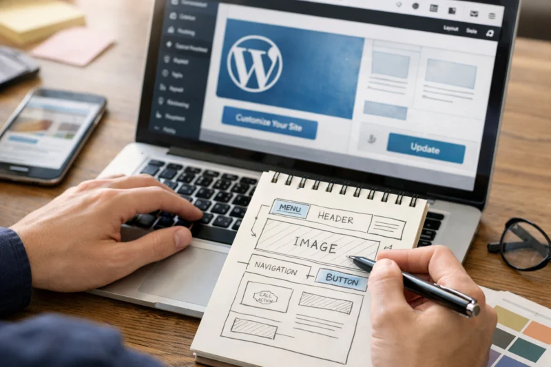
Mastering User Experience on WordPress means building a site that is easy to navigate, fast to load, accessible to everyone, trustworthy, and aligned with what visitors actually want to do.
For WordPress sites, UX is shaped by decisions you make in themes, plugins, content structure, and performance settings, so even small changes can have a big effect on how people behave, stay, and convert. This article shows how to improve UX step by step, not just by listing generic best practices, and it helps you evaluate what to fix first without redesigning everything at once.
In practice, the goal is to reduce friction at every stage: when users scan a page, choose a menu item, read a post, fill out a form, or decide whether to trust your brand. That is why a strong WordPress site is not only attractive; it is also predictable, responsive, and easy to learn. The same thinking supports better WordPress SEO fundamentals, stronger engagement, and more reliable conversions.
Contents
- 1 What user experience means on a WordPress site
- 2 How to improve WordPress UX step by step
- 3 WordPress design choices that shape usability
- 4 Common WordPress UX mistakes that hurt engagement
- 5 Content structure and information hierarchy for better WordPress UX
- 6 Performance, speed, and technical factors that affect experience
- 7 Accessibility and inclusive UX on WordPress
- 8 UX optimization for navigation, forms, and conversion paths
- 9 Advanced UX considerations most WordPress guides miss
- 10 Frequently Asked Questions About Mastering User Experience on WordPress
- 10.1 What is user experience in WordPress?
- 10.2 How do I improve UX on my WordPress site?
- 10.3 What are the most important UX elements on a WordPress website?
- 10.4 Which WordPress themes are best for user experience?
- 10.5 How does page speed affect WordPress UX?
- 10.6 Is page builder design good or bad for UX?
- 10.7 How can I make my WordPress site more mobile-friendly?
- 10.8 What are the biggest UX mistakes on WordPress?
- 10.9 How do I test whether my WordPress UX is actually improving?
- 10.10 How do I improve user experience on WordPress for long-form content?
What user experience means on a WordPress site
User experience on a WordPress site is the quality of the visitor’s journey: how quickly they find what they need, how easily they understand the page, and how confident they feel while using it. It includes usability, clarity, speed, accessibility, and consistency across the site, not just how polished the homepage looks.
This matters because visual design alone cannot rescue a site that is confusing or slow. A site can look modern and still fail if the navigation is overloaded, headings are unclear, or the content does not match the visitor’s intent. In WordPress, these problems often come from system-level inconsistencies: different templates behaving differently, menus changing from section to section, or plugin-driven blocks creating uneven patterns across posts and pages.
Good UX also depends on the audience and the site type. A SaaS landing page, a nonprofit website, and a content-heavy publication do not need the same layout or conversion path. What they share is the need for user friendly navigation, readable content, and trustworthy interactions. If you want a more usable site, start by asking whether each page helps people complete a task with minimal effort, not whether it simply looks impressive.
The practical outcome is measurable. Better UX usually improves engagement, reduces bounce rates caused by confusion, and increases conversions because users can navigate through the site with more confidence. This also supports related objectives, including creating content that aligns with search intent, as pages that are user-friendly are typically easier to read, link through, and return to later. In this context, understanding how to develop SEO-oriented blog content can significantly enhance the overall experience for both readers and search engines.

How to improve WordPress UX step by step
The most effective way to improve WordPress UX is to begin with user goals, audit the biggest friction points, then make changes one at a time and test the results. That gives you a clear cause-and-effect trail instead of guessing which redesign choice helped or hurt.
Start by identifying the top tasks visitors come to complete within the first few clicks. On a service site, that might be finding pricing, comparing offerings, or contacting sales. On a blog, it may be finding a relevant article, checking credibility, or subscribing. Once you know the task, audit the page flow, menu paths, content hierarchy, and performance issues that slow people down. Then prioritize fixes by impact, not by how easy they are to notice.
A practical improvement process looks like this: audit the site, prioritize the worst friction, implement one change, test behavior, and refine based on what changed. Measure before and after using a few core signals such as task completion rate, time to first meaningful interaction, scroll depth on key pages, and form completion. Avoid making multiple major changes at once, because if engagement rises or falls, you will not know which adjustment caused it. That mistake is common on WordPress because owners often switch themes, add plugins, rewrite homepage copy, and change menus in the same week.
For instance, if your contact page features an overly long form with unclear labels, address these issues before focusing on aesthetic changes like color palettes or animations. Similarly, if a blog category is difficult to navigate, prioritize reorganizing headings and internal links over introducing new design elements. This approach aligns with the principles of developing a website that effectively drives conversions, where eliminating major obstacles comes first, followed by testing subsequent areas that may hinder performance.
WordPress design choices that shape usability
The main design approach you choose in WordPress has a direct effect on usability, editing consistency, and long-term maintenance. Block themes, classic themes, page builders, and custom-built templates each make different tradeoffs between creative flexibility and design discipline.
Block themes are often a strong fit when you want native editing control and a cleaner path to consistency. Classic themes can still work well, especially on established sites, but they may require more custom code or plugin support to achieve modern layouts. Page builders offer fast experimentation and easier visual editing, yet they can create bloat and inconsistency if too many modules are used without a design system. Custom-built templates are best when the site has complex requirements, but they demand stronger governance to keep the experience coherent over time.
The right theme choice is not the one with the most features; it is the one that makes good usability easier to maintain. A simpler design system often beats a highly customized layout, especially on smaller screens where complex compositions can collapse into clutter. That is also where polished but overloaded visual effects become a problem: animated sections, oversized hero areas, and multi-column layouts may look refined on desktop but reduce clarity on mobile.
| Approach | Usability impact | Best use case | Main tradeoff |
|---|---|---|---|
| Block themes | Good consistency if well governed | Modern content sites and flexible editing | Needs structure to avoid visual drift |
| Classic themes | Stable, familiar layouts | Existing sites with lighter redesign needs | Less native flexibility |
| Page builders | Fast to build, but easy to overcomplicate | Marketing sites and rapid prototyping | Bloat and inconsistency risk |
| Custom templates | Can be excellent if governed well | Complex or high-traffic sites | Higher cost and maintenance effort |
Good plugin functionality planning matters here too, because many UX problems start when plugins add competing styles or duplicate interface patterns. A visually impressive site can still feel hard to use if every page builder module, slider, popup, and review widget asks for attention at once.
Common WordPress UX mistakes that hurt engagement
Common UX mistakes on WordPress usually come down to clutter, confusion, and friction. The most frequent issues are navigation overload, unclear labels, too many competing calls to action, slow-loading pages, and dense content that does not guide scanning behavior.
Navigation overload happens when every section gets added to the menu because it seems useful individually. The result is a top-level structure that looks comprehensive but forces users to think too hard. Unclear labels create the same problem: if a menu item says something clever instead of something specific, visitors must guess what it means. A site can also suffer from too many simultaneous calls to action, especially when popups, sidebar promotions, sticky bars, and hero buttons all compete for attention. More features often create a worse experience even when each feature seems useful on its own.
Performance issues also belong on this list because users feel them immediately. Slow-loading pages, oversized images, and heavy media create impatience before content even appears. Likewise, content problems such as long unbroken paragraphs, weak heading hierarchy, and inconsistent formatting make it difficult to decide what matters. Accessibility oversights compound the issue when color contrast is weak, focus states are missing, or forms are difficult to complete with keyboard navigation. Incorporating effective accessible web design strategies is essential, as they enhance usability and ensure that all users can interact with your content seamlessly.
What many guides get wrong is treating UX as a set of cosmetic polish tasks. In reality, users notice structural friction first. If the core journey is unclear, no amount of animation or icon design will fix the experience. This is where user friendly navigation, fast page delivery, and consistent patterns matter more than visual novelty.
Content structure and information hierarchy for better WordPress UX
Content structure and information hierarchy guide how people scan, understand, and move through a WordPress page. Strong headings, spacing, and layout help readers identify what is relevant without reading every line, which is especially important on long pages and content-heavy sites.
The best approach is to organize each page around intent instead of forcing visitors to hunt for answers. A service page should answer what the service is, who it is for, how it works, and what to do next in that order. A blog post should support skimming with clear section headings and concise transitions. Internal linking and content grouping are also UX tools, not just SEO tactics, because they help users continue a journey instead of starting over on every page.
Sometimes the right move is to simplify a long page; other times it is better to break the content into smaller destinations. For example, a broad topic page may work better as a hub that links to supporting articles, while a single dense page may overwhelm first-time visitors. Consistency matters across the site as well. If one post uses a detailed hierarchy and another buries key information in large blocks of text, users must relearn how the site works each time they click. That is a subtle but common reason a website feels harder to use than it should.
This is also where SEO friendly blog posts and WordPress SEO fundamentals support UX rather than compete with it. When headings match intent, internal paths are logical, and summaries tell readers what to expect, the page becomes easier for both people and search engines to parse.
Performance, speed, and technical factors that affect experience
Loading time is a core part of user experience because it changes how quickly people can act and whether they trust the site to respond well. Even a well-designed page feels broken if it hesitates, stutters, or shifts while loading.
The main WordPress performance levers are image handling, caching, script bloat, and theme or plugin weight. Images should be sized appropriately and compressed without becoming blurry. Caching can reduce repeated load work, while unnecessary scripts from sliders, analytics tools, or third-party embeds can slow rendering. Heavy themes and poorly planned plugins often create the biggest technical drag, which is why WordPress speed improvements are not just a technical task but a UX priority. Mobile performance deserves separate attention because mobile users often have less tolerance for delay, weaker connections, and smaller interaction windows.
Technical changes affect perceived responsiveness as much as actual load time. A page may technically finish loading, but if the layout jumps around or interactive elements lag, users still feel friction. At the same time, some optimization tactics can break functionality if applied too aggressively. Lazy loading every element, deferring critical scripts, or compressing media too hard can damage forms, galleries, menus, or video playback. The goal is to optimize site performance without making the site feel stripped down or unstable.
If a site is slowing down, start with the most visible bottlenecks, then check whether the right theme choice and plugin functionality planning are supporting the experience or undermining it. Technical UX is often the difference between a page that feels trustworthy and one that feels unfinished.
Accessibility and inclusive UX on WordPress
Accessibility on WordPress means building pages that people can perceive, navigate, and use regardless of device, ability, or assistive technology. The most important basics are color contrast, keyboard access, readable structure, and meaningful alt text.
This improves usability for everyone, not only users with disabilities. Clear labels make forms easier for all visitors. Good contrast helps in bright outdoor light. Logical heading structure helps scanning. Focus states make interactive elements easier to understand. In that sense, accessibility is not a separate layer added later; it is part of the same experience that makes a site calm and usable. The W3C Web Content Accessibility Guidelines are still the best official reference for what good baseline accessibility looks like, and the U.S. Department of Justice ADA guidance is useful when you want to understand legal and practical expectations.
Forms, focus states, and media alternatives are especially important because they are often the first place a user gets stuck. A missing label, invisible focus ring, or unlabeled button can make a page impossible to use with confidence. Accessibility problems also show up first in edge cases like modal windows, menus, and interactive blocks, because those components are easy to test casually but harder to operate correctly across devices and assistive tools.
The biggest mistake is treating accessibility as a final checklist item after design is done. That usually leads to patchwork fixes that do not fully solve the problem. Instead, build with accessible structure from the start, then verify it during content updates, plugin installation, and theme changes. If you want stronger inclusive UX, keep [accessible design tips] and content governance connected, not separate.
Navigation, forms, and conversion paths are the most practical places to optimize UX because they control how users orient themselves and decide what action to take next. Good menu design, category architecture, and breadcrumbs reduce confusion by making the site’s structure visible.
Forms feel easy when they ask only for what is needed, use clear labels, show predictable errors, and keep the next step obvious. A contact form should not feel like a quiz. A checkout flow should not surprise users with hidden requirements. A lead-gen page should match the visitor’s intent at that stage rather than forcing a premature commitment. That is why conversion UX should be matched to user readiness: some visitors want to compare, some want to ask a question, and some are ready to buy. If all three get the same pressure-heavy flow, the site will underperform.
You should also balance simplicity and qualification. Reducing fields may improve completion rates, but it can lower lead quality if the form stops collecting the information your team needs. The same is true for navigation: a cleaner top menu can help users orient themselves, but over-simplifying category structure may make deeper content harder to find. The best approach is to align paths with real tasks and then remove friction only where it does not weaken the outcome.
These choices are especially important for a conversion focused website, where every step should make the next action easier without feeling pushy. If a journey is unclear, users often leave before they ever reach the point of trust.
Advanced UX considerations most WordPress guides miss
Advanced WordPress UX is less about individual pages and more about how the whole system behaves across devices, authors, languages, and content types. Users may start on mobile, continue on desktop, and return later through search, email, or social links, so the experience must remain coherent across sessions.
Content governance becomes critical as sites scale. When multiple authors publish independently, even small differences in style, formatting, image use, and heading structure can make the site feel inconsistent and harder to learn. That is why editorial standards are a UX issue, not just a brand issue. Personalization and dynamic content can improve clarity when they reduce irrelevant noise, but they can also confuse users if they change too much from one visit to the next. The same is true for multilingual sites, membership areas, and large content libraries: each adds useful capability, but also raises the risk of inconsistency and broken expectations.
Most guides stop at basic best practices and miss the challenge of scale. On a larger site, the problem is not just whether one template works well; it is whether hundreds of pages, archived articles, and role-based experiences still feel like one coherent product. That is where [plugin functionality planning], editorial rules, and reusable content patterns become essential. A WordPress site with 500 pages often needs stronger systems than a small business site with 10 pages, even if the design looks simpler on the surface.
In practice, this means reviewing the site as a whole, not only the homepage or newest posts. It also means treating structure, naming, and repeatable patterns as part of UX design, because those are the things that make the site learnable over time.
Frequently Asked Questions About Mastering User Experience on WordPress
What is user experience in WordPress?
User experience in WordPress is how easily visitors can understand, navigate, and complete tasks on your site. It includes clarity, speed, accessibility, consistency, and how confidently people can move from one page or action to the next.
How do I improve UX on my WordPress site?
Start by identifying the top user tasks, then audit the biggest friction points in navigation, content, forms, and performance. Make one change at a time, measure the result, and keep the improvements tied to real user behavior instead of visual preference.
What are the most important UX elements on a WordPress website?
The most important elements are navigation, readability, speed, accessibility, and task clarity. If those five are strong, users can usually orient themselves quickly and move through the site without unnecessary effort.
Which WordPress themes are best for user experience?
The best theme is the one that supports consistent layouts, responsive behavior, and maintainable editing. Look for a theme that helps you keep structure simple, loads efficiently, and does not force you into excessive plugin dependence.
How does page speed affect WordPress UX?
Page speed affects how quickly users can start reading, clicking, or converting, and slow pages often feel less trustworthy. It also changes engagement because delays create friction before the visitor even sees the full content.
Is page builder design good or bad for UX?
Page builders can be good for UX when they help teams create consistent layouts quickly and maintain them easily. They become bad for UX when they add bloat, inconsistent spacing, or too many decorative modules that make pages harder to scan.
How can I make my WordPress site more mobile-friendly?
Use responsive layouts, readable font sizes, tap-friendly controls, and short interaction paths. Also check mobile performance separately, because a site that feels acceptable on desktop may still be frustrating on a phone.
What are the biggest UX mistakes on WordPress?
The biggest mistakes are cluttered navigation, unclear labels, slow pages, weak hierarchy, and too many competing calls to action. Another common issue is inconsistent formatting across pages, which makes the whole site harder to learn.
How do I test whether my WordPress UX is actually improving?
Compare before-and-after behavior using metrics like task completion, form submissions, scroll depth, and exits from key pages. You can also run simple usability checks with real users and collect feedback on where they got confused or stalled.
How do I improve user experience on WordPress for long-form content?
Use strong headings, summaries, internal links, and spacing that supports scanning. Long-form pages work better when readers can jump to relevant sections quickly and understand the page structure without reading every paragraph.
Mastering user experience on WordPress is ultimately about reducing friction, increasing clarity, and aligning the site with real user goals. The strongest improvements usually come from fixing structure, speed, accessibility, and navigation before you worry about cosmetic changes.
Because UX is iterative, the best results come from measuring, testing, and refining rather than treating redesign as a one-time project. A practical next step is to audit one critical user journey on your site, identify the biggest point of friction, and improve that path before moving on to the next one.
Updated April 2026