

Responsive web design Salem Oregon means building one website that adapts cleanly to phones, tablets, laptops, and larger screens so local visitors can read, tap, call, map, and submit forms without friction. For Salem businesses, that matters because many customers are browsing on mobile first, often while deciding whether to contact you, request a quote, or compare a few options quickly.
In practical terms, responsive design is not just about making a page look smaller on a phone. It is about making the site easier to use in real conditions: slow connections, one-handed scrolling, small screens, and short attention spans. This article explains what responsive design is, how to evaluate it, common mistakes to avoid, and what to look for in a local process or provider that can support Salem business visibility and long-term growth.
Contents
- 1 What Responsive Design Means for Salem Oregon Businesses
- 2 How to Get Responsive Web Design Right in Salem Oregon
- 3 What to Look for When Choosing a Responsive Website Approach
- 4 Common Mistakes With Responsive Web Design Salem Oregon Projects
- 5 Advanced Considerations Most Guides Get Wrong
- 6 Technical Signals That Make a Site Truly Mobile-First
- 7 Local Relevance for Salem Oregon: What Users Expect on Small Screens
- 8 Responsive Design vs. Other Approaches: What’s the Best Fit?
- 9 Signs Your Current Site Needs a Responsive Refresh
- 10 Frequently Asked Questions About Responsive Web Design Salem Oregon
- 10.1 What is responsive web design in simple terms?
- 10.2 Why is responsive design important for mobile users?
- 10.3 How do I know if my site is truly responsive?
- 10.4 Is responsive web design better than a separate mobile site?
- 10.5 How does responsive design affect local SEO?
- 10.6 What should a Salem Oregon business prioritize first on mobile?
- 10.7 How long does a responsive redesign usually take?
- 10.8 What is the biggest mistake businesses make with mobile design?
- 10.9 How much content should appear on mobile pages?
- 10.10 What should I ask before hiring for responsive web design Salem Oregon?
- 11 Conclusion
What Responsive Design Means for Salem Oregon Businesses
Responsive design is a single website that reflows based on screen size, orientation, and device capabilities. Instead of building separate versions for desktop and mobile, the layout, typography, navigation, and media adapt so the same page remains usable across devices.
For Salem businesses, that matters because mobile users usually arrive with a task in mind: find hours, check services, tap directions, call, or submit a form. A site can technically “fit” on a phone and still be frustrating if text is tiny, buttons are too close together, or the most important content is buried below long sections that force extra scrolling. That is the gap between something that looks good and something that works well. Good responsiveness supports better mobile decision-making, stronger engagement, and easier conversions.
Responsive design also affects more than appearance. Content hierarchy, page speed, and interaction design all shape how usable the experience feels. A polished homepage that loads slowly or hides key contact details is still underperforming. For that reason, local businesses should think in terms of complete user experience, not just visual scaling. In many cases, the right design choices also support better mobile usability across service pages, contact pages, and location pages.
One common mistake is treating responsiveness as a visual checkbox. That approach can miss the real issue: a site may pass a quick visual test on one phone but still fail during a real customer task. For example, a user might be able to see your phone number but not tap it easily, or find your menu but not understand where to go next. That is why responsive design should be judged by actions, not just screenshots.
How to Get Responsive Web Design Right in Salem Oregon
The best responsive projects start with a mobile-first planning process. That means deciding what the most important actions are on small screens before anyone starts adjusting layouts. For a Salem service business, those actions usually include calling, requesting a quote, checking service areas, or finding the nearest location. If those tasks are easy on mobile, the design is usually heading in the right direction.
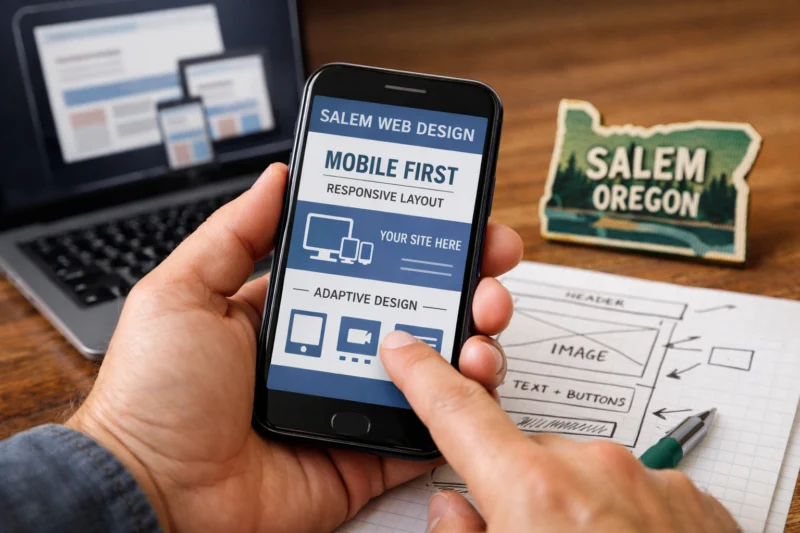
Content hierarchy is the next major factor. The page should present the most useful information first and avoid clutter that forces users to hunt for basics. On mobile, that often means putting service summaries, credibility signals, and conversion points near the top while simplifying anything that does not help the user move forward. This is where planning can directly support navigation menu usability, because a streamlined menu often reduces the time it takes to reach the next step.
Responsive design also depends on the technical building blocks behind the layout. Flexible grids, fluid images, and scalable type let the page adapt naturally instead of breaking at certain widths. When those parts are implemented well, the site feels consistent across devices. When they are not, you get awkward spacing, oversized images, or text that wraps in hard-to-read ways. Businesses that need speed and long-term control often benefit from high performance builds because performance is tightly tied to mobile satisfaction and conversion.
Testing matters just as much as design decisions. A responsive site should be checked across more than one iPhone view, because real customers use different devices, browsers, and network conditions. A checkout button might work perfectly on a modern browser and still fail for an older browser or a smaller Android screen. That kind of edge case is often missed when teams only inspect the desktop version and one popular smartphone.
What to Look for When Choosing a Responsive Website Approach
There are several ways to approach a responsive project, and the best choice depends on budget, timeline, complexity, and how often the site needs to change. Custom responsive design works well when the business needs a tailored experience, unique workflows, or stronger control over the conversion path. Theme-based builds are usually faster and more affordable, but they can limit design flexibility and create sameness if the template is too rigid.
Redesigning an existing site is often the right move when the current structure is outdated but the business still has useful content, traffic, and pages worth preserving. Incremental optimization can make sense when the site already performs reasonably well and the main problem is a few mobile pain points, such as cramped forms or oversized menus. Many teams compare website redesign options without first deciding whether the real issue is visual design, information architecture, or content maintenance.
Content management is another practical filter. A site that is beautiful at launch but difficult to update quickly becomes a liability. That is especially true for businesses that post new services, change hours, add landing pages, or update seasonal content. In many cases, flexible WordPress sites are a smart middle ground because they can support growth without forcing every small update through a developer. The best option is often the one that supports long-term changes, not just the one that looks best in a demo.
| Approach | Best For | Main Tradeoff |
|---|---|---|
| Custom responsive design | Complex goals, strong branding, unique customer flows | Higher cost and longer timeline |
| Theme-based build | Faster launch, tighter budgets, simpler sites | Less flexibility and more template constraints |
| Redesign of current site | Sites with good content but poor mobile experience | Requires careful planning to preserve what already works |
| Incremental optimization | Sites with a few mobile issues but otherwise solid foundations | May not solve deeper structural problems |
Common Mistakes With Responsive Web Design Salem Oregon Projects
One of the most common mistakes is loading mobile pages with too much content. On a small screen, every extra image, block of text, or navigation item creates friction. Users end up scrolling more, tapping less, and abandoning tasks sooner. That is why strong responsive planning should decide what truly belongs on the page and what can be moved deeper into the site.
Another mistake is designing for desktop first and simply shrinking the page. That approach often preserves the wrong priorities. A desktop layout can depend on hover states, sidebars, wide spacing, or multi-column sections that do not translate well to a phone. The result is a page that technically responds but still feels awkward. This is one of the classic common design mistakes that appears subtle in a preview and obvious in real use.
Performance problems are also easy to overlook. Uncompressed assets, heavy scripts, and oversized media can slow the page enough to damage mobile engagement. This is not just a technical issue; it affects how trustworthy the site feels. If a user opens a service page and waits too long, they may assume the business is less responsive overall. Touch usability matters too. Buttons need space, forms need clear inputs, and sticky elements should not cover important content or block the main action. A site can pass a visual review and still fail when a visitor tries to call, book, or complete a form.
Another overlooked problem is that teams often test only the homepage. But many mobile users land directly on service pages, location pages, or contact forms. That means the responsive experience has to work everywhere, not just on the front door. The deeper issue is usually not design polish but task completion.
Advanced Considerations Most Guides Get Wrong
Responsive design should support business goals, not just aesthetics. A pretty layout that buries the contact button or makes users search for service details is not a successful mobile experience. Every layout choice should be tied to what the business wants the visitor to do next, whether that is calling, requesting service, booking, or reading more about a location-specific offering.
Accessibility overlaps heavily with mobile usability, which is why strong teams build with accessible design practices in mind from the beginning. Readable contrast, sensible text sizing, clear focus states, and semantic structure help users with different devices and abilities complete tasks more easily. These choices also help people on mobile in bright light, while moving, or using assistive tools. The best mobile experiences are usually the ones that are easiest for everyone to use.
Content strategy also gets oversimplified in many guides. Some sections should stay visible on mobile, some should be condensed, and some may need to be repeated for clarity. For example, service summaries may need a short version at the top and a more detailed version further down the page. That is especially useful when location and service intent intersect, which is common for local businesses. Thoughtful content structure also supports Salem business visibility because users and search engines can both understand the page more clearly.
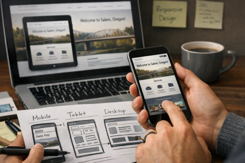
Media strategy is another area where teams overdo decoration. Large hero images, autoplay video, and decorative animations can slow the page without improving the customer decision process. On mobile networks, simpler is often better. A fast, focused page that answers the user’s question will outperform a flashy page that makes them wait. The real mistake is assuming that mobile-friendly automatically means high quality. If the information architecture is weak, responsiveness only makes the weakness easier to see.
Technical Signals That Make a Site Truly Mobile-First
Page speed is one of the clearest technical signals of a mobile-first site. Users on phones are more sensitive to delays because they are often on cellular connections or lower-powered devices. If a page takes too long to become usable, the user experience drops even if the design looks polished. Strong responsive work makes the page feel immediate by reducing unnecessary assets, optimizing rendering, and prioritizing visible content first.
Breakpoints should be based on the content, not arbitrary device labels. The goal is not to match a specific phone model; the goal is to preserve readability and usability as the layout changes. If a section starts to feel crowded at a certain width, that is the point where the design needs a breakpoint or a structural change. This is a practical design decision, not a guess based on gadget names.
Forms, menus, and interactive elements are where many responsive projects fail. A form that is easy on desktop may become difficult on mobile if labels disappear, inputs are too small, or error messages are hard to see. Menus can also break down when too many items are packed into a small space. Good form and menu behavior are part of high performance builds because speed and interaction quality work together, especially on service and lead-generation sites.
Core web vitals and rendering behavior also shape perceived quality. A page that loads its main content quickly and remains stable while images or scripts finish loading feels reliable. That stability builds trust, which matters when someone is deciding whether to contact a business. Technical excellence should make the experience simpler, not more complicated. The best implementation choices disappear into the background and let the content do the work.
For teams comparing implementation standards, official guidance from web.dev — the plugin converts these to links, W3C Accessibility — the plugin converts these to links, and Google Search Central — the plugin converts these to links can help separate good practice from guesswork.
Local Relevance for Salem Oregon: What Users Expect on Small Screens
Local mobile visitors usually want the basics first: services, hours, contact details, location, and proof that the business is credible. In Salem, that often means people are trying to make a quick decision while comparing a few nearby options. If the site answers those questions fast, it is easier for the visitor to move from browsing to action.
Mobile behavior can vary by page type. A service page may need a short description, a direct call to action, and a simple way to request help. A location page may need map access, directions, parking notes, and neighborhood context. An appointment flow needs clear steps and minimal distraction. Responsive layouts should make this kind of local content easy to find without turning the page into a wall of text.
Clarity matters because local intent is often urgent. If a customer is comparing two businesses, even one extra tap can be enough to lose the lead. That is why the mobile version of a local website should make the next action obvious. When the design works well, users can move from a service summary to contact information with minimal effort. That kind of flow supports stronger conversion and more confident decision-making, and it often pairs well with local web design Salem Oregon strategies that focus on practical outcomes rather than visual novelty.
For businesses with multiple service areas or location-specific offers, the challenge is to present enough detail without overwhelming the page. A responsive structure can surface the right details in a compact way, especially when paired with clear content hierarchy and concise calls to action. This is where the site stops being a brochure and starts functioning like a tool.
Responsive Design vs. Other Approaches: What’s the Best Fit?
For most business websites, responsive design is the default choice because it keeps one site consistent across devices. That makes SEO, analytics, and updates easier to manage than maintaining separate mobile and desktop versions. It also reduces the risk of content drift, where one version gets updated and the other falls behind.
Separate mobile sites used to be more common, but they often create maintenance problems. Two versions can mean duplicate work, inconsistent messaging, and confusion over which page should rank or be shared. Fixed-width layouts are even less flexible because they assume the user has a certain screen size. Today, those approaches rarely make sense unless there is a very specific business case.

There are exceptions. Highly interactive tools, content-heavy platforms, or specialized web apps may justify a more tailored experience. Even then, the best solution often includes a responsive foundation for standard pages and a specialized interface only where it is truly needed. In other words, the choice is not always “responsive or not responsive.” It is usually about how much adaptation the user journey needs and where that adaptation belongs.
The deeper consideration is consistency. Multiple site versions can create maintenance and QA problems if the content, metadata, or user paths are not aligned. That is one reason many businesses prefer a single adaptable site. It is easier to evolve, easier to measure, and easier to keep accurate over time. When teams are planning website redesign options, they should factor in long-term updates, not just launch-day appearance.
Signs Your Current Site Needs a Responsive Refresh
If visitors have to pinch-zoom, hunt for the menu, or struggle to read text on a phone, the site likely needs a responsive refresh. Broken tap targets, cramped forms, and overlapping elements are especially strong signals because they interfere with actual customer actions. If people can view the page but cannot complete the task, the design is not doing its job.
Analytics can also reveal mobile problems. High mobile bounce rates, low form completions, short engagement times, or frequent exits from service pages suggest that users are hitting friction. Those signals matter because they show behavior, not opinion. A site that seems acceptable to the owner may still lose mobile users before they ever contact the business.
Not every problem requires a full redesign. Sometimes a few layout adjustments, better spacing, or a simpler navigation structure can solve the issue. But when the information architecture is weak, the content is outdated, or the site was built around desktop assumptions, a full redesign is usually the better path. That is where responsive strategy intersects with broader UX and content planning, especially if the business wants stronger conversion results and better mobile usability.
The most misleading test is saying “it works on my phone.” That is not enough because users have different devices, screen sizes, and network quality. A real audit should include multiple phones, tablets, browsers, and task-based checks. If the current experience cannot handle those variables, it is time to rethink the structure rather than patch the symptoms.
Frequently Asked Questions About Responsive Web Design Salem Oregon
What is responsive web design in simple terms?
Responsive web design is a website that automatically adapts its layout and content to different screen sizes. It keeps the same site usable on phones, tablets, laptops, and large monitors without requiring a separate mobile version.
Why is responsive design important for mobile users?
It improves readability, navigation, speed, and overall usability on smaller screens. Mobile users are often trying to call, map, compare, or submit a form quickly, so a responsive site reduces friction in those tasks.
How do I know if my site is truly responsive?
Check it on multiple devices and browsers, not just one phone. Then test real tasks like contact forms, menu taps, button spacing, and map links to see whether the site works smoothly in practice.
Is responsive web design better than a separate mobile site?
Usually, yes, because one adaptable site is easier to maintain and keeps content consistent. A separate mobile site is only worth considering in rare cases where the user experience needs to be radically different.
How does responsive design affect local SEO?
Responsive design supports mobile usability, page performance, and content consistency, all of which help search engines and users. If the mobile experience is poor, local visitors are more likely to leave before converting.
What should a Salem Oregon business prioritize first on mobile?
Put contact details, services, location, and primary conversion actions near the top. Local users often want a fast answer and a quick next step, so the mobile page should remove extra hunting.
How long does a responsive redesign usually take?
Timing depends on site size, content readiness, complexity, and revision rounds. A simple site can move faster, while a larger redesign with new structure, copy, and testing usually takes longer.
What is the biggest mistake businesses make with mobile design?
The biggest mistake is shrinking a desktop layout instead of redesigning the flow for smaller screens. That often leaves the site readable but still hard to use, especially on forms and navigation.
How much content should appear on mobile pages?
Only the most important content should appear first, with supporting details placed lower on the page or collapsed where appropriate. The goal is clarity, not cramming everything into the first screen.
What should I ask before hiring for responsive web design Salem Oregon?
Ask how they test across devices, how they plan content hierarchy, what performance standards they use, and how the site will be maintained after launch. You should also ask whether they can support responsive strategy, not just visual design.
Conclusion
Responsive design is about more than fitting content onto a smaller screen. For Salem businesses, it affects usability, trust, and conversions because mobile visitors are often trying to take action quickly. A site that adapts well helps people find what they need, understand what you offer, and complete the next step without friction.
The best approach is to evaluate both design quality and technical performance across real devices. That means looking at page speed, navigation, forms, content hierarchy, and the tasks your customers actually perform. Whether you are planning a full redesign or a focused refresh, choose an approach that fits your content, business goals, and maintenance needs. If your current site feels awkward on mobile, compare the pain points, review the analytics, and talk with a qualified local provider or strategist who understands responsive design and long-term usability.
Updated April 2026