
Images are usually the biggest reason a page feels slow, and the fix is to reduce file weight without sacrificing visible quality. If you are looking for How to Optimize Images for Faster Loading Websites, the practical answer is to choose the right format, resize images to the exact space they occupy, compress them intelligently, and deliver them in a way that matches each device and layout.
Enhancing page speed is crucial as it significantly boosts user experience, especially on mobile devices, and positively affects Core Web Vitals, which are vital for search engine evaluations of page quality. Improved speed contributes to better usability, higher conversion rates, and more efficient management of hosting and bandwidth resources. The good news is that optimizing images for speed doesn’t necessitate compromising their quality. By following the right processes, you can maintain visual appeal while reducing file sizes, underscoring why image optimization is a fundamental aspect of site speed strategies and overall SEO best practices in 2026.
Below is a step-by-step guide that covers format selection, resizing, compression, responsive delivery, and loading strategy so your images load quickly without weakening the page experience. You will also see where common mistakes happen, why server speed alone cannot solve oversized images, and how to build faster greener websites without disrupting your design process.
Contents
- 1 Why images slow websites down in the first place
- 2 The image optimization workflow: from upload to fast delivery
- 3 Choosing the right image format for speed and quality
- 4 Resize images to the exact display dimensions
- 5 Compress images without making them look blurry
- 6 Serve responsive images for different screens and devices
- 7 Improve delivery with lazy loading and priority hints
- 8 Common image optimization mistakes that hurt performance
- 9 Advanced image performance considerations most guides skip
- 10 What to compare when choosing an image optimization approach
- 11 How to check whether your images are actually optimized
- 12 Frequently Asked Questions About optimizing images for faster loading websites
- 12.1 What is the best image format for website speed?
- 12.2 How do I reduce image size without losing quality?
- 12.3 Does lazy loading improve website speed?
- 12.4 Should I use WebP or AVIF for all images?
- 12.5 How do I optimize images for mobile websites?
- 12.6 Why are my images still slow after compression?
Why images slow websites down in the first place
Images slow websites down because they often carry far more data than the page actually needs to display. A file can be large because of its pixel dimensions, because it contains too much detail for the intended use, or because it is saved in a format that is heavier than necessary. The important distinction is that image dimensions, file size, and rendered size are not the same thing. A 4000-pixel photo may look like a normal 400-pixel image on the page, but the browser still has to download the larger file unless you optimize it first.
Hero banners, product photos, team galleries, and background images are common bottlenecks because they are frequently placed near the top of the page and loaded early. When those assets are oversized, they delay the first meaningful visual experience and can make the entire page feel unresponsive. That is why improving website load speed often starts with images rather than code. Even if your server is fast, it cannot make a 5 MB image smaller on its own; it can only deliver the oversized file more quickly, which still wastes bandwidth and slows mobile users on weaker connections.
Visual clarity is not the same as optimized delivery. A photo can look polished on a designer’s laptop and still be far too heavy for real users on mid-range phones. The deeper issue is that many sites optimize only the page structure and ignore image payloads. That creates a mismatch: the layout may be efficient, but the media content dominates the transfer budget. Understanding this helps you make smarter choices about format, compression, and responsive image delivery before images become a hidden performance tax.
The image optimization workflow: from upload to fast delivery
The most reliable workflow is simple: choose the right format, resize to the intended display size, compress appropriately, and serve the image efficiently. That sequence matters because each step solves a different problem. Format affects compatibility and efficiency, resizing removes unnecessary pixel data, compression reduces the file size further, and delivery controls whether the browser receives one large asset or the best version for the current device and context.

It helps to think in two phases: before upload and after upload. Before upload, you should decide how the image will be used on the page, what size it needs to appear at, and whether it needs transparency or photographic detail. After upload, you can handle responsive variants, lazy loading, preload hints, and CDN transformations. The biggest mistake is assuming optimization happens only once. In reality, you often need to optimize for every device and view context, especially when the same asset appears as a thumbnail, a wide banner, and a social preview.
This workflow also supports broader performance and content strategy goals. A site that handles media well usually has stronger responsive layout benefits, cleaner content management, and better repeatability across pages. It is also easier to maintain long term because editors do not have to guess which file to upload. That reduces friction for teams working on better website usability, faster greener websites, and pages where image-heavy sections influence engagement. If you are building a publishing or ecommerce workflow, this is where image decisions should be standardized rather than left to individual preference.
Choosing the right image format for speed and quality
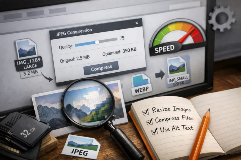
The best format depends on what the image is doing. JPEG is still a strong choice for photographs because it handles complex color gradients efficiently. PNG is useful when you need transparency or crisp flat graphics, but it is often heavier than necessary for photos. WebP usually offers smaller files than JPEG or PNG for many use cases, while AVIF can be even smaller in some scenarios, though generation cost and compatibility still matter. SVG is ideal for logos, icons, and simple illustrations because it is vector-based and often extremely lightweight.
Transparency, browser support, and image type should drive the decision, not habit. For example, a transparent product badge might work best as SVG or PNG depending on whether it contains text or complex shading. A homepage hero photo may compress very well as WebP or AVIF, while a screenshot with sharp interface elements may need closer quality review to avoid artifacts. The smallest file is not always the best choice if it introduces compatibility workarounds, slow image generation, or inconsistent rendering across your audience. In 2026, modern formats are mainstream, but fallback strategy still matters for legacy environments and embedded tools.
Use format selection as a practical decision, not a purity test. A media-heavy ecommerce site may benefit from JPEG-to-WebP automation, while a design portfolio may prefer SVG for brand marks and AVIF for editorial photos. The key is matching the format to the visual content and delivery path. If you also care about SEO web design tips, format choice is part of the page architecture, not just an asset preference. The right format can reduce payload, preserve clarity, and support responsive image delivery without forcing the user to download more than needed.
| Format | Best for | Strengths | Tradeoffs |
|---|---|---|---|
| JPEG | Photos, lifestyle imagery | Wide support, good compression for complex images | No transparency, can show artifacts if compressed too hard |
| PNG | Transparency, flat graphics, screenshots | Lossless option, clean edges | Usually heavier than modern alternatives for photos |
| WebP | Most web images | Smaller than JPEG/PNG in many cases, supports transparency | Needs fallback strategy for some workflows |
| AVIF | High-efficiency photo delivery | Very strong compression potential | Can be slower to encode, more workflow complexity |
| SVG | Icons, logos, simple illustrations | Scales cleanly, often tiny files | Not suitable for photographic content |
Resize images to the exact display dimensions
Uploading a 4000-pixel image for a 400-pixel display area wastes bandwidth and slows the page for no visual gain. The browser can shrink it with CSS, but that does not reduce the downloaded file size. Resizing first ensures the file contains only the pixels the layout actually needs, which is one of the fastest ways to improve image performance without changing design.
To do this well, identify the maximum width each image needs in common placements. A full-width hero image may need a different size than a card thumbnail, and a product gallery may need several widths to support different breakpoints. For retina and high-DPI screens, you do not want to undersize the image so much that it looks soft. The goal is not to make everything tiny; it is to produce a source size that is appropriate for the largest expected display area and then generate responsive variants from there.
This is where source image size and responsive breakpoints are often confused. The source file may be large enough to produce several output versions, but the browser should not always receive the largest one. Instead, build breakpoints around real layout behavior, such as mobile card views, tablet columns, and desktop hero widths. This approach is especially useful for pages with responsive layout benefits because the same asset can serve multiple placements without forcing every user to download the desktop version. It also reduces the chance that a content editor uploads an original camera file that silently slows every page using that image.
Compress images without making them look blurry
Compression reduces file size by removing redundant data, but it must be applied with care. Lossless compression preserves all visual information and is often best for graphics, logos, and screenshots where every edge matters. Lossy compression removes some detail to achieve smaller files and is usually the right choice for photographs, hero banners, and most marketing images. The right method depends on the image type and how much visible degradation your audience will tolerate.
For content images, acceptable quality loss is often higher than teams expect, especially on mobile. A slight reduction in detail may be invisible on a phone, but aggressive compression can create blotches, halos, and text-like artifacts around edges. That is a real issue for product photography and hero images, where users inspect details and judge credibility. Over-compression can reduce trust and conversion if the image no longer clearly shows what the product, service, or environment actually looks like. This is why image optimization is not only a technical task; it can affect conversion rate impact as well.
The most effective approach is to test quality at the exact size the image appears on the page, not at full resolution in an editor. A file that looks perfect at 2000 pixels wide may reveal flaws when it is compressed for web delivery, and vice versa. The deeper mistake most guides get wrong is treating compression as a one-size-fits-all setting. A background pattern, a team portrait, and a close-up product shot each need different tolerance levels. If you are working within WordPress speed optimization or a similar CMS workflow, build presets so editors can apply consistent compression standards instead of guessing on every upload.
Serve responsive images for different screens and devices
Responsive images let mobile users download smaller files instead of the desktop-sized asset, which is one of the most direct ways to reduce wasted bytes. Browsers can choose the right file when you provide multiple versions and tell them how the image will be used. That means a phone can receive a compact file while a large monitor gets a higher-resolution version, improving speed without making the site look underpowered on larger screens.
The core tools here are srcset, sizes, and thoughtfully designed breakpoints. Srcset offers multiple candidates, sizes tells the browser how wide the image is likely to render, and breakpoints map those options to your layout. This is not just automatic scaling. It is smarter delivery. A mobile visitor should not have to download a 2000-pixel desktop hero if the image only displays at 360 pixels wide. When implemented well, responsive image delivery improves performance while keeping visual quality aligned with the device.
Art direction is the other important case. Sometimes you need a different crop on mobile than on desktop because the composition changes. A wide banner might work on a laptop but lose its subject on a narrow screen, so you serve a different version rather than just a smaller one. That distinction matters because responsive delivery is about more than scaling down; it can change the composition shown. If your site uses editorial images, ecommerce lifestyle shots, or complex landing page visuals, this flexibility often leads to better website usability and stronger content clarity.
Improve delivery with lazy loading and priority hints
Lazy loading delays offscreen images until the user is likely to need them, which reduces the amount of content the browser must fetch during the first view. It is especially useful for below-the-fold galleries, long blog posts, product grids, and archive pages with many images. When used correctly, it improves initial load behavior and reduces unnecessary network activity on slower connections.
Not every image should be lazy loaded. Above-the-fold images, especially the main hero or primary content image, usually need to load immediately because they shape the first impression of speed. If the key image is delayed, the page can feel empty or shift awkwardly after text has already appeared. In some cases, it is better to preload or give priority hints to the most important visual asset so the browser fetches it earlier. That is a subtle but important distinction: lazy loading is a good tool, but not a universal rule.
The deeper issue is perceived performance versus technical performance. A page can be technically efficient while still feeling slow if the first meaningful image waits too long. On the other hand, a long article page can benefit significantly from lazy loading dozens of inline images that the reader may never reach. The right strategy depends on page structure, user intent, and image prominence. This is one reason why image performance and website load speed should be evaluated together rather than as isolated checklist items.
Common image optimization mistakes that hurt performance
One of the most common mistakes is uploading oversized originals and relying on CSS to shrink them visually. That keeps the page looking right but still forces the browser to download a much larger file than necessary. Another common error is using PNG for every image even when JPEG, WebP, or AVIF would be lighter and equally acceptable. These habits usually persist because they are convenient, not because they are technically sound.
Compression mistakes are just as damaging. If you push quality too low, you may save a few kilobytes but create visible blur, banding, or artifacting. That is especially risky for product close-ups, team photography, and hero banners where image quality influences trust. The optimization goal is not to minimize file size at all costs. It is to hit the smallest practical size without hurting the user’s ability to understand the page or the product.
Another major oversight is optimizing only one image type while leaving galleries, thumbnails, and background images untouched. The page may still feel slow because the heaviest assets are scattered across components rather than concentrated in one place. Teams also forget to check mobile dimensions, which means desktop-first assets are often served to the smallest screens. If you are auditing for better website usability, make sure every visual layer is reviewed, not just the homepage hero. A complete image strategy should support performance, conversion rate impact, and the broader content system that powers the site.
Advanced image performance considerations most guides skip
Background images and CSS images deserve separate planning because they are often handled differently from content images. A CSS background used for a hero section may not benefit from the same markup-based responsive behavior as an inline article image, so you need to think about how it is loaded and whether it changes at different breakpoints. Decorative images should be minimized or replaced with CSS when possible, while content images should remain accessible and semantically appropriate.
CDN-based image transformation workflows can simplify a lot of repeatable optimization work. Instead of manually exporting every size and format, a CDN or image service can resize, compress, and convert images on demand. This is especially useful for ecommerce catalogs, user-generated content, and pages with many dynamic variants. It also helps teams reuse a single source file across multiple layouts. Caching then reduces repeated transfers so frequently viewed assets are delivered faster after the first request, which supports both performance and infrastructure efficiency.
The edge cases are where a lot of teams get tripped up. User-uploaded assets may arrive in unpredictable dimensions and quality levels, so you need guardrails at upload or processing time. Decorative images used for branding can be small but still numerous, so their cumulative cost matters. Pages with many dynamically generated variants can also create unnecessary duplication if the workflow does not normalize sizes. These details are often ignored in basic guides, yet they strongly influence how scalable your image system will be over time and whether your site truly supports faster greener websites at scale.
What to compare when choosing an image optimization approach
There are three main approaches: manual optimization, plugin-based optimization, and server or CDN-based optimization. Manual optimization gives you the most control because you decide file format, size, and quality before upload. It works well for small sites, design portfolios, and situations where a few key images matter a lot. The downside is maintenance: it is easy for teams to forget the process or apply inconsistent settings across pages.
Plugin-based optimization is a strong fit for content-heavy sites, especially when editors upload images frequently. It can automate resizing, conversion, and compression inside the CMS, which reduces friction and keeps workflows simple. The tradeoff is that you are relying on plugin quality and configuration, and poorly tuned tools can over-compress or generate too many derivative files. Server or CDN-based optimization scales better for larger sites and ecommerce catalogs because it centralizes processing and can adapt delivery to the visitor’s device, but it usually requires more technical setup and ongoing monitoring.
The right choice is not only about the smallest file size. It is about long-term workflow fit, editorial consistency, and operational overhead. A team that publishes daily may prefer automation even if manual tweaking could squeeze out a few more kilobytes. A smaller site might favor hand-tuned assets for critical pages and lighter automation elsewhere. If you are comparing approaches in WordPress speed optimization or a custom stack, think about who uploads images, how often layouts change, and how much control your performance team really needs.
How to check whether your images are actually optimized
The most reliable way to verify optimization is to inspect actual page behavior, not just the image editor export settings. Look at waterfall timing, total page weight, image dimensions, and whether the browser is downloading appropriately sized files for the current screen. If a page still carries large image requests near the top of the waterfall, the optimization work is probably incomplete even if the images appear visually fine.
Simple checks are often enough to reveal problems. Confirm the file size, actual format, rendered size, and whether modern formats such as WebP or AVIF are being served where supported. Test on mobile connections and real devices rather than only desktop previews, because a page that feels quick on fiber may still be sluggish on a mid-range phone. That gap is where many image issues remain hidden. A page can appear successful in design review while still wasting significant bandwidth behind the scenes.
For deeper validation, compare page behavior before and after changes on a representative set of pages: a homepage, a product page, and a long article. That combination reveals whether your approach handles hero images, gallery thumbnails, and inline content consistently. If you care about image SEO best practices, this is also where you confirm that visual assets are not sabotaging crawl efficiency or perceived quality. The best outcome is not just lower file sizes; it is a media system that reliably supports fast, stable, and understandable page delivery.
Frequently Asked Questions About optimizing images for faster loading websites
What is the best image format for website speed?
There is no single best format for every image, but WebP and AVIF are often the strongest choices for modern web speed when compatibility is handled well. JPEG remains practical for photos, PNG is useful for transparency and sharp graphics, and SVG is ideal for logos and icons.
How do I reduce image size without losing quality?
Start by resizing the image to the correct display dimensions, then compress it using the least aggressive setting that still looks clean at the final render size. Choosing the right format matters too, because many images can be made much smaller before any quality loss becomes visible.
Does lazy loading improve website speed?
Yes, lazy loading can improve speed by delaying images that are below the fold or not immediately needed. It should usually be avoided for the main hero image or other important above-the-fold visuals, because delaying those can hurt perceived speed.
Should I use WebP or AVIF for all images?
Not necessarily. WebP and AVIF are excellent for many photos and illustrations, but you still need to consider browser support, generation workflow, and whether a fallback format is required for specific audiences or tools.
How do I optimize images for mobile websites?
Use responsive image delivery so mobile users receive smaller files sized for their screens instead of desktop assets. Also verify that the image composition still works on small screens, since art direction sometimes matters as much as scaling.
Why are my images still slow after compression?
Compression alone cannot fix oversized dimensions, poor format choice, or a delivery strategy that sends the same file to every device. If images still load slowly, check whether the largest files are hero banners, background images, galleries, or uncached assets that are being reused inefficiently.
Images load faster when you treat optimization as a workflow, not a single export setting. The most effective sequence is to choose the right format, resize correctly, compress wisely, and deliver each image based on device and context. When those steps are handled well, you get smaller files, faster perceived loading, and better visual consistency without sacrificing quality.
The practical decision points are simple: match the format to the image type, keep the dimensions aligned with the actual display size, choose a compression level that preserves trust, and use responsive delivery and loading hints where they matter most. If you want the biggest gains first, audit the heaviest images on your key pages, fix those assets, and then expand the same process across the rest of the site.
That approach improves website load speed, supports better website usability, and makes image performance a reliable part of your broader SEO and design workflow.
Google Search Central — official guidance on image indexing and search-friendly page behavior.
MDN Web Docs — technical reference for responsive images, srcset, and sizes.
web.dev — practical performance guidance from Google focused on real-world loading behavior.
Updated April 2026