
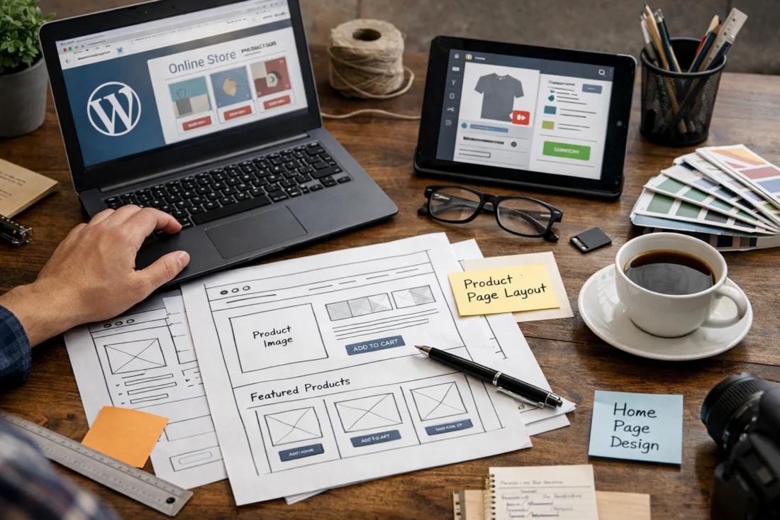
Building a WordPress ecommerce design means planning the store layout, user flow, and conversion-focused experience that helps visitors browse, trust, and buy with less friction. If you want a WordPress ecommerce design that looks professional, supports buying decisions, and stays manageable to maintain, the right approach is to design the store around the shopping journey first and the visuals second.
In practical terms, Building an WordPress Ecommerce Design is less about picking a pretty theme and more about structuring homepage paths, category navigation, product pages, cart behavior, and checkout clarity so the store performs well on mobile and desktop. That matters more in 2026 than ever because ecommerce design influences trust, load speed, mobile usability, and buying behavior, not just aesthetics. This guide covers process, layout decisions, conversion choices, common mistakes, and advanced considerations so you can build a store that works in real use, not just in a demo.
Contents
- 1 What a WordPress ecommerce design must accomplish
- 2 How to plan the store experience before choosing a theme or builder
- 3 Choosing the right WordPress ecommerce approach
- 4 Core layout elements that shape conversion
- 5 Building a mobile-first ecommerce interface in WordPress
- 6 Content blocks and trust signals that support buying decisions
- 7 Common mistakes when creating a WordPress ecommerce design
- 8 Advanced considerations most WordPress ecommerce guides get wrong
- 9 What to optimize after launch
- 10 Frequently Asked Questions About Building an WordPress Ecommerce Design
- 10.1 What is the best WordPress setup for an ecommerce design?
- 10.2 How do I make my WordPress ecommerce store look professional?
- 10.3 What pages are most important in a WordPress ecommerce design?
- 10.4 How do I design a WordPress ecommerce site for mobile users?
- 10.5 What are the biggest mistakes in WordPress ecommerce design?
- 10.6 How do I choose between a theme and a custom design for ecommerce?
What a WordPress ecommerce design must accomplish
A WordPress ecommerce design must guide visitors from arrival to product discovery to checkout with as little friction as possible. Its core job is not decoration; it is to help shoppers find products, understand them quickly, trust the store, and complete a purchase without confusion.
That means the design has to balance branding, usability, and conversion at the same time. A store can look polished and still lose sales if navigation is confusing, product pages hide key details, or checkout feels uncertain. The strongest high converting layouts usually make the next step obvious at every stage, which is why page structure matters more than visual novelty.
The most important elements in ecommerce design are navigation, product presentation, trust signals, and checkout clarity. These pieces work together: if category pages are hard to scan, product pages do not answer objections, or payment steps feel unsafe, buyers hesitate even when the brand identity is strong. That is why experienced teams treat design and conversions as the same conversation rather than separate disciplines. For a deeper framework, compare this with broader ecommerce design practices and related guidance on a conversion focused website.
A deeper nuance is that a good-looking store can still underperform when the information architecture is unclear. Buyers do not judge design only by colors or typography; they judge whether the store helps them decide. That is why product hierarchy, clear content blocks, and trust placement matter as much as style choices.
How to plan the store experience before choosing a theme or builder
You should plan the customer journey before choosing a theme, plugin stack, or page builder. The best WordPress store setup starts with mapping how shoppers move from homepage to category pages, then to product pages, cart, checkout, and post-purchase touchpoints.
Start by identifying product complexity. A store selling a small set of simple items needs a different structure from a catalog with many variants, attributes, or collections. Simple stores can often rely on lighter filtering and tighter page templates, while larger inventories need stronger taxonomy, comparison support, and search behavior that helps users narrow choices quickly. This is one of the most overlooked parts of a wordpress store setup because design decisions should follow audience behavior, not the other way around.
Before any visual work begins, define the must-have page types and content blocks. For many stores that means homepage hero areas, category intros, filtering systems, product galleries, specification sections, reviews, FAQs, shipping details, and checkout reassurance. If those pieces are not planned early, the final site often becomes a patchwork of design edits rather than a coherent shopping system. The same logic applies to ecommerce SEO optimization because the best structure helps both users and search engines understand your catalog.
A common mistake is designing around the homepage only. Real conversion problems usually appear deeper in the journey, especially on category, product, and checkout pages where buyers evaluate risk. Planning the full flow first makes it much easier to streamline store navigation later and support the store’s long-term growth.
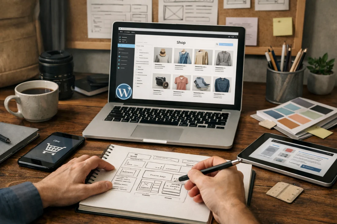
Choosing the right WordPress ecommerce approach
The best WordPress ecommerce approach depends on budget, flexibility needs, performance goals, and how often the store will change. In most cases, the choice comes down to block-based design, classic theme customization, page builder-led design, or fully custom development.
Block-based design works well when you want a modern WordPress workflow, reasonable performance, and easier long-term editing by non-developers. Classic theme customization can be efficient if you are adapting a proven ecommerce theme with strong templates. Page builders offer visual flexibility and faster experimentation, but they can add complexity and performance overhead if used heavily. Custom development offers maximum control, but it usually costs more and requires more technical support over time.
The right choice is not just about launch-day appearance. It is about how the store will evolve. If product pages, promotions, or seasonal landing pages change often, prioritize a setup that future editors can maintain without breaking layouts. If the store has a highly specific purchase flow or unusual product configuration, more custom work may be worth the cost. When comparing options, think about speed, maintainability, design control, and whether the team can safely make updates later. A flexible system often wins over a flashy one because design and conversions improve when the store can be adjusted quickly.
| Approach | Best for | Tradeoff |
|---|---|---|
| Block-based design | Editors who need maintainable layouts | Less granular control than custom builds |
| Classic theme customization | Stores needing a faster launch | Dependent on theme quality and structure |
| Page builder-led design | Teams that want visual flexibility | Potential performance and consistency issues |
| Custom development | Complex catalogs and unique flows | Higher cost and more maintenance |
One deeper consideration is that the “best” setup depends on how often the store will change, not just how it looks at launch. If your team will regularly update banners, categories, product bundles, and landing pages, the edit experience matters as much as the design system itself. That is where many stores either win or lose efficiency over time.
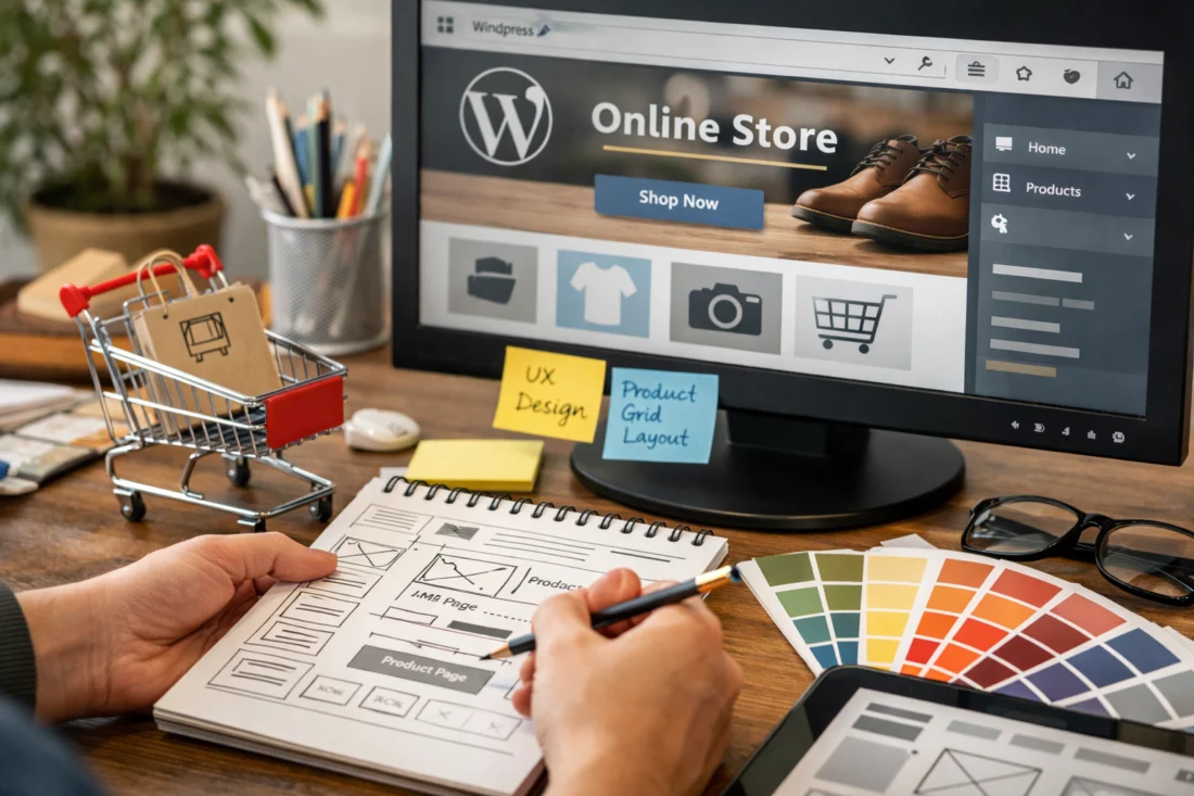
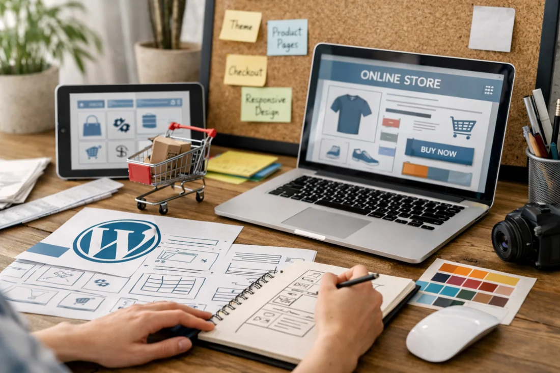
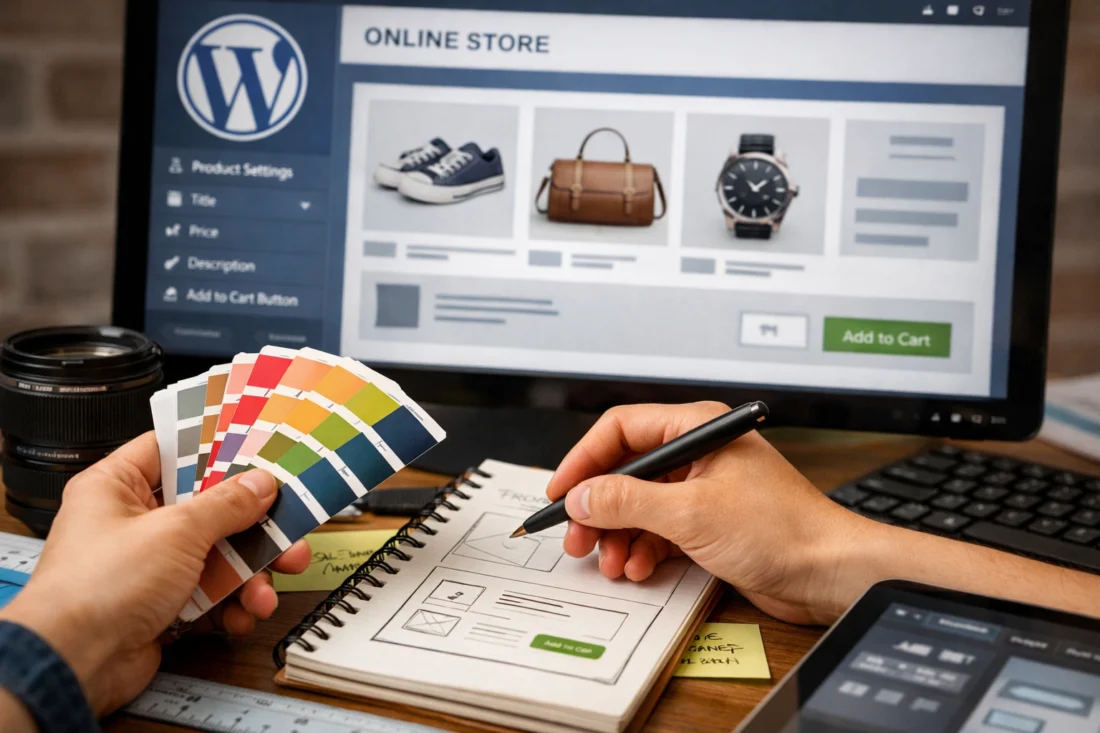
Core layout elements that shape conversion
The core layout of a WordPress ecommerce design should move shoppers from interest to action with minimal hesitation. The homepage, category pages, and product detail pages each have a distinct conversion job, and each one needs a clear layout purpose.
On the homepage, the structure should communicate the value proposition quickly, feature the main categories, show social proof, and offer obvious paths into shopping. The goal is not to explain everything at once, but to help different visitor types find their next step fast. Category pages then need scannable grids, sorting, filters, and strong product labeling so visitors can narrow their options without fatigue. This is where high converting layouts usually focus on simplifying the choice process rather than adding more visual effects.
Product detail pages carry the most persuasion weight. They need strong imagery, concise but complete descriptions, variants and pricing clarity, reviews, trust cues, shipping or returns details, and a clear add-to-cart action. If you sell higher-consideration products, the page should answer more objections; if the item is low risk and familiar, the page can stay lighter and move buyers faster. That means layout should adapt to purchase risk instead of applying one template to every product type.
The less obvious point is that a layout can be visually tidy and still fail if it does not help users decide. Buyers need proof, clarity, and confidence. When you design around those needs, you get a more conversion focused website that performs better than a purely aesthetic store.
Building a mobile-first ecommerce interface in WordPress
Mobile-first design is essential for ecommerce because many shoppers discover, compare, and buy on phones. A store that feels smooth on desktop but cramped on mobile will lose users during browsing, filtering, or checkout.
Good mobile ecommerce design starts with compact navigation, thumb-friendly controls, short forms, and a sticky add-to-cart pattern where it makes sense. Category filters should be easy to open and close, product cards should stay legible, and important buying details should appear without endless scrolling. The same principle applies to image choices and typography: large, clear images matter, but they must load efficiently; text must be readable without crowding the screen. This is where mobile first design becomes practical rather than theoretical.
Mobile constraints also change how you handle content hierarchy. Long product names, multiple variants, bundles, or dense technical specifications can quickly make the interface awkward if they are not condensed well. The fix is not hiding information; it is organizing it so people can move through it. Accordion sections, concise labels, and well-placed microcopy often help more than oversized design elements. For stores with large catalogs, mobile filters and search need extra attention because overflow can become a serious usability problem.
One deeper edge case is variant-heavy product pages. On mobile, color, size, pack count, and subscription options can crowd the primary action area. If those controls are not prioritized carefully, the add-to-cart button gets buried and the buying path slows down. That is why mobile design must be tested on real products, not just mocked-up templates.
Content blocks and trust signals that support buying decisions
Trust signals in ecommerce design should answer the questions that make shoppers hesitate. The most useful signals include shipping information, returns policy, contact details, reviews, guarantees, and secure payment cues placed where buyers naturally look for reassurance.
On product pages, trust content should sit close to the price, variant selector, and add-to-cart area because that is where doubt often appears. If shipping timelines are unclear or returns are hidden, the customer may assume the worst and leave. On checkout pages, trust should be even more direct: security indicators, payment method clarity, and support contact options reduce last-minute abandonment. These choices are part of website security essentials and should be visible without cluttering the interface.
Good trust placement avoids repeating the same reassurance everywhere. Instead, it matches the objection likely to appear on that page. For example, a fragile or expensive product may need stronger guarantee language and delivery details, while a low-cost consumable may benefit more from quick shipping and easy reorder cues. That is why trust signals work best when they are category-specific rather than copied into every section.
If you want your store to feel credible, align reassurance with the shopping moment. That approach strengthens design and conversions because the design is not just communicating polish; it is reducing perceived risk. It also supports more effective ecommerce SEO optimization when key support information is easy for both users and crawlers to find.
Related reading on internal structure can support future links for topics like streamline store navigation, ecommerce design practices, and conversion focused website planning.
Common mistakes when creating a WordPress ecommerce design
The most common mistake is starting with visual style before defining user flow. That often creates stores that look impressive in screenshots but feel confusing in real shopping sessions. A beautiful homepage cannot compensate for poor category structure or a weak product page.
Another frequent issue is overloading pages with too many banners, popups, or competing calls to action. When every section tries to sell something different, shoppers do not know where to focus. The result is usually lower engagement, more friction, and less confidence. Strong ecommerce design usually means making fewer things compete for attention, not more. That is one reason high converting layouts often feel calm, not crowded.
Stores also lose credibility when image quality, typography hierarchy, and spacing are inconsistent. If one product uses crisp studio images while another uses dark or inconsistent photography, the store feels less reliable. If headings, prices, and buttons do not follow a clear pattern, scanning becomes harder and product comparison slows down. This matters even more when the catalog is large because visual inconsistency compounds quickly.
The deeper pitfall is that many owners design for the homepage and neglect the category, product, and checkout experience where conversion actually happens. Homepages may attract praise, but buyers convert deeper in the funnel. A store can rank well and still underperform if the journey after the landing page is weak. This is why design and conversions should be reviewed page by page, not just at the top of the site.
Advanced considerations most WordPress ecommerce guides get wrong
Advanced ecommerce design is not about adding more features. It is about removing friction while keeping the store fast, accessible, and easy to evolve. The biggest mistakes at this level usually come from ignoring performance, accessibility, and scale.
Performance matters because heavy layouts can slow product-heavy stores, especially when they use oversized media, too many scripts, or complex page-building elements. Slower pages can undermine both user experience and search visibility, so design choices should be tested against actual load behavior. Official guidance from Google Search Central is useful here because it keeps the focus on helpful, people-first pages, while Web.dev explains how performance affects real usage. Those technical factors are not separate from design; they are part of it.
Accessibility is another advanced area that often gets underdone. Color contrast, keyboard navigation, readable form fields, and predictable focus states all affect real shoppers, especially on mobile and for users with visual or motor limitations. If a filter panel cannot be used without a mouse, or form errors are hard to read, the design excludes people and harms conversion. Good accessibility also improves consistency for everyone, not only users with assistive technology.
Scalability matters when your catalog grows, promotions become seasonal, or content expands into guides and comparison pages. A design that works for ten products may fail at one hundred if taxonomy, filters, and content blocks are not planned well. The real objective is not feature accumulation. It is making the store easier to maintain while reducing friction, which is why advanced ecommerce design should evolve around growth instead of forcing a redesign every time the business changes.
For businesses that handle payments and customer data, security is part of the design conversation too. Clear checkout labeling, trusted payment flows, and safe account handling support user confidence, and the broader context is covered by official WordPress Developer Resources and U.S. Federal Trade Commission guidance on online shopping safety.
What to optimize after launch
After launch, the best improvements come from reviewing where buyers hesitate, not just where traffic is highest. Look at page-level drop-off, add-to-cart behavior, checkout abandonment, and the points where users repeatedly return to the same section before buying.
The first things to adjust are usually the highest-friction pages: category pages with weak filtering, product pages with unclear variants or weak reassurance, and checkout steps that create doubt. If shoppers are viewing products but not adding them to cart, the product pages likely need better clarity or stronger trust cues. If carts are abandoned late, the issue may be shipping visibility, form friction, or payment uncertainty. These are conversion-focused improvements, not cosmetic updates.
It helps to separate changes that make the store prettier from changes that make it easier to buy. Those are not always the same. A new banner or visual refresh may improve brand perception, but a clearer price display, shorter form, or more helpful delivery message usually has a bigger effect on buying behavior. That is why post-launch work should prioritize the parts of the journey where hesitation is highest rather than only the pages with the most traffic.
A practical refinement cycle is to test one problem at a time, starting with the steps most directly tied to revenue. Over time, that approach makes your WordPress ecommerce design more usable, more resilient, and easier to manage. It also supports long-term ecommerce SEO optimization because the pages that perform well for users tend to perform better for search as well.
Frequently Asked Questions About Building an WordPress Ecommerce Design
What is the best WordPress setup for an ecommerce design?
The best setup depends on store size, budget, and how much flexibility you need. A block-based or carefully customized theme setup is often best for small to mid-sized stores that need maintainability, while custom development is better for complex catalogs or unique buying flows.
How do I make my WordPress ecommerce store look professional?
Professional stores usually have consistent typography, balanced spacing, high-quality imagery, and clear page hierarchy. Trust signals such as reviews, returns info, and secure payment cues also make the store feel more credible.
What pages are most important in a WordPress ecommerce design?
The most important pages are the homepage, category pages, product pages, cart, checkout, and key support pages such as shipping and returns. Product and category pages often have the biggest impact on conversions because that is where shoppers evaluate options.
How do I design a WordPress ecommerce site for mobile users?
Use compact navigation, short forms, clear product cards, and a thumb-friendly layout for filters and actions. Mobile design should keep the add-to-cart path obvious and avoid clutter that slows down comparison or checkout.
What are the biggest mistakes in WordPress ecommerce design?
The biggest mistakes are designing for looks before user flow, overcrowding pages with competing actions, and ignoring product and checkout pages. Many stores also lose trust through inconsistent visuals or missing reassurance around shipping and returns.
How do I choose between a theme and a custom design for ecommerce?
Choose a theme if you need speed to launch, lower cost, and easier maintenance. Choose custom design if your products, catalog structure, or conversion flow require more control than a standard theme can provide.
Effective WordPress ecommerce design is about structure, clarity, trust, and conversion rather than decoration alone. The best stores are built around the customer journey, mobile usability, performance, and page-level reassurance, with each decision guided by product complexity, audience behavior, and future growth.
If you are evaluating your own store, compare it against the criteria in this guide and start with the highest-friction pages first. That usually means category pages, product detail pages, and checkout, because those are the places where hesitation is most likely to cost sales.
Updated April 2026