
The best website layouts for high conversions are the ones that make the next step obvious, reduce doubt, and match the visitor’s intent as quickly as possible.
That is the short answer to best-website-layouts-for-high-conversions: a layout converts well when it creates clarity, trust, and momentum instead of forcing users to interpret the page. In practical terms, “high conversions” means more people clicking, buying, booking, submitting a form, or signing up because the structure of the page makes action feel simple and safe. The right layout depends on the offer, the audience, and the page goal, so there is no universal template that wins in every situation.
This guide details effective layouts and when to utilize each one to enhance conversion rates. It emphasizes selecting a design that aligns with user intent, mobile behaviors, and trust factors, which allows for informed layout choices based on a solid website framework rather than merely mimicking a competitor's aesthetic. Moreover, understanding these aspects can lead to more strategic decisions that ultimately support your site's growth and visibility in search results.
Contents
- 1 What Makes a Website Layout Convert Well
- 2 How to Choose the Right High-Converting Page Structure
- 3 Best Website Layout Patterns for Conversion Performance
- 4 Homepage Layout Elements That Improve Conversions
- 5 Landing Page Layouts That Reduce Friction
- 6 Above-the-Fold Design Choices That Shape First Impressions
- 7 Common Website Layout Mistakes That Hurt Conversions
- 8 Advanced Considerations Most Conversion Layout Guides Miss
- 9 Comparing Layout Options: Which Structure Fits Which Goal
- 10 How to Apply a Conversion-First Layout Strategy
- 11 Frequently Asked Questions About Best Website Layouts for High Conversions
- 11.1 What website layout converts best for most businesses?
- 11.2 Is a one-page layout better for conversions?
- 11.3 What is the best homepage layout for conversions?
- 11.4 How do I know if my layout is hurting conversion rates?
- 11.5 Should I use a long-form layout or a short layout?
- 11.6 What is the best website layout for high conversions on mobile?
What Makes a Website Layout Convert Well
A website layout converts well when it reduces friction, guides attention, and makes the primary action feel obvious. The best layouts do not rely on decoration to persuade; they organize information in a way that helps visitors decide faster. That is why conversion-focused design often looks simpler than flashy design, especially when the offer needs clarity more than spectacle.
Visual hierarchy is the first major factor. If the headline, supporting message, proof, and call to action are arranged in a way that matches how people scan, the page feels easier to process. Spacing matters too, because crowded sections increase cognitive load and can make users hesitate. A strong effective call to action should stand out without fighting for attention against every other element on the page.

Trust signals and content order also shape outcomes. If users cannot quickly see what the business does, who it is for, and why they should believe it, even a beautiful design can underperform. This is where many teams misread the signs of good design: they confuse polished visuals with conversion readiness. A layout can look premium and still create uncertainty if it buries proof, obscures pricing context, or hides the path to action. For deeper context on conversion fundamentals, many teams pair layout work with guidance on Source Name improve conversion performance and broader UX planning such as Source Name optimize website usability.
The best layout also depends on the page’s job. A lead capture page, a booking page, an ecommerce product page, and a newsletter signup page each need different levels of explanation and reassurance. That is why there is no single best website layout for all businesses. The layout must fit the decision the visitor is trying to make, or it will create hesitation instead of momentum.
How to Choose the Right High-Converting Page Structure
Choose the page structure by starting with the user’s intent, not with the visual style you like most. If visitors are already ready to buy, a tight structure with a clear path to the CTA may be enough. If they are comparing options or evaluating a higher-risk offer, the layout needs more explanation, proof, and objection handling before asking for action.
Offer complexity is the second filter. Simple offers usually convert best with fewer sections because they do not need much education. Complex offers need more structure because users need to understand outcomes, process, credibility, and risk before they commit. That is why a service page for a high-ticket engagement often needs a different flow than a low-friction newsletter signup. The same logic applies to Source Name effective call to action planning and to Source Name signs of good design when teams are deciding what to keep or remove.
Device behavior changes the structure too. Mobile visitors scan in shorter bursts, so the sequence and density of sections must be easier to follow on smaller screens. A layout that looks balanced on desktop may bury the primary message on mobile if it relies on side-by-side columns, oversized imagery, or long navigation menus. This is where mobile friendly layouts can materially improve response quality, especially for pages where the first few scrolls decide whether the user stays.
Do not choose a layout only because a competitor uses it. Competitor imitation is one of the most common mistakes in website redesign strategy because it copies surface form without copying audience context. A page can be successful because of traffic quality, brand recognition, or offer simplicity rather than because the layout is inherently superior. Before adopting a structure, test whether it matches your own audience skepticism, the depth of explanation required, and the action you want them to take.
| Page goal | Best layout tendency | Main reason |
|---|---|---|
| Lead capture | Focused landing page | Reduces distractions and keeps the CTA central |
| Ecommerce purchase | Product-led layout | Balances images, specs, proof, and buying actions |
| Service inquiry | Modular explanation page | Builds trust and answers objections before the form |
| Homepage | Hub layout | Routes different visitors to the most relevant next page |
Best Website Layout Patterns for Conversion Performance
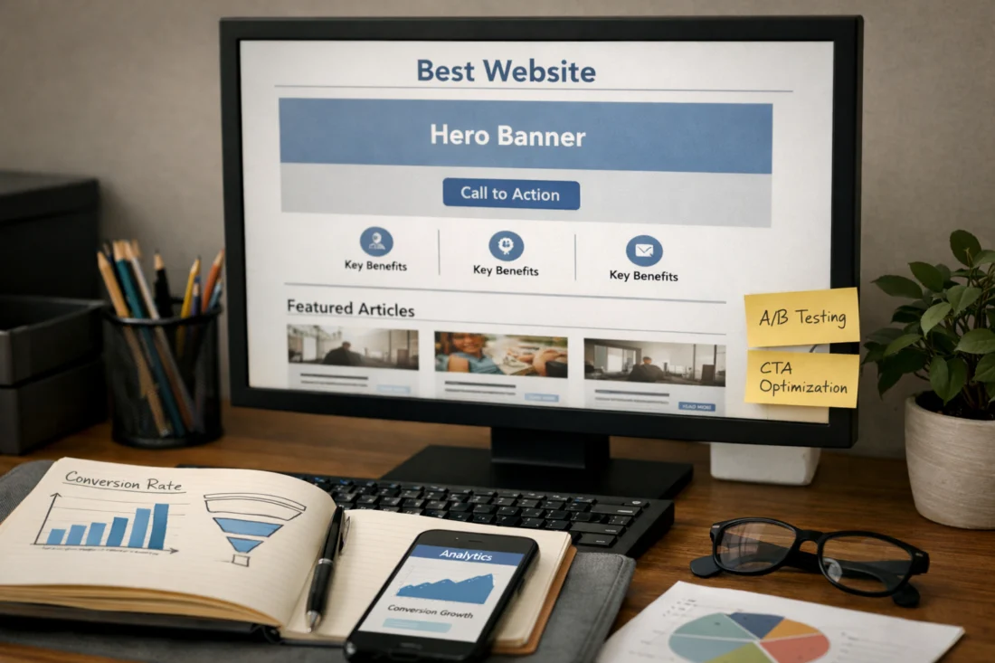
The best conversion-oriented layout patterns are the ones that fit the user journey. A hero-led single-column layout works well when the offer is focused and the decision is simple. The visitor sees the value proposition, the main benefit, and the CTA without distraction. This pattern is especially effective for one-issue lead magnets, demo bookings, and narrow service offers where clarity matters more than education depth.
Split-screen or side-by-side layouts work better when visual presentation matters as much as the copy. They can help ecommerce, product launches, and services with a strong “before and after” story because they allow imagery and explanation to support each other. The limitation is that they can become weak on mobile if the stacking order is poor or if one side carries too much meaning. If the visual does not add decision value, the split layout can slow users down instead of helping them.

Modular landing pages are the most flexible pattern for most businesses because they stack sections in a logical sequence: problem, solution, proof, benefits, objections, and action. This supports a longer decision cycle without overwhelming users in the first view. The risk is bloat. If the page includes too many nearly identical sections, conversion drops because the user has to work harder to find the reason to act. Layouts that support Source Name boost click through rate usually do so by making one next step unmistakable, not by adding more decoration.
Each pattern fits a different journey. A hero-led single column is ideal for visitors with high intent and low need for explanation. A split-screen layout fits audiences who need both emotional and functional cues. A modular layout fits skeptical or busy users who want proof before commitment. For ecommerce, layout choices often overlap with Source Name ecommerce sales layouts, where product imagery, pricing context, and trust markers must work together. The most common failure is choosing a pattern because it looks modern rather than because it supports the decision process.
Homepage Layout Elements That Improve Conversions
A homepage should communicate what the business does, who it serves, and what the primary next step is within seconds. It does not need to say everything, but it must say enough for the right visitor to continue. The strongest homepages act like routing pages: they help people self-select into the page most likely to convert them rather than trying to force one message on every visitor.
Navigation is part of that job, not a separate concern. Too much navigation can dilute focus, but too little can frustrate visitors who are not ready to convert immediately. The best homepage layout balances brand storytelling with conversion-focused simplicity by using a short hero, a brief value statement, visible social proof, and clear entry points into service, product, or contact pages. That balance is especially important for businesses with multiple audiences or offerings.
Section order matters more than many teams expect. A homepage that leads with generic brand language and delays the offer tends to lose attention. One that leads with an immediate value statement, then proof, then the relevant options, usually performs better because it reduces uncertainty early. Common homepage sections that help movement toward a goal include a concise hero, customer logos or testimonials, feature summaries, and a focused next step. Sections that often hurt conversion include oversized sliders, vague mission statements, and long blocks of abstract brand copy that do not connect to action.
The tension between storytelling and simplicity is real. Many businesses want the homepage to reflect the whole brand, but conversion depends on keeping the visitor’s path clear. A homepage can still feel rich without becoming cluttered, especially when brand narrative supports the next action instead of competing with it. If you are refining a homepage as part of a website redesign strategy, compare each section to the one action you want visitors to take, and remove anything that does not help them move there. The best homepages often support Source Name strong website foundation decisions by guiding users into the next most relevant page.
Landing Page Layouts That Reduce Friction
Landing pages usually convert better when they stay narrowly focused on one goal. That focus is what reduces friction: users are not asked to interpret multiple offers, competing links, or unrelated messages. A good landing page layout keeps attention on one action and uses the rest of the page to support that action with clarity and confidence.
The most reliable sequence is problem, solution, proof, benefits, objections, and CTA. This order works because it mirrors how many visitors decide. First they ask whether the page is relevant, then whether the solution is credible, then whether the offer is worth the risk. If the page answers those questions in the right sequence, the CTA feels like a natural conclusion rather than an interruption. Form placement, CTA repetition, and information density are all layout decisions here. A form may work best above the fold for low-friction offers, while more complex offers may benefit from a later form after proof has been established.
Page length should reflect offer complexity, not generic “short page” or “long page” advice. A short page can convert well when the offer is simple and familiar, but it can also underperform if it leaves unresolved doubt. In those cases, adding more content increases conversions because it resolves risk, explains the process, or provides comparison context. This is where many guides get it wrong: they assume shorter is always better, even though higher-priced or unfamiliar offers often need more detail before users are ready to act.

Landing pages often outperform broader site pages because they remove exits and keep decision pressure focused. But that same narrowness can fail if the audience is skeptical or if the traffic source is cold. In those cases, more trust signals, more explanation, and more explicit objection handling may be required. The layout should fit the level of trust already present when the user arrives, which is why layout and traffic source expectations should always be considered together.
Above-the-Fold Design Choices That Shape First Impressions
Above the fold should show the value proposition, the primary CTA, and a reason to keep scrolling. If users cannot understand what the page is offering quickly, they are less likely to engage with the rest of the layout. The first viewport is not meant to explain everything; it is meant to create enough clarity and interest for the visitor to continue.
Visual hierarchy does most of the work here. The headline should carry the main promise, the subheadline should clarify the offer or audience, and the image or graphic should support the message instead of distracting from it. The action area must be easy to identify, especially on mobile where screen space is constrained. One mistake is letting the visual compete with the headline for attention, which weakens the message and makes the CTA feel secondary.
The fold is not a fixed line, so layout decisions should not be based on an outdated pixel rule. Different devices, browser sizes, and text scaling settings change what users see first. The real goal is clarity in the first visible area, not satisfying an arbitrary fold benchmark. That means short copy can work when the offer is obvious, but more contextual detail can be necessary when the audience is unfamiliar with the brand or the offer requires explanation.
Another common mistake is packing too many messages into the first viewport. When users see separate headlines for audience fit, product range, promotions, and brand values all at once, the layout loses focus. That first screen should answer one question: why should I care right now? For mobile friendly layouts, this is even more important because stacked elements can crowd out the CTA if the content order is not carefully planned.
Common Website Layout Mistakes That Hurt Conversions
One of the biggest conversion killers is overcrowding. When sections are packed too tightly or contain too many competing messages, the visitor cannot quickly identify what matters. The result is usually lower engagement, weaker CTA clicks, and more abandonment because the layout forces interpretation instead of guiding action.
Weak CTA placement is another common problem. If every section has a different button label, different destination, or equal visual weight, the page loses directional clarity. A page can have many buttons and still fail if none of them feels like the primary action. The same issue appears when hidden navigation or distracting links pull users away before they understand the offer. Good layout is not just about making things visible; it is about making the right thing visible first.
Mobile stacking issues cause another major drop in performance. A design that looks balanced on desktop can become confusing if the mobile order hides proof, interrupts the value proposition, or buries the form below several unrelated blocks. Inconsistency in section spacing can also create a feeling of instability, which affects trust even if users cannot name the reason. Generic stock imagery can make this worse because it adds visual noise without increasing relevance or credibility.
Many modern layouts fail because they prioritize style over scanability and trust. Oversized whitespace, decorative animations, and editorial-style arrangements can look impressive while making the path to action harder to follow. That is especially risky for unfamiliar businesses or higher-stakes purchases, where users need reassurance more than atmosphere. If a layout feels trendy but does not support decision-making, it is likely costing conversions.

Advanced Considerations Most Conversion Layout Guides Miss
Page speed and layout complexity affect how patiently users interact with a page. Heavy layouts with large media files, excessive scripts, or content that shifts while loading can reduce trust before the message is even understood. A conversion-focused layout should feel fast, stable, and easy to scan, because responsiveness influences whether users continue exploring or leave early.
Trust cues also need to be placed differently depending on offer risk. For expensive services, regulated industries, or unfamiliar products, proof should appear earlier and more often than it would for low-risk offers. That can mean placing certifications, testimonials, case study snippets, or guarantees closer to the primary CTA. In more complex sales, progressive disclosure works better than dumping every detail into the first view. You reveal the information in stages so the user can keep moving without feeling overwhelmed.
Traffic source expectations are often ignored, but they should shape layout decisions. A visitor coming from a highly targeted search query may need less introduction and more evidence, while a social or referral visitor may need more context before the main offer feels relevant. The layout should support the promise implied by the traffic source, not just the page itself. That is why experimentation matters. In many cases, the best layout is not the one that matches a template; it is the one that best fits the actual behavior of your audience across channels.
Most guides also understate how often a “less optimized” structure can outperform. A longer page with more explanation may beat a minimalist design when skepticism is high. A denser service page may outperform a sparse one because it answers the questions real buyers ask before they contact a business. If your audience needs reassurance, structure the page to earn trust rather than forcing brevity.
Comparing Layout Options: Which Structure Fits Which Goal
Focused landing pages are best when the conversion goal is narrow and the audience is already close to taking action. They work well for lead magnets, single offers, and campaign-specific traffic because they remove distractions and keep attention on one CTA. Their main risk is under-explaining the offer when the visitor is still uncertain.
Content-rich service pages are better when the sale requires more trust, more context, or a longer decision cycle. They can support detailed explanations, proof, process, FAQs, and pricing context without feeling bloated if the sequence is disciplined. The downside is that they can become too long or too broad if they try to answer every question equally. This structure supports service inquiries, discovery calls, and consultation bookings when the offer is not self-evident.
Product-led layouts are strongest when visuals, specs, and buying action all matter. They work especially well for ecommerce and physical products because users need to compare features, understand use cases, and confirm details quickly. The risk is that too much emphasis on aesthetics can reduce clarity around price, shipping, or return expectations. This is why Source Name mobile friendly layouts often need simplified purchase paths and compact proof placement, especially for shoppers who browse on phones first.
Homepage hub layouts are best when a brand serves multiple audiences or multiple offers. They do not need to convert directly in every case; instead, they should route visitors into the most relevant path. That makes them valuable for businesses with several services, content ecosystems, or mixed-intent traffic. In some cases, a more traditional, less “optimized” structure outperforms because it matches audience skepticism better and gives people the information they need before asking for commitment. The right choice is not the most minimal structure, but the one that best supports the actual conversion goal.
How to Apply a Conversion-First Layout Strategy
Start with one primary conversion goal per page. If a page tries to generate calls, sell products, build email subscribers, and tell the full brand story at once, the layout usually becomes too diffused to perform well. A conversion-first strategy begins by deciding what the page is supposed to do, then making every section earn its place.
Audit each section for necessity. Ask whether it helps the visitor decide, reduces risk, or supports action. If it does none of those things, it probably belongs somewhere else or should be removed. A useful layout flow is hook, clarify, prove, reduce risk, prompt action. That sequence works because it mirrors the decision journey while keeping the CTA visible enough to feel natural rather than aggressive. It also helps preserve brand identity because the content still reflects who you are, but the structure remains guided by clarity and readability.
This approach is especially useful when paired with a website redesign strategy. Many redesigns fail because they change visuals but leave the logic of the page untouched. A better approach is to test the biggest friction points first: headline clarity, CTA prominence, proof placement, mobile stacking, and form simplicity. If you are improving movement from page to page, layout decisions should also support related goals such as non-profit website SEO strategy, local service lead generation, or product category navigation.
A simple decision path helps. If the offer is simple and the traffic is warm, keep the layout tighter and the CTA sooner. If the offer is complex or the audience is skeptical, add more proof, more explanation, and more opportunities to confirm relevance. If mobile traffic is high, compress sections and simplify navigation. If the brand needs to feel premium, use spacing and typography to reinforce hierarchy without sacrificing scanability. That balance is what separates a good design from a conversion-ready layout.
Frequently Asked Questions About Best Website Layouts for High Conversions
What website layout converts best for most businesses?
There is no universal winner because the best layout depends on offer type, audience intent, and page goal. For many businesses, a modular landing page or a focused service layout converts best because it balances clarity with enough explanation to reduce doubt.
Is a one-page layout better for conversions?
A one-page layout can work very well when the offer is simple and the user already knows what they want. It becomes a problem when the decision requires education, comparison, or trust-building that the page does not have room to provide.
What is the best homepage layout for conversions?
The best homepage layout is one that quickly explains value, audience fit, and the next step. It should direct users into the right page, not try to close every conversion itself.
How do I know if my layout is hurting conversion rates?
Common signs include low CTA clicks, poor scroll depth, high bounce on important pages, and users leaving before key proof or form sections. If visitors seem to hesitate at the same spot, the layout may be creating confusion or hiding the action.
Should I use a long-form layout or a short layout?
Use the length that matches the complexity of the offer. Short layouts work for simple, familiar decisions, while long-form layouts often perform better when the visitor needs more proof, more context, or more reassurance before converting.
What is the best website layout for high conversions on mobile?
The best mobile layout uses clear stacking order, tap-friendly CTAs, compact proof, and simplified navigation. It should keep the main message visible quickly and avoid placing critical information in columns that collapse badly on smaller screens.
The best high-converting layouts are built around clarity, intent match, and friction reduction. When the structure fits the offer, the audience, and the page goal, users move more naturally toward the action you want them to take.
There is no single best layout for every site, but there is a best layout for every situation. The winning structure is the one that respects skepticism, supports decision-making, and makes the next step feel obvious. Focus on hierarchy, CTA placement, trust signals, and mobile behavior, then adjust the layout to the complexity of the offer.
If you want a practical next step, audit one important page and compare it against this framework. Look for the biggest points of friction first, then test the section order, CTA clarity, and mobile stacking before changing the entire design.
Updated April 2026