Boost your revenue with proven strategies! Learn How to Improve Your Website’s Conversion Rate and turn visitors into loyal customers.
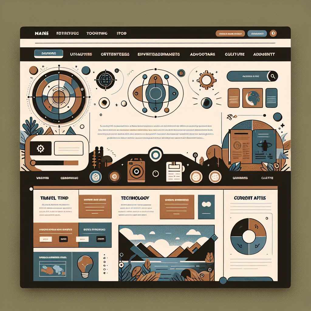
Understanding Responsive Design: Why It Matters for Your Website’s Success in a Mobile-First Era
In today’s digital landscape, responsive design has become essential for any successful website. As more users access the internet through various devices—smartphones, tablets, and desktops—having a site that adapts smoothly to different screen sizes is no longer just a luxury; it’s a necessity.
Responsive design enhances user experience (UX) by ensuring that content is legible and easily navigable, regardless of device size. This adaptability can significantly impact your website’s bounce rate. According to studies, users are more likely to leave a site that isn’t mobile-friendly, which can hurt your overall traffic goals. To learn more about creating a better UX, consider exploring user experience design tips that focus on accessibility and ease of navigation.
Moreover, search engines like Google prioritize mobile-friendly sites in search results, making responsive design crucial for SEO. By optimizing your website for various devices, you improve its visibility online. A well-structured, responsive site helps retain visitors longer, leading to increased conversion rates. If you’re interested in ensuring your site meets these criteria from the ground up, check out this comprehensive guide on optimizing your web design for SEO.
Furthermore, responsive design reduces the need for multiple versions of the same site, simplifying maintenance and updates. By utilizing CSS techniques and a flexible grid layout, developers can create aesthetically pleasing and functional sites. This approach also assists in streamlining content management, saving time and resources. Including high-quality images that are appropriately scaled for different devices enhances visual appeal without sacrificing loading speed.
Responsive design is not just about aesthetics; it’s about creating a seamless experience for your users. As businesses continue to embrace digital transformation, adhering to these principles could mean the difference between being noticed or overlooked. To get ahead, integrating mobile-friendly strategies into your web development process is vital.
In conclusion, responsive design is indeed a critical component of modern web design that not only improves user experience but also optimizes your site for search engines. If you haven’t yet adopted these principles, now is the time to do so to ensure your website stands out in an increasingly mobile-first world.
How to Optimize Your WordPress Site’s Performance
Learn how to optimize your WordPress site’s performance with essential strategies for speed, SEO, and user experience to boost your online presence.
Why Your Business Needs a Mobile Friendly Website
Discover Why Your Business Needs a Mobile Friendly Website to enhance user experience, boost SEO, and increase conversions in today’s mobile-first world.
How to Build Trust and Credibility Through Website Design
Learn how to Build Trust and Credibility Through Website Design with user-friendly elements, responsive layouts, and effective SEO strategies for business growt
How to Optimize Your WordPress Site for SEO – Search Engine Optimization
Optimize Your WordPress Site for SEO – Search Engine Optimization with practical tips to enhance visibility, drive traffic, and engage users effectively.
Creating a Seamless User Journey on Your Website
Enhance your online presence by Creating a Seamless User Journey on Your Website. Discover key strategies for improved user experience and engagement.

How Custom Ecommerce Web Design Boosts Sales and Engagement
Discover how **custom ecommerce web design** can enhance user experience, boost sales, and improve brand identity for your online store. Learn more!

Top 5 Must-Have Modern Web Design Features
Discover the must-have modern web design features that enhance user experience, boost SEO, and drive conversions for your website.
How to Create a Mobile Optimized Website in 5 Steps
Learn how to create a mobile optimized website with our Mobile Optimized Website 5 Steps guide. Boost user experience and improve your online presence!
The Most Overlooked WordPress Design Trends of 2024
Discover the Overlooked WordPress Design Trends 2024 that can elevate your website’s user experience, SEO, and conversion rates. Stay ahead in web design!