

“Mobile optimized” means your website is easy to use on phones, not just resized to fit. You build a mobile optimized website by preparing your mobile goals, designing responsive layouts, building for touch and performance, testing on real devices, then launching and maintaining.
In 2026, most browsing behavior is shaped by small screens, touch interactions, and variable mobile networks. People expect fast loading, readable text, and clear navigation in seconds, not minutes. They also multitask, so they scan quickly and act with taps.
This guide gives a clear path in five steps: prepare → design → build → test → launch and maintain. You will learn what to define before you touch a theme, which design details matter most on small screens, how to avoid “responsive but unusable” layouts, and how to validate fixes without guessing.
You will also see common pitfalls that make even well-designed sites feel broken on mobile. The focus is on task success: navigation, readability, tap targets, media behavior, and real-device testing.
Contents
- 1 Start by defining your mobile goals and top user journeys
- 2 Design a responsive layout strategy that fits how people scan on phones
- 3 Build for mobile performance and touch usability with the right implementation priorities
- 4 Test on real devices with a structured workflow that catches phone-only issues
- 5 Launch with final mobile QA, then maintain mobile-friendly behavior after updates
- 6 Recognize why responsive design alone does not equal a truly mobile optimized website
- 7 Choose the right build approach: responsive layout, progressive enhancement, or template-tailored experiences
- 8 Optimize beyond the basics with accessibility, form UX, and international content behavior
- 9 Frequently Asked Questions About Mobile Optimized Website Creation
- 9.1 What does “mobile optimized” mean if my site is responsive?
- 9.2 Can I create a mobile optimized website without changing my whole design?
- 9.3 What’s the difference between responsive design and mobile optimized website performance?
- 9.4 How many device sizes should I test for a mobile-first launch?
- 9.5 Why do my layouts break only on certain phones even with media queries?
- 9.6 What’s the best way to optimize images for mobile without hurting quality?
- 9.7 How should I test mobile forms so they don’t fail on submit?
- 9.8 Is it okay to use pop-ups on mobile?
- 9.9 How do I keep my mobile optimized website from regressing after updates?
- 9.10 How can I handle long articles on mobile without overwhelming users?
- 10 Conclusion: turn mobile optimization into a repeatable 5-step process
Start by defining your mobile goals and top user journeys
mobile optimization starts with clarity, not styling. You need to decide what success looks like on a phone before you design any layout changes.
This matters because mobile users often do one thing at a time. They arrive from search, social, or ads, then scan for the next step. If your site does not make the top action obvious, you will lose users even if the design looks fine on desktop.
How it works is simple: you set mobile goals, then map journeys that lead to those goals. For a lead generation business, the key journey might be: land on a service page → understand the offering → trust signals → tap to call or submit a form. For an ecommerce store, it might be: find a product → view key details quickly → add to cart with minimal steps.

To apply this, create a short list of your “top tasks” per template. Examples include: find pricing, book an appointment, request a quote, read an article, or contact support. Then attach measurable KPIs that reflect mobile behavior, like form completion rate from phone traffic or scroll depth to the main call to action.
Tradeoffs exist. You cannot optimize every path equally, especially on smaller screens with less space. If you try to fit too many options into one mobile experience, navigation becomes cluttered and users miss the primary action.
One common edge case is when mobile users reach a page that is not the actual task they need. If someone clicks “contact” but lands on a long blog post, they will bounce. Another nuance is assuming that “time on page” means mobile success. For mobile, task completion often matters more than raw engagement time.
A frequent mistake is using generic goals like “improve SEO” and “increase traffic.” Mobile optimization needs goals tied to real actions you want users to take. If you later pursue on-page SEO best practices, you will still need a mobile flow that turns visits into outcomes.
Design a responsive layout strategy that fits how people scan on phones
A responsive layout helps, but the design strategy must match how people read and tap on phones. Plan the structure so content hierarchy stays clear at every screen width.
This matters because “responsive” can still fail if line length, spacing, or navigation behavior breaks scanning. On mobile, users skim headings, look for answers, and tap links quickly. If your layout forces long paragraphs or hides key elements far down, mobile usability drops.
How it works: you choose a responsive approach and define consistent breakpoints based on content behavior. Many teams use a fluid grid plus flexible media, then adjust at a few key widths when layouts become awkward. You should keep typography readable, avoid horizontal scrolling, and make spacing adapt so elements do not overlap.
Practical application starts with wireframes for your most important templates. Build wireframes for home, your main article or product template, category or listing pages, and your contact or form flow. Also include at least one landing page style if you run campaigns. Wireframes should show where navigation lives, how the primary call to action appears, and how users move from content to action.
Navigation strategy is a major tradeoff. Hamburger menus save space, but they can hide choices too deeply if users need quick access. Sticky elements can help keep navigation or key actions reachable, but they can also steal screen real estate. Choose based on what tasks dominate on your site.
An edge case to plan for is content density differences. Long articles may need a different hierarchy than product cards. If you force the same structure on every template, you can end up with huge blocks of text or cramped cards that users cannot tap accurately.
A common mistake is treating breakpoints like a checklist for device sizes. Real content can be longer, translated, or dynamic. You must test with your actual headlines, internationalized strings, and real page components so the layout still holds under variation.
Another nuance is anchor targeting with sticky headers. If your site jumps to sections, the heading might hide behind a fixed header. Plan spacing so anchor sections land correctly on phones, especially for “jump to pricing” and “jump to FAQs” patterns.
Build for mobile performance and touch usability with the right implementation priorities
Mobile optimization depends on how the site behaves, not just how it looks. Build your mobile experience to be stable, readable, and easy to interact with using touch.
This matters because performance issues feel harsher on mobile. A slow or jumpy page breaks trust, and misaligned elements waste taps. Users also rely on the phone keyboard, so forms must handle input smoothly and clearly.
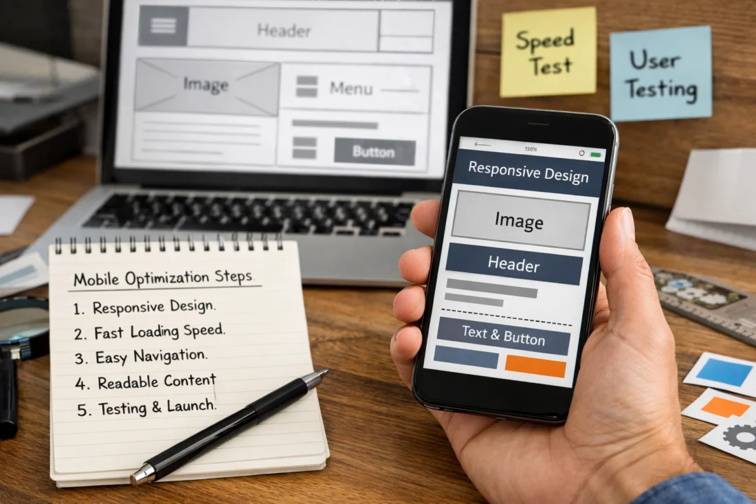
How it works begins with implementation priorities. You should handle images with responsive sizing, choose legible fonts, and prevent layout shifts as media loads. Reducing render-blocking resources also helps the page become usable sooner.
Practical usability steps include designing interaction ergonomics. Use comfortable tap target sizes, keep enough space between buttons, and ensure text remains readable without zooming. When users fill forms, fields should behave well with mobile keyboards, and error messages should appear in a clear, reachable spot.
For media strategy, use responsive images and lazy loading where it makes sense. Avoid heavy autoplay videos on mobile unless you have a strong reason and a clear user control. If you must use rich media, ensure it does not push key content far down the page.
A deeper insight is that “responsive” does not guarantee stability. Layout shift can happen when images load without reserved space or when ads inject content late. Reserve space for images and any variable components so the page does not move as it loads.
A common mistake is focusing on visual polish while ignoring build checklist items. For example, a beautiful responsive hero can still fail if fonts swap late or if scripts delay interactive elements. Another edge case is users on slow connections who see incomplete rendering for too long.
To ground performance and rendering expectations, follow guidance from the Web Performance community such as Google Web Fundamentals and consult MDN Web Docs for reliable behavior details across browsers. For accessibility-focused touch and focus behavior, use resources from W3C Web Accessibility Initiative.
Test on real devices with a structured workflow that catches phone-only issues
To confirm mobile optimization, you must test on real phones, not only emulators. A structured workflow helps you catch usability bugs that appear only on specific browsers or touch conditions.
This matters because many mobile issues do not show up on desktop resizing. Touch behavior, browser quirks, zoom handling, keyboard overlays, and third-party widgets can all break the experience. Real-device testing also reveals if your tap targets miss, if text wraps awkwardly, or if sticky elements cover content.
How it works is staged. Start with emulators to iterate quickly, then validate critical flows on real devices. Test navigation behavior, readability at common zoom levels, and form usability, including validation and error display.
Practical checks should be repeatable. Verify that links and buttons are not overlapping, breakpoints apply correctly, and truncated headings do not hide key information. Ensure the primary call to action remains reachable without excessive scrolling, and confirm that “back to top” or anchor jumps land correctly.
To handle edge cases, test long titles, internationalized text length, and slow networks. Also check accessibility modes like larger text settings, because mobile users may increase font size for readability. If your design fails under larger text, users will struggle even if it passes basic screen tests.
A common mistake is treating responsive testing as binary: either it works or it does not. Instead, you need a severity model. Blockers include broken forms, unreadable text, or navigation failures. Polish issues include minor spacing shifts or slightly off alignment that does not stop task completion.
Use a test report template so you can track fixes by template and component. A good report lists device and browser, page template, exact steps to reproduce, expected behavior, actual behavior, and recommended severity. This keeps the team from repeating the same debugging loop after updates.
For device coverage, include at least one low or average-spec phone and one high-resolution device. Then cover your main browsers, since Safari and Chrome can behave differently with layout and viewport handling. This helps you build a reliable baseline for future changes.

Launch with final mobile QA, then maintain mobile-friendly behavior after updates
A mobile optimized website is never “done,” because updates can re-break the phone experience. Launch only after final mobile QA, then monitor and maintain mobile usability over time.
This matters because real sites change. Themes update, plugins add new scripts, content editors publish new layout patterns, and new campaigns introduce new templates. Each change can create regressions that only show on phones.
How it works at launch is careful and practical. Do a final mobile QA pass on your critical templates, then check URL and redirect behavior. Ensure analytics and tracking scripts do not block core interactions or break your primary mobile flows.
Practical application means setting up ongoing monitoring. Track page errors, error rates on forms, and meaningful conversion changes after updates. Watch for sudden increases in failures on mobile segments, not only across all traffic combined.
For iteration, plan how you will test new content patterns before they go live. If your CMS allows flexible sections, validate the most mobile-sensitive blocks, like hero banners, image galleries, pricing modules, and sticky CTA components. This prevents “editor-friendly” features from becoming “mobile-breaking” features.
A deeper insight is that regressions often come from unexpected sources. A plugin update may change default styles, inject new wrappers, or alter focus order. Even if the design looks similar, the build can shift due to DOM changes and CSS overrides.
A common mistake is launching after desktop QA and assuming mobile will follow. Another limitation is skipping regression checks for every template. Mobile issues can be template-specific, so you should test by template rather than only by page URL.
To keep maintenance realistic, set a cadence that matches your update frequency. Many sites benefit from monthly mobile checks for critical templates, plus deeper quarterly audits when you add or overhaul features. For sites with heavy content publishing, do smaller spot checks more often.
Recognize why responsive design alone does not equal a truly mobile optimized website
Responsive design is the starting point, not the finish line. A site can resize correctly and still fail key mobile usability expectations.
This matters because mobile optimization includes touch comfort, content readability, stable layout behavior, and task flow clarity. If a user cannot tap the right element, read the text comfortably, or complete a form without friction, your responsive layout will not save you.
How it works is that responsive CSS controls layout, while mobile optimization controls user experience. You must evaluate whether navigation choices are reachable, whether the primary action stays prominent, and whether media does not push essential content too far down. You must also validate stability so the page does not jump while loading.
Practical application means you look for specific failure modes. For example, layout shifts can happen when images or ads load late. Broken forms can occur when keyboard handling or validation messaging is not designed for small screens. Anchor links can land behind sticky headers, hiding the section users intended to reach.
Tradeoffs show up in common UI features. Pop-ups and blocking overlays may increase newsletter signups, but they can obstruct primary tasks and frustrate users on small screens. Carousels and sliders can consume interaction time, especially when swipe gestures compete with scroll behavior.

An edge case is “pixel-perfect on one phone.” If you design only for one test device, you may miss wrap differences on smaller sizes, or you may fail when text is longer in another language. Another nuance is perceived performance: a page may “load” but still feel unusable if content appears in the wrong order.
A common misconception is that you can solve mobile issues with more media queries. Often the underlying problem is hierarchy, interaction spacing, or missing reserved space. Fix the experience first, then fine-tune breakpoints.
If you later expand content and templates, keep this mobile lens. When you add new sections, re-check legibility, tap spacing, and layout stability so your mobile experience stays consistent.
Choose the right build approach: responsive layout, progressive enhancement, or template-tailored experiences
The best approach for a mobile experience depends on your site type and your maintenance capacity. Most teams can succeed with responsive design plus careful mobile UX, while others benefit from progressive enhancement or template-tailored experiences.
This matters because each approach changes how you prioritize development and testing. You want an approach that delivers strong core content and interactions on phones without creating unmanageable complexity.
How it works depends on the category you choose. A responsive single-site layout uses one site structure with CSS rules that adapt. Progressive enhancement focuses on delivering core content and navigation first, then adding richer features when the browser supports them. A template-tailored strategy keeps one site, but adjusts layouts by content type so long articles, listings, and forms each get a layout that fits the task.
Practical decision criteria include content type and team resources. If you run frequent campaigns and publish new posts, responsive plus template improvements usually offers the best balance. If you rely on heavy interactive widgets, progressive enhancement can reduce the chance of a broken experience on limited browsers. If your site has clear content categories with very different user needs, tailored templates can keep mobile navigation focused.
Tradeoffs include testing complexity and risk of fragmenting user experience. Multi-experience setups can improve usability, but they also add more layout variants to test. That can increase QA time and raise the chance of inconsistent behavior across templates.
An edge case is when you feel tempted to create a separate mobile-only site. It can seem like it will simplify mobile design, but it often introduces duplicated content management and more chances for regressions. A single site with tailored templates usually keeps consistency, even when screens differ.
To make this decision, write down your highest-risk features. If those features are mostly “nice to have,” progressive enhancement or mobile-first build patterns can help. If your core value depends on them, you still need strong mobile testing for those features.
If you are planning your next content and UX improvements, grounding your structure can support future on-page SEO best practices, especially when content templates stay consistent on mobile.
Optimize beyond the basics with accessibility, form UX, and international content behavior
Mobile optimization must include accessibility and form usability, not only visual layout. When you design for touch, focus order, and readable text, the site becomes easier for everyone.
This matters because mobile users often interact differently. Some rely on screen readers, some need larger text, and some navigate by keyboard or assistive controls. If your mobile experience ignores accessibility, you create avoidable friction and can exclude users.
How it works is that you design the full interaction path. Ensure tap accessibility, clear focus order, and sufficient contrast for readable text. Make sure screen reader users can understand headings, labels, and interactive elements. For forms, reduce cognitive load by keeping required fields minimal and showing errors near the problem.
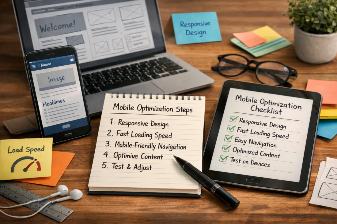
Practical form UX includes mobile keyboard choices and safe validation behavior. Use the correct input types so phones show the right keyboard, like email or numeric keypad. Keep error messages short, avoid vague wording, and prevent accidental submissions by disabling the submit button until input is valid.
International content behavior adds another layer. Longer strings can wrap differently, and locale-aware date or number formats can change element sizes. If you serve global audiences, design your spacing and templates to tolerate these changes without breaking layouts.
A deeper insight is perceived performance and loading order. Skeleton patterns or sensible content priority can make a page feel usable sooner, even if heavy content loads later. But you must avoid shifting layouts after the user starts reading key content.
A common mistake is validating accessibility only in a desktop context. Mobile screen readers and larger text settings can reveal focus and contrast problems that desktop tests miss. Another nuance is that a form may look fine until a user triggers an error, at which point error placement can cover the submit button.
Validate these experiences with a mix of checks. Use keyboard-only navigation tests, screen reader checks where feasible, and mobile text-size testing. This reduces reliance on visual-only inspection and catches mobile-specific failures early.
For accessibility principles, use guidance from W3C Web Accessibility Initiative. For general best practices in HTML semantics and interactive controls, consult MDN Web Docs.
Frequently Asked Questions About Mobile Optimized Website Creation
What does “mobile optimized” mean if my site is responsive?
Mobile optimized means your site is usable on phones in real tasks, not only visually responsive. You still need clear navigation, readable text without constant zooming, and tap targets that match finger precision. It also requires stable layouts so content does not jump while loading, plus real-device testing for forms and key links.
In practice, you should verify primary actions work smoothly on touch screens, including scroll behavior and any sticky UI elements. You should also check that content hierarchy stays understandable when headlines wrap and cards stack.
Can I create a mobile optimized website without changing my whole design?
Yes, you often can keep your overall brand styling and many content blocks. You usually need to change mobile-critical pieces like navigation behavior, typography scaling, spacing rules, form layouts, and media handling. Responsive CSS may handle layout, but mobile UX details often require targeted redesign.
Start by auditing the highest-traffic mobile pages and rebuilding one template that drives the biggest outcomes. If you keep a desktop structure but improve mobile hierarchy and interaction ergonomics, the experience can improve fast.
What’s the difference between responsive design and mobile optimized website performance?
Responsive design is about layout adaptation across screen sizes. Mobile optimized website performance includes how quickly and smoothly the page becomes usable on phones, including stable rendering and sensible media behavior. It also includes reducing input friction in forms and preventing layout shifts that disrupt reading.
In short, you can have responsive layout and still have poor performance due to heavy assets or late-loading elements. You must evaluate both layout and user interaction quality.
How many device sizes should I test for a mobile-first launch?
Test a practical set that covers your real usage rather than every possible width. A common approach is to cover a small, common, and large width range, then validate on key browsers you support. Include at least one real low or average-spec device so you see what slower networks and hardware do to perceived usability.
Also test your key browsers and viewports with larger text settings, since accessibility needs often change layout behavior. Prioritize the templates that drive your highest traffic and conversions.
Why do my layouts break only on certain phones even with media queries?
This often happens due to incorrect breakpoint assumptions, missing CSS overrides, or dynamic content that changes element sizes. It can also be caused by third-party widgets injecting styles, scripts, or wrappers that shift layout. Some phones also handle viewport and zoom differently, which can expose hidden alignment bugs.
To debug, reproduce the issue with the exact device and browser, then inspect which CSS rules apply. Check for overlaps, off-screen buttons, and content blocks that change height after images or scripts load.
What’s the best way to optimize images for mobile without hurting quality?
Use responsive images so the browser can select an appropriate size for the phone screen. Choose an effective sizing and cropping strategy so images look intentional when stacked in cards or scaled in heroes. Modern formats and sensible compression usually help keep quality while reducing download size.
Also reserve space for images to reduce layout shifts. A good mobile result feels stable while still looking sharp, even when the network is slow.
How should I test mobile forms so they don’t fail on submit?
Test forms by completing real submissions on phones, not just checking visual fields. Verify keyboard behavior, required field validation, error message placement, and that focus moves to the first error field. Confirm that error text does not push the submit button off-screen.
Check edge cases like users correcting mistakes after validation, and confirm tracking captures success and failure reliably. Make sure the submit flow works whether the user taps the main submit button or uses the keyboard submit action.
Is it okay to use pop-ups on mobile?
Pop-ups can be okay when they support a clear primary task, but they often harm mobile usability if they block content or interrupt scanning. If you use them, make sure they are dismissible, do not cover critical buttons, and appear at a time that fits the user journey.
Be careful with pop-ups that trigger immediately on load, since they compete with reading and form tasks. Test pop-ups on real devices to confirm users can reach key actions without extra steps.
How do I keep my mobile optimized website from regressing after updates?
Prevent regressions by testing per template before publishing updates, especially mobile-sensitive templates like forms, listings, and landing pages. Create a regression checklist that includes layout stability, navigation behavior, and form submission paths. Also monitor errors and conversion changes on mobile segments after the update.
When themes or plugins change, validate any UI components they touch. Even small CSS or DOM changes can affect spacing, focus order, or tap accuracy on phones.
How can I handle long articles on mobile without overwhelming users?
Make long content easy to scan with clear headings, comfortable spacing, and a hierarchy that shows what matters first. Avoid dense blocks of text and ensure images and media do not interrupt reading with excessive loading time. Keep tables readable by using layouts that work well on small screens or by making key information stand out.
Also confirm sticky elements do not block headings, and that anchor links scroll to visible sections. If users need to find details quickly, place key calls to action within natural reading breaks rather than at the very end.
Conclusion: turn mobile optimization into a repeatable 5-step process
You can create a mobile optimized website by repeating a reliable workflow: define goals → design responsive templates → build with mobile usability and performance in mind → test on real devices → launch and maintain. That sequence keeps you from treating mobile as an afterthought.
In 2026, mobile success is about more than resizing. It is about task success on touch screens, readability without constant zooming, stable layout behavior while content loads, and forms that work reliably with mobile keyboards.
To start, pick your highest-traffic pages and rebuild one template first, rather than trying to perfect everything at once. Then run a structured real-device testing sprint before you ship, using a severity model so you know what must be fixed for the launch to be safe.
Once your mobile experience is solid, maintain it with a cadence that matches your publishing schedule and updates. A mobile optimized website stays optimized only when you monitor for regressions and validate new content blocks before they spread across your site.
If you want a quick next action, audit your current mobile experience, choose one template to rebuild first, or run a structured real-device testing sprint before launch.
Those same steps become easier over time, because each sprint builds your team’s checklist and reduces uncertainty. Start with the pages that drive the most value, then expand the mobile improvements template by template.
Updated September 2026