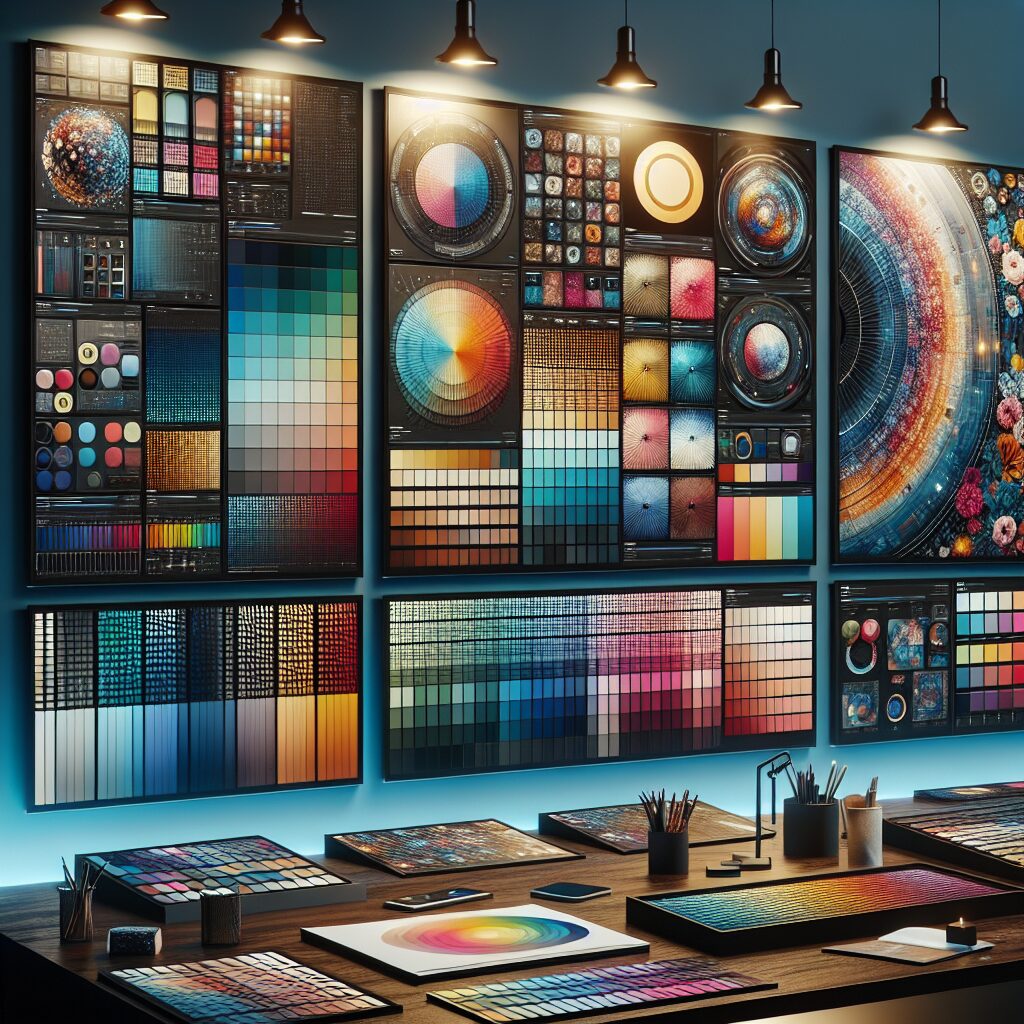
Top Color Schemes for Modern Websites
Introduction
Have you ever thought about how colors make you feel? Colors can change the mood of a website. They can grab our attention or make us feel calm. That’s why selecting the Top Color Schemes for Modern Websites is super important!
In today’s online world, we see colors everywhere. From bright reds to soft blues, colors help tell a story. They are not just pretty; they influence how we think and act. Studies show that the right color can boost a website’s conversion rate by up to 200%! That’s a big deal!
When we talk about color in web design, we must consider color psychology. This is the study of how colors affect emotions. For example, blue often makes us feel safe, while yellow can bring happiness. So, choosing the right colors is not just about looks; it’s about feelings.
Trends in user experience (UX) and user interface (UI) design are also changing. Designers are leaning towards softer colors and more natural palettes. They want to create spaces that feel inviting and easy to use. This means understanding how colors can help with brand identity. A good color scheme can make a company memorable.
In this article, we will explore popular color combinations. We will also look into how these colors work on different devices. Plus, we can’t forget about accessibility. Everyone should enjoy a website, no matter their visual ability.
So, let’s jump in and discover the Top Color Schemes for Modern Websites!
Common Challenges with Top Color Schemes for Modern Websites
Now, let’s talk about some bumps in the road. Choosing the right color palette can be tricky. Here are some challenges we might face:
Difficulty in Choosing Colors
Selecting colors for a diverse audience is hard. What appeals to one person might not work for another. Think about it: a bright orange might excite some, but it could annoy others.
Balancing Aesthetics and Functionality
We want websites to look good. But they also need to work well. Sometimes, a beautiful color scheme can hide important information. We must find a balance between style and usability.
Branding Consistency
Staying consistent with colors across platforms is vital. If a brand uses green on its website but blue on social media, it confuses users. A consistent color scheme helps build trust.
Color Accessibility
This is a big one! Not everyone sees colors the same way. Some people have color blindness, while others might struggle with contrast. Choosing colors that everyone can see is essential.
Technical Aspects of Responsive Color Schemes
Colors can look different on various screens. A shade of red might look vibrant on a computer but dull on a phone. Designers need to think about how colors will appear on different devices to ensure a great experience for all users.

How to Get Started with Top Color Schemes for Modern Websites
So, how do we choose the right colors? Here is a simple guide to get started:
Research Color Theory
First, we need to learn about color theory. This helps us understand how colors work together. Some colors complement each other, while others clash.
Analyze Your Audience
Next, think about who will visit your site. What do they like? What colors do they respond to? understanding your audience is key to selecting the right colors.
Create a Mood Board
Now, let’s get creative! A mood board is a collection of colors, images, and styles. It helps visualize how the colors will look together. This can make choosing easier.
Test Your Colors
Don’t just pick colors and hope for the best! Test them out. Create mock-ups of your website and see how the colors work in real life. Get feedback from others.
Refine Your Choices
Once you have feedback, refine your color choices. Make sure they align with your brand and appeal to your audience.
Consider Accessibility
Always check for accessibility. Use tools to see if your colors are friendly for everyone. This ensures that all users can enjoy your site.
Popular Color Combinations
Let’s look at some popular color combinations that work well together. These are tried and tested, so you can’t go wrong!
1. Blue and White
- Blue: Trustworthy and calming
- White: Clean and simple
This combo is perfect for businesses aiming for a professional look.
2. Green and Brown
- Green: Freshness and growth
- Brown: Earthy and warm
This scheme fits well with nature-focused brands.
3. Black and Yellow
- Black: Bold and strong
- Yellow: Cheerful and bright
This combination can grab attention and is great for creative industries.
4. Pink and Gray
- Pink: Fun and playful
- Gray: Neutral and sophisticated
This pairing is popular among fashion and beauty websites.
5. Red and Cream
- Red: Passionate and energetic
- Cream: Soft and inviting
This duo is often used for restaurants or food-related sites.
Insights into mobile-friendly website design Considerations
When choosing colors, let’s think about responsive design. This means making sure colors look good on all devices. Here are some things to keep in mind:
Test on Multiple Devices
Make sure to check how your colors appear on different screens. A color that looks great on a desktop might not look the same on a mobile device.
Use Color Contrast Checkers
Tools are available that help check color contrast. This ensures that text is readable against the background colors. It’s super important for accessibility.
Keep It Simple
Sometimes, less is more! Too many colors can confuse users. Stick to a few main colors and use shades or tints for variety.
Importance of Accessibility in Color Selection
We all want our websites to be welcoming. That’s why accessibility matters. Here’s how we can make our color choices inclusive:
Use High Contrast
Ensure there is enough contrast between text and background. This helps everyone read your content easily.
Include alternative text
For images that use color, add alternative text. This describes what colors are used and helps visually impaired users understand your design.
Avoid Color-Only Indicators
Don’t rely solely on color to convey information. Use symbols or text alongside colors for clearer communication.
Conclusion
Choosing the Top Color Schemes for Modern Websites is a journey. It involves understanding colors, knowing our audience, and ensuring accessibility. By following these steps, we can create websites that are not only beautiful but also effective.
By using these insights, we can enhance our web design efforts. Colors are more than just aesthetics; they are powerful tools that can impact user experience and brand identity.
FAQs
1. What are the best colors for a website?
The best colors depend on your brand and audience. Blue, green, and neutral colors are often popular choices.
2. How do I test my color scheme?
You can create mock-ups of your website and get feedback from users. Tools for checking color contrast can also help.
3. Why is accessibility important in web design?
Accessibility ensures that everyone can use your website, including those with visual impairments.
4. Can I use multiple colors on my website?
Yes! Just be careful not to overdo it. Stick to a few main colors for a cohesive look.
5. How can I learn more about color theory?
Many online resources and courses teach color theory. It’s a good idea to explore them for deeper understanding.
Resource Links:
- reddit.com: … You can find a lot of cool palettes on the Adobe Color platform. They have an inspiration area there, and it’s also very useful to find …
- visme.co: … The best color combinations for websites in the technology industry include a mix of modern, sleek tones like blue, white, gray, black and …
- daveyandkrista.com: … 17 Fresh Color Palettes for Your Website in 2024 · Pantone 2024 Color Palette · Color Me Coral Color Palette · Lavender Haze Color Palette.

