
Dark Mode Web Design is the practice of delivering a website with a dark color scheme that adapts to user or system preferences to improve readability and reduce glare. In 2026, widespread support for prefers-color-scheme, accessibility expectations, and performance considerations make it a strategic capability rather than a cosmetic tweak. This guide provides a practical decision path and depth on accessibility, performance, and UX, with a framework to evaluate, implement, test, and iterate dark mode on real sites. The primary goal is to give you a clear framework to evaluate approaches, anticipate edge cases, compare implementation options, and future-proof your design system.
What is Dark Mode Web Design and why is it relevant in 2026?
Dark Mode Web Design refers to designing and implementing a website so its UI can render in a dark color scheme, either automatically based on system preferences or via an explicit user toggle. It matters in 2026 because users increasingly expect a theme that respects ambient lighting, reduces glare in long reads, and preserves brand identity across modes. This topic also intersects with accessibility baselines and performance considerations as devices and browsers optimize rendering for dark surfaces.
In practice, teams often start with a system-based approach (prefers-color-scheme) and then layer an explicit toggle for users who want to override the OS setting. The goal is not to force a single look but to preserve readability, maintain brand cues, and minimize layout shifts when switching themes. The process benefits organizations that run SaaS dashboards, e-commerce product pages, or content-heavy sites by providing a consistent experience under different lighting conditions. For governance and real-world templates, look into related topics such as the “Best website design team” and “Salem web design partners” to align internal standards and cross-team workflows, and to ensure the dark mode approach scales across teams and pages. Web Content Accessibility Guidelines (WCAG) Quick Reference — Apple Human Interface Guidelines – Dark Mode —
How it works in 2026 commonly relies on CSS custom properties (design tokens) and a handful of well-tuned assets. The practical upside includes higher perceived readability in dim environments and a brand-forward look when users switch themes. The tradeoffs include the risk of color misalignment if tokens aren’t shared across components, the potential for asset duplication, and the need for careful testing across devices. When you plan for Dark Mode Web Design, you’re planning for a durable user experience that respects accessibility and performance constraints while staying true to brand, across a spectrum of devices and contexts. For foundational guidance on color strategy and motion, refer to authoritative guidelines like the Material Design dark theme and WCAG, which help codify expectations for contrast and readability. Material Design: Dark Theme — Web Content Accessibility Guidelines (WCAG) Quick Reference —
How do you define success metrics for dark mode?
Success metrics for dark mode start with readability, accessibility conformance, user satisfaction, and engagement signals. In 2026, success also means measuring how well the dark theme degrades gracefully under unusual content or system settings and how it influences task completion times. The practical objective is to create a measurable framework that guides design decisions, implementation quality, and ongoing iteration.
To translate this into action, you’ll want to establish baseline metrics (contrast ratios, focus visibility, repeat visits with dark mode, task success rates) and monitor changes after enabling dark mode on a subset of pages or features. Visual tests should cover body text, UI text, and focus states, while usability tests should include users who rely on high-contrast modes or assistive technologies. By mapping outcomes to 2026 expectations—such as faster perceived load times on dim surfaces and more consistent color usage across pages—you create a decision framework that’s testable and auditable. See how design-system governance, like a robust token architecture, directly informs these metrics and long-term durability; this aligns with governance patterns you’d see in top design teams and partners. Web Content Accessibility Guidelines (WCAG) Quick Reference —
Edge case awareness matters here: some users rely on OS-level high-contrast modes that override color choices. If your UI depends on subtle color cues, you may misrepresent state or status in those contexts. Common mistakes include treating color alone as the signal for status or ignoring focus indicators that must remain visible in dark surfaces. Most guides overlook the nuance that dark mode metrics must include accessibility-focused signals (like pattern, label, and ARIA cues) in addition to color-based cues. Practical real-world testing with color-deficient users and real-device testing helps avoid these gaps. Internal references to governance content such as “Salem web design partners” can support cross-team alignment when you review these metrics. Web Content Accessibility Guidelines (WCAG) Quick Reference —
How do you design a token-driven system for dark mode?
A token-driven system uses color tokens, typography tokens, shadows, and elevation rules to ensure consistency across light and dark themes. This system defines a robust naming scheme, scope per component, and clear fallback behavior so that any UI element can render correctly regardless of mode. The design tokens form the backbone of a scalable Dark Mode Web Design, enabling a unified look across pages and components while accommodating brand identity in both themes.
With tokens in place, you can implement mode switching by toggling a root data-theme attribute or by switching CSS custom properties at runtime. This approach minimizes reflows and preserves layout stability when the user switches themes. When you plan the token architecture, think through inheritance, token scope, and fallbacks for older components that may not support dynamic theming. It also helps with performance by caching token values and avoiding repeated computation during theme switches. For broader context on design-system governance and cross-team consistency, you might consult resources about a top design team and Salem partners to align token strategies across departments. Material Design: Dark Theme — MDN: prefers-color-scheme —
Edge case: certain legacy components or third-party widgets may not honor tokens automatically and require explicit overrides or asset variants. Common mistake: creating separate, parallel color palettes for each page instead of a single token-driven system. What most guides miss is describing a governance process that enforces token naming, scope, and fallback policies across teams. A well-documented token strategy reduces color drift and accelerates long-term maintenance. For internal alignment, reference materials like “Best website design team” or “Salem web design partners” to shape governance. Web Content Accessibility Guidelines (WCAG) Quick Reference —
How should you handle default state vs user override and edge cases?
The default state should respect system preferences where possible, with an explicit user override available via a prominent toggle. This respects user autonomy while allowing brands to present a consistent aesthetic when users don’t opt out. In 2026, relying on prefers-color-scheme for the initial render and offering a persistent toggle is a best practice for many sites.
Edge cases include users with high-contrast accessibility settings or systems that aggressively override themes. You must ensure that essential information is not conveyed by color alone and that focus rings remain visible in both modes. Practical implementation requires testing across devices, including iOS, Android, Windows, and macOS, to confirm that toggles persist, tokens switch cleanly, and there are no layout shifts during the transition. The governance perspective should ensure that the explicit toggle remains accessible and discoverable across all major pages, not just a few. See how professional design teams coordinate this with their internal guidelines. Apple Human Interface Guidelines – Dark Mode — Web Content Accessibility Guidelines (WCAG) Quick Reference —
Deeper Insight: Edge case — a user with a screen that reports low brightness but a device with high ambient light might perceive text differently than expected; ensure text remains readable with a high-contrast setting. Common mistake — assuming a single toggle solves all cross-device issues without verifying on at least two OS families. What most guides get wrong — they fail to document persistence and re-synchronization when content changes (e.g., dynamic loaded widgets) or when system theme changes while the user is navigating. When designing, consider how to align toggles with ongoing content changes and dynamic widgets. Internal references to “Salem mobile-friendly design” or “Salem website development tips” can help ensure the toggle behavior remains consistent across pages. Web Content Accessibility Guidelines (WCAG) Quick Reference —
What is the step-by-step decision path to implement dark mode?
The practical decision path starts with inventorying all UI surfaces, tokens, and assets that must switch between modes, followed by mapping tokens to light and dark variants. You then implement a robust toggling mechanism, ensure system-preference fallbacks, and perform cross-device testing with measurable outcomes. This approach creates a repeatable, auditable process that scales as sites grow or teams expand.
Implementation steps can include building a token-driven design system, introducing a global data-theme switch, auditing for color-safe assets, and validating contrast and accessibility across devices. Each step should be measured against objective metrics and integrated into a governance workflow so that new components automatically inherit dark mode considerations. The practical takeaway is to treat dark mode as a system capability, not a feature. To align with governance and cross-team practices, consult internal references such as “Best website design team” and “Salem web design partners” to ensure the process scales. For accessibility guidelines during this process, refer to WCAG and related official documentation. Web Content Accessibility Guidelines (WCAG) Quick Reference — MDN: prefers-color-scheme —
- Inventory existing UI assets, components, and tokens
- Map tokens to light and dark variants with a naming scheme
- Implement a reliable toggle with system preference fallback
- Perform cross-device and cross-browser testing, measure outcomes
- Iterate with user and performance data to refine tokens and interactions
Edge case: a dashboard that fetches live data might briefly render a mismatched color state during data loading. Common mistake: underestimating the impact of subtle elevation and shadow shifts in dark mode. What most guides get wrong: neglecting to plan for third-party widgets that don’t automatically respond to theme changes. Consider a hybrid or phased rollout approach and reference governance content like “Salem mobile-friendly design” to ensure consistency across teams. Material Design: Dark Theme —
What core design considerations matter in dark mode (color, typography, imagery, layout, branding)?
Color strategy in dark mode favors nuanced dark grays for surfaces rather than pure black, with careful attention to text, surface, and accent colors to preserve legibility and brand identity. The palette should maintain a clear hierarchy and avoid harsh contrasts that create glare. Typography in dark surfaces requires careful contrast, increased line-height, and letter spacing tuned to reduce optical crowding and improve readability in low-light conditions.
Imagery and icons sometimes require adaptation: assets can be swapped for dark-optimized variants, or recolored with consistent rules to remain legible. Vector assets (SVGs) allow precise color control, while raster images may need light/dark variants. Layout rhythm—spacing, grid density, and card elevation—should be tuned to avoid perceived clutter, especially in content-heavy designs. Brand consistency requires governance around logo usage, accent colors, and micro-interactions so the brand feels unified in both modes. In terms of practical governance, you can reference the Salem design ecosystem and Best website design team guidance to ensure cross-page consistency. Apple Human Interface Guidelines – Dark Mode — Google Material Design: Dark Theme —
Edge case: some screens with OLED displays show different brightness performance; design tokens must account for hardware quirks and ambient lighting. Common mistake: using high-contrast yellow accents that appear too muted on dark gray surfaces. What most guides get wrong is treating color as the sole signal for emphasis; add non-color cues like weight, texture, and iconography to preserve information when color is not the primary channel. When shaping these decisions, consider cross-team alignment via internal references such as “Salem web design partners” to maintain consistency. Web Content Accessibility Guidelines (WCAG) Quick Reference —
How do accessibility, contrast, and motion work in dark mode?
Accessibility in dark mode centers on maintaining sufficient contrast, ensuring focus visibility, and avoiding information loss when color cues are minimized. WCAG-like thresholds translate into practical targets: body text should meet at least 4.5:1 contrast against its background, with larger text exceptions that allow slightly lower ratios if line length and readability are preserved. Focus states must remain visible against dark backgrounds, and non-text elements that receive focus should include patterns or ARIA signals that convey purpose beyond color.
Motion considerations include honoring prefers-reduced-motion settings and ensuring essential information is not conveyed solely through animation. Dark-mode components should degrade gracefully if animation is blocked, with fallbacks for critical states. Test with screen readers to confirm semantic clarity and with color-deficiency simulations to validate non-color cues. Real-world testing should combine automated checks with live-user feedback. For cross-reference on accessibility guidelines, consult WCAG and device-specific guidelines such as Apple HIG and MDN resources. Web Content Accessibility Guidelines (WCAG) Quick Reference — MDN: prefers-color-scheme —
Edge case: a data viz or chart may rely on color to distinguish series; without non-color cues (patterns, labels), users with color vision deficiencies may misinterpret data. Common mistake: relying on color alone for focus indicators. What most guides get wrong: not providing keyboard-visible focus indicators that are legible in both themes. For broader context, consider internal governance references such as “Salem mobile-friendly design” when building accessible storytelling across widgets and charts. Apple HIG – Dark Mode —
What are the technical implementation options and performance considerations?
Implementation options include using system-level theming with prefers-color-scheme, an explicit user toggle, or a hybrid approach that defaults to system theme but offers a manual override. The technical core is a token-based theming architecture, often implemented via CSS custom properties and scoped theme selectors to minimize reflows when switching modes. The performance angle emphasizes keeping the token payload small, minimizing asset swaps, and reducing CLS during theme changes by inlining critical variables and using progressive enhancement.
Asset strategy matters: dual assets (light/dark) or dynamic recoloring strategies have different tradeoffs for LCP and CLS. Inlining SVGs can be beneficial for color control and reduced asset fetches, while CSS filters or on-the-fly recoloring can add rendering costs. Cross-device testing is essential because mobile devices may be more sensitive to layout shifts and font rendering differences between modes. For deeper guidance on color token architecture and theming, see MDN guidance on media queries like prefers-color-scheme and official design-system discussions in the Google Material Design and Apple HIG ecosystems. MDN: prefers-color-scheme — Apple HIG – Dark Mode —
Edge case: embedded third-party widgets that don’t respect the site’s theme can create a visually jarring experience. Common mistake: swapping entire assets instead of swapping by theme where possible, causing cache inefficiencies. What most guides get wrong: underestimating the impact of dynamic content loading on CLS when theme swaps occur. Future-proofing requires a token-driven approach that travels with new components and a testing matrix that tracks performance deltas across modes. For governance alignment and portfolio consistency, consult internal references like “Salem Web Design Partners” and “Top Web Design Frameworks” to ensure scalable asset strategies. Web Content Accessibility Guidelines (WCAG) Quick Reference —
What are common mistakes and misconceptions about Dark Mode Web Design?
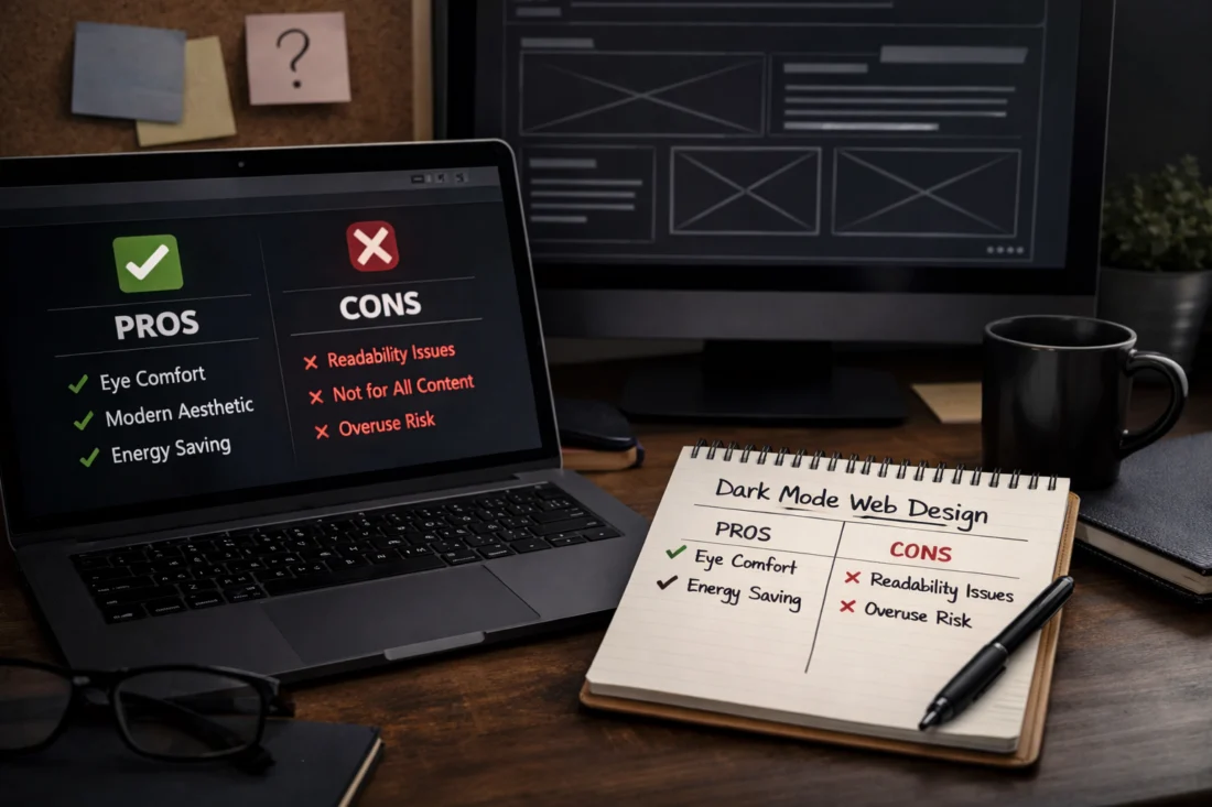
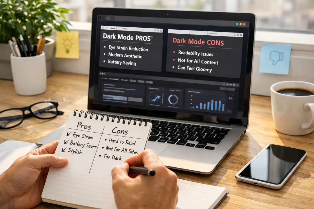
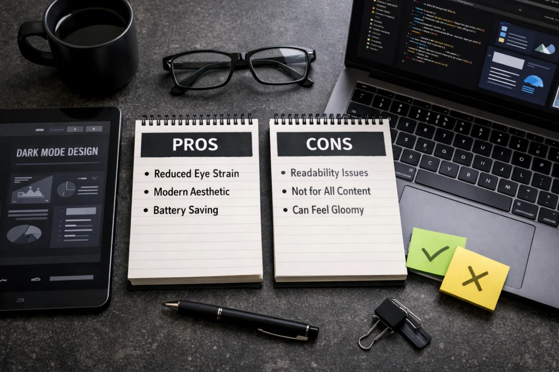
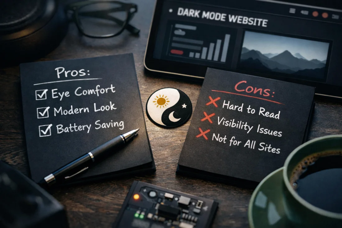
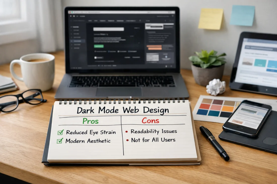
Common misconceptions include assuming dark mode is universally easier on the eyes or that it always improves readability. The reality is context-dependent; poorly executed dark mode can increase glare or reduce readability on certain content types. The most successful implementations balance contrast, typography, and brand tone across modes rather than relying on a purely aesthetic shift.
Another frequent mistake is treating dark mode as a page-level toggle rather than a systemic capability with token-driven design. Inconsistent implementation across pages, neglected accessibility for images and charts, and performance pitfalls tied to frequent reflows are typical patterns. A robust design system with shared color tokens, typography scales, and standardized component behavior reduces drift and supports long-term durability. For governance and implementation reference, consider internal resources like “Best website design team” and “Salem website development tips” to align across teams. Material Design: Dark Theme —
Edge case: a corporate site with multilingual content may require different contrast targets for each language due to typographic differences. Common mistake: ignoring non-color signals in charts and data visualizations. What most guides get wrong: assuming a single set of tokens works for all content types without content-aware adjustments. For longer-term durability, ensure a token-driven system supports content-driven adjustments and multilingual needs. WCAG Quick Reference —
How do you compare and choose among implementation approaches (system-based, user-toggle, hybrid) and future-proof?
System-based dark mode respects OS preferences automatically, which can reduce cognitive load and provide a seamless starting point. The downside is potential brand drift if brand-specific cues are diluted or overridden by OS themes; a user override helps restore control but adds UI complexity. Hybrid approaches—system default with explicit override and page-by-page exceptions—often strike a balance for complex sites that require granular control across sections or apps.
Future-proofing involves building a token-driven system that can evolve with brand updates, whether you maintain a purely system-driven approach or expand with more granular overrides. Maintain governance standards so new components inherit theme behavior by default, and set up instrumentation to monitor user interactions and readability across modes. Real-world applicability notes apply to SaaS dashboards, product pages, and content-heavy sites: the best approach depends on the type of site, user expectations, and the feasibility of maintaining multiple theme states at scale. For practical alignment and cross-team governance, refer to internal resources such as “Salem web design partners” and “Top web design frameworks.” Apple HIG – Dark Mode — MDN: prefers-color-scheme —
Edge case: a global site with regional content might encounter cultural differences in perceived contrast or color meaning; ensure localization and accessibility remain coherent in both themes. Common mistake: treating dark mode as a one-off feature rather than a persistent, design-system-driven capability. What most guides get wrong: assuming one-size-fits-all dark mode rules across all pages; you should audit and tailor theme behavior by page templates and content types. Internal references like “Salem mobile-friendly design” can help align mobile-specific considerations during a hybrid rollout. WCAG Quick Reference —
Advanced considerations, edge cases, and future-proofing Dark Mode Web Design
High-contrast mode compatibility requires graceful degradation when OS or user settings demand louder contrasts. Plan fallbacks for Windows high-contrast modes, and provide alternative patterns, textures, or icons to preserve information without color reliance. Dynamic content and third-party widgets must respect theming or be isolated with theme-agnostic wrappers so they don’t break the overall design when the theme changes.
Internationalization and RTL add complexity: dark-mode color choices must preserve legibility and ensure that mirrored layouts remain visually balanced. Updates to accessibility guidance in 2026 influence token naming, component design, and testing coverage; staying current means aligning with WCAG evolutions and platform guidelines. Future-proofing the theming architecture means scalable design tokens, a modular component library, and instrumentation to monitor drift in user experience across modes. For cross-reference on official standards and guidelines, see the WCAG Quick Reference and platform-appropriate design guidelines. Web Content Accessibility Guidelines (WCAG) Quick Reference — Apple HIG – Dark Mode —
To keep readers engaged after exploring the pros and cons of dark mode, you can map practical steps with a WordPress success checklist that guides design decisions, accessibility, and user preferences without overhauling the CMS. This bridge to the FAQ section helps readers anticipate questions about switching themes, toggles, and contrast settings while keeping performance in mind.
From a marketing and content perspective, aligning with Salem SEO essentials while answering common questions in the FAQ can help sites maintain reach as they adapt to dark mode. By highlighting how color contrast, loading times, and responsive design affect search visibility, the article stays useful for readers seeking quick, actionable answers.
Frequently Asked Questions About Dark Mode Web Design
What is dark mode web design and why does it matter in 2026?
Dark mode web design is the practice of delivering a website that can render in a dark color scheme, often controlled by system preferences or a user toggle. It matters in 2026 because accessibility, readability, and brand consistency across modes influence user satisfaction and engagement on modern devices.
How should I decide between an automatic OS-based approach and a user-toggle approach for dark mode?
An OS-based approach provides seamless defaults but can obscure user control; a user-toggle ensures explicit control and can improve satisfaction for users who prefer one theme regardless of OS settings. A hybrid approach often offers the best balance for large sites with diverse content.
What are the best practices to ensure sufficient contrast in dark mode across devices?
Use nuanced dark surfaces rather than pure black, adhere to WCAG-like contrast targets, test with real devices, and validate focus visibility against dark backgrounds. Include non-color cues for essential states and ensure text remains legible across mobile and desktop environments.
How should images, icons, and media adapt when dark mode is enabled?
Icons and images can swap to dark-optimized variants or be recolored with token-driven rules to preserve legibility. SVG assets are preferable for precise color control, while raster images may require light/dark variants or overlays to maintain readability.
What are the most common mistakes to avoid when implementing dark mode on a large site?
Common mistakes include relying on color alone for signaling, ignoring accessibility for non-text elements, and failing to maintain a consistent token-driven system across pages. Performance issues often arise from heavy asset swapping and reflows during theme changes.
What is the best approach for implementing dark mode on a large enterprise site with multiple teams in 2026?
A token-driven design system with centralized governance and component libraries supports consistency and scalability across teams. A hybrid approach with system defaults and explicit overrides, plus a staged rollout and strong testing matrix, tends to work well for complex sites.
Conclusion — planning notes for the writer
Takeaway themes to summarize:
– A principled design system is essential for durable Dark Mode Web Design across products and teams. Maintain a single source of truth for tokens, elevation, typography, and color across light and dark themes.
– Accessibility and contrast must be prioritized, with clear focus indicators, non-color cues, and testing that includes color-deficient users and assistive technologies.
– Establish a clear decision path and governance: define default behavior, user overrides, and the process for token evolution as the brand evolves.
– Test across devices, gather measurable outcomes, and iterate. Treat dark mode as a long-term investment in user experience rather than a one-time feature.
– Align with brand while staying flexible for future updates, including cross-team workflows and ongoing asset and widget compatibility.
Actionable next step: conduct a dark mode accessibility and contrast audit, or set up a token-driven design system and run a cross-team implementation review. This will help you move from theory to practical, durable outcomes that scale with your organization. For future internal planning, you can reference related content like “Dark mode website version” and “Dark mode aesthetics guide” as templates for broader adoption across site types. Web Content Accessibility Guidelines (WCAG) Quick Reference — Apple HIG – Dark Mode —
Updated April 2026